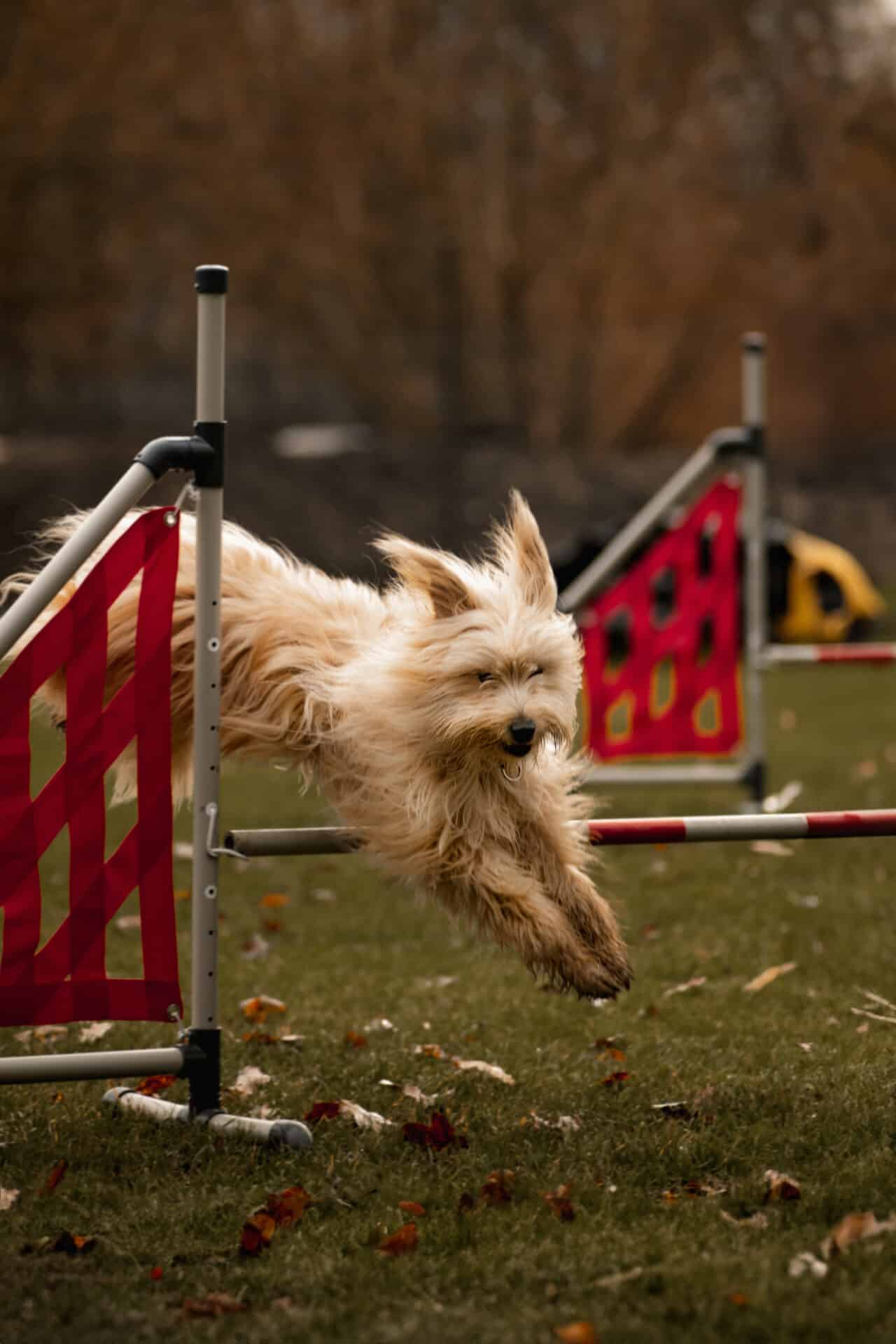
Composition Matters More Than Your Subject

Everyone who presses the shutter button on a camera or phone is composing an image. It doesn’t matter what’s in the photo, a landscape, your family, or a pet, the composition must be done correctly.
Almost everyone today takes photos on their phone, camera, tablet, or other device. They share photos on social media and tag the people in the photos. These photos often have composition errors like street signs or tree branches sticking out behind someone’s head, or a part of the face or body missing. We’ll tell you how to avoid these composition errors.
Composition affects perception
With the right composition, your photos will have a greater impact on your viewers. They can draw the viewer into the photo or bring them closer to reality. They have greater storytelling power, are more pleasing to the eye, and above all, appear more professional. When a photo has poor composition, we feel the opposite. And that’s what you want to avoid.
We won’t burden you with technical details or detailed camera settings. We’ll take a closer look into the viewfinder or display of your camera, whether it’s a phone, mirrorless camera, DSLR, compact, or other device.
What is composition?
The dictionary defines composition as: “The arrangement and interrelation of shapes depicted on the surface of an image.” Put simply, it’s how the main subject is viewed and its placement within the image.
The different types of composition are:
- Fill the frame—Use the entire space for the main subject.
- Central composition—Place the main subject in the center. Used in architecture or portrait photography. May not be suitable for other genres.
- Rule of thirds—Simplification of the golden ratio. Important elements are placed roughly at the intersections of imaginary lines dividing the image into thirds.
- Diagonals—Oblique lines that can intersect at the lines that divide the image into thirds. Diagonals add an element of dynamism to the image.
- Framing—Use a natural “frame” in the scene to frame the main subject.
- Rhythm—Capture the motif of repeating elements. Works best with diagonal lines
- Leading lines—Lines in the scene that guide the viewer’s gaze (roads, rivers, fences, etc.).
- Texture—Capturing the surface of objects.
The most common composition errors
Centered photograph (central composition):
Almost everyone holding a camera for the first time makes this mistake. Another culprit is someone who has little interest in photography. It is simply taking a photo where the main object is “beautifully” centered. However, if the subject of interest is directly in the center of the frame with a distracting or indistinct background, it’s hard to draw the viewer into the photo. The viewer may not understand it or the photo can appear boring.
This error can be easily fixed. Start by using the golden ratio, or apply the rule of thirds, and place the object in one of the intersections of the imaginary lines dividing the image into thirds.

Getting lazy
Another composition error is getting lazy. When we sit, we don’t want to get up. When we stand, we don’t want to crouch. We also don‘t want to kneel, let alone lie in the grass.
If you always shoot from one place, the subject may not fit entirely into the frame. If you don’t take a step or two backward or sideways, your friend’s ankles or the top of their head may be cut off. There’s no freedom in the photograph. It’s crowded, and the context of the entire photo isn’t visible (unless it’s a portrait without any other message).
You can easily eliminate this error too. Learn to use eye-level photography. Learn that not only can your subject move, but you as the photographer should move too.
Incorrect focus
A minor but quite common error. The photographer focuses outside the main subject, which can also be caused by a lens that either overfocuses or underfocuses. Proper focusing emphasizes the main subject and also what you want to say with the picture. Always take more pictures than you need. There’s plenty of space on your camera card, and they can always be erased.
Protrusions and other distracting elements
Something protrudes or appears to be “growing” from the main subject (tree, pillar, traffic sign, and anything else distracting). This is a small detail that doesn’t look good and usually occurs out of carelessness. It’s certainly not pleasing to the eye when a lamppost grows out of the head of your subject or when a branch covers part of the face. Just moving the camera to the side will remove distraction.
Out of the frame
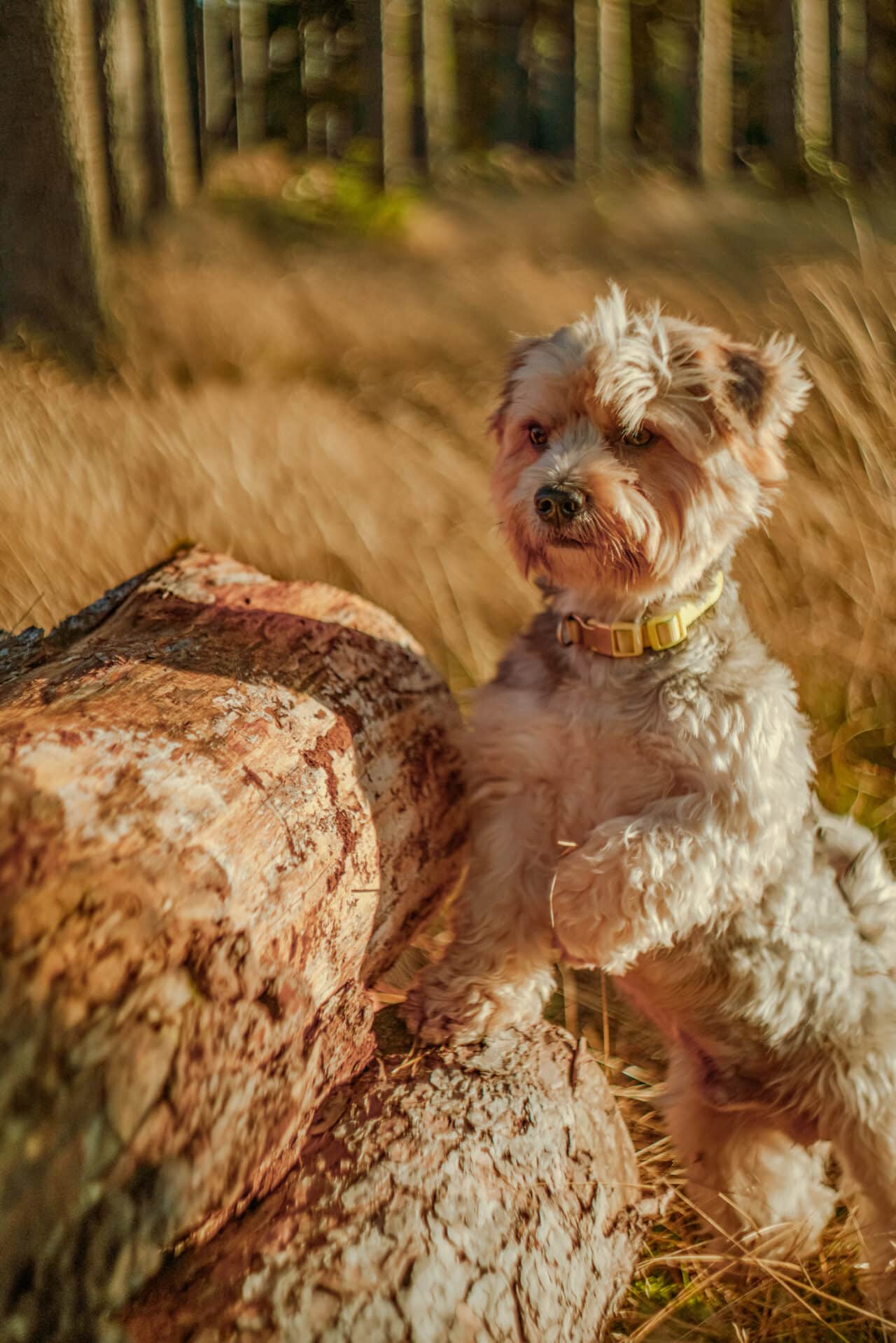
This error occurs more frequently when following the golden ratio. It occurs when the movement, gaze, or concentration of the subject in the photograph leads out of the photo, as if beyond the frame of the image. This is neither appropriate nor desired. The viewer can’t find out what will happen next or where the person in the photo is looking.
This error can be eliminated by simply moving the subject into the second third of the photograph and leaving enough space in the direction of movement or gaze.
Slanting photos
Slanting is more visible in landscape and architecture photography than in portraits, but it’s important to pay attention to in any genre. Keep your trees and walls of buildings vertical and your water surfaces horizontal. In reality, surfaces, as well as buildings or trees, do not slant to the side.

To help your shoot, you can use a tripod with a level or a grid on your camera’s display or viewfinder.
A little goes a long way
Remember these simple rules to avoid the composition errors we discussed and your photographs will be even better. Before pressing the shutter button, decide what you want to say with your photography and whether future viewers will understand your message. Approach your composition accordingly.
As mentioned, you can use a grid or a focusing screen on the camera to avoid composition errors. A tripod is also an excellent tool that, when used correctly, helps eliminate many photography errors. If you have the time and space, be sure to use it.
No one was born a perfect photographer. It takes practice, patience, and above all, motivation. Your photos will look better even without expertise in all the functions and technical parameters of your devices, or post-processing. Especially in the beginning, a little goes a long way.
