Colors in Photography: All There Is to Know about Black

The color black is formed by mixing all three primary colors together, as if it absorbs these colors. Since ancient times, the use of black in art has evoked feelings of darkness, emptiness, and even death. At the same time, it is a source of fascination because it can create indispensable contrast and depth. These qualities are among the reasons why black and white photography remains so popular after so many years.
Black is the opposite of white, which we wrote about in our previous article. While white reflects all colors of the spectrum, black indicates their absence. More specifically, it absorbs all colors of the spectrum.
Interestingly, there is no cultural consensus on the meaning of black like there is with white. Our association of black with dark emotions is deeply influenced by ancient Greece, on whose pillars our civilization stands. Greek heritage tells us black is the color of death, darkness, sorrow, and mourning.
However, if we travel further south to ancient Egypt, we find a different cultural context. Black was the color of the god Osiris, the lord of death, but also of life, rebirth, and fertility. Even in China, black does not have a strictly negative context. It is also the color of water and in this sense represents stability and eternity.
The psychology of black
Although we may encounter positive aspects of black in some cultures, there is no culture where black is exclusively associated with positive emotions. Therefore, we can say that emotions associated with black are primarily of sadness, loss, and death. In some cultures, this color is worn or used in funerals and rituals associated with departure.
Black also evokes associations with the unknown and mystery. It is the color of night, concealment, and darkness that we are unable to grasp and recognize. We don’t know what lurks in the darkness, and therefore it evokes feelings of uncertainty and fear.
However, black is also associated with elegance and simplicity. It can evoke a sense of seriousness, respectability, and prestige. Think of the black robe worn by judges or black clothing worn on special occasions. A black belt in martial arts signifies a high level of achievement.
Black for marketing and design
For marketing and design, use black with caution. On one hand, black can balance overly vibrant colors. On the other hand, it can be overwhelming and evoke negative emotions. Black is a color that can convey a lot, even on a small scale. Therefore, it is better served as a complementary color rather than a primary one.

The proven combination of black and white or black and gold in marketing and design works well.
For example, the logos of companies like Nike, Wikipedia, or The New York Times communicate seriousness and credibility with their simple use of black and white. Chanel, which also uses a simple contrast of black and white, incorporates black and gold, evoking a sense of luxury or elegance.
Black in art
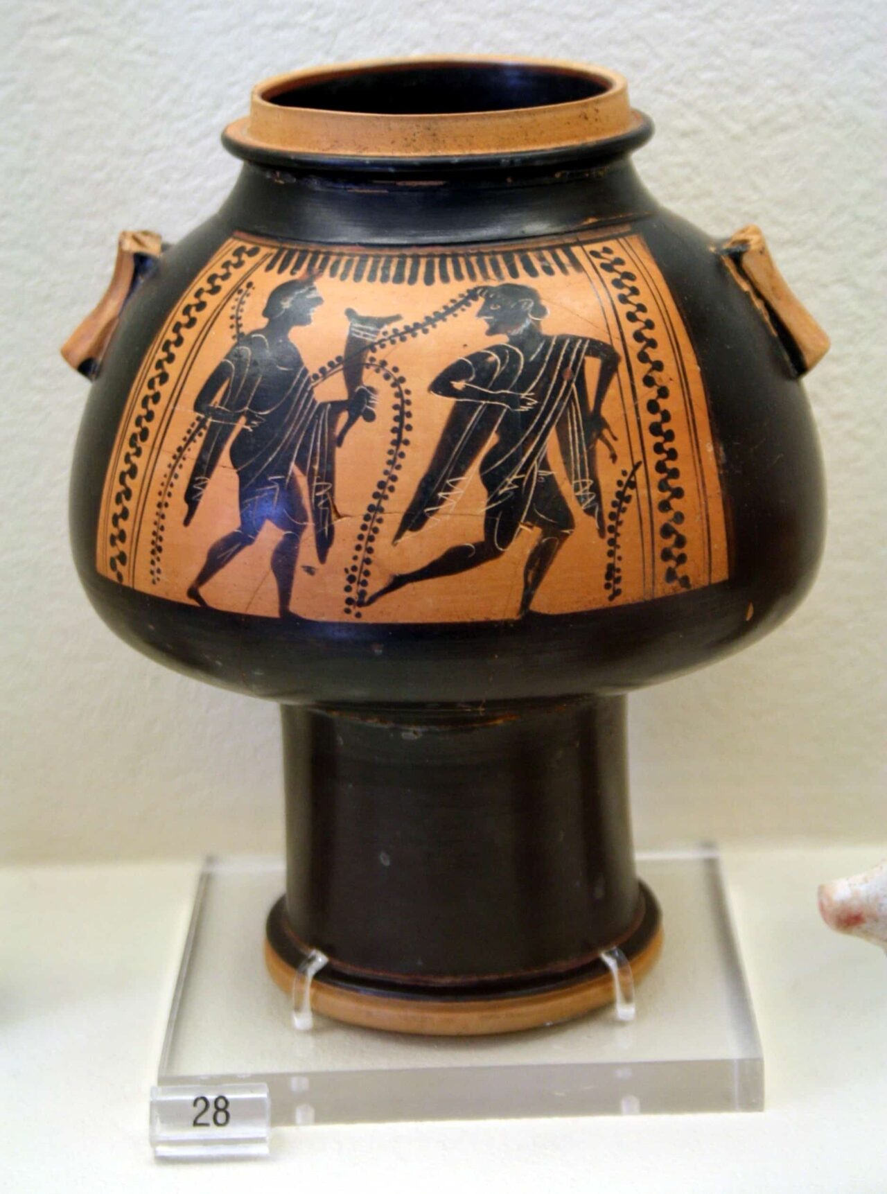
The color black was prevalent in prehistoric paintings. Prehistoric artists skillfully used black pigment in cave paintings. Similarly, ancient Greeks began to paint black silhouettes of figures and sophisticated decorations on clay vessels. Photographers today use a similar effect when photographing silhouettes in backlight.
In the Middle Ages, black was primarily used to depict evil and sin. There were exceptions. A well-known example is the Benedictine order, who began to dress in black as a sign of simplicity and humility, to distinguish themselves from the Cistercians, whose white habits were considered a symbol of vanity and pride.
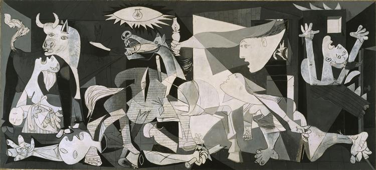
In Spanish traditions of the 19th and 20th centuries, some of the greatest anti-war works of all time were created, with black being dominant. It was used as a symbol of evil and sin but in a reversed socio-cultural context.
Goya’s Black Paintings envelop the church in black, depicting the evil committed by the Spanish Inquisition.
Goya’s successor, Pablo Picasso, depicts the universal horror caused by war in his terrifying painting Guernica.
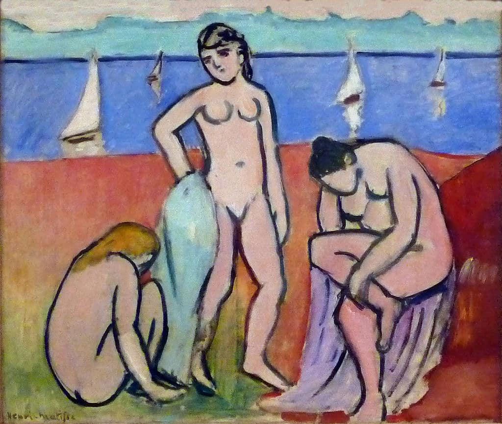
Photographers can learn a lot from the use of black by another giant of the 20th century, Henri Matisse. Matisse cleverly used simple black brushstrokes to bring sharp contrast and tension to his paintings.
Colors that compliment black
Like white, black is a universal color that goes well with all other colors. It depends on what you want to communicate.Black and red is a timeless combination that expresses vitality, strength, and passion. It is also very visually striking. If you want your photo to attract attention, this is the right choice.
Another timeless combination is perhaps the most famous—black and white. These two colors are naturally in contrast. A balanced ratio of these colors achieves a blissful equilibrium (Yin and Yang). And when you add light to the equation, you can create a very dynamic photo.
Another option is combining black and gold. You evoke feelings of luxury, wealth, elegance, and a certain mystery. Interestingly, in medieval paintings, this combination was used as a clash of opposites. Black was the symbol of the devil and sin, while gold was the symbol of divine light, illuminating the darkness.
In our Colors in Photography series, we gradually introduce all the basic colors and explore each of their aspects from history to psychology.
Read the article about the color white, green, red, blue and yellow to learn interesting facts about the use of white not only in photography.


