Photography Exercise—Abstract Color Compositions

Colors are all around us and we often perceive them peripherally, yet they play a crucial role in photography. This exercise will make you focus on different colors and how to capture them aesthetically.
For this exercise, it helps to understand some basics about colors and their combinations. Let’s quickly recap some key points before diving in.
When I refer to color, I primarily mean hue. Saturation and brightness play a lesser role here, but it’s best to keep them within reasonable limits so the hues remain distinguishable.
Color theory in a nutshell
Colors can be visualized in various ways, with the color wheel being a standard for artists for centuries. While some versions also include brightness and saturation, we’re focusing solely on hues.
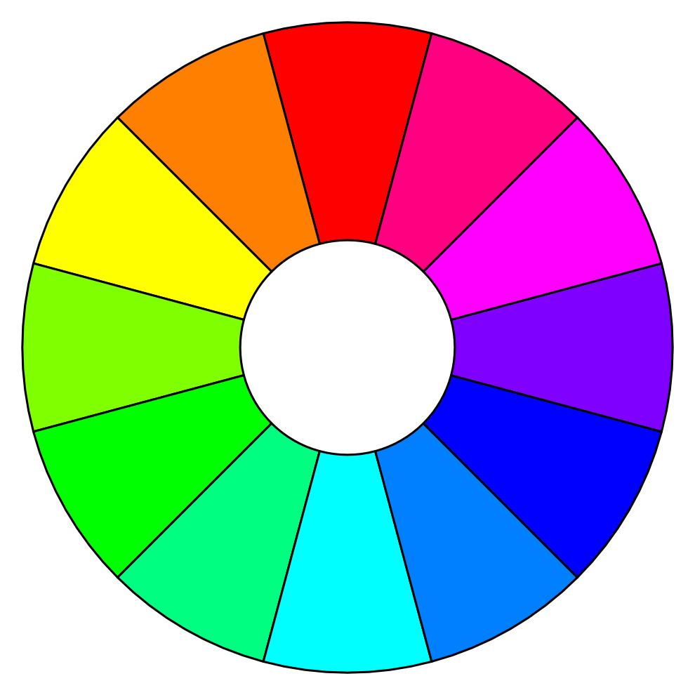
Painters discovered long ago that certain colors work together, creating visually pleasing combinations. For our purposes, we’ll focus on two main types:
- Analogous colors— colors next to each other on the color wheel, creating a sense of harmony.
- Complementary colors—colors opposite each other on the color wheel, producing strong contrast.
While there are more complex color schemes using three or more colors, we won’t cover those here. You can read more about color theory in the article Coloring Step by Step I: Color Theory.
Photography exercise: Your assignment
Your task is to go out and photograph abstract color compositions using either analogous or complementary color combinations. Aside from the colors themselves, consider composition so you can avoid a dull, overly descriptive photo with different left and right halves.
The assignment is simple, but keep these key points in mind:
- Aim for abstract photos, typically close-ups where the subject isn’t immediately recognizable. The goal is to emphasize and capture color with the right composition.
- Capture exactly two colors. No more, no less.
- Black, white, and gray aren’t considered colors for this exercise. They can appear in the photo, but they shouldn’t count as part of the main color combination.
- The exercise should be done outdoors, either on the street or in the great outdoors, not at home, where you can easily arrange objects.
Perfect color pairings from the color wheel are rare, so don’t worry if your combinations aren’t exact.
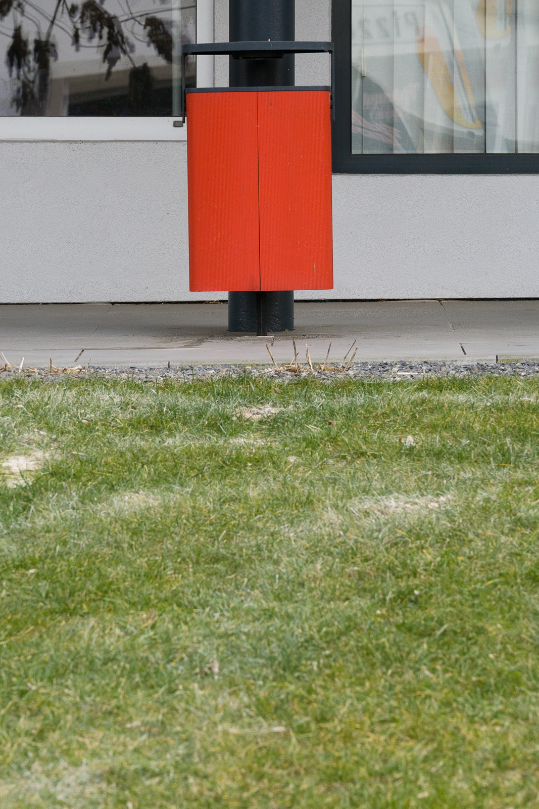
Over time, I’ve noticed some repetitive subjects. To keep things interesting, try avoiding skies, plants, fruits, vegetables, or large architectural elements. I’m also considering banning plastic trash bins and road signs.
Three approaches to the assignment
I see three ways to approach this exercise.
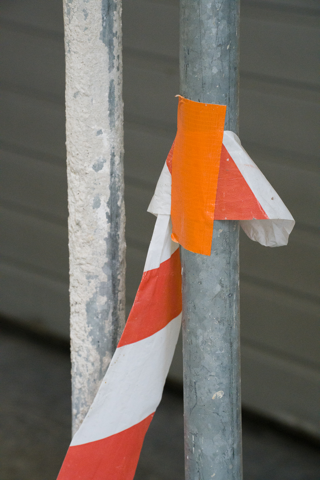
The first and easiest method is to find objects where a designer has already placed color intentionally. The designer understands color theory and uses those colors deliberately. You don’t have to find and create combinations. Your job is simply to compose the shot well.

Sony A7R V, Tamron 35-150/2-2.8, 1/250, f/4, ISO 100, focal length 150mm
The second approach involves spotting objects that just happen to be positioned together, creating a visually appealing color combination. This combination is not created by the hand of a designer, but rather found by the photographer.

Sony A7R V, Tamron 35-150/2-2.8, 1/250, f/8, ISO 1000, focal length 46mm
The third approach is deliberately waiting for or anticipating a fleeting color combination. This may or may not be more complicated than the previous option.

Sony A7R V, Tamron 35-150/2-2.8, 1/250, f/8, ISO 500, focal length 150mm
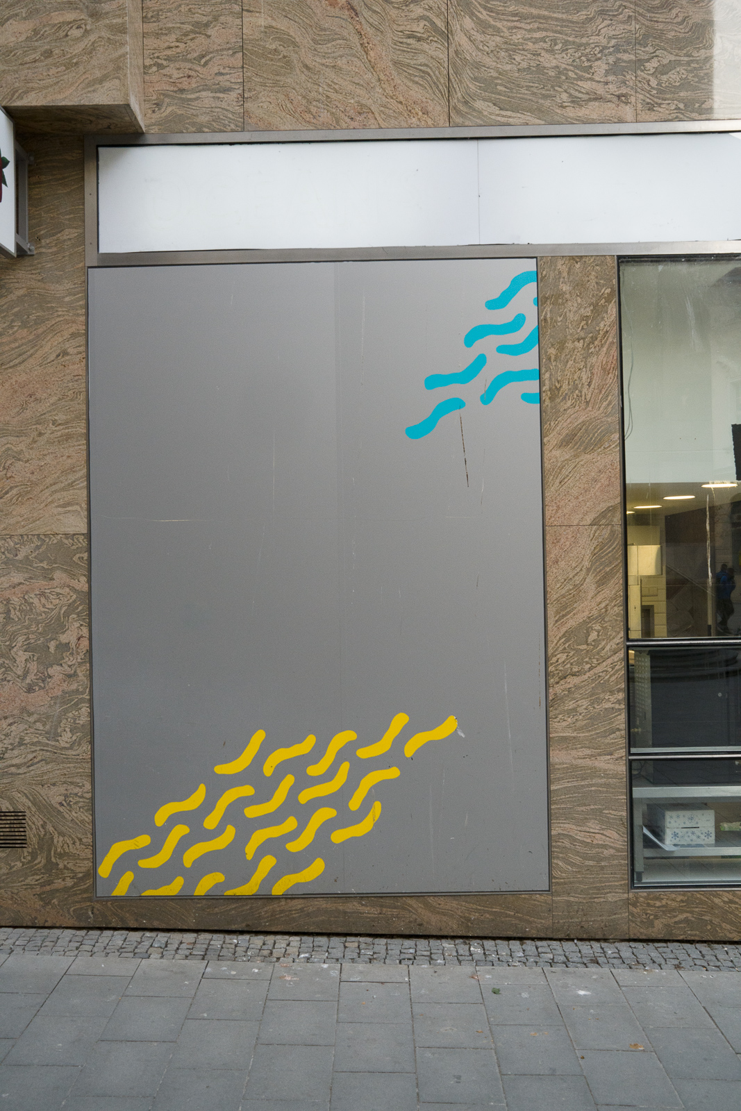
Color compositions
Your goal is to capture color with minimal distractions. Shadows or leading lines can be useful, but cluttered backgrounds detract from the effect.

Sony A7R V, Tamron 35-150/2-2.8, 1/250, f/10, ISO 12800, focal length 35mm
Sony A7R V, Tamron 35-150/2-2.8, 1/250, f/10, ISO 10000, focal length 150mm
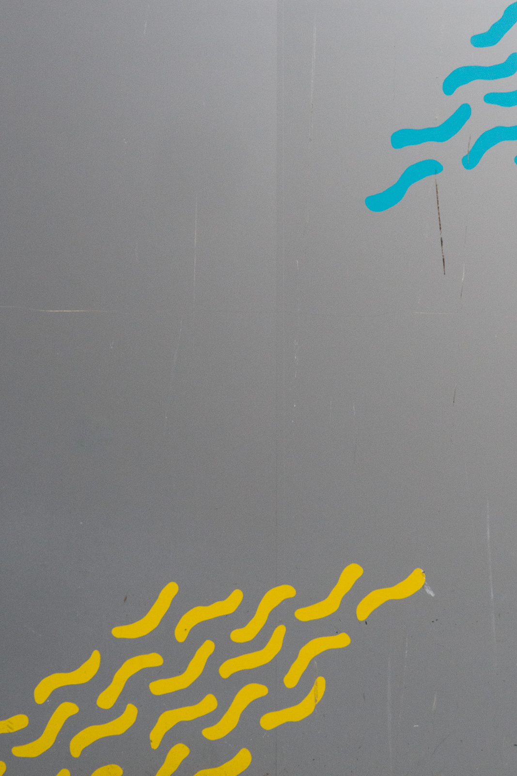
It’s best to take the tightest possible shot or crop details from the photos if you can’t get very close or don’t notice the distraction until later.
Sony A7R V, Tamron 35-150/2-2.8, 1/250, f/10, ISO 3200, focal length 35mm
Sony A7R V, Tamron 35-150/2-2.8, 1/250, f/10, ISO 10000, focal length 35mm
A telephoto lens and narrow focus are useful and make it easy to eliminate unwanted objects at the edges, but also make it possible to optically zoom in on otherwise more distant objects.
Sony A7R V, Tamron 35-150/2-2.8, 1/250, f/9, ISO 1600, focal length 150mm

The actual placement of things in the picture depends on the circumstances. A central composition can be effective in some cases.

Sony A7R V, Tamron 35-150/2-2.8, 1/250, f/8, ISO 1600, focal length 150mm
However, though, it makes sense to consider the golden ratio, or rule of thirds a majority of the time.

Sony A7R V, Tamron 35-150/2-2.8, 1/250, f/8, ISO 1600, focal length 150mm
Still, it’s often interesting to rotate the camera to create diagonals.

Sony A7R V, Tamron 35-150/2-2.8, 1/250, f/8, ISO 1600, focal length 66mm
To keep things from getting dull, don’t just shoot perpendicular to the subject/wall/plane, but try taking some horizontal shots as well.

Sony A7R V, Tamron 35-150/2-2.8, 1/250, f/8, ISO 1000, focal length 72mm
Common issues
Some photos are overly wide and simple cropping would get rid of a lot of distractions at the edges. I mentioned this above.
A tilted horizon looks amateurish. Of course, in some cases, this is the artistic intention, but then you need to turn the camera significantly and not just a few degrees. More advanced photographers fix this issue automatically when editing their images.

Sony A7R V, Tamron 35-150/2-2.8, 1/250, f/8, ISO 640, focal length 150mm

Sony A7R V, Tamron 35-150/2-2.8, 1/250, f/8, ISO 640, focal length 150mm
Another stumbling block is less saturated colors which seem fine to the photographer at the time, but are less vibrant than expected. Sometimes the problem is incorrect white balance and naturally muted tones that are more gray. The solution is to either adjust white balance manually and/or in RAW format and later balance the colors how you want. A similarly common issue is the colors in the shoot weren’t very saturated. This is when it’s a good idea to increase saturation, either to the color itself or to the entire photo.

Sony A7R V, Tamron 35-150/2-2.8, 1/250, f/9, ISO 1250, focal length 150mm

Sony A7R V, Tamron 35-150/2-2.8, 1/250, f/9, ISO 1250, focal length 150mm
Sometimes, there is too little or too much color. The goal is two main colors, ignoring black, white, and gray.

Sony A7R V, Tamron 35-150/2-2.8, 1/250, f/10, ISO 3200, focal length 150mm
Colors are fascinating
I hope you enjoyed this exercise, and you begin noticing color combinations around you. Even in seemingly dull locations, you can find interesting details and capture them in a creative way.