[Test] 4 lenses, 35mm, f/2.8: See Which Lens Stood Up Best
![[Test] 4 lenses, 35mm, f/2.8: See Which Lens Stood Up Best](https://learn.zoner.com/wp-content/uploads/2017/11/test-4-lenses-35mm-f-28-see-which-lens-stood-up-best.jpg)
When you sit down with lenses that all offer the same focal length and aperture, you might think that they’ll all give almost the same outputs. But in reality their outputs vary in a variety of details. To see this difference “live,” check out our test of some Canon and Sigma lenses that—in theory—“meet” at the 35mm focal length.
I use one single lens at weddings far more than all the rest: a Sigma 35/1.4 Art. But occasionally I do go and use a different one—a Canon 16-35/2.8 III—and even though I’m shooting with the same apertures and focal lengths, I can tell on my monitor which photo came from which lens.
I thus wanted to test how these lenses differ, while also testing two more that cover the same focal length:
- Sigma 35/1.4 Art – introduced in 2013, weight 660 g
- Sigma 24-35/2 Art – introduced in 2015, weight 940 g
- Canon 16-35/2.8 III – introduced in 2016, weight 790 g
- Canon 24-70/2.8 II – introduced in 2012, weight 800 g
These are all fairly high-end lenses, but of various types. Even just looking at their technical parameters, you can already see that they have various advantages and disadvantages. I concentrated on here taking pictures at a single focal length:35 mm. Likewise all of the tests used the same f-stop: f/2.8. I tested on a Canon 5D Mark IV camera, so the test photos are all 30-megapixel outputs.
Not even one of the lenses here is ideal in every way. They still have various problems, albeit less so than other lenses where the manufacturers tried to cut costs or produce something very universal.
Image Sharpness
Sharpness is probably the main thing that comes to a photographer’s mind in lens tests. I tested for it against a wall and in two parts of a picture, so it could manifest in both the center and the corners. Before the corner test, I focused on the given spot, just in case my camera might not be facing straight at the wall or the lens might have a crooked plane of focus.
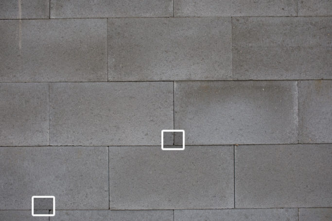
Here’s a comparison of the centers:

And here are the corners:

Not surprisingly, the Sigma 35/1.4 wins out in both tests, with the Canon 24-70/2.8 close behind. Here the qualitative jump for the Sigma 24-35/2 is very visible, and the Canon 16-35/2.8 lags well behind the rest.
The Sigma 35/1.4 is especially at an advantage in this test, because for it, the f/2.8 setting is nothing extreme. For very fast lenses like this, the jump from f/1.4 to f/2.8 helps in general to improve their sharpness…. even though this particular lens is excellent even at full wide (an f/1.4 aperture), and so the difference is surprisingly small.
Geometric Distortion
The previous test had the side effect of highlighting geometric distortion. That’s because photos of a wall nicely show off any and all geometric lens distortion. However, you do need to get close to see the differences, so clicking the thumbnail for the next picture will blow it up larger than usual. Take a close look at the shapes of the horizontal crevices between the bricks at the top and bottom:

The Sigma 35/1.4 displays some minor barrel distortion, while the rest tend towards pincushion distortion. The Sigma 24-35/2 does well here, the Canon 24-70/2.8 less well, and the Canon 16-35/2.8 again comes off the worst. However, this effect is not eye-catching at all. So if you’re not photographing architecture, in practice you generally won’t even notice it.
Vignetting
When it comes to vignetting, the lenses that start off faster than f/2.8 are at an advantage. After the aperture is closed up, the vignetting falls away, and you get a more even brightness distribution. We tested this on a white wall:

With this specific setup (35 mm, f/2.8), the vignetting in the Sigma 35/1.4 is better (milder) than for the rest; the other lenses are mostly in similar shape, although the Canon 16-35/2.8 truly is just a touch worse.
Nonetheless, unless vignetting is utterly extreme, I don’t consider it a problem.
In fact, vignetting tends to suppress the action at the edges of a photo, so a little bit can draw even more attention to a subject near the center. So I think that lenses with relatively strong vignetting can be at an advantage in many situations. But definitely not in all situations.
Bokeh
The amount of blurring for the background behind a photo’s subjects can be calculated. However, the way in which things are blurred is important as well. The quality of this blurring is called bokeh.
The composition of blurred backgrounds is very visible for lights in the dark. Therefore I used Christmas lights against a dark background here.
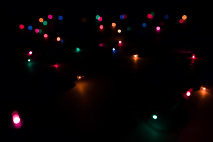
For this lens test, I focused on a light placed about half a meter from the camera. The other lights in the back, over a meter and a half away, always had roughly the same blurring. However, the absolute size of the circles they formed doesn’t interest us. More important are the details on a single light. In this case I chose a close-lying pair of lights at the top middle.

The actual shapes of the lights are influenced by multiple factors, so we shouldn’t be surprised that even though they usually appear round, the Sigma 35/1.4 turns them into nine-sided polygons. What’s happening here is that, since its aperture has been tightened from f/1.4 to f/2.8, it’s starting to show off the shape of its shutter blades. For the other lenses, the blades are mostly tucked away, and so you see a nice round lens shape.
More important here is the structure inside of the lights. While the Sigma 35/1.4 is great here, the rest have small, or large, problems. The Canon 16-35/2.8 draws this structure in a fairly ugly, and specific, way. You can see this effect above; it’s sometimes nicknamed “onion rings”.
To give you an idea of how these rings look in practice, I’ve taken a picture outdoors:
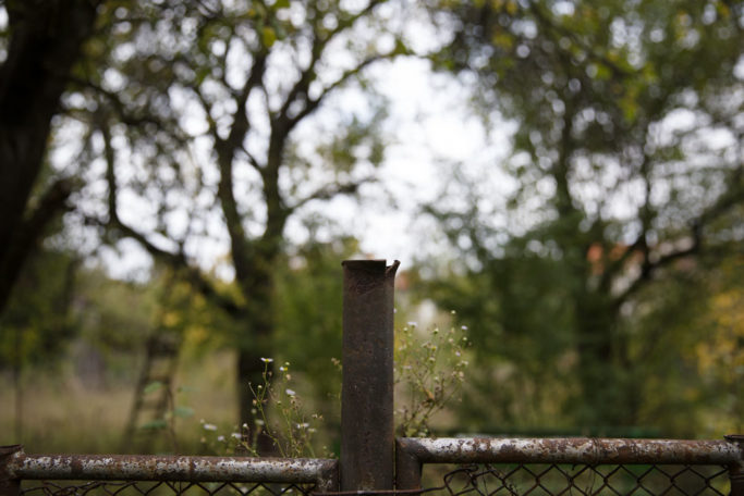
A close-up of a part that’s just a bit to the right of the center looks like this:
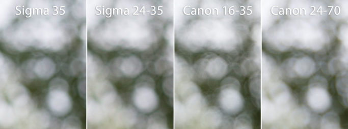
All of the lenses blur the background, but some add further details to it, making the background less inconspicuous than you might prefer. You can sometimes run into the phrase nervous bokeh in connection with this.
Chromatic Aberration
When a photo is suffering from chromatic aberration, it has green or purple pixels lining its more visible contours. Now, if for example you have a perfectly focused object in the middle of a picture, it will tend to be free of this defect. But depending on the type of aberration, you can run into cases where colored outlines appear more and more often towards a picture’s edges (lateral chromatic aberration) or as you move further behind or in front of the plane of focus (longitudinal chromatic aberration).
Here I’ve explored the latter problem, since it plagues fast lenses frequently. This time around my test scene was a lighted wire fence that offered a lot of bright contours against a dark background.
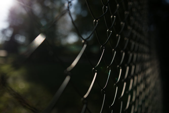
And here are the closeups, each showcasing one wire in front of the plane of focus and one beyond it:
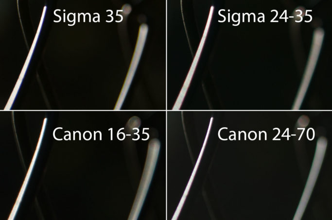
Just like at the start, I want to emphasize that the Sigma 35/1.4 is at an advantage in this lens test, because we’ve tightened up from its widest aperture. (And indeed, at f/1.4 it behaves worse here than all the other lenses tested.) But overall, none of the lenses had catastrophic problems. That said, the Sigma 24-35/2 had the largest problems. The Canon 16-35 has restored its good name a bit here, because it truly tried its hardest, and even in this setup where it was at its limits, it gave very good results.
Not Even a Test Can Tell You Everything
As you’ve seen, the Sigma 35/1.4 gives you access to a combination of strong sharpness and mild bokeh, while the Canon 16-35/2.8 III lags behind in this area. Every lens has its pluses and minuses. They can even lie in characteristics that “aren’t in the table,” such as resistance to rough handling or the weather—and of course the range of focal lengths.
So everyone should consider their own needs and choose a lens based on them. This will always be a matter of compromises, and that comes into play here as well: Although the Sigma 35/1.4 is the leader in our tests, it’s also terrible at zooming.
Also, don’t forget that you can fix mild lens deficiencies while you’re editing your photos. Just go into Zoner Studio and apply the profile for your given lens.
There’s So Much I Could Test
There are so many more things I could have tested: behavior against the light, what kinds of stars form around light sources at high f-stops, the speed and precision of focusing, and much more. But not all of it is relevant for photographers, or possible to measure well enough and fairly enough. (Of course not even the above tests are perfectly ideal, but then, we can’t ever really create totally fair conditions.)