12 Photo Clichés That You Should Avoid
We all want gorgeous photos. But sometimes we send our efforts in foolish directions. Clichés—endlessly repeated motifs and approaches—trap us in the talons of simple visual ingratiation and leave us creating photos that might look nice at first sight, but are otherwise uninteresting. Which clichés are these, and how do you avoid them?
There are places in this world that have been photographed so many times, a photographer should practically be ashamed to point their camera at them. I don’t just mean the Eiffel Tower, but also the Taj Mahal, London’s Tower Bridge, and the Leaning Tower of Pisa (those “funny” pics where you prop it up). Photos from these and other similar places have nothing to say but “I was here and I know how to press a trigger.”
How can you do things better? Buy and send some postcards, that’s what they’re for! Or take postcard-worthy photos at less-seen parts of tourist destinations.
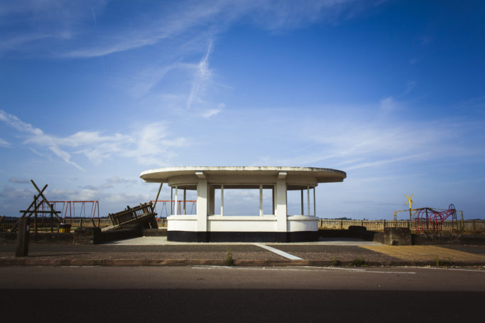
Canon EOS 1000D, EF-S 18–55mm f/3.5–5.6, 1/500 s, f/7.1, ISO 100, focal length 18 mm
Resist the Sunset
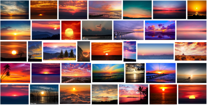
This might just be biggest photographic cliché of all. The warm orange and red coloring of the sky acts on photographers like the full moon on a werewolf. It brings evil, and it hurts. If you don’t want to wake up naked and defenseless after a sunset like this, try thinking about the nature of the light, not the sunset itself.
Observe how you can put it to work for other subjects. And inject a little early-evening atmosphere into your photos.
Enough With the Film Grain and the Matte Look
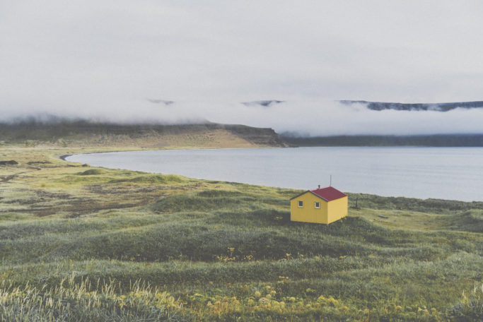
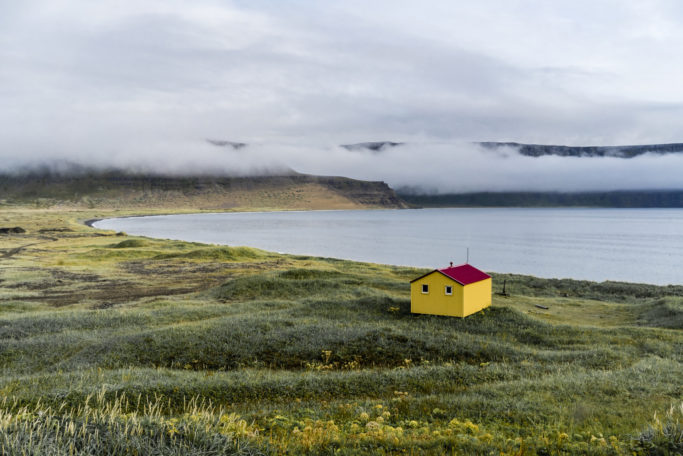
Ever since the arrival of Instagram, film-like edits with cropped blacks and whites, desaturation, and low contrast have been spreading like a virus. Naturally there’s nothing bad about seeking inspiration for photo edits in the colors and execution of old film photos. The trouble comes when you go at it the wrong way and overdo things.
The low-contrast matte look is more a trait of low-quality film photos, and they often result from developing poorly exposed negatives.
In digital photography, overdoing this kind of edit can rob you of details, vibrant colors, and contrast, and leave it all looking like, well, a cheap Instagram filter. And when you print out a photo edited like this? It looks dull and bland. So break free of the pack and take inspiration from high-quality photos.
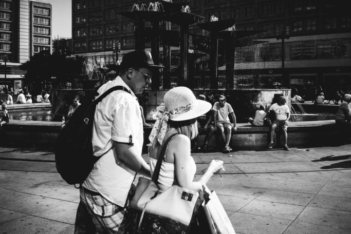
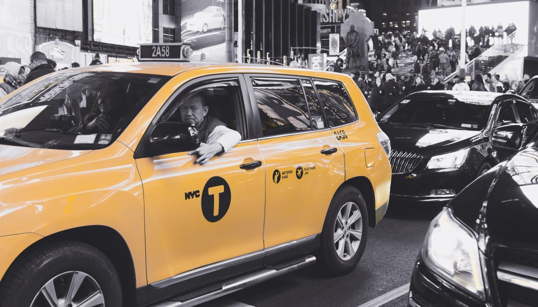
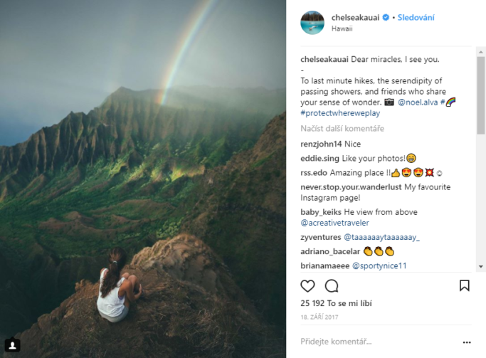
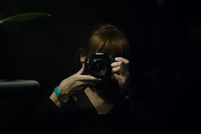
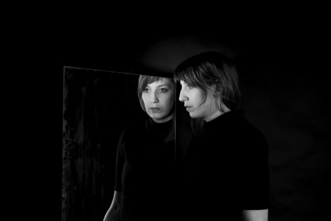
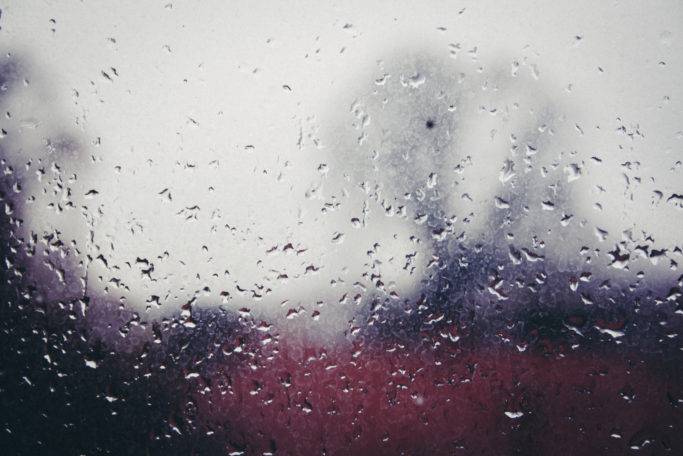
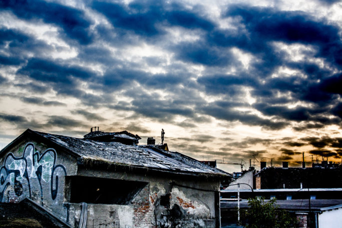
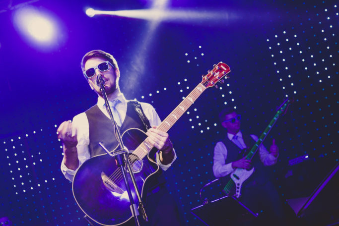
The first picture is suffering from a matte edit with simulated film grain. The second has ordinary edits to contrast, lights, and shadows. You can tell at first sight how in the first photo everything’s running together, and the photo has less impact overall. There was a time when black and white was the only option. Photographers back then didn’t face that excruciating choice between tones of color and shades of gray. And for some of them, this was definitely a good thing. I’m not campaigning against black-and-white here; it still has its place in our digital world. But many photographers suffer from the illusion that making pictures black and white turns them into artworks. Or they may dive into even more awkward edits, like selectively desaturating almost everything in a picture of a rain-drenched street… everything but a red umbrella. (But that may be out of fashion now. Let’s hope.) Black and white conversions frequently damage photos. They often obscure some parts of them completely. And that has little in common with art at all. To learn the ins and outs of going black and white, read our article How Can You Tell When Black and White Is Right? In the unedited photo, it’s clear that this is basically a boring record of two people walking. The heavy-handed black-and-white edit just tries to hide this with high contrast and vignetting. The last few years have seen the rise of bloggers and “instagramists” who consider themselves travelers and adventurers (not tourists). And yet their photographic style is little different from postcard shots of the Eiffel Tower. Matte edits are a near-permanent part of their repertoire. Their photos all seem to show the same things, too. If you follow this topic a bit, then you’ll definitely remember the wave of photos with a person standing on a mountain peak and gazing entranced into a landscape (in an incongruously fashionable outfit). After ten profiles like these, you can find it hard to tell one “traveler” from another. You can even start to doubt if these peak adventures are as intensely experienced as they are precisely arranged. My recommendation? When you head out traveling, keep in mind that it’s sometimes better to enjoy your travel moments than to take pictures for fleeting likes on social networks. Do you feel like a photographer? Then you definitely do not need to use a photo of yourself with your pricey camera in front of the mirror as your profile pic. People will still figure out that you probably own, love, and use a pretty good rig. And meanwhile, you don’t want to be doing the same thing as everyone else. Try engaging your brain cells and taking an imaginative self-portrait instead. The kind that really says something about you and your abilities. Selfie photographers aren’t the only ones obsessed with their gear. There’s also a sizable group who will buy any lens at any price if it promises them numerous shapely bubbles of bokeh. Then they’ll try to overwhelm you with pictures that show off this technical capability. Who cares that there’s little to see in these photos but the bokeh? Well, you should. And you definitely shouldn’t feel ashamed that you don’t have a lens like that. Put your efforts into your photos’ composition and content rather than technology wars. If I had to choose the least likable cliché that’s widespread among street photographers, it would be pictures of homeless beggars. After all, this can be taken somewhat as exploiting their unhappy and unenviable situations. Photos of little children running in the dusty streets of poor countries, where a photographer with a big camera makes for a big scene, can be viewed similarly. If all you want to do with photos like this is to improve your portfolio, then step back for a bit. It’s a huge cliché, and it’s ethically dubious as well. Instead of heading after shallow subjects, think about what’s really worth photographing on the street and what might be overlooked by others. Another hackneyed subject in street photography. After all, it’s not that nice to run around out in the rain and try to capture an authentic situation. And your camera might get wet! So you might get the idea—how about photographing it through the window? And taking a little nostalgia from the drops dripping down the pane, and leaving the street blurry? Wiser souls will know that this is the wrong way to go. It’s been repeated so many times that nothing novel can come of it. So either get some waterproof jackets for yourself and your camera and head outside, or wait for the rain to end. So much has been written about this that there’s little to say here. HDR is a technique that’s easy to take too far. Then you get a photo that’s immediately eye-catching… but for the wrong reasons. Its excessive details and amplified saturation can soon set your temples throbbing. Here the rule is: even a bit can be too much. You’ve probably also had the feeling sometimes that what you see in the viewfinder is a little boring. And yearned to bring life, playfulness, and action into it somehow. If you get the idea of tilting the horizon a little, shoo that idea out of your mind. Unless, that is, you want people to twist their necks trying to view your picture. This often comes up for concert photos and portraits. The group is standing or sitting at a strange angle, and it’s tough to look at them. It can take you years to find a signature style that makes your photos stand out at a distance. But using a flashy watermark with a shouty font won’t bring your audience any closer. You might protest that it’s there to protect your photos from theft. But watermarks won’t necessarily prevent a photo’s theft on the Internet. So make life easier for your viewers and let them enjoy your pictures in their full beauty. I could definitely keep on naming more photographic clichés. Wedding photos, for example, are their own chapter, and so are pregnancy photos and carefully arranged photos of children. Photobank photos are also haunted by clichés, and so are food photos (especially coffee with latté art). So if there’s a cliché that bugs you, and we missed it in this article, don’t hesitate to mention it in the comments.
Sony A7, Sony FE 35mm f/2.8 ZA, 1/200 s, f/11, ISO 400, focal length 35 mmDon’t Go B&W Just to “Make Art”
Sony A7, Sony FE 35mm f/2.8 ZA, 1/320 s, f/8, ISO 100, focal length 35 mmDon’t Be Yet Another Instagram Individualist
Say Goodbye to Mirror Selfies
Sony A7, Sony FE 50mm f/1.8, 1/200 s, f/3.2, ISO 100, focal length 35 mmDon’t Rely on Bokeh Alone

Sony A7, FE 35mm f/1.4 ZA, 1/100 s, f/1.4, ISO 100, focal length 35 mmStreet Photos Aren’t About Photographing Homeless People
No More Raindrop Streets
Canon EOS 1000D, EF-S 18–55mm f/3.5–5.6, 1/50 s, f/6.3, ISO 100, focal length 55 mmDon’t Overdo It With HDR
Canon EOS 1000D, EF-S 18–55mm f/3.5–5.6, 1/200 s, f/7.1, ISO 200, focal length 34 mmA Tilted Horizon Won’t Help a Picture
Sony A7, Sony FE 35mm f/2.8 ZA, 1/100 s, f/2.8, ISO 400, focal length 35 mmDon’t Sign Your Pictures With Flashy Watermarks
A Nearly Endless List
