Battle of the Edits: 2 Approaches to Editing a Landscape
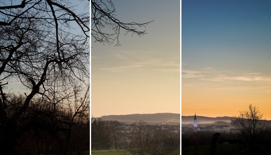
One photo. Two different edits. Two completely different final pictures. If you hand the same RAW file to two photographers, things can go really far—even this far. And that’s exactly what we’ve done with one landscape photo. Take a look at what they’ve done with it.
Landscape photos (and not just landscape photos) offer many editing possibilities. Meanwhile, it can’t be clearly said that any one of those possibilities is the only one. It depends not only on what your picture is like but also on what you want it to say. That can lead to entirely different edits.
Josef Halicek and Jan Kupcik are here to prove it to you. They’re both members of the Zoner Studio team, both tasked with editing the same photo. Decide for yourself which approach and which edit you like more. And take inspiration for your edits too.

Try out editing this picture yourself. Download the attached RAW file, unzip it on your computer, and open it in Zoner Studio.
Josef Halicek’s edit
My goal was to make this photo all about the village. The branches and bushes around it form a frame, and the photo overall evokes the feeling of an autumn morning or evening.
I’ll work as follows:
- I’ll start with basic edits in the Develop module of Zoner Studio to fix the exposure defects,
- and then I’ll switch to the Editor, where I’ll retouch the image,
- and then I’ll export the picture at its final size and sharpen it.
Basic Fixes in the Develop Module
In the freshly developed, unedited RAW, I see that the foreground (including the village) is seriously underexposed. I’ll have to fix this imbalance before I move on.
I’ll use the Gradient Filter (G) for this. In fact, I’ll use it twice. I position the first filter so that it darkens the sky. The automatically set exposure shift, -1.0, is too strong for me, so I reduce it to -0.8 and confirm.
Now I come back to the Gradient Filter and click Add Mask to add a mask. Here I set a positive shift. I’ll also rotate the filter so that it covers the bottom part of the picture with the villages and the foreground.

This edit leaves picture’s exposure better balanced. Just to double-check that, I click the picture-comparison button, which I can use to show the original picture when I’m working in the Develop module. There’s also a shortcut key for this button—the semicolon (;).
I’d also like to emphasize the photo’s subject—the village. I’ll use the Radial Filter (R) for this. It lets me change the exposure within a circle- or oval-shaped area. I then invert the filter’s mask (by turning on Invert mask) and reduce the exposure.

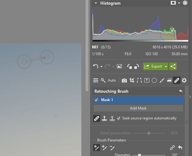
I then use the Retouching Brush (J) to remove the dark spots from the sky; these were most likely caused by dust on or in the lens.
I’ve decided to do a supplementary crop as well during my work in Develop, to make the village at the bottom right take up more space.

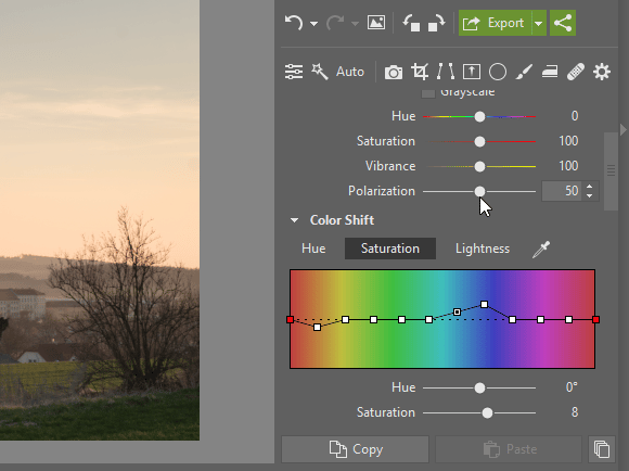
As my last step here, I’ll adjust some individual colors—specifically green, orange, and blue. A correction to their hue, saturation, and lightness will help me here.
I can now move on to some work in the Editor.
Retouching and Adjustments in the Editor
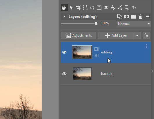
As my very first move in the Editor, I copy the layer with the original image, by clicking Duplicate Layer. That way, I can restore my original image at any time. Then I give my layers meaningful names, to keep them organized.
Now I can start with the individual edits. First I’ll brighten the walls of several key buildings, to make the whole village stand out more. I’ll use the Dodge tool (I) on the duplicated layer for this.
I’ll strengthen the roofs’ colors similarly. The Effect Brush (E) in Saturation mode with its Strength raised high into the pluses will work well here. Here again, it’s enough to cover just a few key surfaces; I don’t need to adjust every single roof.

When checking the composition, I noticed some branches “sticking out of the sky.” I’ll remove them easily with the Healing Brush (J). First I hold down Ctrl and click on the spot that I want to take the color and texture from. Then I just brush the branch away.

I do something similar for a few distractions in the grass in front. The crane in the middle of the village is one of them. It definitely doesn’t belong here. Removing it won’t be easy, but it also isn’t impossible.
I’ll first have to remove the crane’s arm from the buildings. The Clone Stamp (S) is best for this. I’ll use it to pick up some wall structure (ideally near the window) and paint that over the problem spots. Here again, I’ll pick the source region by Ctrl+clicking the selected spot. I then gradually remove the whole crane using a combination of the Clone Stamp and the Retouching Brush.

With that, my edits to the village are done, and I can start on the sky. I’ll use an editing layer, specifically the Color layer, and I’ll directly set up a gradient in its mask so that it only affects the picture’s top half (i.e. primarily the sky). Then I’ll reduce the Saturation and increase the Vibrance. By doing that, I’m making room for the less-represented colors.
Now I’ll use a small trick to adjust exposure in the sky.
For the Color layer, I’ll set the current mask to the selection (by right-clicking the mask) and create a new Adjustment layer (Exposure). That layer will have an identically configured mask right from the start. With its aid, I’ll slightly darken the sky, so that it doesn’t distract from the village.

I save my work so far as a TIFF file. This uncompressed file lets me store my work on the picture in full quality. I’ll definitely save my results to the .Zoner Studio format too. That way, I can go back to my edits at any time later.
Local Sharpening and Saving
Now one last phase awaits me—getting the photo to its final size for presentation on the internet. In the Editor, I press Ctrl+E to shrink the photo to a reasonable size. My expectation here is that most people will be viewing it on a Full HD monitor (1920×1080 pixels), and so a width of 1500 pixels and height of 1000 pixels will be enough.
The final sharpening that I’m adding after shrinking the photo is mild, and so I’ll follow it up with additional sharpening wherever I think it’s needed.
I’ll create a copy of the layer and name it Local Sharpening. Now I’ll use the Adjustment menu’s Sharpen filter. Here I feel free to set a high effect strength. After all, I’ll have a lot of control later on over where and how strongly it’s applied—as you’ll see.
Now I add a mask by clicking the Hide All button. It’s right next to the layer thumbnail. (If it isn’t, then just click the Menu button on the right for Layers, and then turn on Large or Extra Large thumbnails.) This adds a mask, which starts out all-black. So nothing on the sharpened layer is visible at first.
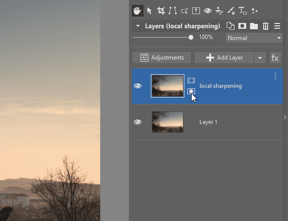
I’ll immediately change this situation using the Paintbrush, with its color set to white, which I’ll use to draw on the originally black mask. The places I paint over in white reveal the top—sharpened—layer. If the effect is too strong, I can weaken it by reducing the brush’s Opacity.
I’ve sharpened the middle of the village to highlight a number of details (the tower, the roofs, and the windows). That’s the end of my edits. I save (well, I usually save) this result as well to .Zoner Studio for further work, and lastly I save it as a .jpg for presenting on the web.
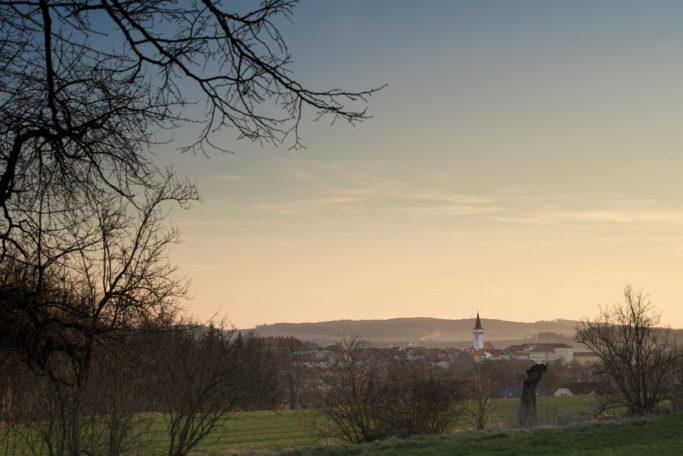
The original and the edited photo.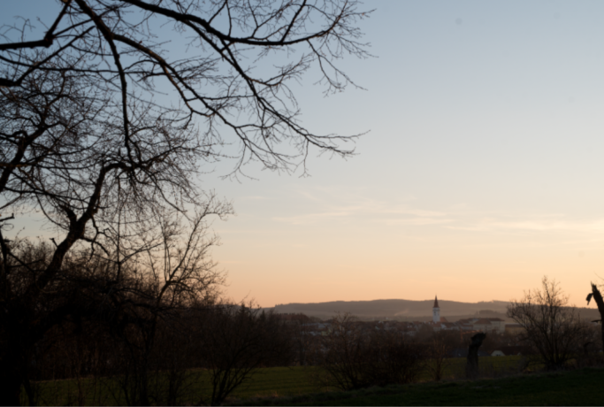
Jan Kupcik’s edit
Before I get started editing, I clarify for myself what I think the picture needs and what I want to achieve. This stopping and thinking will keep me from losing my way during my edits and going overboard.
I expect that the photographer wanted to depict the little town here, the mist above it, and the interestingly colored sky, which he tried to frame with the tree branches in the foreground. These will be the main picture elements that I’ll try to emphasize. Meanwhile, I’ll be suppressing the complicated foreground that’s overlapping the subject.
I’m guessing that this photo was taken in the blue hour after the sunset. But the picture I have before me looks lighter than it really was, and it has more warm colors than it really should.
So my plan is:
- crop away the pointless parts,
- adjust the colors,
- get some color contrast into the sky using curves and gradient filters,
- darken the foreground until it feels like a silhouette,
- emphasize the town, and especially its contrast with the mist above it, using the Radial Filter.
I’ll be making every one of these edits in the Develop module in Zoner Studio.
While my edits might seem drastic, they’re only bringing the picture towards how the photographer may have perceived reality. After all, our minds embrace scenes more broadly than a camera does, and we tend to idealize them.
Adjustments in the Develop Module
I have a RAW file available, so I choose the Develop module. RAW lets me work with the original data and emphasize colors that might not be visible at first.
I start with a crop using the Crop and Rotate tool (C).
- First I’ll slightly straighten the horizon using the clock tower (or maybe it’s the town hall).
- The tree trunk sticking out on the right doesn’t do it for me, so I crop away the top right corner, removing this distraction.
- Then I do the same on the other side, to get the subject and the horizon close to the golden-crop line and crop away the branches on the left.

I also see some blotches on this picture—apparently caused by sensor dust. I retouch them away one by one using the Retouching Brush (J).

So I’ve noticed that the sky lacks blue tones. It’s typical for a camera to start fighting the dominant blue during the blue hour by setting a high color temperature. Thus I’ll now use the Daylight setting in the White Balance menu.

I switch over to work with the Tone Curve, where I try to bring out the contrast in the sky.
- I explore the sky with the cursor while watching the Histogram, which shows me where I should increase the contrast. You can see how it’s roughly the third to the fourth segment. So I improve the contrast using the Tone Curve.
- Using the first point in the third quadrant, I try to darken the sky just above the horizon. Here you can really see how this darkening brings out all the colors. I’m deliberately ignoring the rest of the picture, which I’ll fix in some upcoming steps.
- Using the second point (in the fourth column), I return some light to the picture, thus creating some contrast in the sky.
- I’ve also used the curve to darken the darkest tones and with them the whole foreground. That also means I won’t have to edit it further. But maybe I can just use the points at the start of the curve to return a little detail to the picture’s dark tones so that the effect isn’t too strong.
- I wrap up by saturating the colors to support the picture’s color contrast.

Now you can see in the sky how the top left corner is darker than the top right corner, and how meanwhile the middle is short on color. So I’ll place two gradient filters.
One for balancing the top right corner, just with a light exposure reduction.

The other to reduce exposure as well—although I can see that the sky is getting gray now and isn’t highlighting the blue. So I’ll apply a color that I take in through the eyedropper. I also change the blending mode to Burn and raise the Intensity.

Now I’ll focus on highlighting the town. The Radial Filter (R) will serve me best here.
- I’ll place it so that it’s under the horizon and emphasizes the mist.
- I’ll raise the exposure by 1.5 EV. Since I’m working with RAW data, I have lots of room for this exposure work.
- But still, raising the exposure decreases the contrast. So I’ll raise the contrast. While I’m doing this, I’m being careful not to lose the details in the lights and shadows.
- I’ll increase the contrast even more by adding some Clarity.
- Because this part of the picture contains lots of details, I’ll sharpen it too. Meanwhile, I’ll watch to make sure that the added sharpness looks natural and doesn’t create a halo effect in the bush’s branches on the right.

Some mild vignetting will also help this picture. It will naturally darken the gradient in the sky, and it will hide the chaotic foreground a bit.

My favorite final trick is to give a picture some extra contrast using a dodge & burn technique. That lets me highlight details or hide them.
I’ll use Presets for this: I’ll go to the Dodge & Burn Brushes item in the Tool Actions presets. This preset automatically creates two masks for the Filter Brush. One with negative exposure correction, and one with positive correction.
I’ll draw the light details that I want to shine into the Dodge mask. For example the clouds, the mist, and the facades.

In the Burn mask, meanwhile, I’ll darken the adjoining areas and unwanted details. That means the horizon, part of the houses in the foreground, the surroundings of the tree trunk in the foreground, the crane, and other elements.

In closing, here are some words on denoising and sharpening. It may surprise you, but I don’t worry much about either of these.
I don’t denoise at all. If I don’t want noise, I shoot at a lower ISO and struggle with the effects during the shot itself. And if there’s no way around it, then I usually highlight the noise even further.
When sharpening, I use a tried-and-tested value in the Develop settings and practically never change it. I’ve confirmed for myself that the default settings in Zoner Studio are a very good compromise. I handle the rest using the local edits I showed above.
Further sharpening, this time for a specific output size, is done by Export itself. Here again some superb default values are set automatically, and they can stay. Unless you have some specific goal.
Now I’m done.
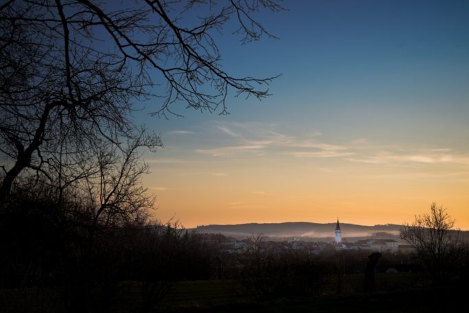
The original picture and the edited version.
Good Edits? Both.
While the first type of edit is subtler and provides a space for the photo’s foreground, the second type of edit is built mainly on colors’ saturation and contrast, and it suppresses the foreground instead. Each of the two approaches has its advantages and disadvantages, and it’s up to each individual which variant they’ll prioritize.
Both variants have their strong points. Which one you like more is just a matter of taste.
Feel free to try a similar experiment with your own photos. Just download Zoner Studio, use it 7 days for free, and get started editing.