Colors in Photography: Everything You Need To Know About Blue
The color blue can have an impact on viewers that is varied and multifaceted. Blue is primarily known as a cool color in photography. We most commonly associate blue with the sky. Let’s delve deeper into how to work with blues in photography.
Simply look up at the sky and you are surrounded by blue. Vincent Van Gogh once said, “I never get tired of the blue sky.” This is evident in many of his paintings where both the day and night sky play a significant role.
Blue is as popular among photographers as it is with artists. It is a very versatile color with a wide range of creative uses.
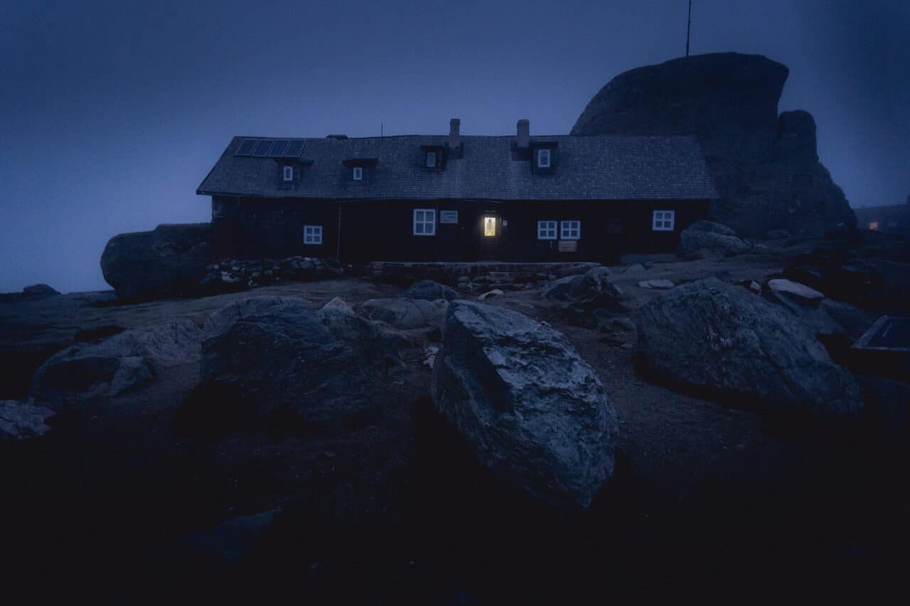
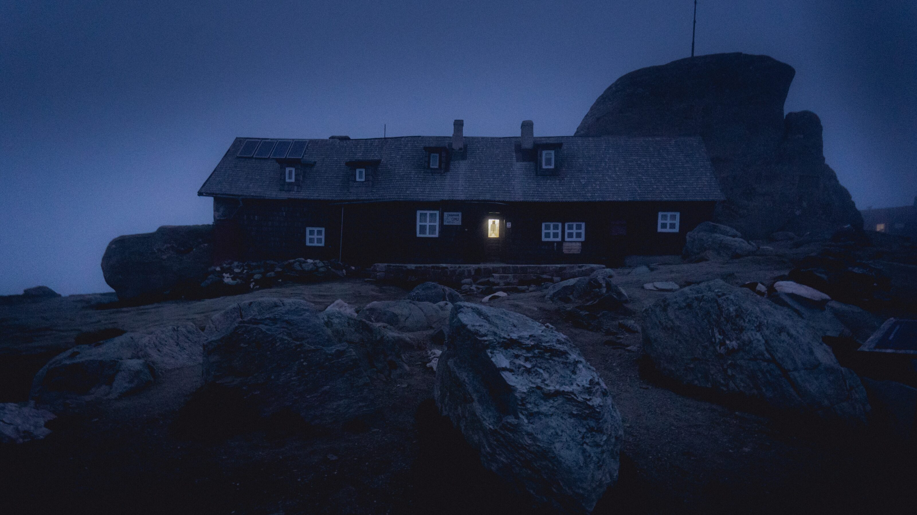
If you don’t want to shoot the sky just during the day, wait for the traditional “blue hour,” about an hour before sunrise or an hour after sunset.

Landscapes and cities acquire a unique atmosphere during the blue hour.
You can also look for and combine different shades of blue in nature. Lastly, you can create your own version of blue using artificial lighting to enhance product photos or studio portraits.
Psychology of the color blue
I have already written about the associations of blue with the sky and sea. The sight of an endless ocean or a rich blue sky evoke feelings of calm and harmony. That’s why blue is the color often found in hospitals and offices. Blue soothes and calms the soul.
However, blue is also the color of tears, winter, and ice. In this respect, it can also be interpreted as a color associated with cold, distance, or even sadness and loneliness. The ultimate feeling depends on how much blue is used in the image and what other colors it is combined with. More on this below.
Color perception in different cultures is deeply influenced by religion. In world religions, blue is interpreted differently. Green is undoubtedly the dominant color in Islam, but blue is a close second, symbolizing blessing and protection. In Christianity, blue is a symbol of heaven, truth, and purity, often associated with the Virgin Mary.
In Hinduism, blue symbolizes infinity and bravery. Rama or Krishna are often depicted with blue skin as a sign of their courage and strength to face evil, as we learn from epics like the Ramayana and Mahabharata.
Blue in marketing
Facebook, Twitter, LinkedIn, Zoom, IBM, Samsung, Visa, PayPal, and Ford are just a few famous brands that use blue as the main color in their logos. Why? There are several reasons, but the main one is that blue evokes trust, reliability, and stability. For the same reasons, this color also carries a corporate reputation.

In marketing, blue also symbolizes purity and cleanliness. That’s why it is used, for example, on water bottle labels and in the cosmetic and pharmaceutical industries.
Deep blue contrasted with a light color is very striking and is therefore a popular combination in web design where it is used for buttons like “buy” or other call-to-action buttons. It particularly stands out against a pastel background, which is currently popular in web design.
Blue in art
The popularity of blue dates back to ancient Sumer and Egypt. The Egyptians even developed their own synthetic blue, which has survived on many artistic artifacts to this day. It was equally popular in ancient Greece and Rome, although these nations did not yet have a name for the color.
In the Middle Ages, blue was associated with nobility because the process of making blue dye was arduous and expensive, and only the wealthier classes could afford to include blue in their wardrobe. Besides nobility, blue was also reserved for the church, specifically for depicting the Virgin Mary.
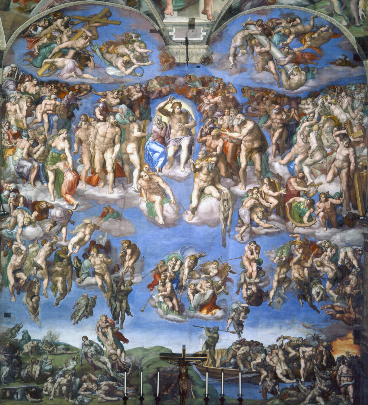
The Renaissance brought a revolution in the production technology of blue, and it became very popular among Renaissance artists. A magnificent example of the use of blue is the interior of the Sistine Chapel.
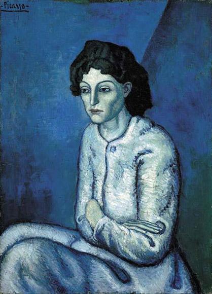
The Romantic and Impressionist periods brought blue back down to earth and used it to emphasize a desire for a deeper connection of man with nature. In the 18th and 19th centuries, blue acquired a darker context, and artists began using it to express sadness, melancholy, and loneliness. A shining example of this approach is Picasso’s Blue Period, in which Picasso painted monochromatic blue paintings with sad themes in paintings such as The Beggar, The Prostitute, or Harlequin.
What colors go with blue?
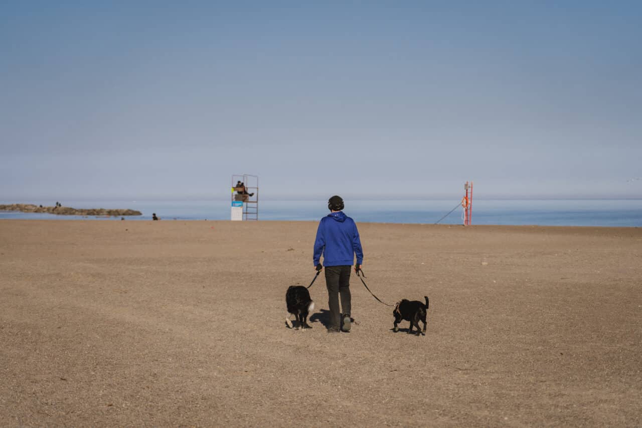
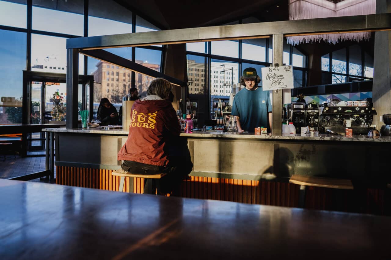
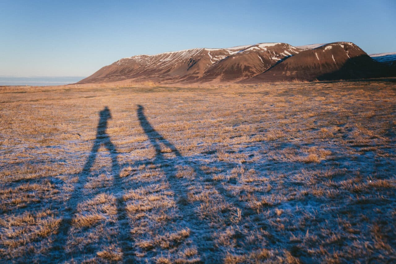
You are probably familiar with the combination of blue and orange. These two colors are complementary and create a dynamic based on the contrast of cool and warm tones. The source of blue is most often the sky, where an orange object serves as contrast.
But you don’t have to limit yourself to orange; contrast can also be achieved using yellow.
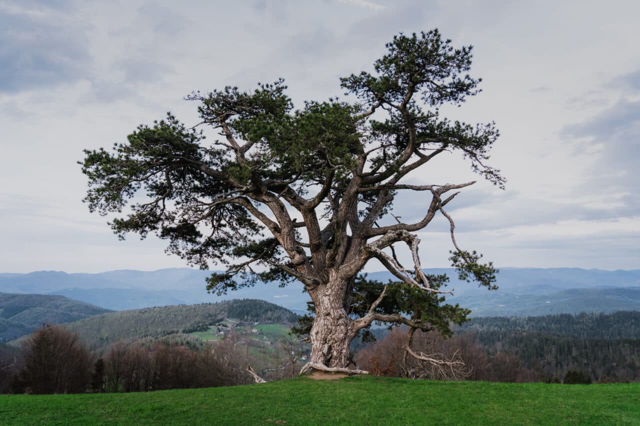
A frequently overlooked combination is blue and green, two colors that are next to each other on Newton’s color wheel. Recall the calming effect of the combination of green grass and blue sky.
In our series, we will gradually introduce all the primary colors and go through each of their aspects from history to psychology.
Learn interesting facts about white, black, green, red and yellow and how they apply to photography and other mediums.
