Composition: Fill the Frame
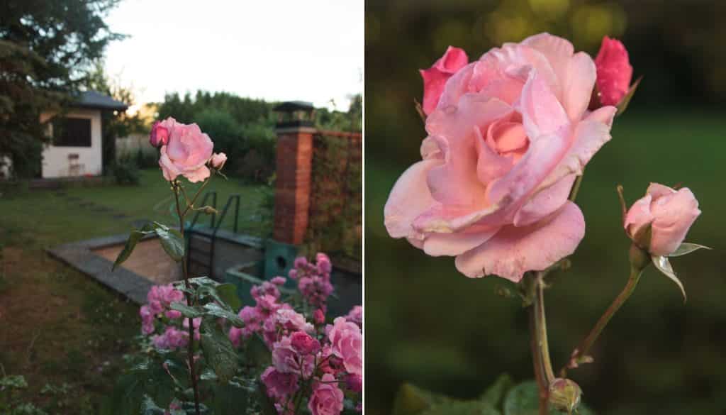
You’ll enhance a photo’s composition whenever you make sure to fill up its frame with your subject. To do this every time, sometimes you’ll need to use a zoom or a long lens, and sometimes you’ll need to step closer, but your pictures will speak more strongly, and your audience will know what they’re looking at.
Be honest with yourself—do you try to capture too much at once in your photos? “Busy” pictures like these contain lots of things that can distract from your subject. Meanwhile, your subject ends up getting too little room in the shot. So in the end, even though the picture tries to say many things at once, in the end it tells your audience almost nothing.
All this is best summed up by a quote from famous war photographer Robert Capa: “If your pictures aren’t good enough, you’re not close enough.” This quote was originally intended for reportage photography. Looking at the photo, your audience should feel like they are directly a part of the events it portrays. But I think that this rule can be applied to other photographic genres as well.
Fill the Image Frame
Remember, your photograph should only contain what you’re trying to express. Everything else in the picture is excess and can only confuse your audience. When you’re shooting a portrait, it should fill up the whole picture—ideally against some kind of a neutral, undistracting background. A portrait photograph is about the person it portrays. Everything else in it is unessential. To remove the surroundings from a photo, use a long-focus lens (85 mm or more).
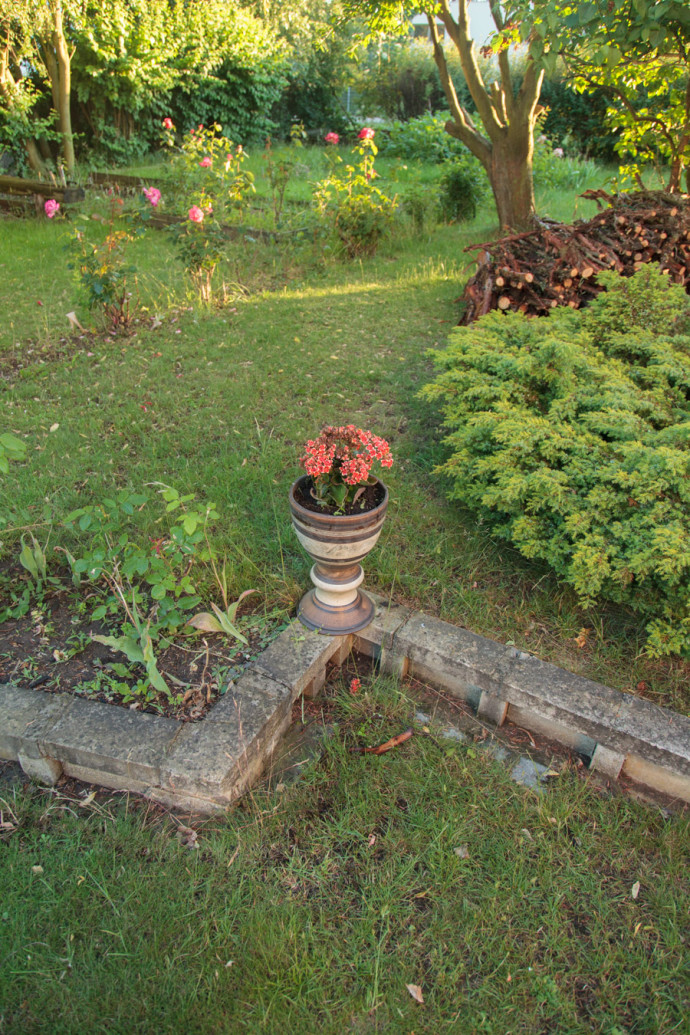
Canon EOS 5D MkII, EF 24-105/4.0, 1/80 s, f/4, ISO 400, focus 24 mm
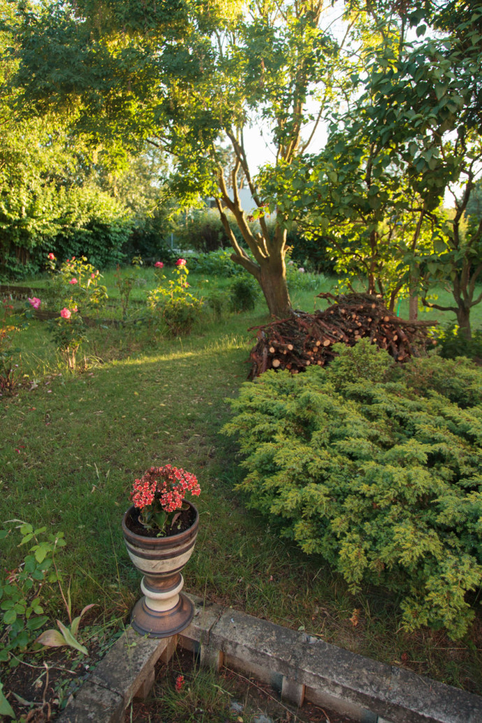
Canon EOS 5D MkII, EF 24-105/4.0, 1/100 s, f/4, ISO 400, focus 24 mm
A different situation appears when your picture is “about” a wide landscape. Here you’ll need to use a wide-angle lens (typically 24 mm or less). When using a lens with a short focal length like this to capture a wide landscape, a large amount of empty space will appear in the picture’s foreground. Because of this, you’ll want to occupy the foreground with some kind of interesting element that gives the photo space and depth and leads your audience’s eyes into the landscape. That way the photo will contain blank spaces, making it more attractive.
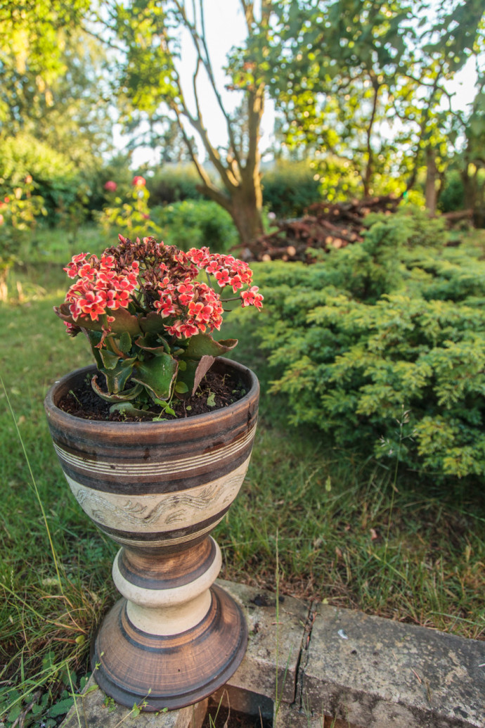
Canon EOS 5D MkII, EF 24-105/4.0, 1/80 s, f/4, ISO 400, focus 24 mm
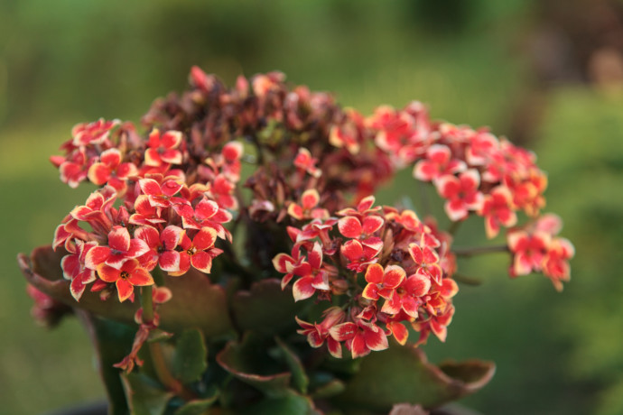
Canon EOS 5D MkII, EF 24-105/4.0, 1/100 s, f/4, ISO 400, focus 105 mm
Compose to Your Final Format
The final display size you plan for your photos should play a large role in your composition. For a portrait, you can expect that it will be displayed in a relatively small format, 30×20 cm or less, or as a picture on the wall that, though larger, will also be viewed from a larger distance. In that case, we want to fill up the whole frame.
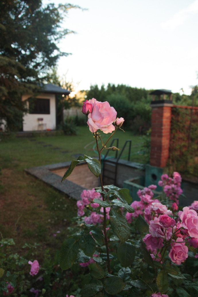
Canon EOS 5D MkII, EF 24-105/4.0, 1/320 s, f/4, ISO 400, focus 24 mm
If, however, your intention is to create a photograph that you’ll be using as the wallpaper for a large wall, then filling the whole frame with a portrait will leave you with a photo that isn’t readable from a normal viewing distance. With such a large format, instead of a face, you can capture a whole person, and also position them within an interesting environment.
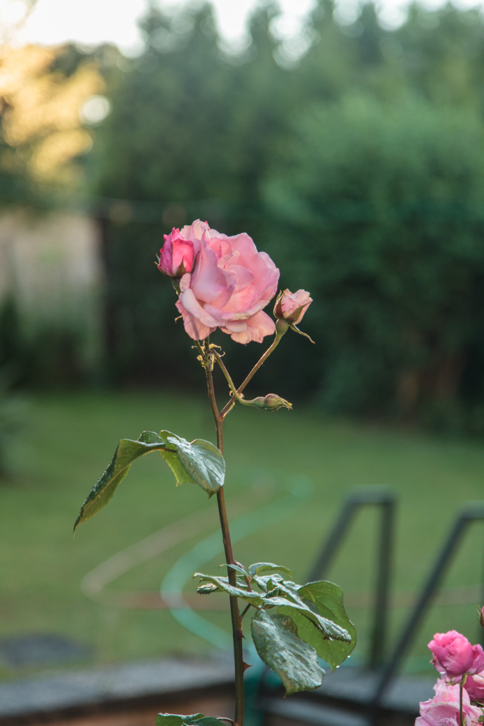
Canon EOS 5D MkII, EF 24-105/4.0, 1/320 s, f/4, ISO 400, focus 24 mm
Meanwhile for landscape photography, you will want a narrower shot if you know that the photo will be printed out on a small format. But when preparing wallpaper, meanwhile, choose a panoramic crop and a wide take. That way your audience will be able to explore all the small details in the landscape from close up.
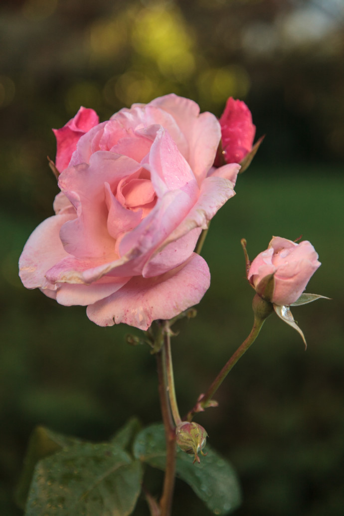
Canon EOS 5D MkII, EF 24-105/4.0, 1/400 s, f/4, ISO 400, focus 84 mm
Print out Your Good Photos
Unfortunately, most photos today end their journeys on the screens of mobile devices and computer screens. But there’s still no harm in taking a picture composed for presentation at a nice large size and creating a print to match. A single picture like this, in front of you every day, can bring you a lot more joy than hundreds of shots laying forgotten on your memory card.