Foundations of Portrait Composition Part II: Learn to Use Your Model’s Environment
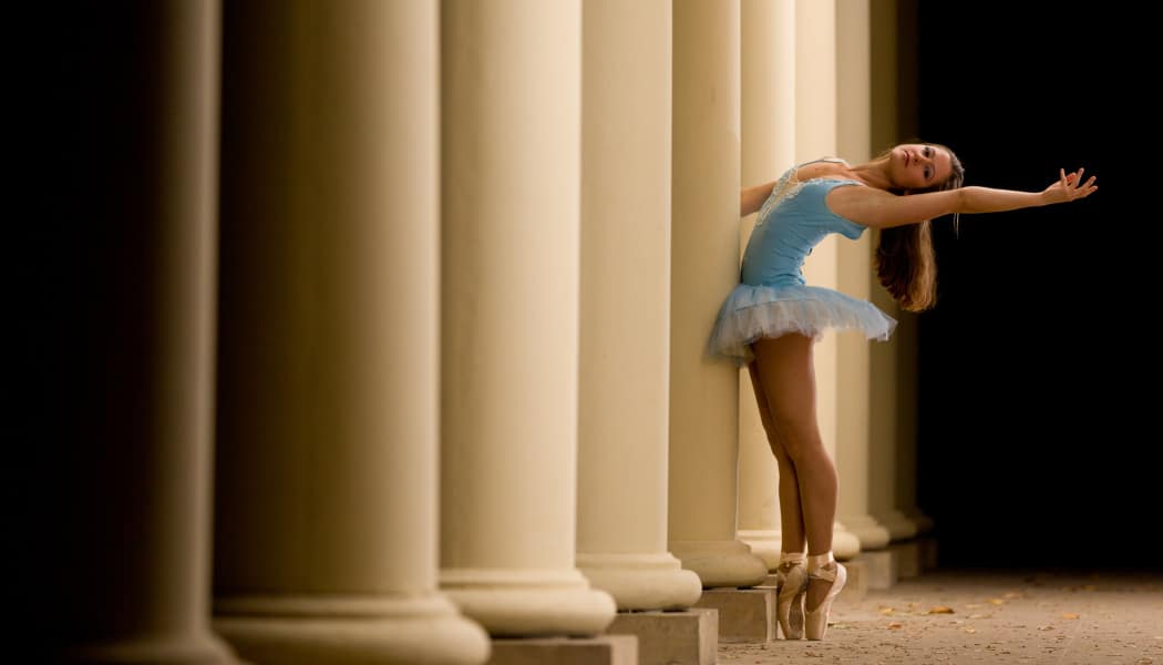
The most important thing in portrait photography is your subject. But that doesn’t mean that their environment doesn’t have any role to play. Not at all! The things that a picture shows in its subject’s surroundings have a share in how that picture feels overall. Even an ordinary bush can ruin an entire portrait—or bring it to perfection. In this article you’ll learn how to deal with environments and how to take advantage of them.
In my first article on the rules of composition for portrait photography, I mainly discussed work with your subject. This time around, I’ll be showing that it’s important to keep their environment in mind as well. Depending on the style of the photograph, you may be able to choose the environment yourself or, if it’s a quick reportage photo, you may at least be able to choose what’s inside the frame, and what falls outside it.
Look out for Poles
Poles, antennas, and isolated dark branches can all be treacherous. One common beginner’s mistake is to forget to look out for them—these objects love to settle right behind your subject and visually stick out of their head. An observer in three-dimensional reality can distinguish the individual distances and will ignore the faraway pole, but in a picture, everything is two-dimensional, and the structure will visually melt and meld with the subject’s head. Because of this, you yourself can’t depend on seeing these mistakes in the viewfinder. However, you can actively watch for such problem areas—and then move your camera to keep them out of your subject’s way.
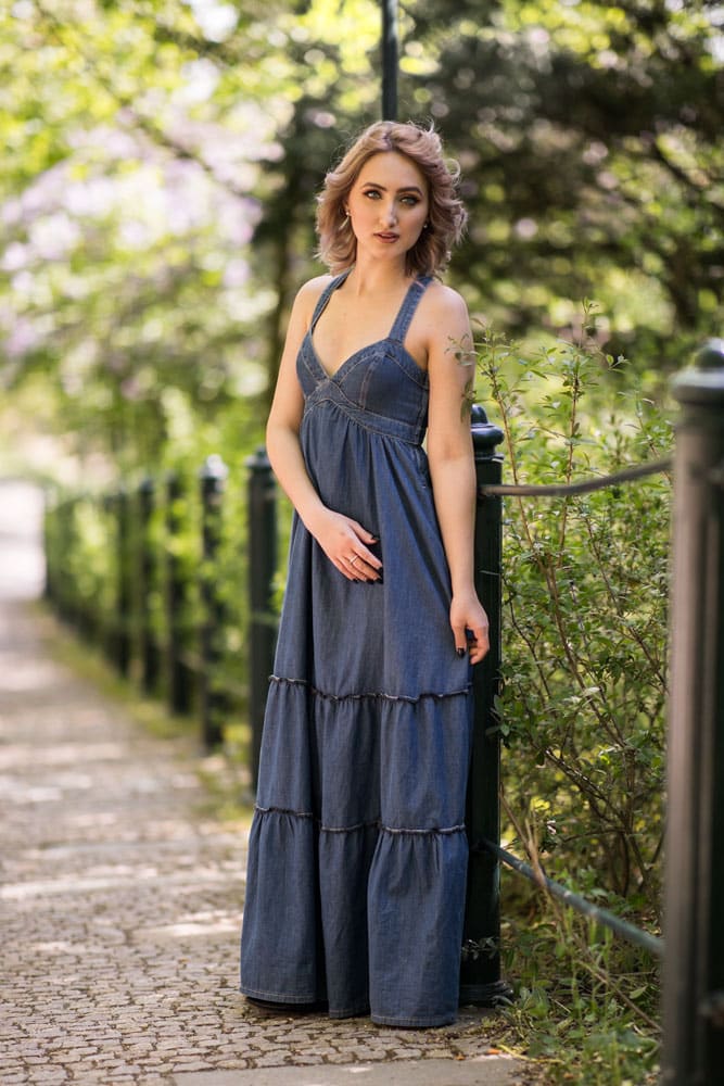
While you can usually retouch away any mistakes, it’s easier to just avoid them.
Poles are harder to see in a photo where you’ve used a low f-stop and blurred the background. But they can still be a stumbling block even then.
Watch out for Objects With Distracting Colors
Poles and trees aren’t the only things that can disrupt a picture. Other objects can cause trouble as well, even if they don’t happen to be sticking out of your subject’s head. Anything with striking colors will attract attention, no matter whether that’s traffic signs, a red car that’s trying to park, or ugly trash cans.
If you can, take a step or two to the side. You’ll be taking your picture in a different direction, getting those strikingly colored objects out of the frame. Alternatively, you can hide them right behind your subject.
Naturally this works vice-versa as well. If you do want to get something into the picture, there again you can fine-tune everything to your satisfaction through minor tweaks.
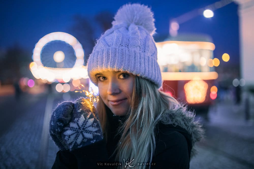
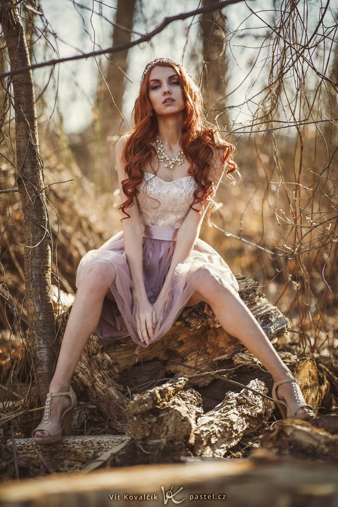
Shoot Against the Light or in the Shade
If you’re shooting in the direction of the sun’s rays, that means your poor subject is facing the sun and will have to squint—and their features will form dark shadows as well. These will go on to emphasize wrinkles and darken the eyes.
When you’re shooting in the shade, or against the sun, these problems fall away, and the light on your subject’s face is much milder.
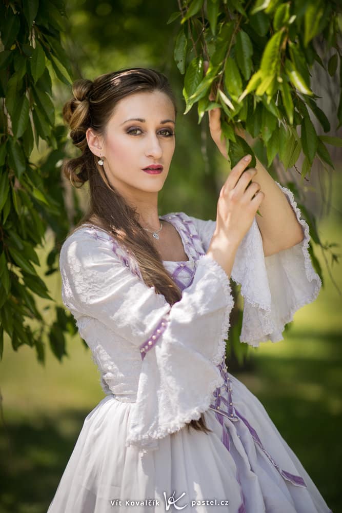
If you choose the option of a backlit photo, you’ll also get a shining outline in your subject’s hair and on their shoulders. If you combine them with a darker outline, the person in question will be all the more striking.
Take Advantage of Visual Guidelines
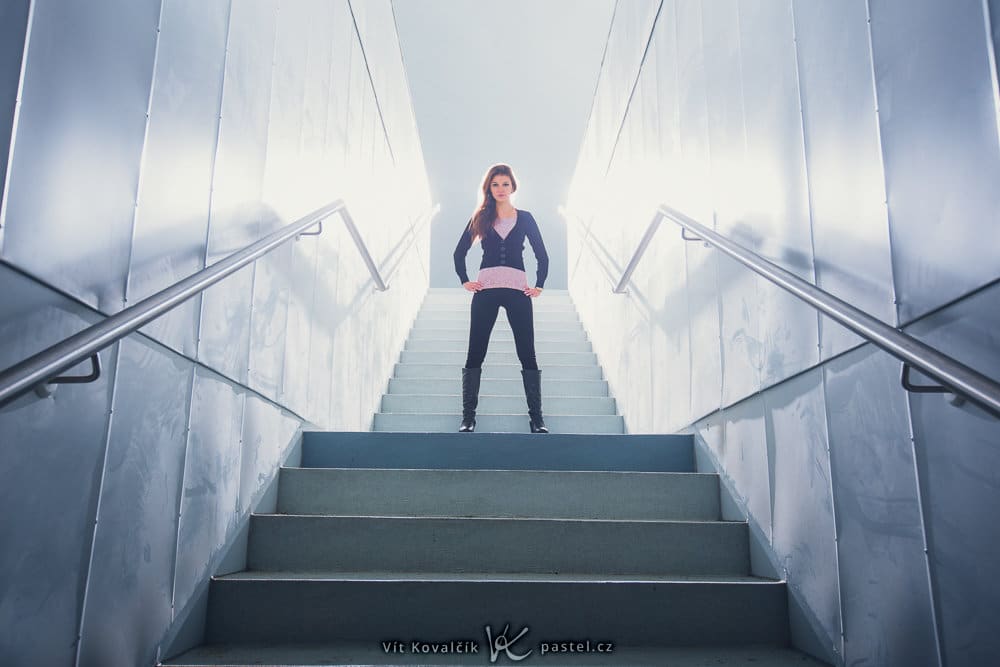
You can highlight your model by making clever use of elements in their environment. Guidelines are a good example. They’re much-discussed elsewhere in photography, and useful in portraits too—point them towards your model to focus a viewer’s attention.
Break up the Rhythm of Repeating Elements
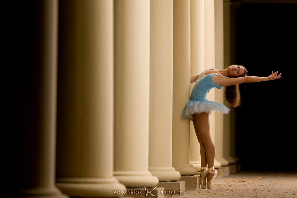
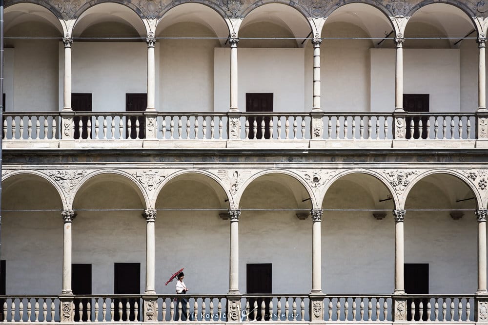
The repeating of elements within a picture can be taken as an extension of guidelines. Here the guidelines aren’t explicit, but the human mind fills them in. Your model then functions as an element that breaks up the rhythm, making it highly visible within the surrounding harmony.
Include a Foreground Too
This is where the really good photographers distinguish themselves from the rest. They’re able to creatively make use of the environment or surrounding objects and either take their picture through some kind of framing object or include suitable “props” in front of their model.
I myself am a fan of photos like these, and I’d like to have more of them to my credit, but putting this tip into practice is far easier said than done.
Still, there are some shortcuts. With repeating elements, especially, you can place your model a bit towards the back instead of right by the first such element. Besides breaking up the rhythm, you also get, as a bonus, a pleasant foreground that breaks up the image and gives it depth.
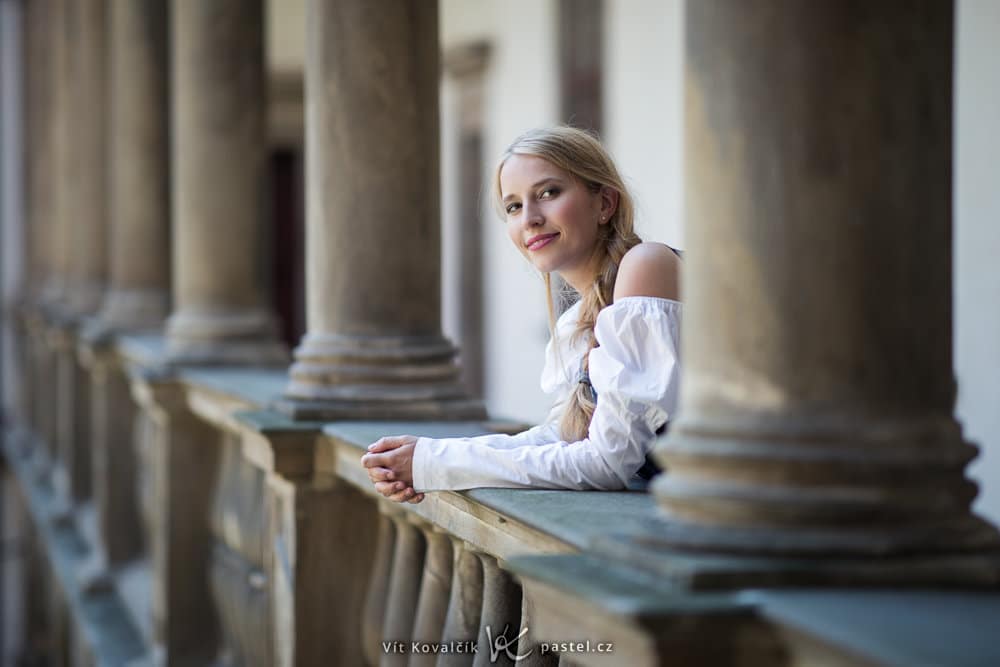
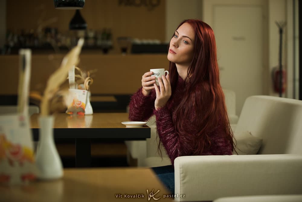
A subtly captured blurred object in the foreground is another good way to get attention. Here again, these things never happen on their own; you have to move in very close with your camera, and often you even have to take your picture in an uncomfortable position. When taking the picture below, I practically had my camera on the table, and it was halfway aimed right at the nearby vase. Anybody sitting nearby must have thought I was a ceramics photographer.
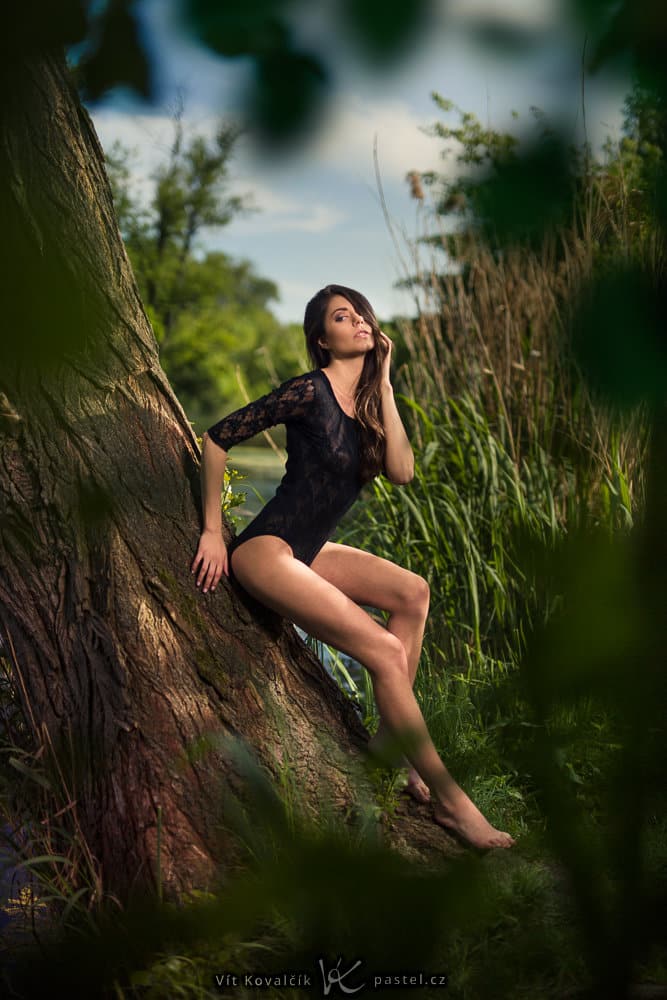
The following picture was even more difficult to photograph. I took it from the middle of a thicket (and it was quite a trip to get there).
Try More Than One Option
It’s hard to tell in advance which composition will work well; there are too many factors at play. So try out different options, then pick one of them at home. Even if many them fail, or aren’t the best picks and nobody sees them, you’ve still at least learned new approaches. And next time you’ll know what you can and can’t get away with.
Experiment!
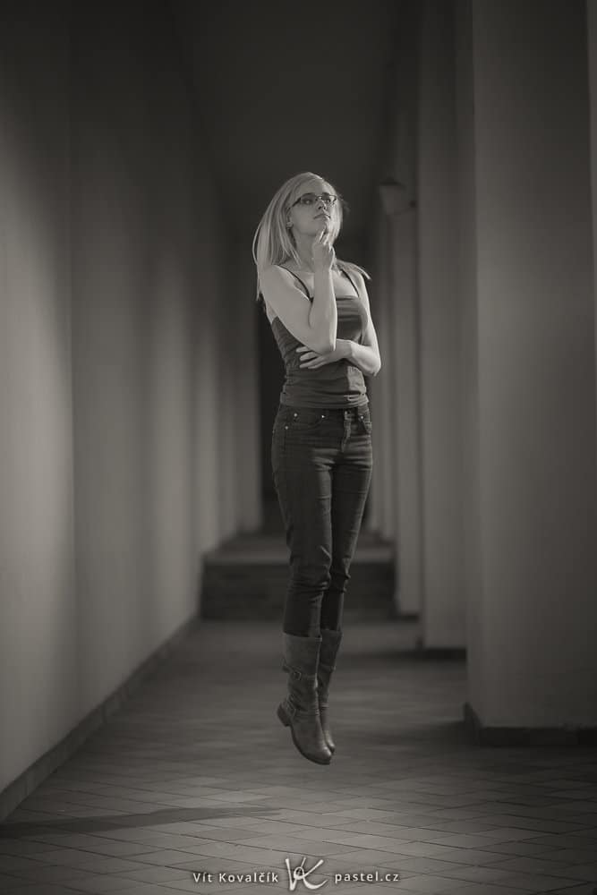
There’s no law saying you have to take conventional portraits; everything’s permitted, and wild experiments just might lead you to a style that will bring you popularity in the future.
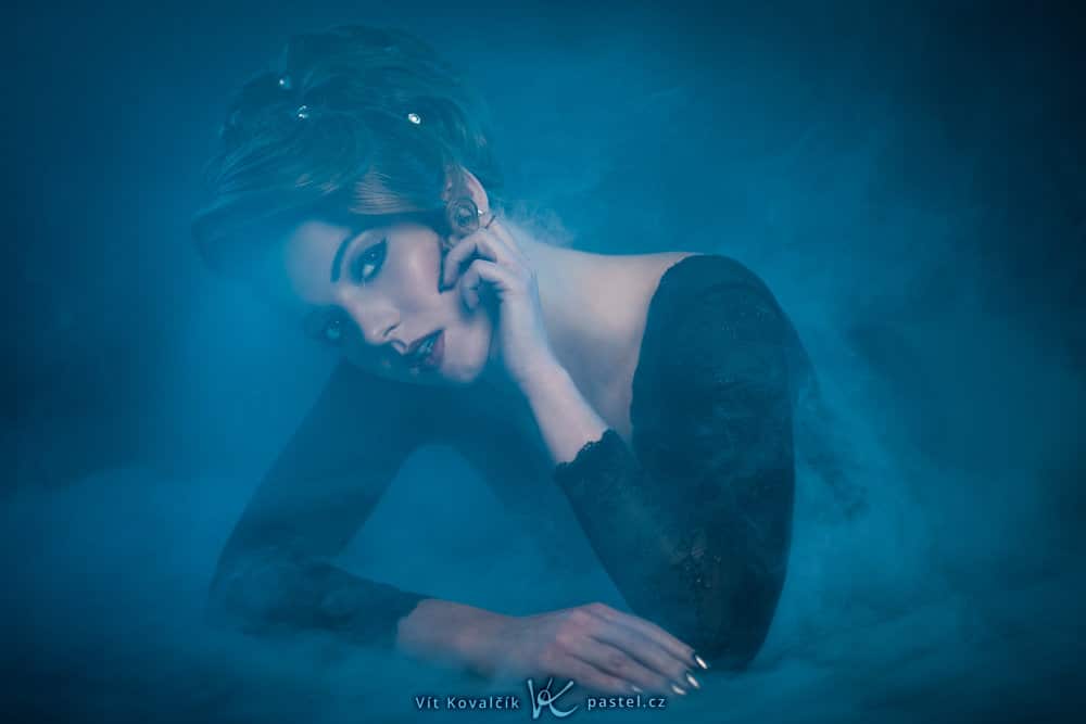
Following the Rules or Breaking Them on Purpose
You don’t have to be hyper-creative and think up new ideas every time. Even the following relatively simple exercise will push you ahead: try choosing one of these rules and completely following it, or on the other hand completely ignoring it. This might for example be a rule that doesn’t appear in your pictures, or one that you’re sick of due to frequent use.
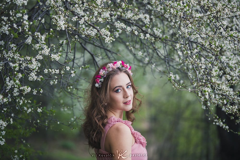
And that’s that for portrait composition. You can find further inspiration on any experienced photographer’s photo pages. And now that you’ve read this article, you can also think about which of the above rules they use in their work!