How To Edit Landscape Photos Step-by-Step
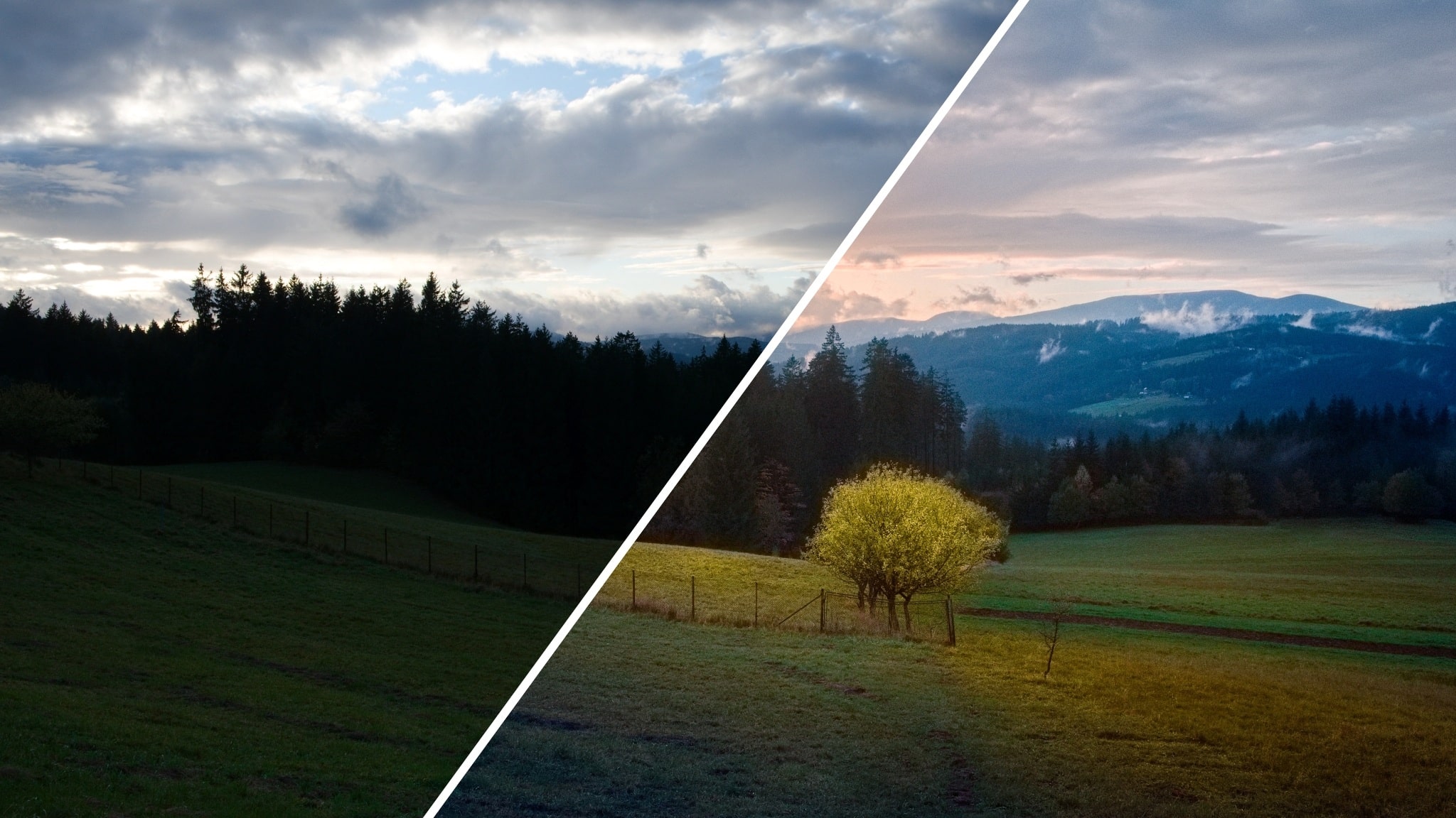
Capturing the beauty of a landscape seems like a simple task, but the results don’t often match up to your experience. In this article, I show you how you can use Zoner Studio to edit landscape photos step-by-step.
I am an advocate of subtle adjustments to an image, but sometimes I can’t avoid major adjustments. For the article, I chose a RAW format photo that needed additional work in post-production. RAW format contains more image data about dynamic range. Also, thanks to non-destructive editing in the Develop module, I can skip and combine tools the way I want.
Try editing with us

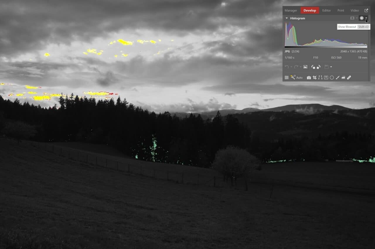
Before you start editing, it’s a good idea to enable Show Blowout, using the keyboard shortcut Shift+O, or by clicking the icon on the right above the Histogram.
After enabling Show Blowout, the image preview is black and white. Green indicates dark areas (where the image is completely black) and yellow indicates bright areas, known as blowouts (where details are missing and the image is completely white).

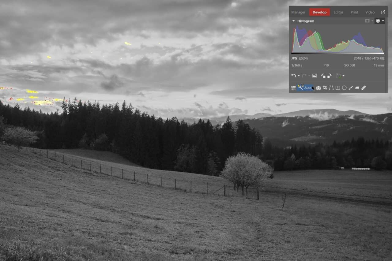
The AI Automatic enhancement tool can give you a quick idea of the dynamic range potential of your photo.
I decided to try and bring back the feeling I felt when I took the photo. I am going to edit the photo from scratch. I use the Undo arrow to undo the AI Automatic enhancement and can start editing.
Cropping and composition
I recommend cropping right at the beginning. This gives you a better idea of the composition of the final image and helps you consider what’s important and where you want to lead the viewer’s eye.
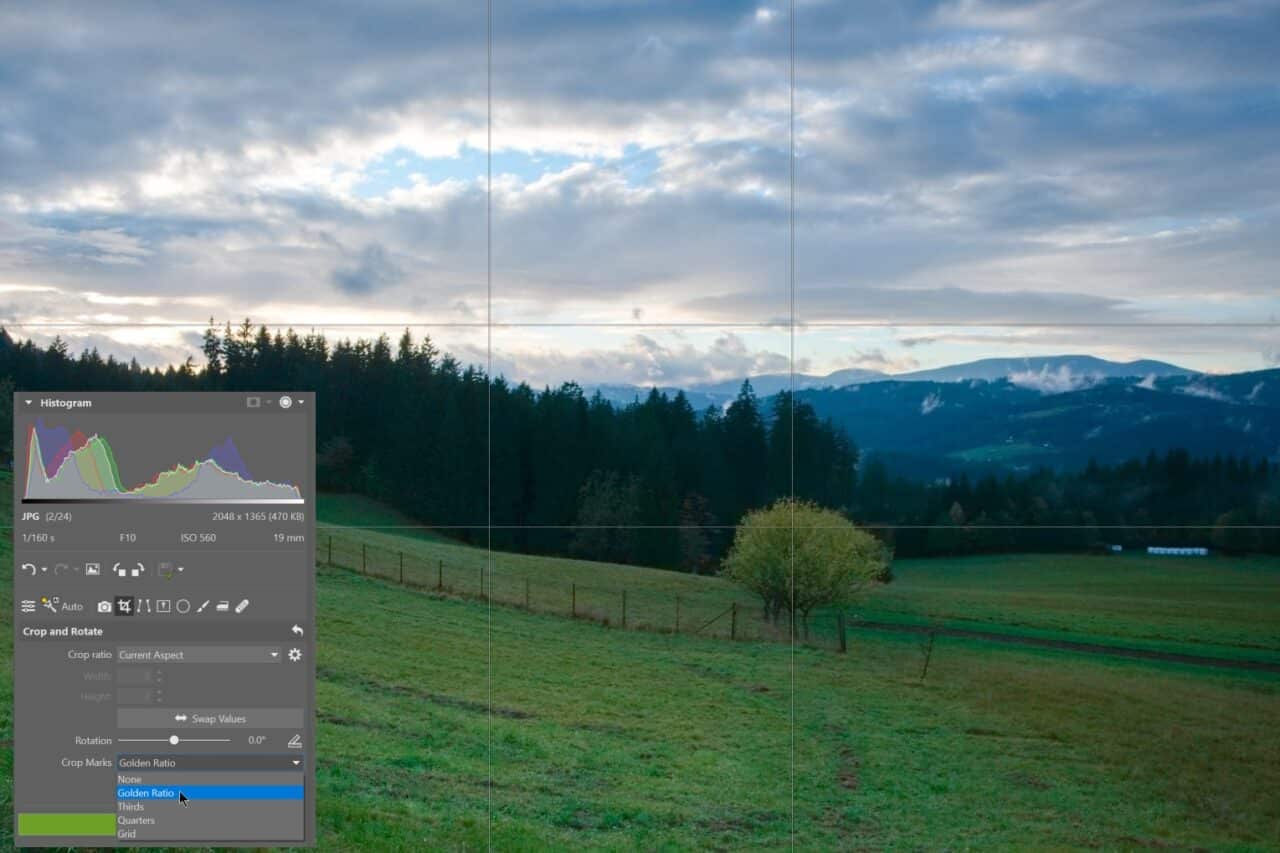
If you are not already familiar with the golden ratio or rule of thirds, you can use Crop marks to guide you.
I chose the 16:9 widescreen format. Also, I used cropping to straighten the slight tilt of the image to the right. When shooting handheld, it’s easy for the horizon to appear crooked and tilt to one side or the other.

A crooked horizon doesn’t look good in landscape photography, so be sure to check for it.
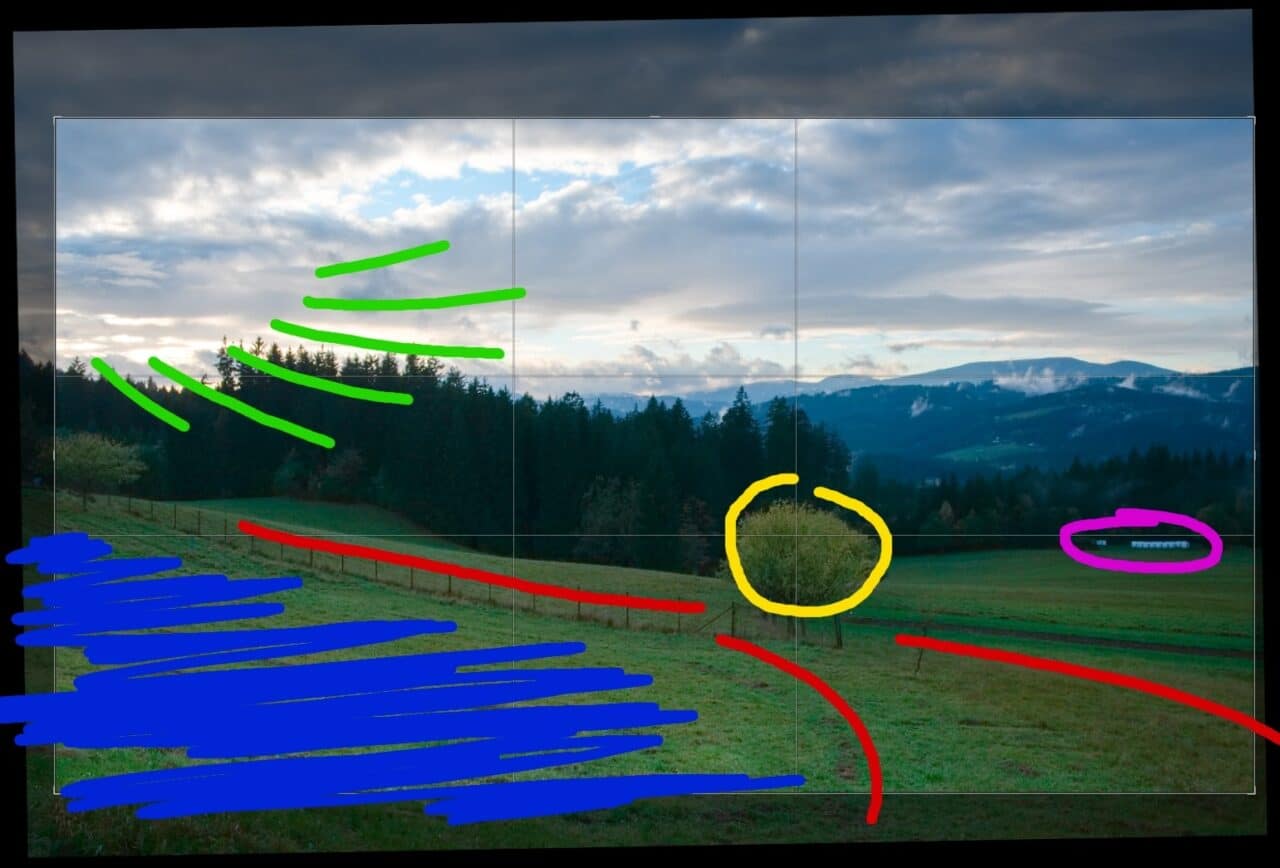
Next, let’s take a look at the main composition elements:
In the photo, there is an interesting a path (red) that starts in the bottom corner and curves nicely to the tree (yellow). The tree is located in the golden ratio. The fence leading from the other side underscores the entire composition.
The main light source (green) comes from the top left corner and angles toward the main subject. On the right, there are bales of hay (pink) which are distracting and can detract from the main subject. The area in the bottom left corner marked in blue also is a bit distracting.
Throughout the editing process, I’ll show to use various tools in Zoner Studio to:
- Return the original atmosphere to the photo.
- Add light to the sky.
- Reduce distracting objects and areas that can misguide the viewer’s attention.
- Bring out the main subject using the golden ratio.
- Enhance the visibility of the path to better guide the viewer through the picture.
Exposure
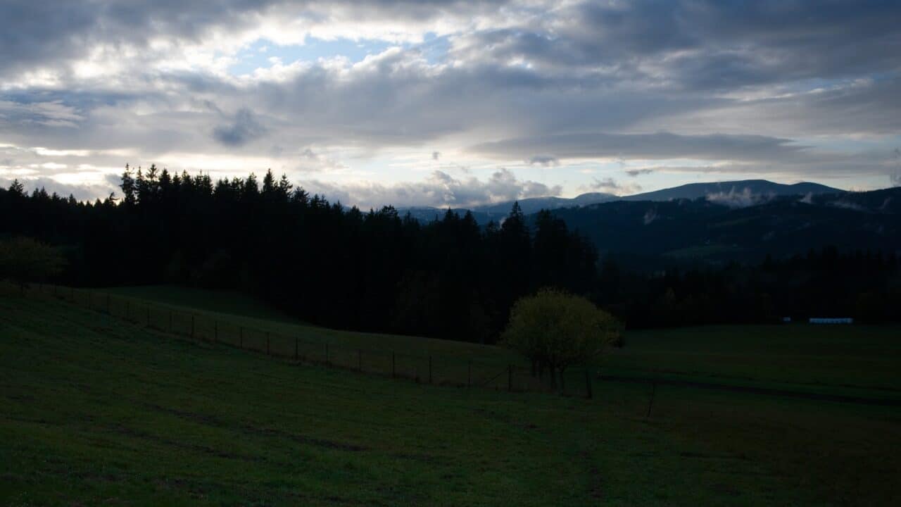
The photo was taken before sunset, when the sun’s rays were filtering through the clouds and the valley was in the shadows. The camera darkened the image to prevent blowouts in the sky. This is an example of when it’s useful to use a graduated ND filter.
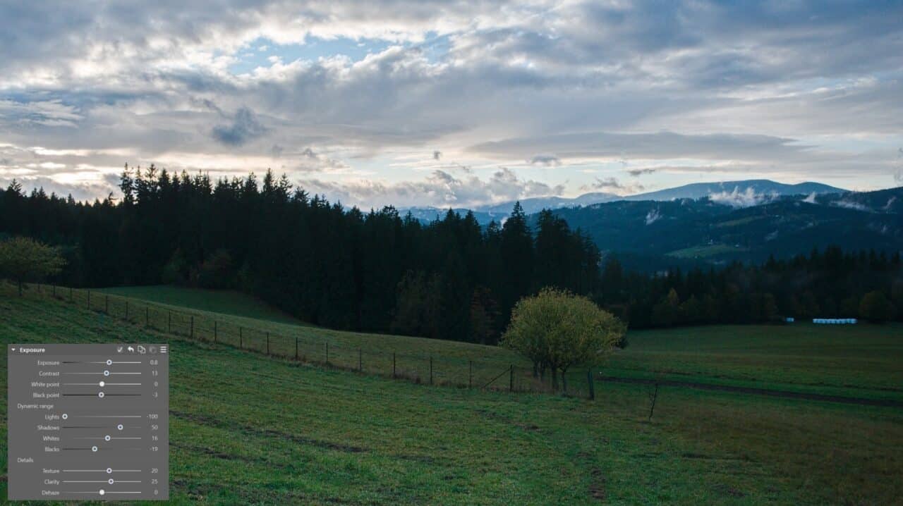
The goal of exposure adjustments is to expand dynamic contrast. I moved the Lights slider to negative values to reduce blowouts while keeping the white. I moved the Shadows slider to positive value to bring out the details in the shadows.
Be careful with these types of adjustments. A large amount of digital noise can appear if you overdo the adjustments.
I slightly increased Contrast and Clarity with Texture. This resulted in distortion of the details in the image. I will do subsequent exposure adjustments using tools for local adjustments.
Retouching
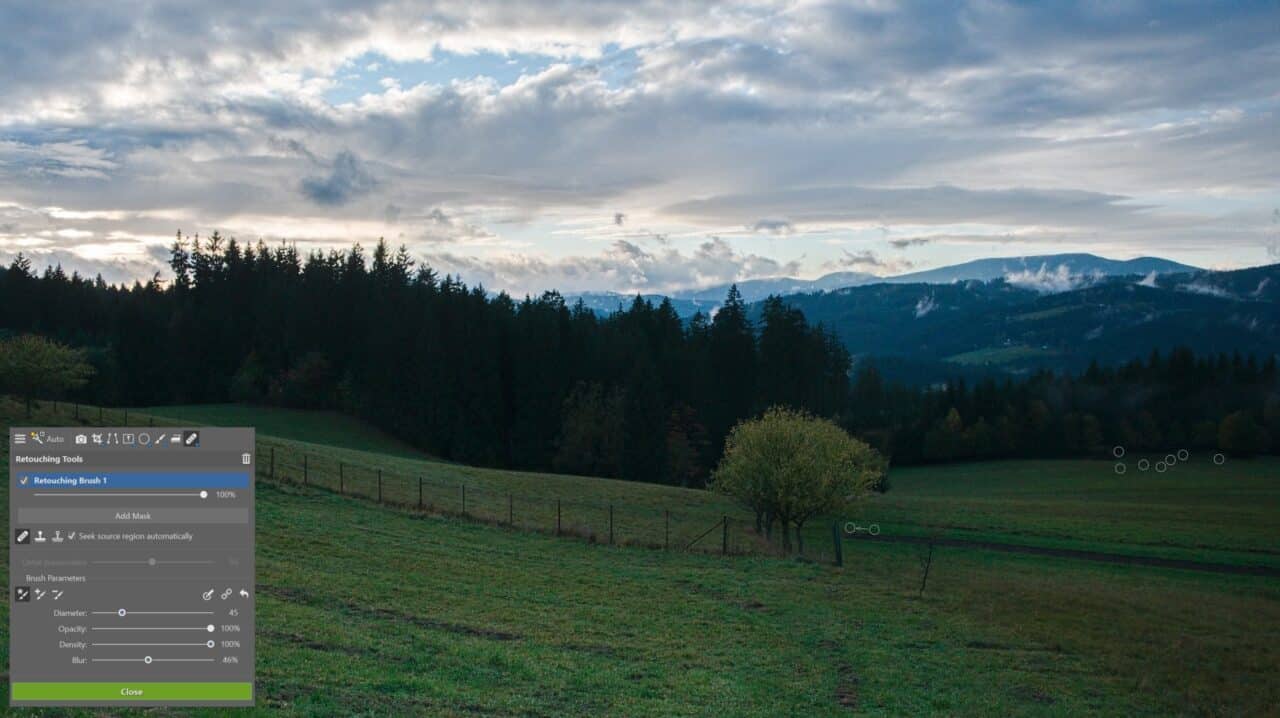
The bales in the right part of the image distract the viewer’s attention from the main subject. Since they have no story value here, I remove them using retouching tools. Specifically, with a combination of the Clone Stamp and Healing Brush.
I always try to minimize any distracting objects right at the beginning of the editing process. But it’s good to check for them after final adjustments are made also. Certain issues from retouching can emerge.
Local exposure and color adjustments
Darken
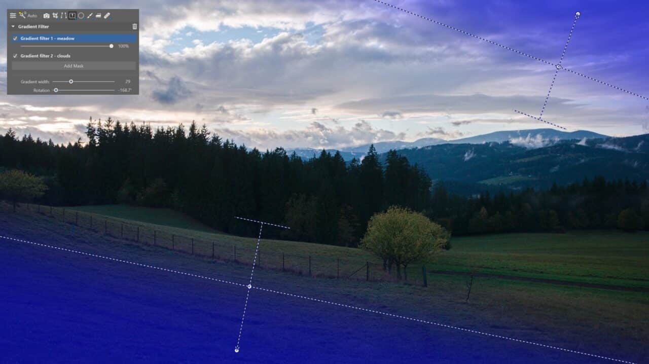
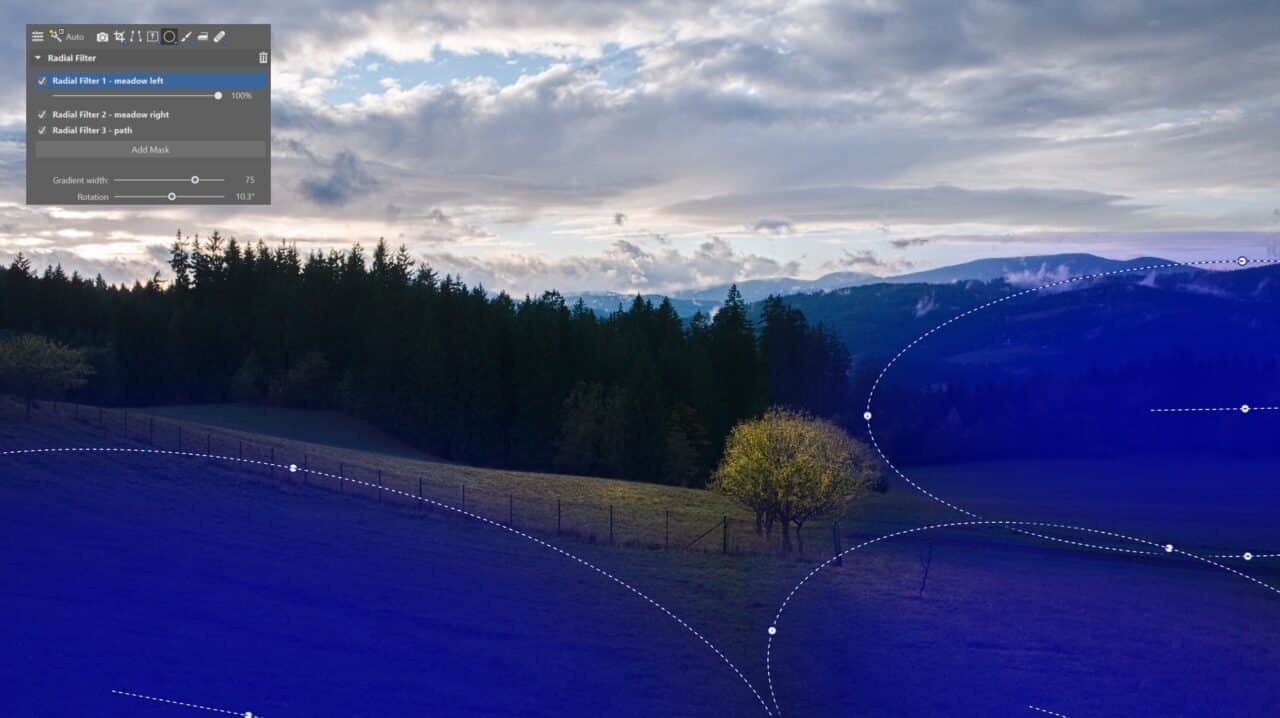
I use local tools, the Gradient filter (G) and Radial Filter (R), to reduce the exposure of parts of the image that were distracting. This helps to guide the viewer’s eye to the main subject.
Lighten
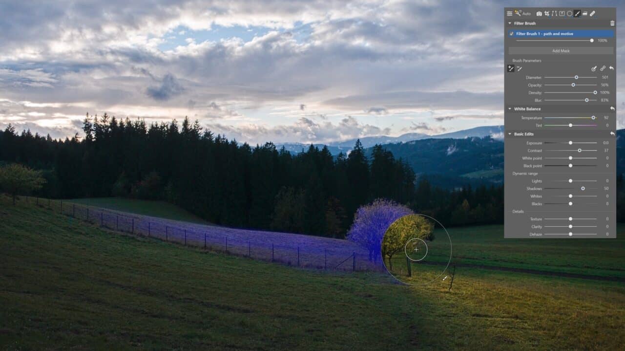
I use the Filter Brush (B) to emphasize the curve of the path and bring out the main subject, bringing the image to life. At the same time, it beautifully guides the viewer through the picture.

You can use keyboard shortcuts to speed up working with the brush. Shift + mouse wheel changes the brush diameter, and holding Alt unmasks.
Color adjustments
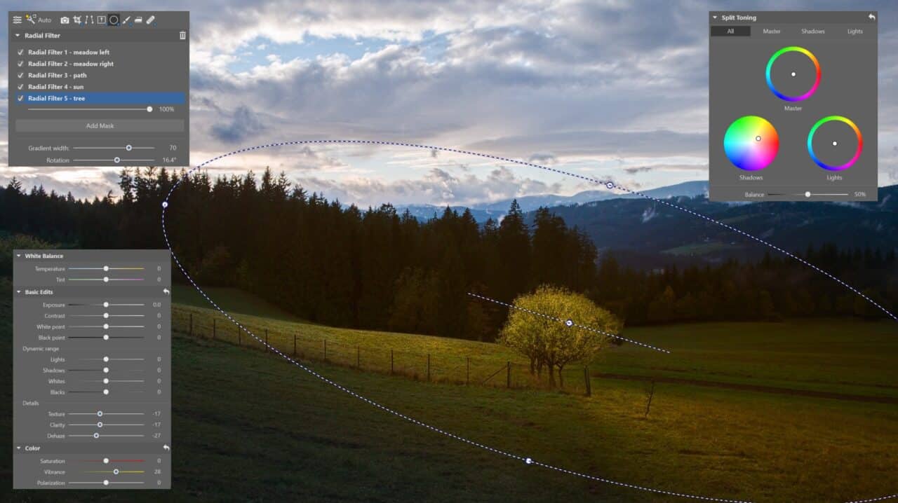
I used the Radial Filter to soften the details of the main subject and path and added warmer tones.
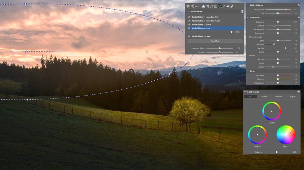
I locally added orange to the setting sun, softened the light source, and added Luminance to make the sky brighter.
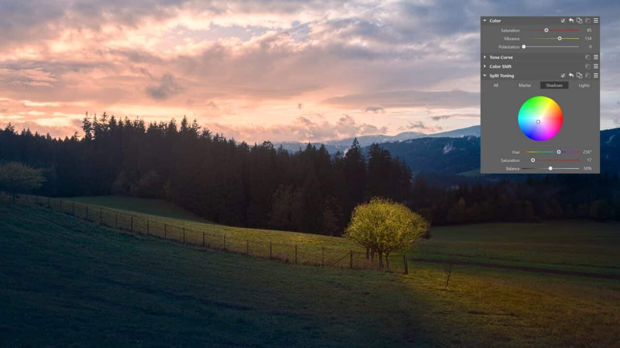
Lastly, I globally decrease Saturation and increase Vibrance. To make the photo look more natural and improve contrast in the shadows, I added a light blue tone to the shadows.
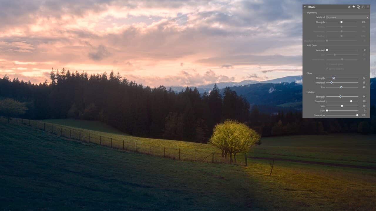
I fine-tuned the photo’s atmosphere by adding Glow and Halation effects, making the scene come alive and look dreamier.
Remove noise and sharpen
Removing noise and sharpening are among the last editing steps. This is because certain adjustments affect the appearance of noise or image sharpness.
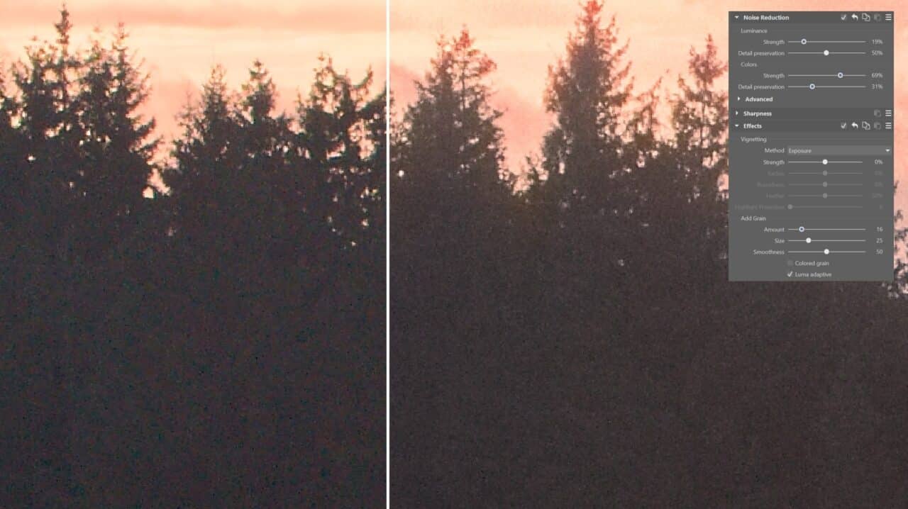
The photo was too dark due to the strong contrast with the sunset. Increasing the shadows caused distracting noise to come out in the dark areas. It’s not a large amount and would probably be lost in a normal print. But it’s better to remove it to be safe.
To keep the texture in the trees, I added some grain after reducing noise. This gave me a much more pleasing result.
Final adjustments
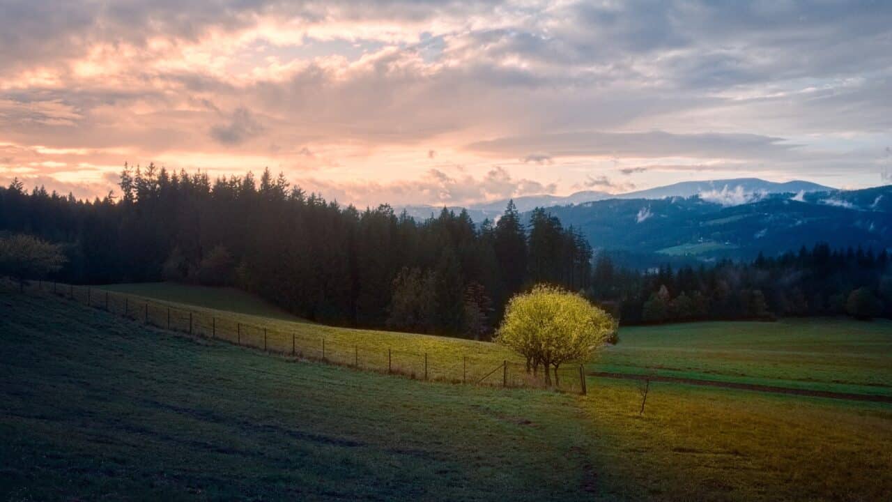
After adding effects, it’s a good idea to make necessary final adjustments. The photo seemed dark overall, so I brightened the shadows some more. I adjusted the Filter Brush settings to highlight the path, which ended up more pronounced than I would have liked. Finally, I fine-tuned the shades of blue and purple.
In Closing
For major adjustments, I recommend comparing your image during the between steps and taking a break of several hours before finishing. Examine your photo in both daylight and darkness. This is because we perceive darkness and color differently in different lighting conditions.
These adjustments are very individual. The same values can look different on different photos. But this photo served us well as a practice photo. If you want to try the editing steps on this same photo, you can download it and repeat the process yourself.
Download Zoner Studio free for 7 days limit-free and with support for all features. Try editing your own landscape photos or download our demonstration photo.
