How to Make Glass Shine
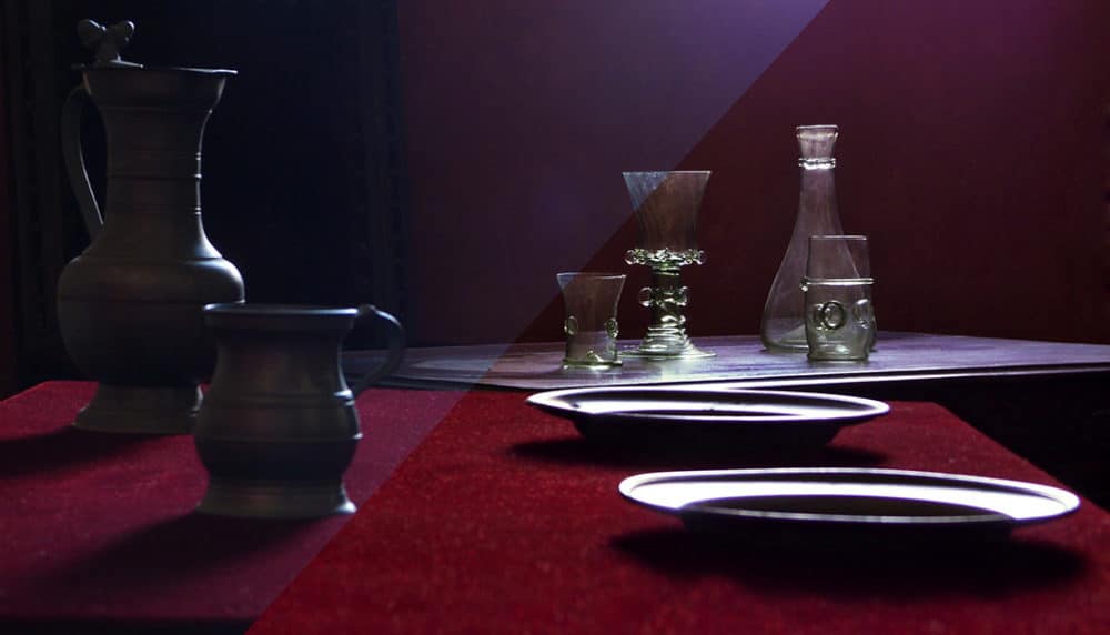
Today I’ll be taking a look at the art of improving a picture after the shot. I’ll be demonstrating how to emphasize the subject and remove distractions in an already well-exposed photo, using a series of careful post-edits.
I was asked to repair this still-life, and was glad to accept, because the lighting used was a great pick for the glass objects in the picture. And meanwhile the composition really needs fixing. My tool for all of this will be Zoner Studio.
Deciding What to Do
This is a still life of a set of glass and metal vessels. This photo has a disorganized composition. It contains a number of objects that overlap and run into each other. It’s a shame it wasn’t shot from further to the left—that would have avoided the composition problems.
The author photographed glass and metal, two of the hardest things to photograph, period. Glass is transparent; in theory you can’t photograph it at all. So photographs of glass actually capture the reflections in the glass. You use these to express the shape of the glass. Here the author has solved this issue nicely, by finding good natural light conditions for shooting the scene. The glass objects have well-defined outlines thanks to the combination of backlighting with a dark background—and also thanks to the fact that they’re a little bit dirty. The placement of the metal objects in the shadows has made it possible to avoid unwanted reflections of their surroundings. These are very common in photographs of metal objects.
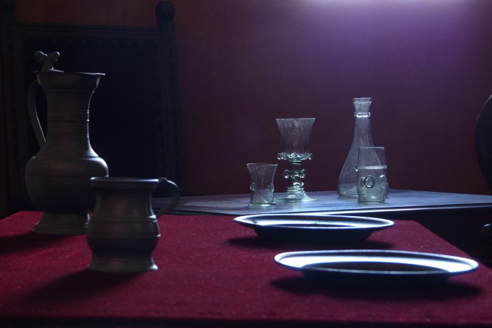
To wrap up the list of problems: the photo suffers from blue tinting (bad color temperature), the subject isn’t highlighted, and towards the borders of the photo, there are elements that distract from the subject—especially the blob of light at the top of the picture, the black object at the right border, and the edge of the table.
I used the following tools for my work:
- Quick Edits,
- Lasso,
- Clone Stamp,
- Quick Filters,
- Rectangular Selection,
- Copy
- and Paste.
Global Edits in Zoner Studio
First I make global edits to the photo—that is, edits that can affect the whole picture. I can make these edits in any out of several main parts of the program. I can use the individual tools in the Editor, or the RAW module controls (even on a non-RAW file… it’s complicated), or the Editor’s Quick Edits tool. Today I’ll be using the last out of these options.
I click the lightning-bolt icon in the Toolbox towards the Editor’s right edge to bring up the Quick Edits controls… though I could have also pressed Q. I’ll start by removing the blue cast from the photo. I do this using the White Balance settings.
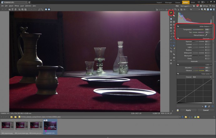
Then I adjust the exposure to help emphasize the glass objects. The overall exposure is fine, so I’m careful to use settings that don’t change it. To be more specifc: I bring the details out of the shadows by raising the Shadows slider to 50. Since most of the detail is in the shadows, this strongly brightens the whole image. Too strongly! I compensate for this by dragging the Exposure slider down to -0.5. To increase the overall contrast, I move the Black Point to -15 and raise the Clarity to 10.
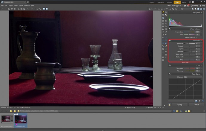
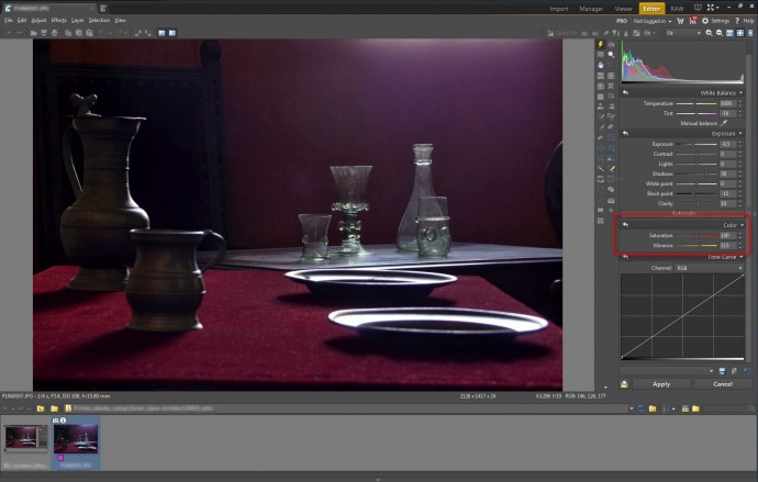
I set the Vibrance to 115, to mildly increase the picture’s saturation.
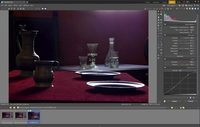
My last global edit is to enhance contrast by emphasizing reflections in the picture. I use Tone Curve for this. I click towards the bottom left of the graph to add a node in the shadows, and then drag that node upwards.
Local Edits in Zoner Studio
While global edits can affect the whole picture, local edits can only affect the current selection. I’ll be using local edits to remove distractions from the photo and to make the glass look cleaner. I start by pressing L to bring up the Lasso, and then lassoing the dark object towards the picture’s right edge.
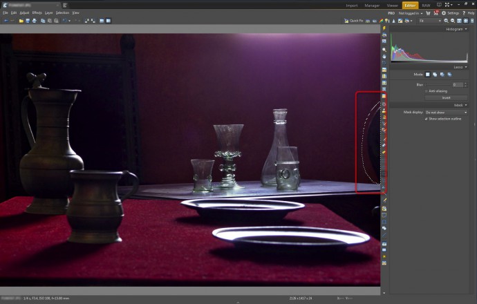
Then I use the “Selection” menu’s “Fill with Surroundings” command to remove the dark object. The object I removed partially overlapped with the table, which is brighter than the object, and so using this command has left an ugly bright spot.
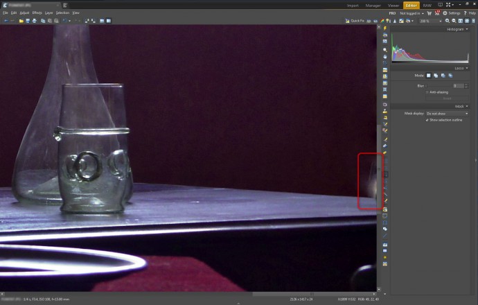
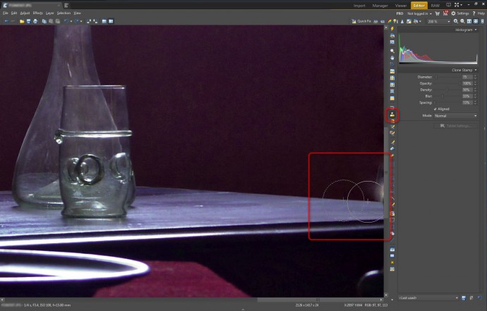
To repair the side-effects of removing the dark object, I’ll use the Clone Stamp. I use it often, so I’ve memorized its shortcut: S. I hold down the Ctrl key and click in the picture to set the source area for cloning—in other words, to set what I’ll be “painting onto the picture” using the Stamp. Then I click and drag to cover up the bright spot with detail from the source area. I’ll also use the Stamp to eliminate the bright reflection towards the right edge of the picture, under the tabletop.
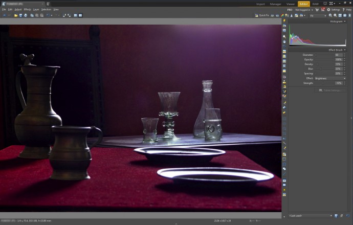
To start darkening the top edge of the photo, I first press E to turn on the Effect Brush. I then set the Effect to Brightness and use Strength settings in the range from -5 to -10 percent, gradually darkening the bright areas with strokes of the Brush. My goal isn’t to eliminate light, but to soften it until it doesn’t distract from the subject.
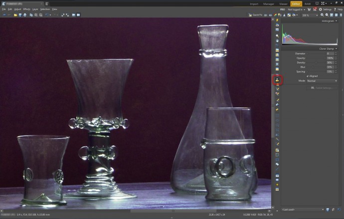
I use the Clone Stamp again to at least partially clean off the dirty glass.
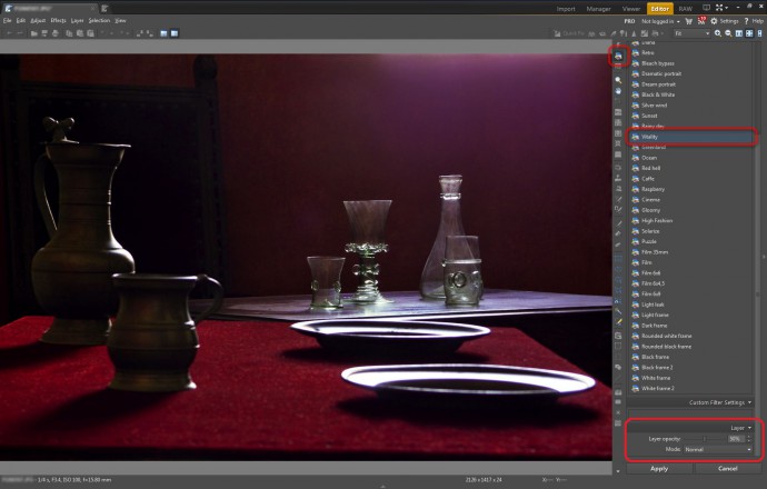
To make this photo more alive and more attractive, I click the top-right toolbox button to show the Quick Filters, and then I pick the “Vitality” filter. (I could also have shown the Quick Filters by pressing Shift+K instead.) I reduce the filter’s strength by bringing the Layer Opacity down to 50 percent.
To hide the table edge at the bottom of the picture, I first get it into a selection the quick and easy way: the Rectangular Selection tool (M).
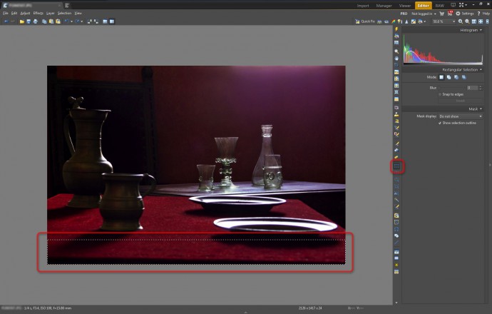
I then copy the selection (Ctrl+C) and then paste it back into the picture (Ctrl+V). The pasted copy starts out in the middle of the picture. I move it to the bottom by clicking the last Alignment button in the controls on the right. Then while holding down the Ctrl key, I drag the bottom-middle handle, to stretch out the selection. This makes the black strip drop off the edge of the photo.
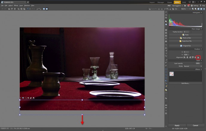
I then use the Clone Stamp again to clean up several remaining dark surfaces at the bottom of the photo, and I also apply the whole selection/stretching process to the top edge of the photo to eliminate the last overexposed area there.
Conclusion
This photo started out with good exposure, so I made sure that my edits didn’t change it. I had to make a number of local edits to remove distractions from the picture. The scene in question could benefit from better composition, but that would require physically rearranging the scene.
This picture before and after my edits.
