A Beginner’s Introduction to Color Management

Color is the language of photography (unless you’re shooting in black-and-white, but let’s not ruin my metaphor) but as your photo journeys from your camera to your monitor and then to your printer, some color can get lost in translation. To ensure your photo is represented accurately on your monitor and your printer, you need to manage your color.
Why Should I Bother?
If you have no higher ambition than to look at your photos on a monitor or tablet, then you probably don’t need to bother with color management. By default, Zoner Studio works with the color information provided by your camera and monitor (and printer or scanner) to optimize your photo. For casual shooters, you’re already in good hands.
If, however, you want to print your photos and especially if you want to sell prints, it makes sense to take more control over your color. If not, you could be flying blind. The colors you see on your monitor may not be faithfully reproduced on your printer and neither your monitor nor your printer can be configured to work in harmony. If you’re sending your prints to a professional lab, they will likely require some degree of color management in advance, too. (If you want an extremely technical deep-dive into the principles of color management, have a look at the FAQs put together by Color.org. And brew some strong coffee.)

Ok, So What Do I Need?
The essence of color management revolves around the profile. Think of the profile as a universal translator for color — it’s a file, a set of instructions embedded into your photo (or device) that tells other devices how color is supposed to be reproduced. When you snap a photo, it typically contains a profile. Your printer and monitor also contain profiles that explain how they reproduce color.
As we said above, if you do nothing at all, your camera, monitor, printer and Zoner Studio will simply draw on whatever profiles were shipped with your camera, monitor, printer, etc. as guidance for how colors are to be reproduced. However, every device and every environment is different. Over time, printers and monitors will “drift” away from their ideal state and no longer reproduce colors as they once did. This presents an obvious problem: the profile says one thing, but the monitor or printer is doing something else!
That’s why many photographers insist on creating custom profiles of, for instance, their monitors, so they can get the most accurate representation of real world performance. This way, they not only know what their monitor is truly capable of, they can tell when it’s no longer performing at its optimal level.
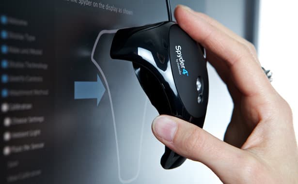
To do this, you need a monitor calibration kit that will measure the colors emitted by your monitor and create a custom profile using included software (Photo Studio can import these custom color profiles, so it’s perfectly tuned to your workflow). Then, on a regular basis you can re-check your monitor using the calibration device to ensure it is still performing in its optimal state. If not, you can reset the monitor back into its profiled state.
Printers can be treated the same way with their print/color performance measured by a device called a colorimeter. While all printers will come with “canned” profiles, many photographers (and almost all professional labs and printers) will go beyond this to create custom profiles. If they catch the printer “drifting” it can be recalibrated (usually using software that came with the printer itself). Armed with this information, you can ensure that what you see on screen will be what you see on paper.
Next week, we’ll dive into some specific color management guidance that we’ve learned from the pros.
(Image: Freshome)