Portrait Backgrounds: The Most Common Composition Mistakes
Finding a nice location is not enough when taking portraits. You also have to position the subject, horizon, and other objects in the frame correctly. Let’s take a look at the most common beginner composition mistakes and some simple tips for fixing them.
In this article, you learn:
- Why beginners often incorrectly place the subject in the frame.
- How to correctly work with the horizon when taking a portrait.
- How to use the rule of thirds when composing a portrait.
- How to avoid objects “growing” out of the subject’s head.
- How to incorporate other objects in the background.
- How to use negative space.
- How to use the foreground to create depth and more interesting composition.
- The most common beginner composition mistakes.
My students were the inspiration for this article. They’re comprised of experienced photographers, beginners who never studied photography before, and students who want to get the class over with as quickly as possible. They all approach assignments differently, and I’ve tried to pinpoint the most common mistakes—specifically those related to portrait composition.
I can’t publish their photos, so I’ve chosen schematic illustrations instead. Again, I’d like to point out that the “rules” I describe don’t always apply. There are cases where the exact opposite of what I recommend works better. Take these tips as a guide—a rough outline for composing portraits.
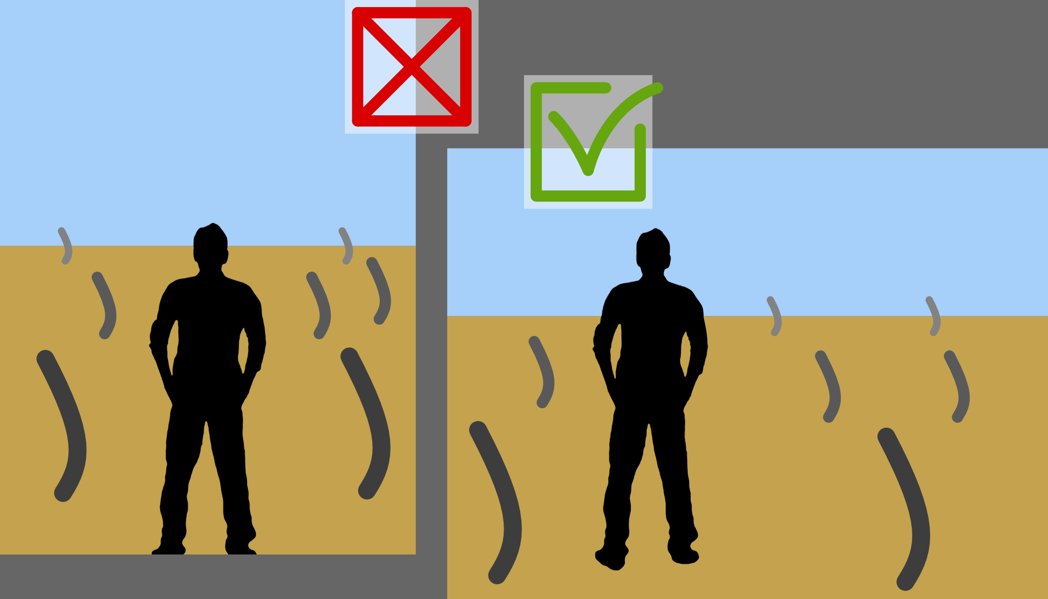
Common composition errors in portrait photography
If I had to find a photo that combines most of the basic mistakes, or rather less-than-ideal solutions, it would look something like this:
There are several factors that make this photo less than ideal:
- The subject’s head is right in the middle of the frame. This is very typical for beginners and leads to the other mistakes below. It’s tempting to center the subject’s head, but a central composition is usually not the best approach.
- The horizon is also in the center. It intersects with the head, which does not look good, and also reveals that the photographer took the photo from the same height as the subject.
Positioning the horizon this way also divides the image into two unbalanced halves: the lower half with the person and the city or landscape, and the upper half where nothing is happening. If there are no clouds and a clear blue sky, the upper half of the photo is wasted space. - The photo cuts the subject off at the ankles. In general, it’s better to keep the edge of the image away from the joints or include the entire figure. Instead, there’s an unnecessarily large amount of sky.
- The question is whether vertical composition makes sense here. It depends on the purpose of the photo. If the target audience is viewers with mobile phones, vertical may be necessary. However, if you have more freedom, it’s often better to choose a wider view. The specific shape of the clouds probably isn’t that interesting. The viewer is more interested in the city around the subject. Vertical composition works well for portraits, but it should be a conscious choice. Unfortunately, many beginners simply shoot vertically with their phones without thinking.
How to compose a portrait correctly
An improved version of the same photo might look something like this:

I chose this composition for the following reasons:
- The subject is shifted to the side using the golden ratio or rule of thirds. They could also be placed on the opposite side. If they were turned slightly sideways, their body would face the open space instead of facing a “wall,” or the edge of the frame.
- The horizon does not pass through the subject’s head. You can estimate the shooting height based on where the horizon intersects with the subject. Here, it’s roughly at the biceps, which suggests the photographer was probably squatting. The horizon is also not centered. Again, the golden ratio rule applies, although this cannot always be exactly followed. It also depends on the focal length and the surroundings, especially the height of buildings. The subject and its placement in the photo are more important.
- The subject is fully visible. This may seem trivial, but when focusing on the buildings in the background, it’s easy to forget about the subject and crop them awkwardly. That’s why it’s a good idea to do one last check before pressing the shutter button.
- Landscape orientation. For comparison, I kept the original 4:3 aspect ratio, but most cameras have a 3:2 ratio, which would make the shot even wider. With larger cameras, shooting horizontally often feels more natural than shooting vertically, unlike with smartphones.
How to include background objects in portraits
The composition above is also practical when you want to include another object behind your model. Simply place it about one-third of the way from the edge on the opposite side to balance it with the subject.
The exact placement depends on what you’re photographing. Otherwise, you might end up with a photo of the Taj Mahal—and a funny restaurant sign in front of it. With tall buildings, try lowering the camera closer to the ground instead of simply zooming out. This shifts the horizon downward, creating more space.

For this and other photos, you can also use a tighter composition, where the subject is cropped at a suitable point in the frame. Common cropping points are the middle of the thighs, around the waist, or just below the shoulders.

Composition errors with background objects
In practice, I’ve seen many unfortunate attempts to place a secondary subject in the frame. Let’s go over what to watch out for.
The first error is objects “growing” out of the subject’s head.

Of course, I don’t expect you to hide the Eiffel Tower completely. But I’ve seen photos of the Charles Bridge composed similarly, where the statues converge at the edges, and the distant tower appears to grow out of the subject’s head. The solution is to take a step to the side and get the composition described in the previous paragraph. Or, if symmetry is important, try changing the shooting height and either move the object higher in the frame or hide it behind the subject’s body.
Another unfortunate decision is placing everything interesting on one side of the image.

While this may not happen with the Eiffel Tower, I’ve seen photos with an empty landscape, a person, and a single tree, arranged exactly like in the picture. There’s no reason to look at the right side of the image—everything important is on the left. This is essentially the same problem as the empty sky mentioned at the beginning of the article.
I also want to bring attention to frequent misuse of image formats.

Beginners are often satisfied once they capture what they intended to. But they don’t always consider everything else that ends up in the frame, or simply leave too much empty space. This is known as negative space, and it can be useful. But often it’s better to move closer or use a telephoto lens.
Creating depth in portrait photography
More advanced techniques involve working not only with the background, but also with the foreground. This requires some active searching, but the result immediately looks more intentional.
This is especially useful when there isn’t anything interesting in the background. Instead of a monument or sign, you can place something in front of the subject. If you’re close enough or using a fast lens, the foreground object will blur and enhance the sense of depth.

Placing the subject among repeating patterns is another effective composition technique. These can include fence posts, street lamps, or rows of windows.

With a telephoto lens, this can create gradual focus on the subject and smooth background blur. The pose doesn’t have to be rigid. For example, have your subject hold one of the repeating objects, lean on it, or stand slightly sideways and look off to the side.
Experimenting with portrait composition
The solutions described above don’t always work. Sometimes the best result comes from choosing a completely different approach. However, if you’re unsure, these tips provide a solid foundation when other compositions don’t work. It’s always useful to try several different shots so you can later choose what works best for a given location.
FAQs
How should I position my subject in the photograph? The rule of thirds is commonly used. The subject is positioned roughly one-third of the way into the frame instead of directly in the center. This makes the photograph more natural and dynamic.
Why is it undesirable to place the subject’s head in the center of the photograph? Central composition can appear static and dull. If the horizon intersects with the subject’s head, the image can appear unbalanced and dull.
Where should the horizon be in portraits with landscapes? The horizon should not pass through the subject. It’s usually better to place it either higher or lower depending on whether you want to emphasize the sky, landscape, or subject.
How can I avoid objects “growing” out of the subject’s head? Always check the background in the viewfinder when composing your shot. If you notice a lamp, tree, or tower directly behind the subject’s head, take a small step to the side or change your shooting height.
How can I include other objects in the background? Try placing additional objects roughly in the opposite third of the frame from the subject. This creates natural balance in the composition.
How do I create depth in portraits? Use foreground, middle ground, and background elements. For example, a blurred object in the foreground can frame the subject and add depth.
Is it better to take portraits horizontally or vertically? It depends on the purpose of the photo. Vertical orientation is common for social media portraits, while horizontal orientation often works better when you want to incorporate the surroundings.