Vignetting—An Issue and a Blessing
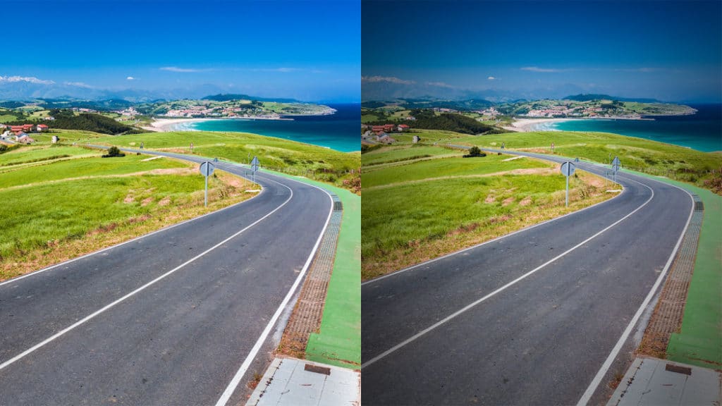
Practically every photo is vignetted at least a little. Sometimes you want this, other times you don’t. But either way it’s not a curse, because there are tools for suppressing vignetting—or even adding it. Do you know how and when to use them?
The term “vignetting” in photography means darkening in a picture’s corners. This darkening comes from a compromise in the design of lens assemblies. To keep them reasonably small and light, the lenses within them are as small as possible, and towards the edges, the assembly—to state it simply—shades itself. If it’s a zoom lens, then things are usually worst at the wide end. Vignetting is usually reduced when you use a narrower aperture… but often you can’t, or shouldn’t.
The illustration below shows a picture with and without vignetting:

Filters on the end of your lens can also cause trouble. These often strengthen vignetting further, especially if you’re using two filters at once. That’s why, if you’re still using a UV filter, you’ll want to take it off before mounting a polarizing filter.
However, the above example is extreme. Since you’re normally photographing scenes that are more complex than white paper, the darkened corners are hard to notice, and so the vignetting usually doesn’t matter.
Manufacturers know the nature of the vignetting in their individual lenses, and so in some cases a camera can automatically eliminate it right after a shot. But this has consequences. You get more noise in the corners, and you might want to keep vignetting—it’s not always best to let the camera decide.
Why Vignetting Is Good
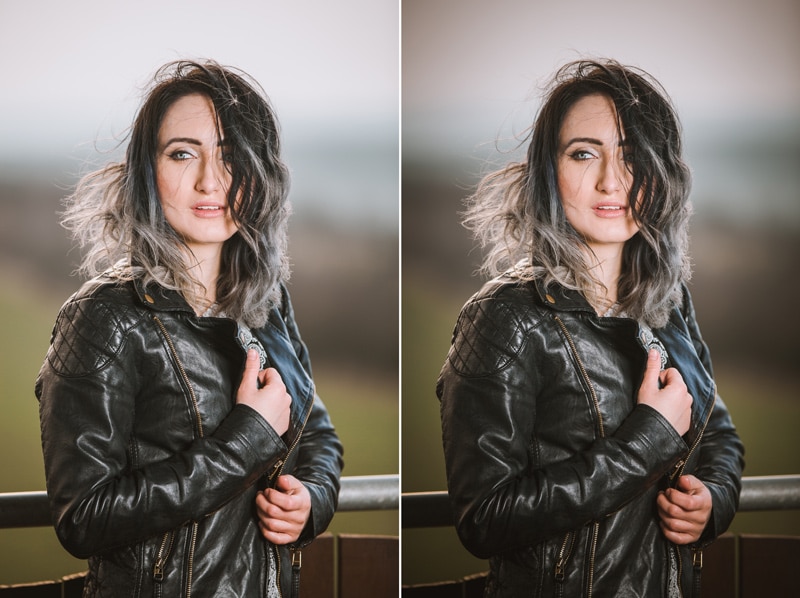
I’ve implied above that vignetting is something you can sometimes keep. It serves as a subtle guide for your viewer’s eyes. The photo’s dark corners are subdued—just an accompaniment to the subject. The subject doesn’t have to be precisely in the picture’s center, but it’s generally somewhere nearby and is always brighter than the corners.
People generally don’t even consciously notice this effect, but if you ask them to choose among versions of a picture, they’ll generally choose one with some vignetting. And so you’ll often want to add vignetting as you edit, instead of removing it.
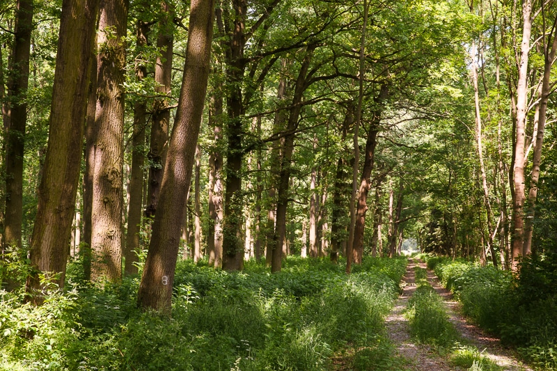
But there are exceptions. When shooting in the countryside, clear cloudless skies suffer heavily from vignetting.

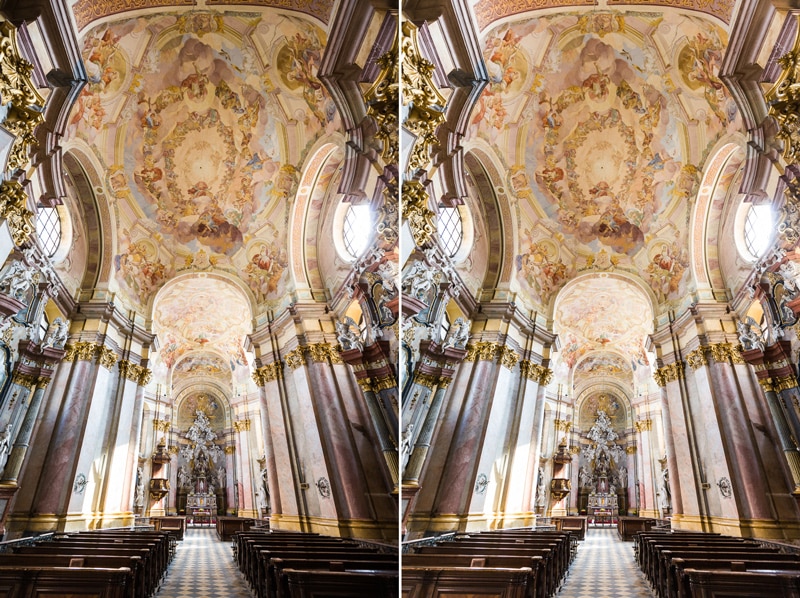
In the city, the troublemaker here is architecture. While vignetting can be used in urban photos, pictures look cleaner and spaces look bigger without it.
Vignetting is also a problem for panoramas. You have to eliminate any darkened corners in your source photos, or they won’t lead in to each other. But fortunately, panorama-stitching software can usually handle this automatically.
How to Edit Away Vignetting
Whenever vignetting is in the way, Zoner Studio can help, via a function tailor-made for removing it. Ideally you want to fix vignetting in a picture right away, when you’re developing it from RAW. So open the photo’s RAW file in the Develop module. In the “Lens” group’s “Manual Correction” section, you can have vignetting removed automatically from RAWs for you, once you’ve added the right profile for your lens. Or you can remove vignetting manually by adjusting settings. This works even on JPEGs.
The Editor has a similar function, in the Adjust menu. It’s simply named Vignetting. Pressing Ctrl+Shift+G also brings it up.
![[vignetting-group.jpg] The Vignetting settings in the Editor’s right panel.](http://learn.zoner.com/wp-content/uploads/2017/01/vinetace_panel.png?fidl=2019-06-mag-en&utm_source=learn.zoner.com&utm_medium=referral&utm_campaign=vignetting-an-issue-and-a-blessing&utm_content=text)
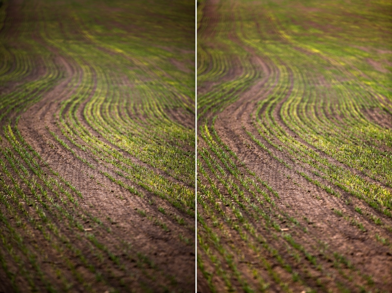
Fine-tuning the settings here is important, to prevent over-brightened corners.
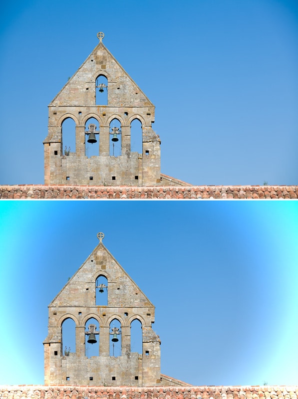
Don’t forget that antivignetting works by brightening originally dark parts of an image, and that means added noise. Here the change is hardly noticeable, but when a photo is taken in bad light conditions that cause significant noise, antivignetting really makes it stand out. (If you’ll be publishing a shrunken-down version of a picture, this problem can be ignored.)
How to Add Vignetting
Adding vignetting is easy. Either use the above-mentioned antivignetting control, or, better yet, use the Vignetting control in the Develop module’s “Effects” group. It takes cropping into account, and also lets you set the vignetting method—via color or exposure. To use this control for antivignetting, just draw the Strength down past zero. Edit with care; you don’t need anything extreme for the Strength. I recommend setting the Radius to something small, so that more than just small areas in the corners are dark. For illustration let’s start with this picture:

In both cases I used a vignetting strength of -54%, but I used a radius of 19 the first time and 100 the second time. Notice how in the second case the corners are ugly, and so instead of mildly attracting attention to the center, my edit just distracts.
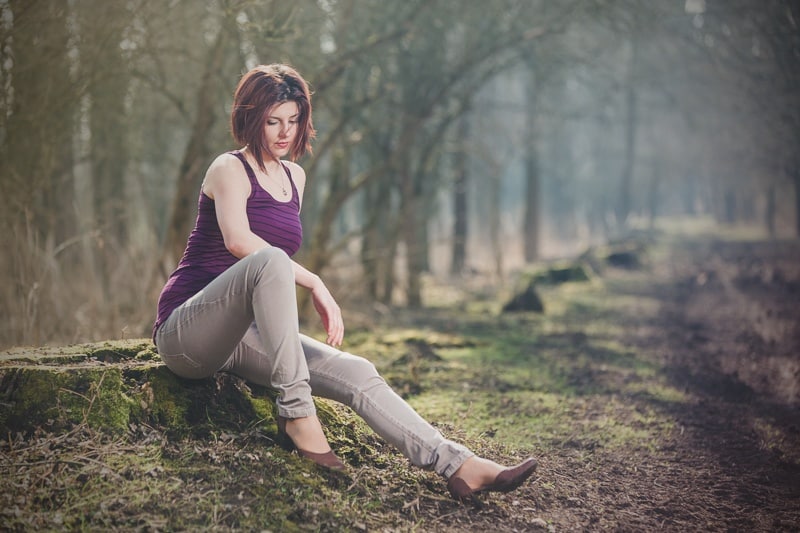
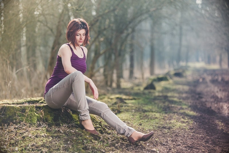
The advantage of adjusting vignetting in the Develop module is that your edits are non-destructive (that is, you can take them back at any time) and you can save your vignetting as a preset—along with other edits like added contrast if you’d like—and even apply this set of edits to whole batches of photos at a time.
The Editor module, meanwhile, is useful when you want to work with layers, selections, or brushes.
Another way to add (false) vignetting is to use the Radial Filter in the Develop module. Here you’re not limited to just brightening or darkening from the center. You can move your filter around and change its radius, exposure settings, etc. (And we’ll go into that… in a later article.)
Vignetting Is a Plus
Personally I use vignetting a lot, although I usually keep it weak. With some other touches, it makes a photo more interesting, so subtly that you won’t know anything’s changed. If you haven’t tried this function yet, then it might be time to add it to your toolbox.
Want to vignette or antivignette your pictures too? Try Zoner Studio for 7 days.