3 Ways You Can Add Life to Dull Photos
Did you recently come back from a trip with beautiful photos, but they don’t look as vivid and colorful on your computer as they did when you took them? If your lackluster photos need you to breathe some life into them, try these three methods.
There are many ways to add life to your photos. Every photo you take benefits from a slightly different approach. For this article, we use three different editing techniques for three different pictures. But don’t take these examples as rules of photo editing that are set in stone. Adapt the adjustments we demonstrate here to suit your photos and needs. Often, a few simple and intuitive steps are all it takes to freshen up dull photos.
Before we get to the editing itself, shooting in RAW is worth it. RAW images often have different colors than JPEGs taken on the same camera and can even look washed out. JPEG are pre-processed by the camera. RAW files are unaltered and retain much more image data than JPEG. This also makes editing RAW images easier and more effective.
We edit all three photos in the Develop module of Zoner Studio demonstrating the following techniques:
- Adjusting highlights, shadows, contrast, and white balance
- Highlighting using selective colors
- Highlighting using LUTs and additional effects
Contrast and White Balance
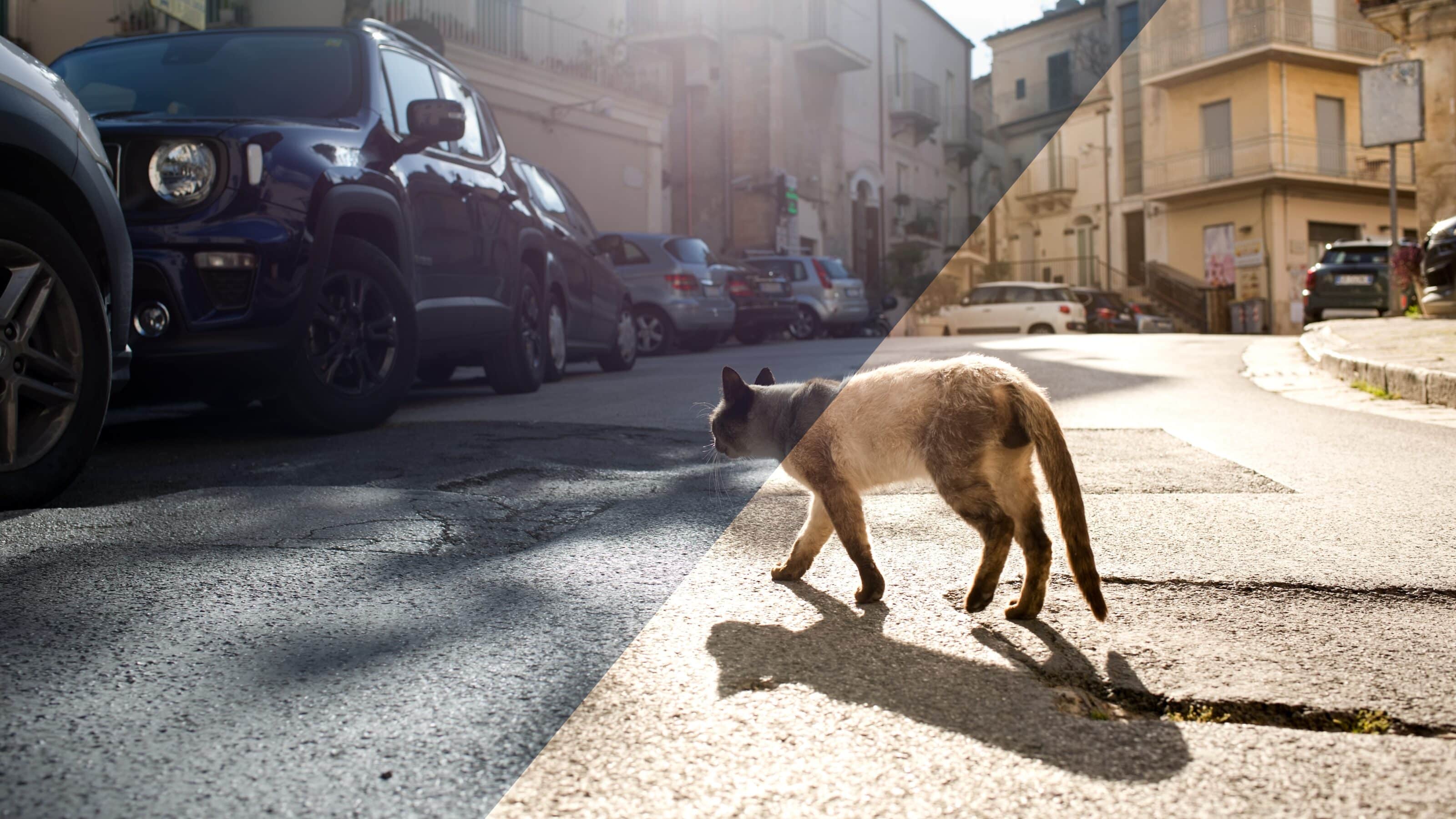
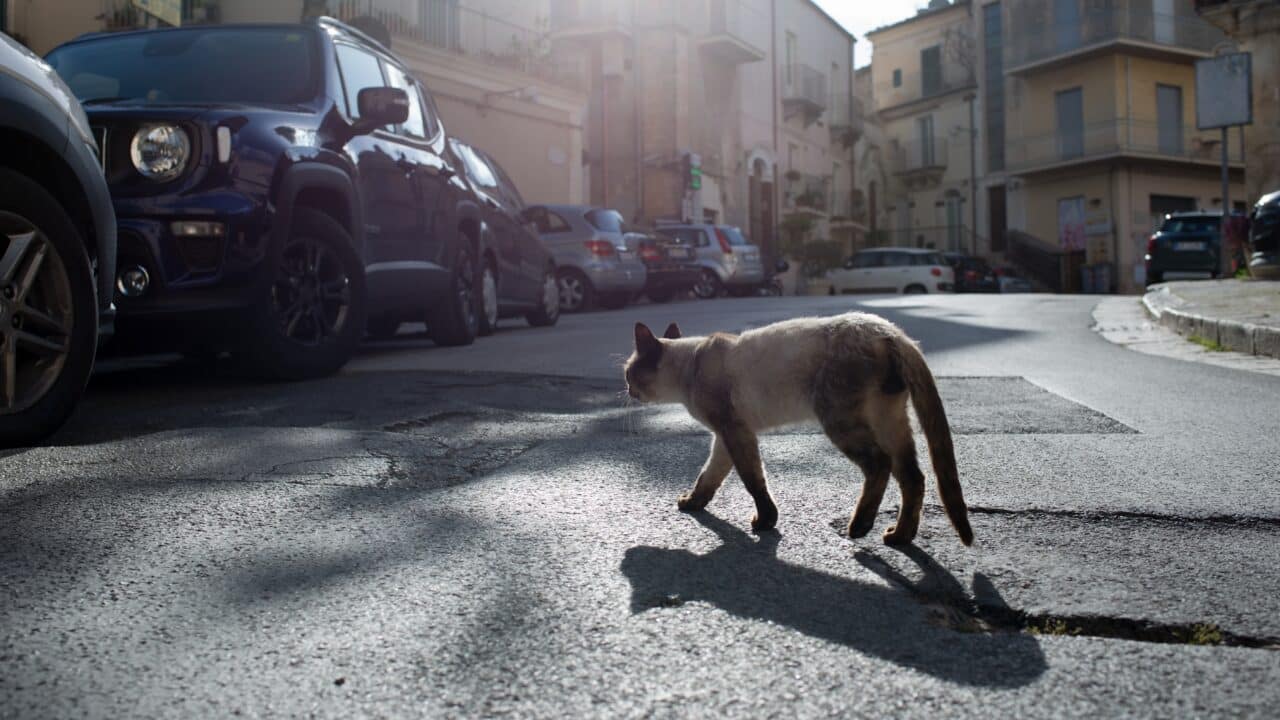
The first photo I edited is dark and dull. The Histogram showed me that the photo lacked overall contrast. I correct the imperfections using basic tools in the Exposure section of Zoner Studio.

Adjusting just a few sliders immediately made the photo look noticeably better. This is because our eye perceives high-contrast photos as more appealing than low-contrast photos, which are dark and dull. Basically, the idea is to get the details out of the shadows, accentuate the highlights, and bring out whites and blacks.

Whenever a photo seems dull and tired, start with contrast adjustments. We discussed contrast in great detail in our article Basic Adjustments for Livening Up Dull Photos.

The photo looks more interesting thanks to greater contrast and better exposure, but it’s not quite there. Maybe some warmer colors would be good for this photo taken in sunny Sicily. The Temperature slider above the basic exposure tools can help. White Balance is another simple, but very effective adjustment you can use to add some life to your photo.
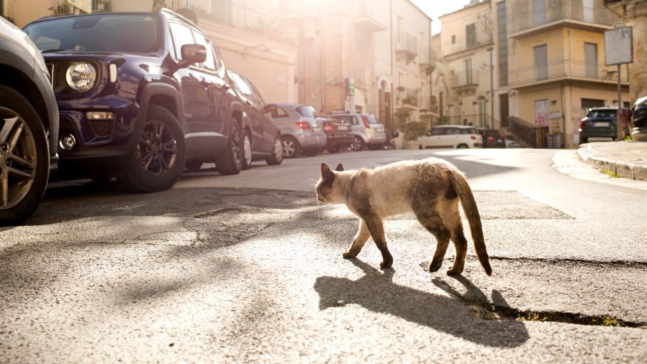
A few quick basic adjustments were all it took to make the photo look better. Next, we could continue with further adjustments, such as Color Shift or the Radial Filter, but we’ll let the cat stroll on her merry way and move on to the next technique.
Use selective colors to bring out photos
Sometimes it isn’t exposure that makes a photo dull, but rather the colors in the photo. You can help bring out the colors by increasing saturation for the entire photo or by editing each color separately. The second technique using Color Shift gives you greater control over each color.

Our photo already has basic exposure adjustments, but it’s still missing something. It could use a bit more pizzazz. It would be a shame if we didn’t make use of the blue and orange color contrast in the photo.
We use Color Shift to increase Saturation and Luminance for these primary colors. The colors come through nicely and give a breath of fresh air to the photo.

What is the advantage of using Color Shift versus increasing Saturation for the whole photo? It’s simple. The Saturation slider, under Color in right panel of Develop, increases the saturation of all colors in the photo across the board. However, we only want to accentuate the selected primary colors and leave the others alone.
Color Shift allows us to adjust Saturation for each of these colors separately. It also allows us to adjust the colors’ Luminance, which the Saturation slider does not.

3D LUT and other effects
The next photo isn’t that dull, but that’s because we are going to use Effect 3D LUT. These LUTs are added to the photo at the very end, after basic adjustments have been made. We already made basic exposure adjustments. 3D LUT is not an adjustment that works on its own. When combined with basic exposure adjustments, it can give you striking results.

If you haven’t come across LUTs before, here’s a quick summary—a LUT is a Look Up Table. It’s a handy little file that can tweak your photos’ colors. It’s similar to a preset, but is different in that it doesn’t move any sliders. LUT is more similar to the camera color profiles you’re familiar with in Zoner Studio. It’s a file that determines how colors, highlights, and shadows look in the photo you’re editing.
There is a huge amount of LUTs available on the internet. Some are for purchase and some can be downloaded for free (like Fresh LUTs). The variety of LUTs out there means you have a lot of options for how your photos can look. And as to not digress from the topic of this article, it’s a great and relatively easy way to add some life to your photo.

I might be happy with this photo at this point. But before I show you the after photo, I’m going to use one last tool that can bring a photo to life. It’s the Glow slider, which is perfect for our photo because it can make “glowing” objects shine brighter. In this case, it’s the windshields of the motorcycles.


Effect 3D LUT can brighten up dull colors in a different way than you’re used to from classic photo editing. I recommend not skipping LUTs when trying to add new life to dull photos.
Every photo needs something different
These three methods aren’t an exhaustive list of photo editing for dull photos. Like we mentioned at the beginning, the editing process may look completely different for different photos. Don’t be afraid to experiment and see what you can achieve. If you get a really good photo, feel free to share it with us!
Download Zoner Studio free for 7 days with support for all these features and add life to your photos today!