Better Composition Through Cropping: 4 Ways to Improve a Photo With a Crop
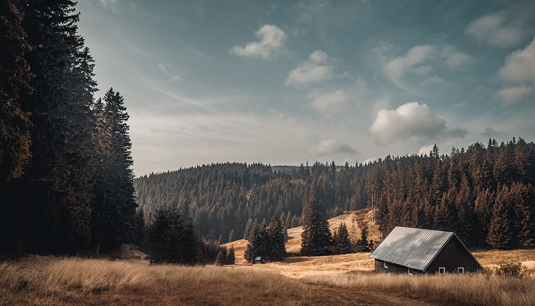
It’s important to think of composition during your shot, it’s true. But often you’ll only find out on your computer that a crop can make a picture even more interesting. After all, cropping a photo can give it a completely different look. You just have to work right with its composition.
Even before you start, stop for a moment and think about what you actually want from your edits.
Consider for example whether everything in the photo is important, or whether there’s some part that it would be better to crop out. If you find that kind of unimportant or distracting area at one of the edges of a photo, cropping is in order.
The other thing that you should definitely think about right away is maintaining a common ratio of sides. You’ll appreciate it when you go to print out the photos.
Read the Basic Rules of Composition
Once you’re sure what you want to do, get started cropping the photo. Open up Zoner Studio, go to the Develop module, activate the Crop (C) tool, and turn on Crop Marks.
Whether you choose Golden Ratio, Thirds, or another mode is up to you. You’ll definitely appreciate these marks when you’re doing your cropping. They’re based on basic composition rules, and so they’ll make it easier for you to find the right composition.
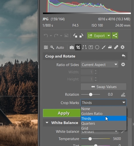
Golden Ratio
The picture below shows what golden-ratio cropping looks like for my example:
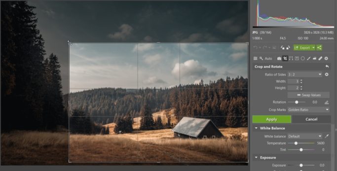
When you’re cropping with a 3:2 ratio, the golden-ratio marks are ideal. Here, the horizon copies the upper line, and the strip of forest falls into the middle, thinner section. The bottom-right intersection, meanwhile, leads to the cottage—the photo’s subject. This crop here really helps the cottage to stand out.
Portrait Crops
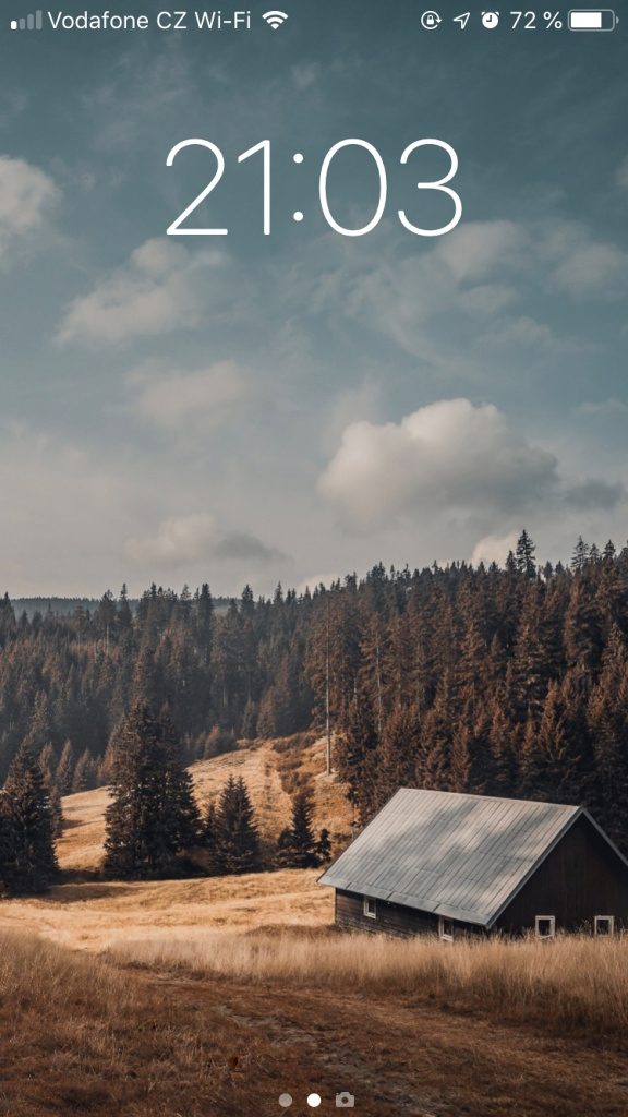
Take a moment to see if a non-landscape crop works for your photo. Click the ⇔ Swap Values button, and the crop will be swapped to a portrait orientation. On the one hand, this will cut a large part of the photo away. But on the other hand, it can still have just as much to say—like here.
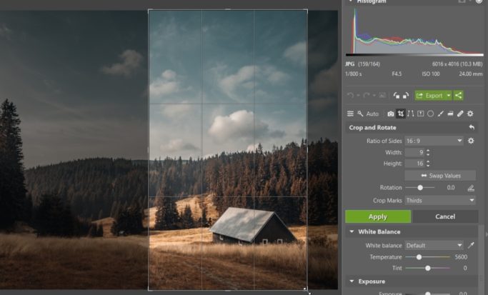
This cropping method is used frequently for producing phone wallpapers.
Try a Cinematic Composition
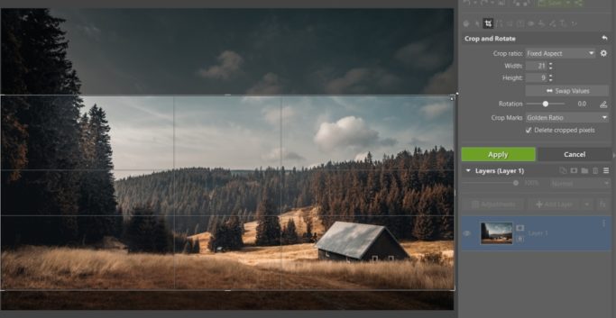
The opposite extreme can be an interesting option as well. So set the ratio of sides to 21:9—this “widescreen” format just might make the picture more interesting. This ratio of sides is used for most movies, and has been for some time.
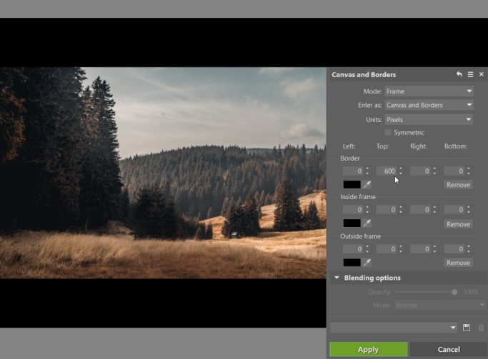
For an even more movie-like look, add black strips at the bottom and top of the photo. Use the Canvas and Borders function (Ctrl+Shift+B) in the Editor for this. Set the color to black, and then in the Top and Bottom boxes, enter a number that feels right (aim high here). Be sure to use the same number in both.
Then you just need to use Crop one more time and crop the photo to a 16:9 ratio. That’s the ratio you’ll generally have on an ordinary TV when watching a movie.
Just make sure that your final crop is centered and your black strips are the same size.
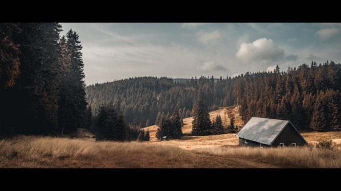
You might be saying to yourself here that it’s nonsensical to cut away part of a photo and put a black area there. And you might be right. But it looks very cinematic, and this approach definitely still has its fans.
But it usually isn’t a good fit for print. Those black strips can look good on a computer, but on paper or a white wall, not so much.
A 1:1 Composition
Another possible option in my example is to cut off the forest on the left while leaving the sky. A square crop will suit this approach best. Square crops are definitely attractive, and thanks to Instagram, they’re very popular as well.
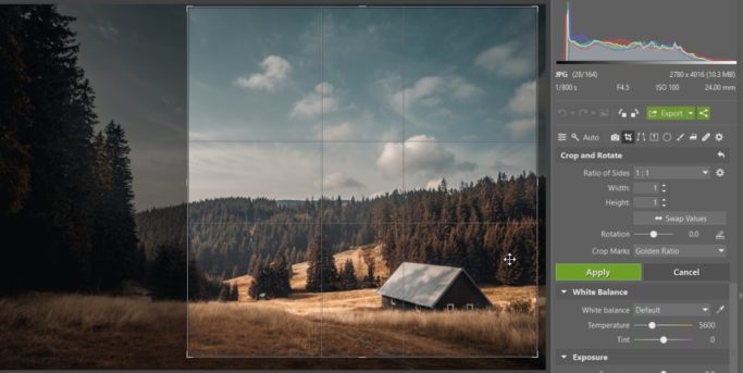
For this photo, I actually think the square composition is the best of all.
Try Changing the Crop to Get a Different Response
Today’s cameras produce very high resolutions—enough to left you use even very strong crops and still get a quality picture. So why not take advantage of that? Download Zoner Studio, try it free for 7 days, and get started exploring.