5 Classic Edits to Liven up Your Landscape Photos
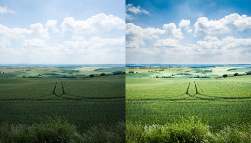
Just about all of us shoot when we’re on the road. But the pictures that experienced photographers post on the Internet look a little different. Their exceptional shot locations definitely help, but their final looks actually owe a lot overall to computer edits. And meanwhile, these are rarely complicated tricks. In this article, you’ll find several common workflows that you too can use on your photos.
There are simple techniques and complicated ones. Paradoxically the easy ones often do more for a photo, and they can very quickly push an ordinary “snap” into the category of interesting pictures. I’ve picked out a few universal edits I use that are a good fit for practically any landscape photograph.
1. Color Temperature (White Balancing)
Color temperature edits are my favorites because they’re fast, you just move a slider. Also at the same time, you can change a photo’s whole mood. In nature, I prefer the golden light that corresponds with the ideal times for photography around the sunrise and sunset. Unfortunately, we can’t always shoot at a favorable time, and also some cameras have a tendency to diminish this lightly golden light by inappropriately guessing the color temperature and pushing the picture towards the blues.
Here, for example, is a file straight from the camera (which has automatically set the white balance to 5511 K):
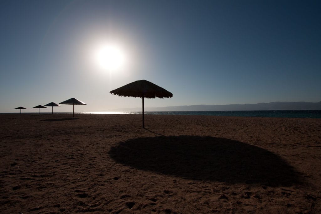
Canon 40D, Canon EF-S 10-22/3.5-4.5, 1/1250 s, f/8.0, ISO 100, focal length 10 mm
Fortunately, we have the ability to push the white balance towards warmer, oranger tones:
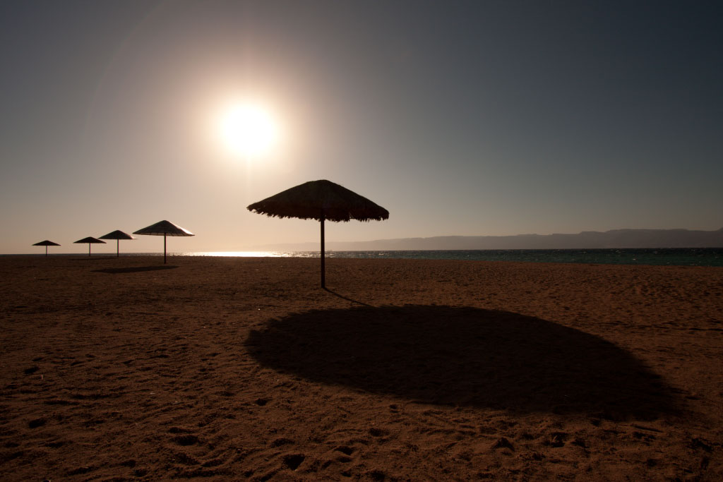
This can bring us either back to fairly realistic colors, or out to even a deliberately, strongly tinted picture. This kind of extreme edit isn’t always good, but sometimes it’s usable:
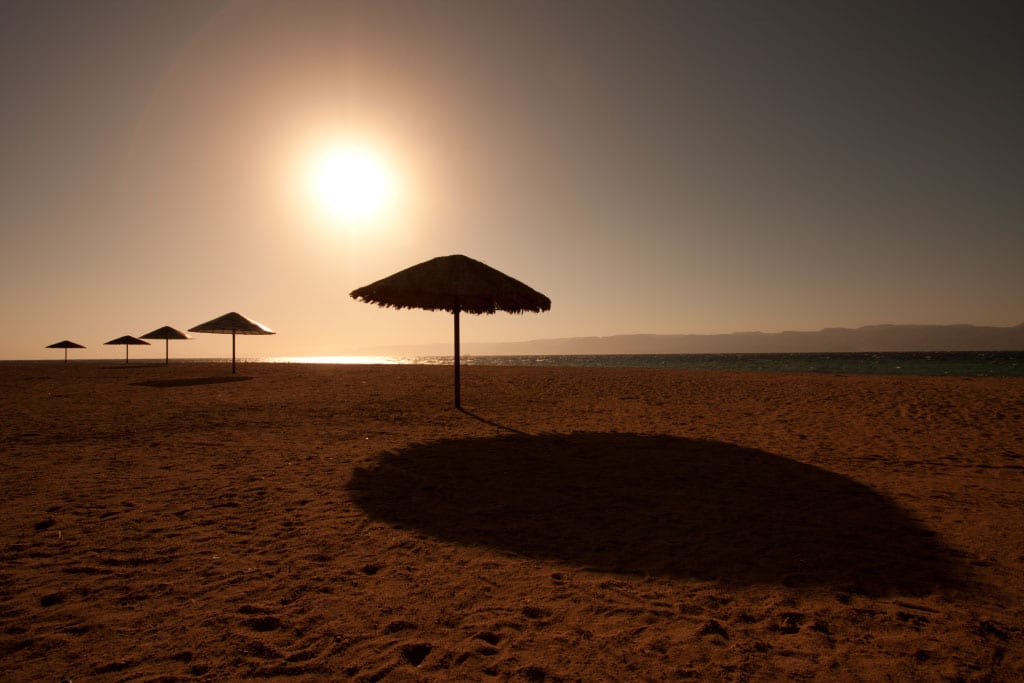
There’s no bad variant; it all depends on your goals and your taste. To show that color temperature changes aren’t just for photos taken under sunlight, here’s a forest closeup. The original color temperature of 4300 K was changed to 5400 K, and so the grass looks healthier:
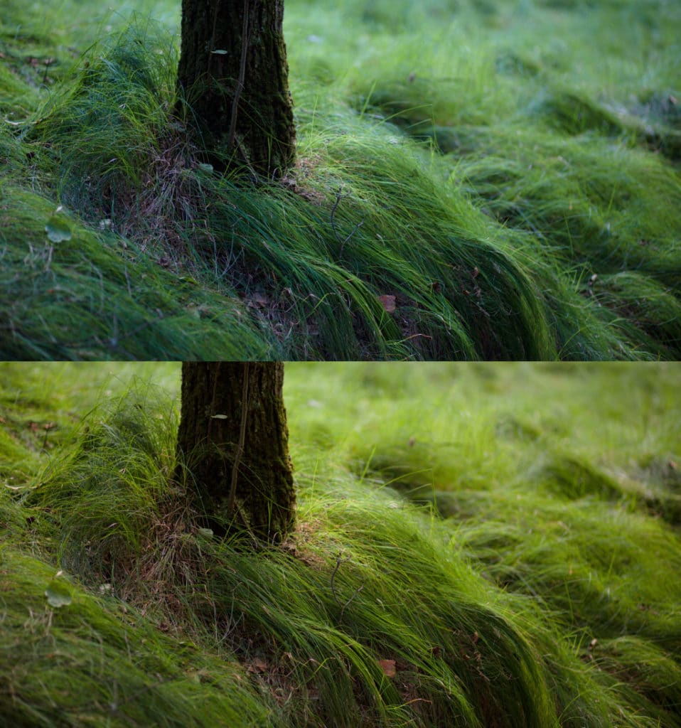
Canon 5D Mark III, Canon EF 85/1.8, 1/80 s, f/8.0, ISO 500, focal length 85 mm
I mention color temperature first, because if you’re shooting to RAW, then you need to make this correction right at the start to avoid an unnecessary loss of quality. (For more about this issue, read our article on the benefits of RAW). In Zoner Studio, starting in version 18, this work is done in the Develop section, using the very topmost slider: White balance.
If you are shooting to a different format than RAW or have already made changes in the Editor, you can always change the color temperature there as well. For, roll down the menu, go to the Adjust menu and choose Adjust Color Temperature….
2. Gradient Filter
Using the Gradient Filter on a photograph is an extremely important step. That’s because photos often have dark land and a light sky. (Note that no matter what, you can’t save a sky with blown-out highlights—pure-white blobs in the whites.) You can brighten the land using the Gradient Filter (click the Gradient Filter in the Editor or press Shift+G). Use this filter to lighten or darken a portion of your choice within a photo—typically the ground or sky. The effect gradually weakens towards a border line that you set, leaving the other part of the picture unaffected.
There is such a thing as physical, real-life gradient filters (pieces of glass or plastic with one half darkened; when placed against a lens they create this effect in reality). However, they are awkward to carry and use. Because of this, you may want to create this effect via software, even though it will cause increased noise in your image.
Applying the Gradient Filter is very straightforward. Its benefit is a much more “readable” picture. For illustration, here’s an edit of the beach photo from before (I chose the middle version with a temperature of 8000 K). I’ve brightened the bottom half:
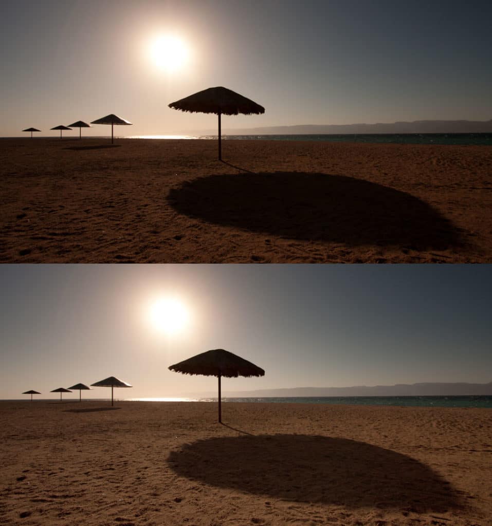
Alternatively you can instead use this filter to darken the sky. Remember my note above about how blowout isn’t fixable? I’m happy I don’t have a blown-out, pure-white sky here. If I did, then darkening wouldn’t give me the structure of the clouds; instead of a white half of the picture, I would just have a gray half.
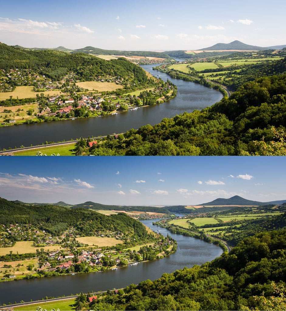
Canon 5D Mark III, Canon EF 16-35/2.8 II, 1/50 s, f/9.0, ISO 100, focal length 31 mm
3. Color Contrast and Saturation
I increase contrast and saturation in practically every landscape photo I shoot. The easiest way to do this in the Zoner Studio Editor is to use the Enhance Colors function in the Adjust menu (or the Ctrl+1 shortcut).
It’s best to adjust Contrast first because changing contrast alters saturation (…always; not just in this case). Only after fine-tuning things do I move on to increasing saturation. For this, I don’t jump straight to Saturation; I first go to Vibrance.
Vibrance is the gentler kind of saturation edit. It too saturates colors, but it concentrates on the ones that weren’t already saturated. Thanks to this, the colors that already started out saturated don’t blow out and I don’t get the extremely saturated, “poison” tones that the Saturation slider can sometimes produce.
If my image also contains people, then I have to be careful with my edits, so that the people don’t start changing color or getting over-sharp features. But if there’s nothing but nature in a picture, I can really push the settings to the extreme. In the following edit, the Contrast slider was set to 45, and Vibrance was set to 140 percent.
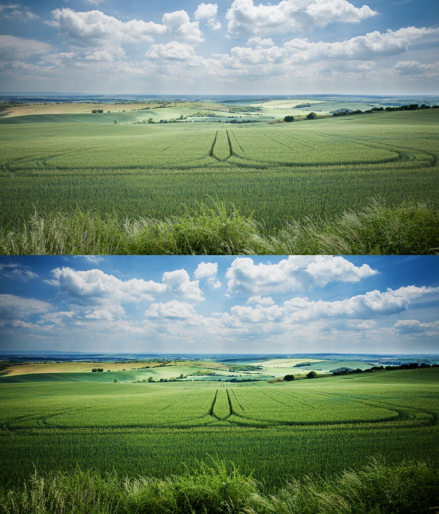
Canon 5D Mark II, Canon EF 16-35/2.8 II, 1/100 s, f/8.0, ISO 200, focal length 19 mm
Here’s one more tip concerning not just this edit, but others too. The best effect strength can be hard to guess, and meanwhile, effects are precisely the thing that can make your photo stand out among others on the Web. Because of this, I sometimes work the sliders “backward”—I move the given slider to the maximum value and then back towards zero until I find a value that’s still usable, but isn’t overdone. You see, when I go the normal route, starting from zero and moving upwards, I can get shy and stop early. That does give me an effect that’s stronger than my starting status, but it’s one that could easily still be stronger.
4. Sharpening
Just like with contrast, sharpening too makes a picture bolder overall—just in a different way. And it’s not bad to combine the two. For sharpening, visit the Editor, roll down the menu, go to Adjust, and use the Sharpen item. For more on how exactly it functions and what you can expect from it, read our article on the three kinds of sharpening (you’ll appreciate the part on creative sharpening the most).
But you can use this function quickly even without studying up first. You only have to keep in mind that you need to set a small effect strength (e.g. 40 percent in the example below) and a high Radius (in the example it’s 200 pixels, which is a lot, but I worked with a much higher resolution than the one used in the end in the article). The Threshold is for fine tuning. You usually don’t need to waste time on it and can just leave it at 0.
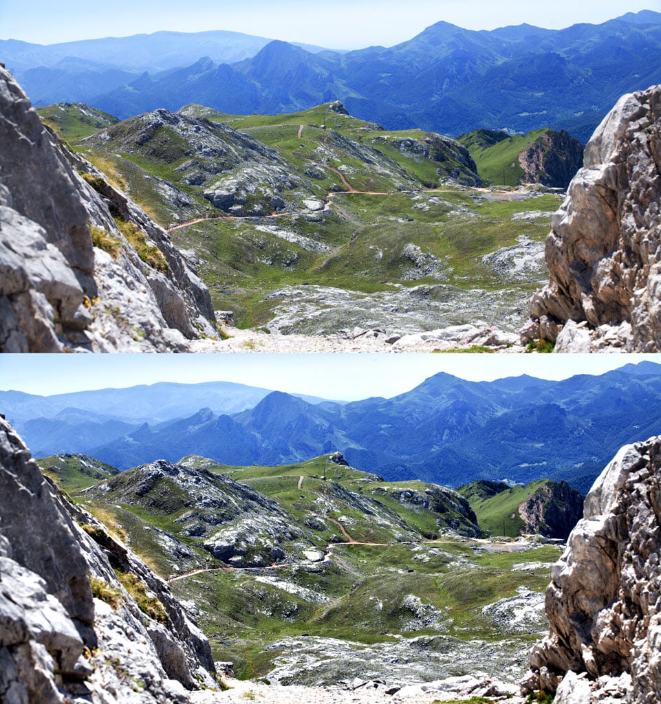
Canon 5D Mark II, Canon EF 70-200/2.8 II, 1/80 s, f/11, ISO 500, focal length 100 mm
5. Selective Brightening and Darkening
Selective brightening and darkening are more complicated. I don’t always use it, but it can emphasize exactly what you want in a picture while suppressing the uninteresting parts. There are a couple of ways to do it; my way makes use of the Effect Brush (from the Editor’s toolbox or via the E shortcut key).
It just takes a few strokes with this brush, using a large radius and a blurred border, and you’ve got your change. The rocks in this picture have been darkened to keep them from sticking out too much. This originally evenly-lighted photo now highlights the water instead.
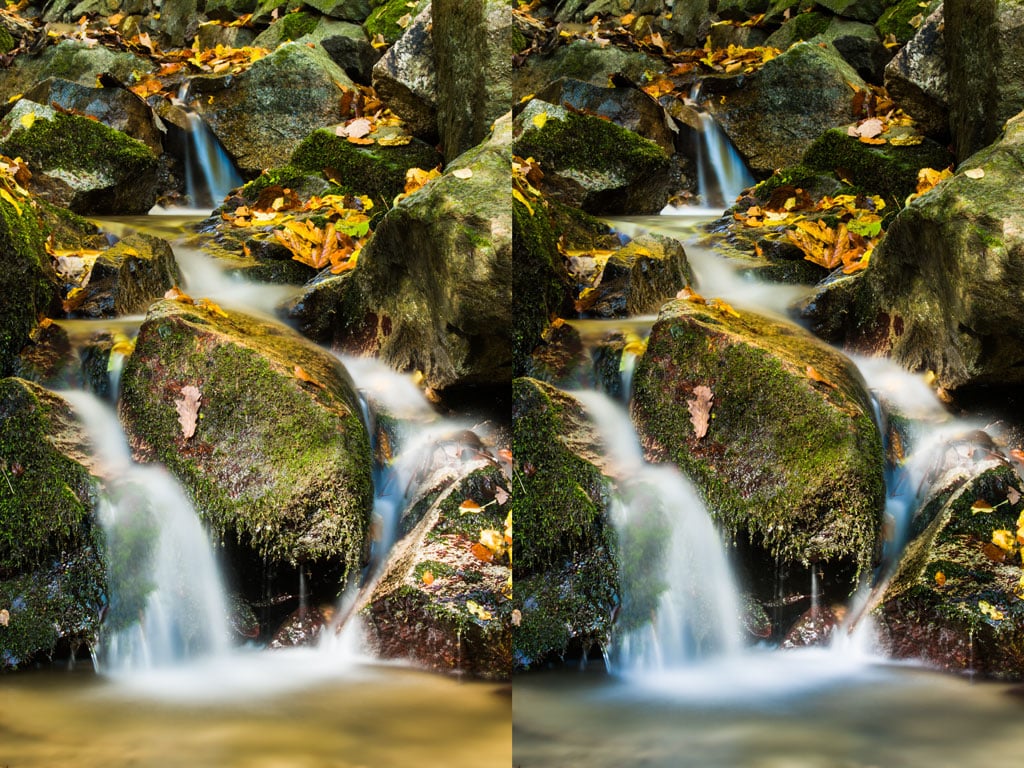
Canon 5D Mark III, Canon EF 70-200/2.8 II, 30 s, f/20, ISO 100, focal length 88 mm
In this seaside photo I’ve similarly darkened the sand and brightened the deadwood:
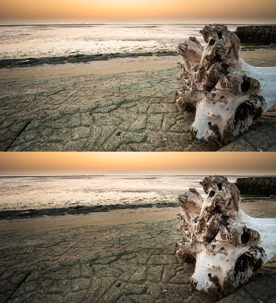
Canon 40D, Canon EF-S 10-22/3.5-4.5, 1/13 s, f/5.6, ISO 200, focal length 10 mm
Good Results in Good Time
If you leave your photos almost untouched, it’s a shame—you’re missing out on your potential. Reach boldly for these edits, and you’ll see how they enhance your photos. You’ll only need a little time, and your pictures will suddenly tell a whole new story.
Do your nature photos need edits like these? Download Zoner Studio, try it free for 7 days and push your photos to perfection.
