6 Edits You’ll Do Better to Avoid
We usually give you tips on what you should do when editing your photos. This time we’ll work from the opposite end and show you some edits that are best avoided. We’ll be talking about edits that you often see out there, but it’s best to stay away from them. What are they, and how can you do things better? You’ll learn all this in today’s article.
Few of your photos can get by without edits in Zoner Studio, but too much editing is a problem too. It’s always smart to keep thinking about when your changes are still a net benefit, and when they’ve crossed the line. Take a look at our selection of editing’s biggest missteps.
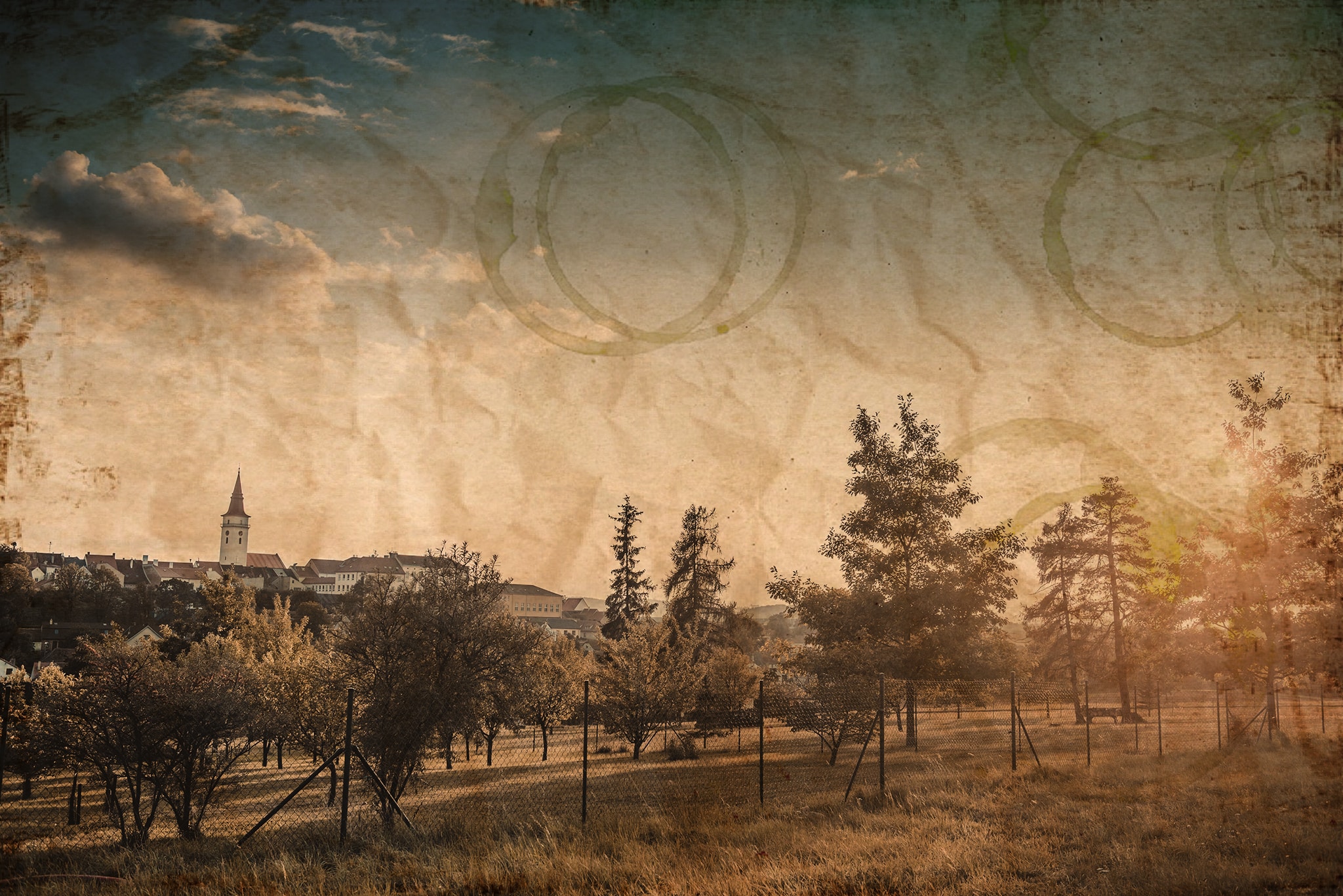
An Overdone Retro Look
There’s nothing wrong with adding an old-paper texture to a photo, and it often makes that photo look livelier. But the problem comes when you overdo it and the antique-photo effect is the only thing your audience notices. The photo’s actual contents then fade away completely.
Making Photos “Dreamlike” by Reducing Clarity
The Clarity setting is a great tool, and it can highlight many of a photo’s details. But what usually doesn’t work is to drop Clarity into the negatives to get a “dreamlike” look. Excessively high values for Clarity can cause trouble as well. As with every edit, the golden rule is: don’t overdo things!
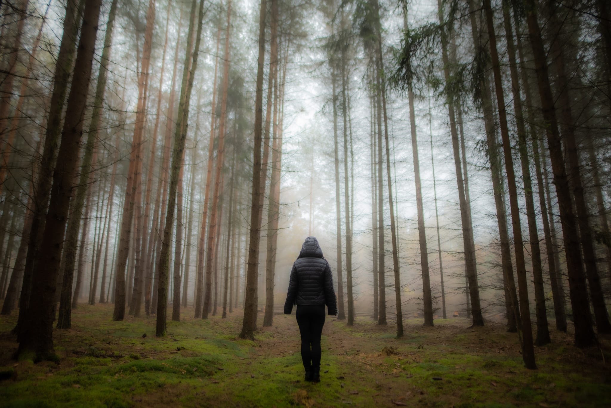
Used right, Clarity is an essential aid to your photography. Learn how to work with it, and you’ll know how to use its potential to the maximum.
Overly Sharp Eyes and Zombie Whites
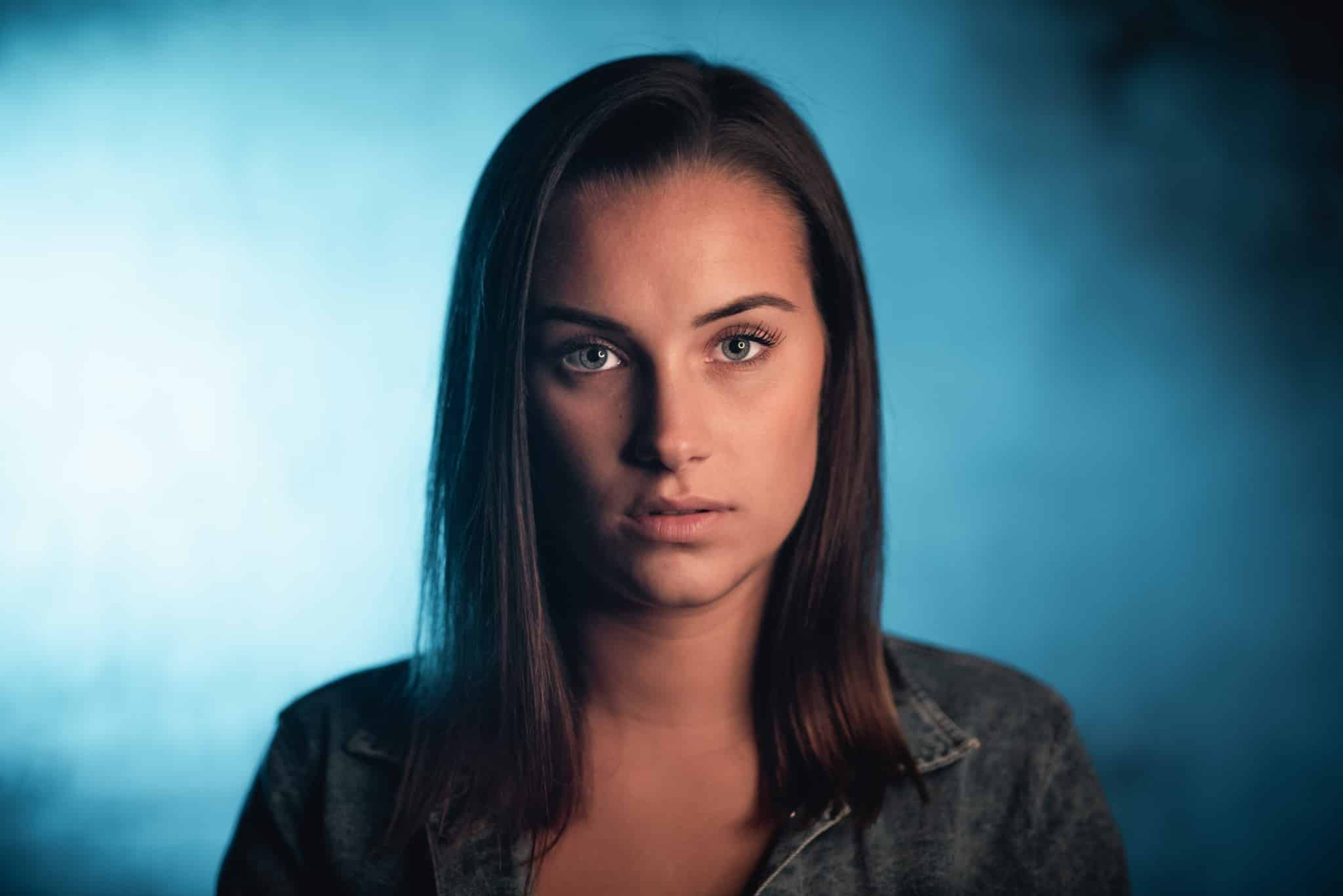
Taken together, brightening and sharpening of the eyes are a very common edit, and one that usually benefits a portrait. But only as long as it isn’t overdone. If the subject’s eyes shine too brightly, it makes them look sick, or even like a comic-book character. These overdone edits have no place in a traditional portrait.
The Best Retouching is the Retouching You Can’t Notice
Excessive retouching and an absolute loss of details—that’s one of the most frequent mistakes in portrait editing. Go too wild, and you’ll often get a picture that looks like you shot it on a smartphone. Phone camera apps are where you’ll find “beautification” effects that iron out everything but the eyes. Whether you add that kind of effect on a phone or do the same on a computer, don’t overdo it. Nobody looks good as a wax figure.
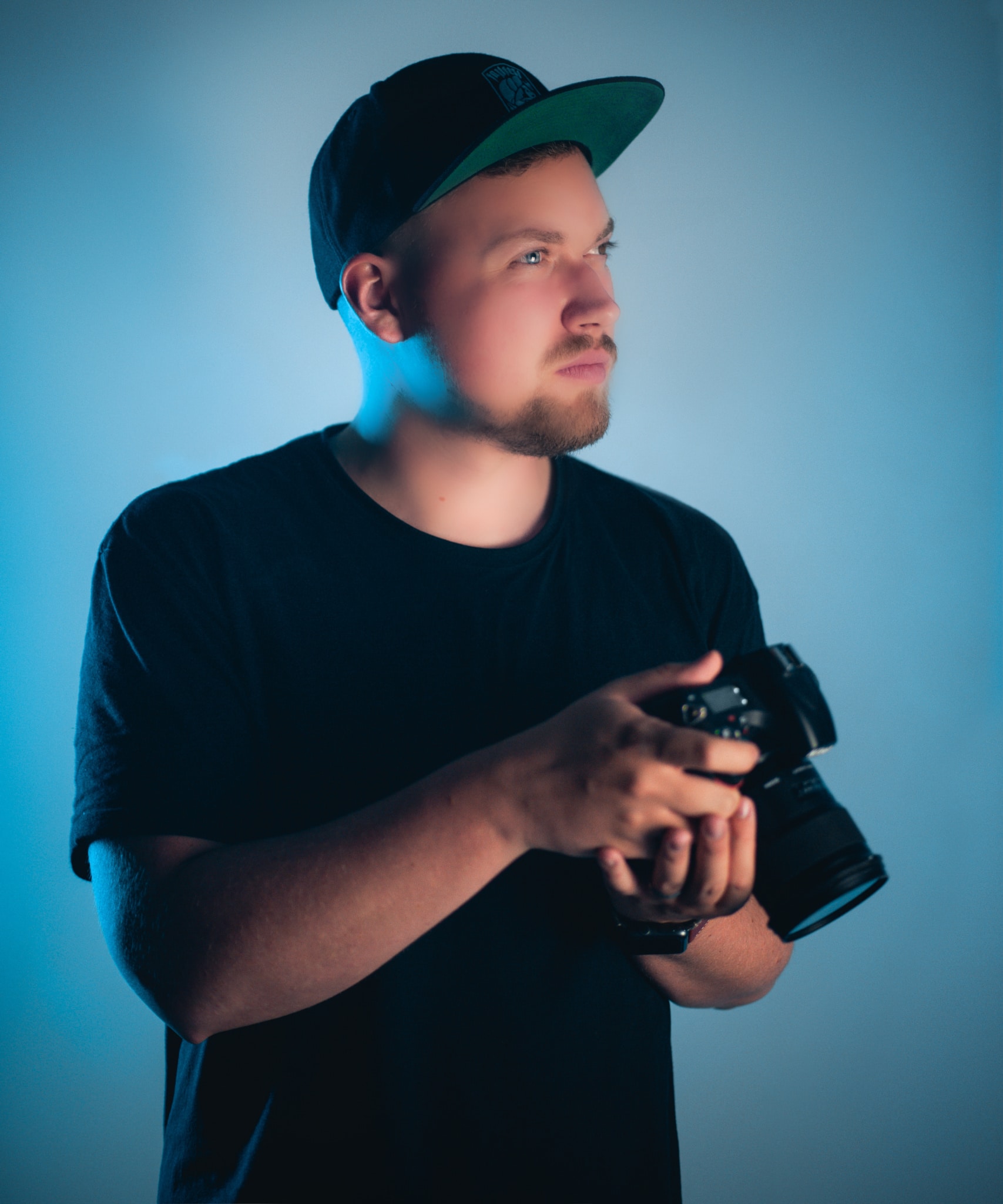
The last two kinds of retouching can be handled in Zoner Studio far better than this. Learn about the right way to retouch a portrait and avoid beginner’s mistakes.
Fake Bokeh Isn’t Bokeh
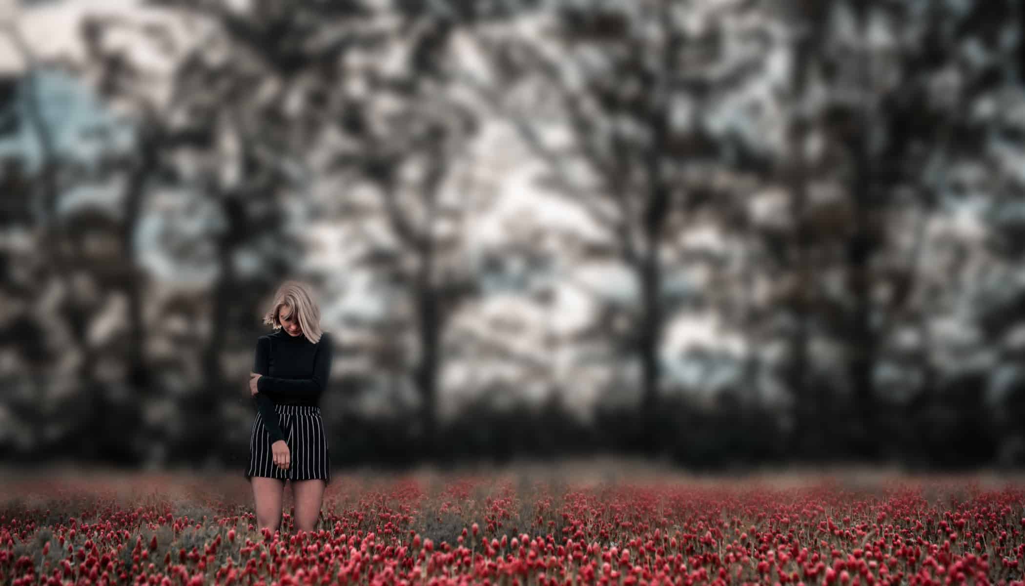
Artificially blurring a background can sometimes be useful. But if you can tell at first sight that it’s artificial, that it’s not natural from the lens, it will likely hurt rather than help. Mistakes here tend to most often be visible through clumsy blurring of the background right around the subject or their hair.
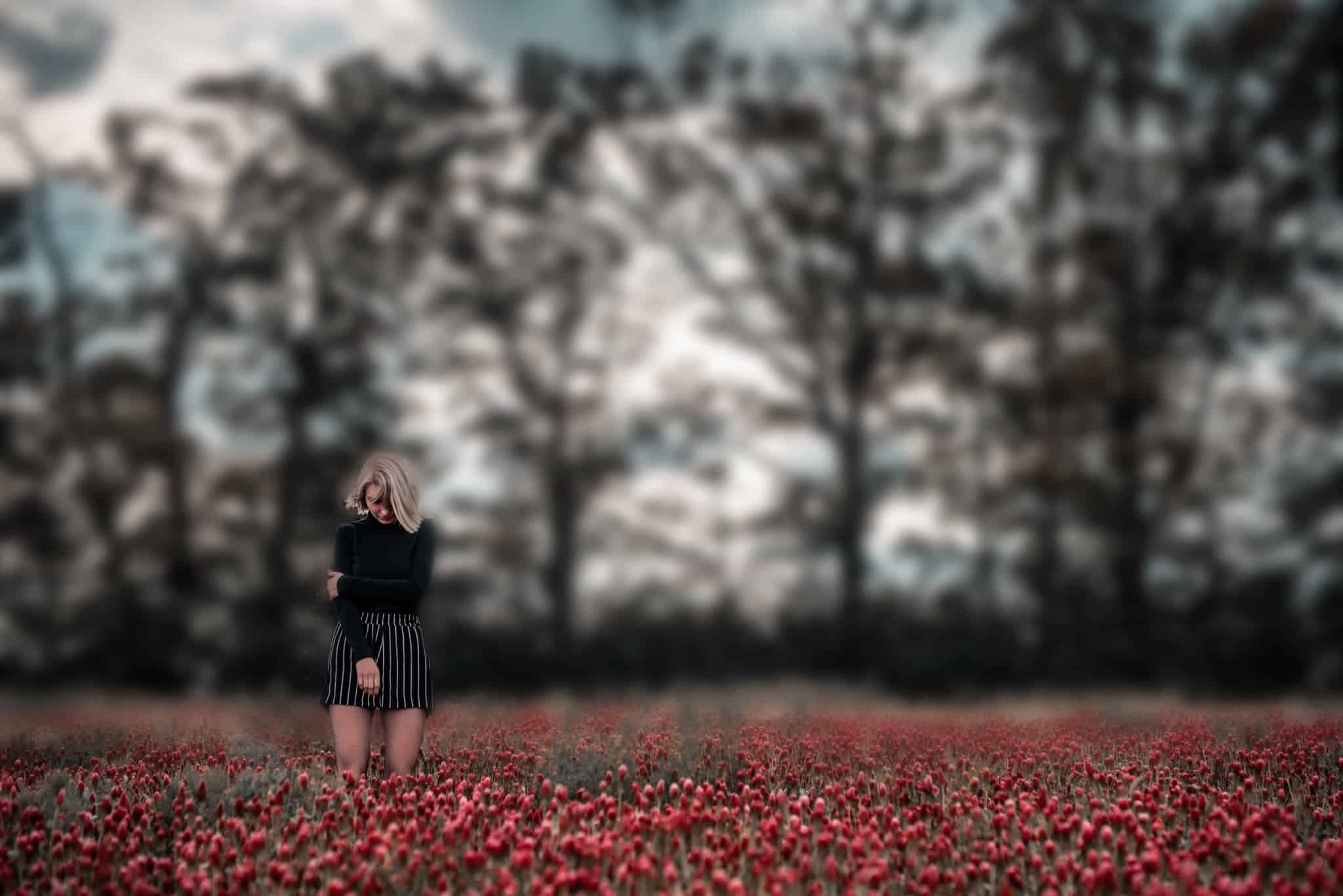
It’s true that blurring a background can sometimes be useful. But you should always think hard about when and how much you should use it. When you overdo it, the results tend to look bad.
Unnatural Textures Won’t Save a Photo
And last but not least, let’s look at particle effects. Snow, rain, fog, sunshine… all these effects can really give a photo the right touch when used right. But if you take a rain and sun texture and thoughtlessly slap it onto a photo, that will be noticeable, and it will hurt rather than help.
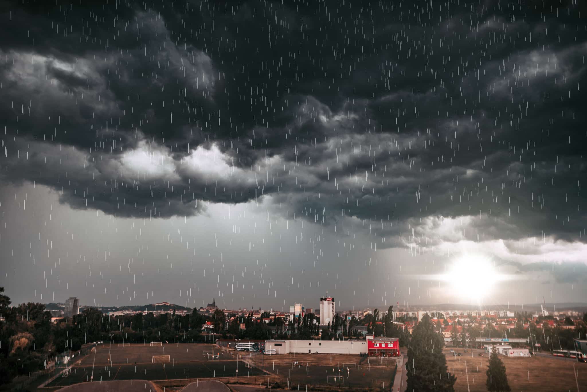
When applying textures to your photos, try playing with different blending modes, for example. You’ll see how fast this can give you a better picture.
Every Edit Has a Use, But They All Can Be Taken Too Far
Our list here is not by far complete, and you’ll definitely find a lot of other examples that could have gone into this article. Do you know any edits that you feel would belong here? Let us know in the comments.
And don’t forget to download Zoner Studio, try it free for 7 days, and use it to create something better than the edits shown here.