5 Ways to Enhance Contrast in Your Photography

Enhancing exposure and contrast in your photos are among the most basic adjustments. There are many options for adjusting exposure and contrast in Zoner Studio. You can choose between several possible techniques for contrast alone. Check out these techniques and get rid of dull images once and for all.
Contrast adjustments are an integral part of photo editing in the Develop module. Contrast helps photos pop and helps the main subject stand out. In this article, we’ll take a look at a few basic ways to enhance contrast. They are:
- AI Automatic enhancement for exposure
- Sliders in the Exposure section
- Clarity and Texture
- Curves
- Tools for local adjustments
1) Quick and easy: Automatic enhancement
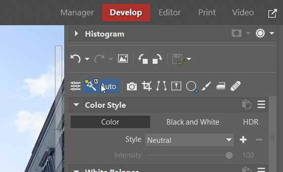
For less demanding adjustments, AI Automatic enhancement can be enough. You can find it in the toolbar of the right panel of Develop. AI Automatic enhancement automatically evaluates the image’s exposure and automatically applies various adjustments, including contrast. All sliders can then be manually adjusted.
In addition to exposure and contrast, AI Auto enhancement also affects other settings, such as color. All changes are non-destructive so you can always return to the original.
Zoner Studio does all the adjustments for you. Occasionally, you need to tweak the adjustments, but that was not the case here.
2) Exposure sliders
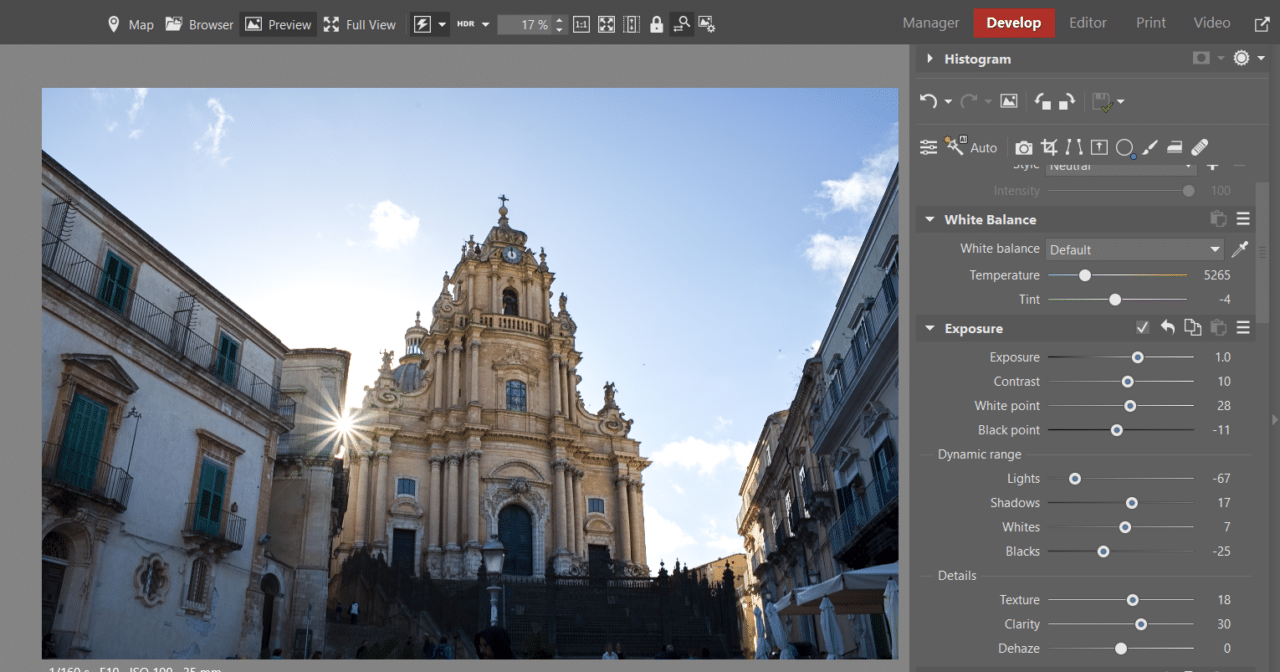
The exposure sliders are found under Exposure in the top part of the right panel of Develop. Sometimes, you only need to adjust the Contrast slider. Other times, you need to adjust the White point, Black point, Lights, Shadows, Whites, and Blacks sliders. Use these sliders to apply adjustments to the dark and light parts of the image separately to help bring out low-contrast areas.
3) Curves
Working with curves is slightly more complicated, but pays off and gives you better results. Click in the graph and a point appears that you can move to set a new value.
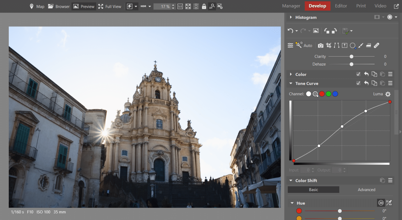
To see how useful curves can be, create three new points that divide the curve into thirds. Move the first one a little lower, and the second and third higher to create an S-shaped curve. You’ll immediately see the contrast in your photo increase.

For more detailed instructions on how to work with curves, check out the video in the article VIDEO: Tone Curve—3 Practical Tips. You’ll see that it’s not as hard as it may seem at first glance.
This adjustment was made using the S curve. Before that, I slightly increased the Exposure slider to make the original photo less dark. Then, adjusting contrast using the Tone Curve was a piece of cake.
4) Radial Filter
The Radial Filter (R) is found in the top toolbar of the Develop module. Working with the Radial Filter is not as quick as the previous adjustments, but it gives you complete control over which parts of the image are affected by the adjustments. You can use it when you want to highlight a certain element in the photo and darken the background.
When you select the Radial Filter, the mask is automatically enabled. Click and drag to select the area you want to adjust. In the image below, I masked the cathedral. Then, brighten it and add more contrast if needed.
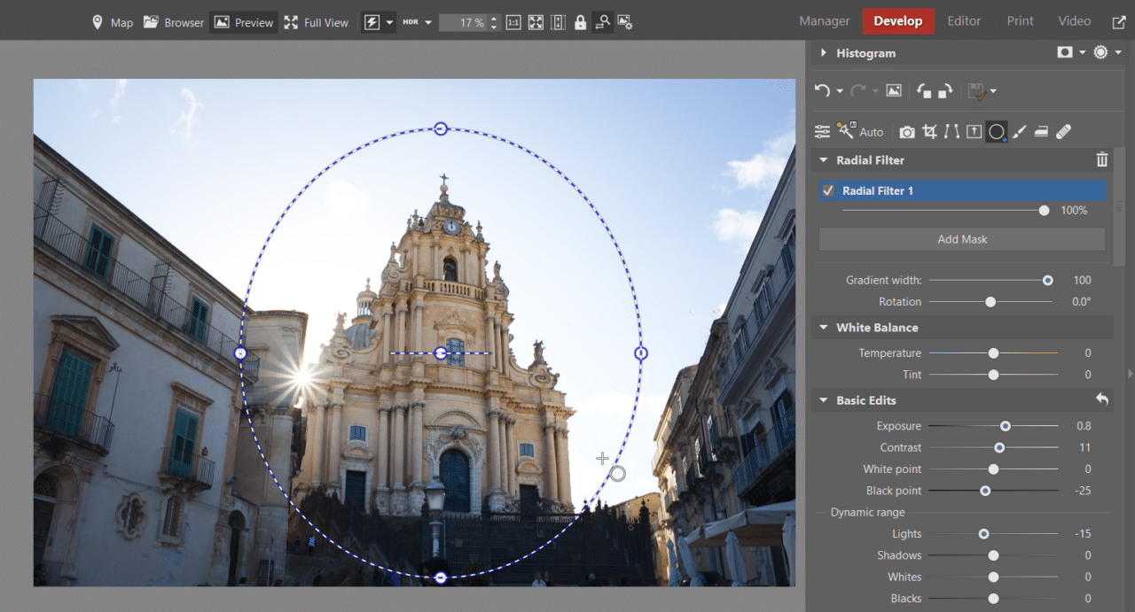
For local adjustments, you don’t have to only use the Radial Filter (R). You can also use the Filter Brush (B), which you can find next to the Radial Filter. You can use it to easily select an area or object of any shape that you can draw using the Filter Brush.

If there are faces in your photos, you can also use AI presets to adjust contrast and other settings.
5) Clarity and Texture
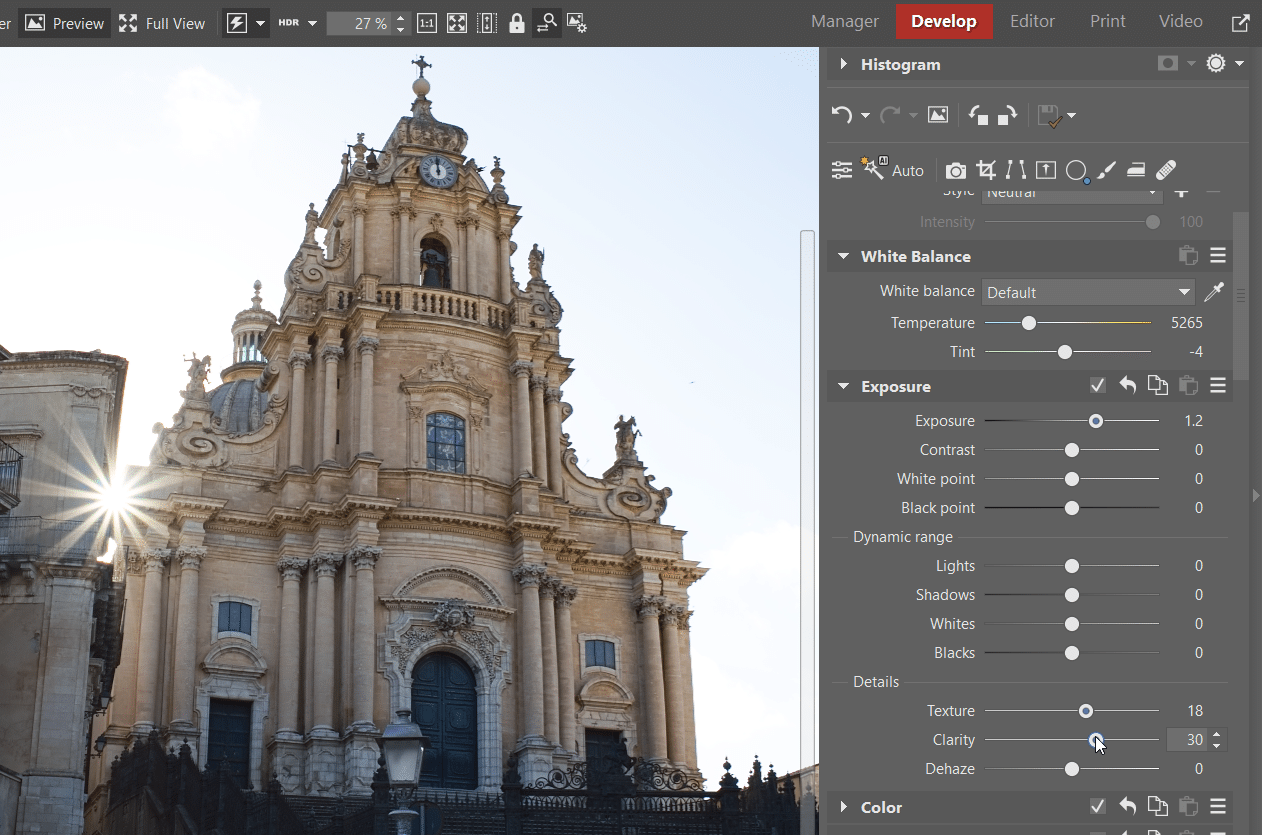
Finally, let’s go back to the beginning—to the sliders in the Exposure section. This is where you can find Texture and Clarity under Details. Unlike Contrast, these sliders affect only local contrast, which is also why we’re including them at the end of this article.
Texture and Clarity affect places where there are distinctive features, such as the edges of objects. They differ in how softly or sharply contrasting edges are adjusted. Clarity adjusts larger contrasting edges, such as the edges of objects, while Texture adjusts fine textures, such as grass and sand.
If you‘re editing portraits, it’s a good idea not to overdo it with these sliders. This is because they also accentuate facial features that many people would rather have subdued, like wrinkles or acne. When editing photos that include buildings or landscapes, we can increase Clarity and Texture.
For comparison’s sake, I am using a smaller cutout from the photo so that the highlighted details are visible.
Now you are familiar with 5 ways you can enhance contrast in your photos. The ones you choose to use are up to you. Give it a try on your own photography. Download Zoner Studio free for 7 days and gain access to all these features limit-free. Say goodbye to dull photos with no contrast!
