How to Use Curves to Adjust Image Exposure
The Curves tool is a hugely important tool for photo editing. Though complex at first glance, it’s simple after that. Soon proves itself a powerful tool for a wide range of uses. Use it to fine-tune contrast, brighten or darken a picture, highlight low-visibility objects shot against the light, and more.
How Does The Curves Tool Work?
Put broadly, what this tool does is to let you replace a picture’s original brightness distribution with a different one. It processes each pixel independently, without any analysis of the whole picture, making this a fairly simple global edit.
All you have to do is to click in the graph to shape the curve (the function). It divides up input pixels based on brightness and assigns them new brightnesses based on that.
The Zoner Studio Editor offers the Curves tool via Menu > Adjust > Curves (or via the Shift+C keyboard shortcut). But you can also work with Curves in the non-destructive Develop module—in its Tone Curve section.
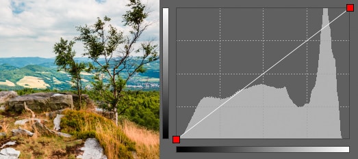
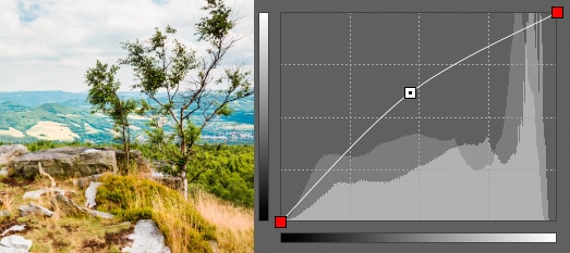
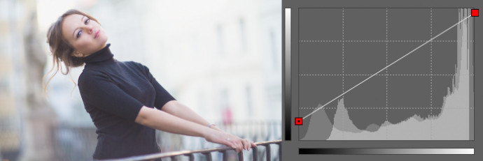
In the beginning the curve looks like this (on the left you can also see the picture whose exposure is being reshaped):
The “histogram curve” is a line that you can grab and shape. Zoner Studio looks at the way that you shape it. Than Zoner Studio uses that to turn different input brightnesses for dots in the picture into different output brightnesses. The input, or starting brightness of a dot—a “pixel”—determines its position on the horizontal axis, and based on that position, the program looks for a position on the curve’s vertical axis. Our main interest will be the vertical axis. The higher up you go on that axis, the brighter a pixel becomes.
The neutral curve that you see at first doesn’t change the picture in any way. It’s a simple diagonal line that says that a pixel’s new brightness will always be the same as its old brightness (it basically says y=x). Again, this is the curve you see when you start editing, and it makes a great foundation.
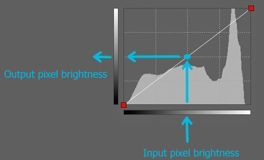
When you’re working with Curves in the Editor, you can see a “histogram” in the background of the graph. The histogram shows the distribution of brightnesses that Curves will produce, from the darkest to the lightest parts, and with midtones in the middle. If you haven’t learned to work with a histogram yet, then you can read more about them in our article on how to read a histogram.
This histogram is shown for your information; it doesn’t directly affect how you work with the curve. Use it to immediately see the range of brightnesses that will be in your picture with the current curve. You also see, whether you should brighten it or darken the picture (and by how much).
Adding Nodes
Each click on the curve adds a node to it. You can grab and move each node to change the course of the curve and thus the brightnesses in the photo. The result is visible immediately. To remove a node, just right-click that node. You cannot remove the far right or far left node.
This is, in a nutshell, how you work with Curves. You can use this simple foundation to achieve a huge variety of effects. In practice, the complicated part is just in the details of how much to move what nodes where.
In the following lines, I’ll show you a few examples of the way that Curves is commonly used.
Darkening/Brightening Pictures
Above all be aware that you’re working with a specific range of pixel brightness values—typically from 0 for a completely black pixel to 255 for a completely white one—and that you can’t go outside of this range.
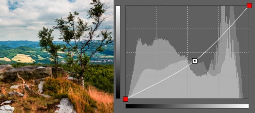
So although you can take the naive approach of brightening all pixels by e.g. 30 just by moving the endpoints, this will move all values over 225 to a value of over 255, which will be “capped” down to 255, making them all “melt together,” creating a big white blob on your photo. You can see this effect in the clouds in the photo below.
On the opposite side of the spectrum, for dark tones, we’ve raised the value of 0 up to 30, which does have a brightening effect. But it pointlessly robs us of the values 0 through 29, reducing the picture’s contrast, and making it feel flat (although that can also be done deliberately).
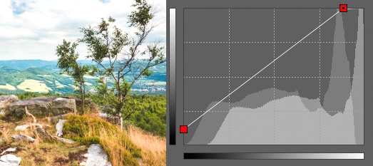
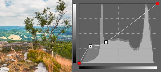
Overall this primitive approach doesn’t do what we might expect. A typical smarter curve for adding brightness looks like this:
This time we left the endpoints in their original places—that means that pixels with values of 0 and 255 will still have those values when we’re done. But we’ll change the course the curve takes between them by adding one extra node. The brightness of the very dark and very bright pixels will change only slightly, while the middle values will change much more significantly. This time tones won’t blend together. When moving the added node, you instantly see what kind of change it will cause, and then all you have to do is stop when you’re satisfied.
Everything works in a similar way when darkening a photo; you just drag your new node down instead of up.
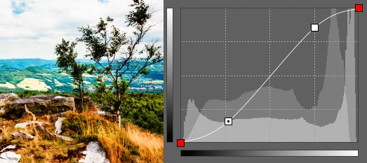
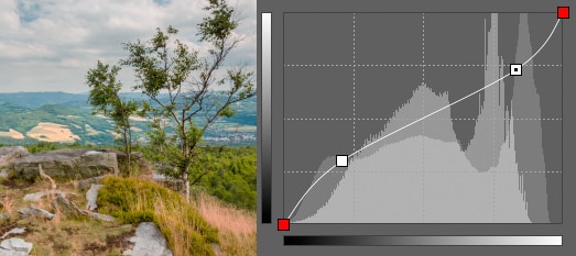
Limited Brightening
The real power of Curves lies in the fact that you can add multiple nodes for a more precise definition of how the curve will behave. For example you can decide that you mainly want to brighten dark tones while leaving bright tones bright. For this, add a node for brightening, this time in the dark tones only, plus a second (and maybe third) node to put the curve back in place, so that in the bright tones, the curve is on its original course—the one that means “no changes.”
To keep you from having to just guess a specific pixel’s brightness, Curves has an eyedropper tool with which you can click on a place in a photo to automatically create a node for its brightness level.
Changing the Contrast
To raise contrast, use a similar approach to the above. Divide the curve in your mind into two parts. Work with each part separately—use two added nodes to brighten bright tones more and darken dark ones more. This increases the difference between them and makes the picture look higher-contrast. This gives the curve a shape that is called the “S-curve.”
Here again you can dive into editing and precisely fine-tune both nodes or the path between them. You wouldn’t be able to do that with just a simple “Contrast” slider.
When reducing contrast, the core principle is the same; this time you just darken the bright tones and brighten the dark tones.
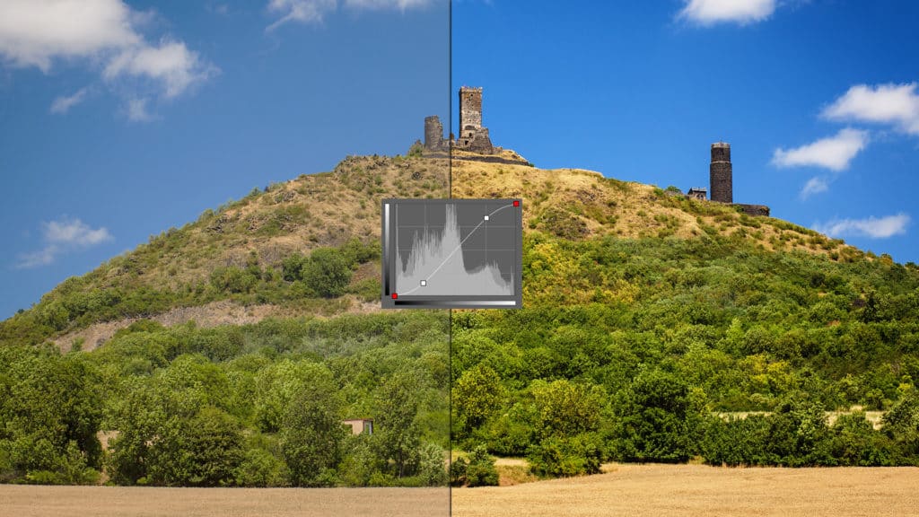
Stretching the Histogram
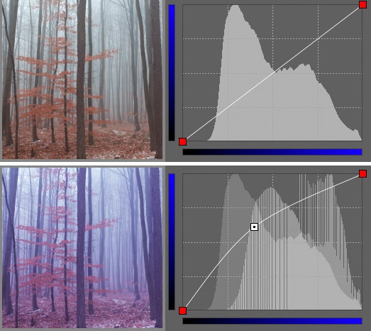
When you take pictures from a long distance or against the light, the pictures can end up very light, making the objects in them hard to see. You could definitely increase contrast here like in the last section, but there is also an alternative that is more direct and closer to what you really want to do. Here’s a photo on which we’ll be using Curves to make low-visibility objects stand out more:
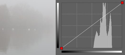
It has brightness values ranging from 100 to 150. We need to stretch it out to use the whole available spectrum (i.e. from 0 to 255). We’ll use the best way to do that, which is: reduce the 100 value down to 0 and raise the 150 value to 255. Everything between those values will be recalculated smoothly. The result is below:
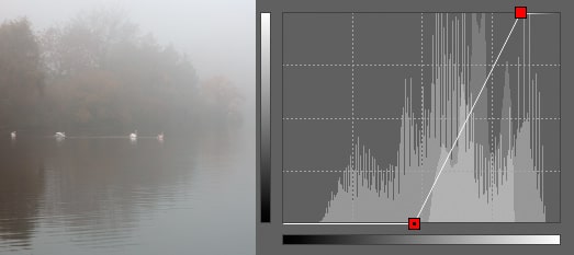
In many cases, stretching out all the way to the limits doesn’t look good, and so you’ll want to fine-tune the curve instead to get an eye-pleasing compromise. With this edit ready, you can also adjust the actual contrast, using some added nodes.
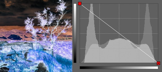
Compressing the Histogram
Curves can also do the opposite, that is, they can bathe what was originally a high-contrast photo in a light mist. This can give a picture a melancholy feel and free it up a little from the terse perfection of digital devices.
Inversion
You don’t have to stick to just normal shapes. You can also easily perform do things like inversion—i.e. replacing the picture’s original brightnesses with their opposites. Because this operation is performed independently on all three color channels (red, green, blue), the result is a picture with colors that are the opposite of the original. While inversion is rarely useful directly, it can be useful for special effects such as blending one picture into another, etc.
Each Color Channel Separately
So far we’ve only discussed changing pixels’ overall brightness, but you can also work with pixels’ three color channels separately. In the “Channel” list above the curve, you can choose between red, green, and blue (or all three together—which is what you’ve been doing up until now).
So it’s not a problem to intensify just the blue channel, giving a picture a blue tint:
Countless Possibilities
The techniques described are simple in principle, and also universally useful, since they can be customized for each individual picture. There are many possibilities for fine-tuning photos in Curves.
In a future article, we’ll describe how to use Curves for more complicated color toning. For now, just see what you can do in your own experiments!