Tint Your Photos Using Curves
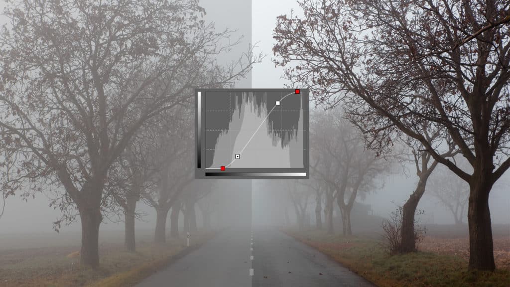
There’s a simple way to tint your photos, and that way is to work with the Curves tool. The Curves tool, found in photo software like Zoner Studio, is more than just a great way to tweak exposure. You can also use it for color toning. In this article we’ll show you how to use the Curves tool to adjust photographs’ color tones, for a better atmosphere and more artistic impact.
We’ve covered work with the Curves tool in Zoner Studio in an earlier article. If that article has passed you by, then read it first. Then if you want to get even better and take your work with Curves to the next level, read today’s article.
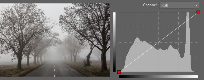
Our illustrations in this article will mainly show off work with the following photo. Here’s its original version:
A small confession: There are other tools you can also use to make the changes that I discuss below. The real reason why I chose the Curves tool for them is because I wanted to show just how versatile it can be. Once you learn to work with Curves, you’ll be able to make a variety of advanced edits all in one place.
Color Channels
In the previous article on Curves, we made a picture brighter overall, but this time we’ll focus on work with the individual color channels separately. Here again we’ll be working in the Editor, even though work with Curves is also available in Develop.
What Is a Color Channel?
In color digital photography, each pixel’s color comes from mixing basic colors in a certain ratio—these colors are generally red, green, and blue.
Although some edits work with all the pixels in a picture, if you restrict your changes to just one channel, for example red, then this is called working with the picture’s red channel. This leaves the picture’s blue and green elements (the blue and green channels) completely untouched.
In the examples below, we’ll be working separately with the picture’s red, green, and blue channels. To select a particular channel, use the list just above the curve graph.
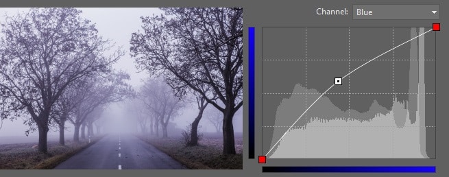
If you brighten the blue channel, the picture will visibly become bluer, giving it a clammy, mysterious feeling.
From Blue to Yellow
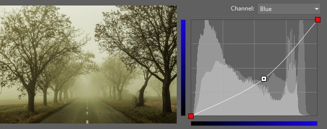
The opposite shift is also useful. That is: darkening a channels, say the blue channel, suppresses that channel, and the opposing color starts to appear in its place—for example yellow.
Work with the other channels works similarly:
Suppressing red—the image moves towards blue-green.
Suppressing green—the image moves towards purple.
Suppressing blue—the image moves towards yellow.
In the last example the yellow isn’t quite as pretty as you might expect. That’s because the adjustment to the picture has also given it a mild green tint—which is a good opportunity to switch to the green channel and slightly suppress it as well:
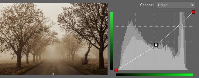
Neutral Sepia
Our last picture variant is very close to what’s commonly called sepia. This is a brownish photo that feels historical. However our sample picture does contain some of its original colors.
It’s a step away from “real” sepia—all we need to do is to convert the whole picture to black and white (e.g. by using the Effects menu’s Grayscale item) before using the curve adjustments described above. In this case, and with an image this small, the difference in results is small, but sometimes it can be very significant.
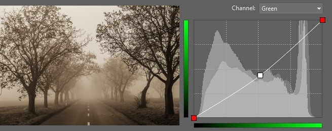
There’s no way to say that one version is right and the other wrong; the artist’s own vision is the important thing.
There’s also no reason not to just desaturate a picture instead of going all the way to black and white. For doing these experiments in Zoner Studio, the ideal tool is the Develop section, which unlike the Editor lets you work with both curves and saturation in one place, and also offers non-destructive editing. So if you later decide to edit or alter an effect, it’s no problem to do so automatically and with no loss of quality.
Two Tones
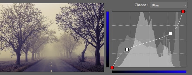
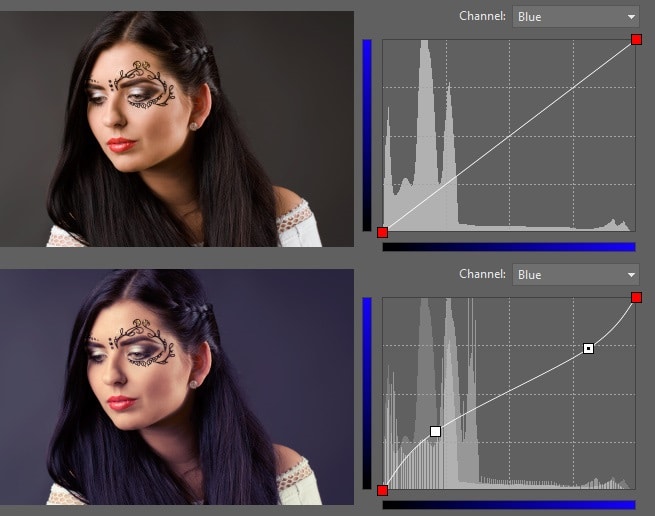
Toning a picture a single color is one possibility, and it’s an impressive one, but my favorite trick is two-color toning. Just as we increased the contrast in the previous article, this time we will adjust one of the channels to strengthen it in the shadows and suppress it in the lights. Our biggest change will be to the blue channel, pushing shadows towards blue while light tones are pushed towards yellow. The result is more sophisticated than a mere shift towards one color.
To illustrate the fact that this also works with other photographic subjects, I’m including an example of a studio portrait that originally had a gray background. It’s easy to make a photo more interesting using toning. How strong the effect will be and what particular colors you’ll use is up to you. Just take this as an example of what you can do.
Reducing Light and Dark Levels
You can be even more “aggressive” with curves and instead of just darkening or lightening extreme tones, your can also crop them to a certain value. By doing this you state that (for example), the top 20% of the lightest tones will not gradually reach up to white, but instead will all have the same value in the light yellows. Similarly, you might choose to make dark tones end at a dark blue instead of fading all the way out to black. The curves for this and the result are here:
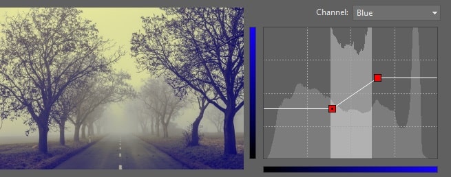
This example is deliberately overdone so that you can see its effect even after shrinking. But this effect shouldn’t be taken too far, or else there will be nothing really left of the picture—too many of the pixels will have melted into just two colors. On the other hand, used well, this effect can help you to slightly suppress imperfections in the lights and shadows. Distracting details simply disappear.
Recovering From Blowout
The trick from the last section can also be used for ameliorate sun-damaged areas in a photo. When you don’t guess your exposure right, an all-white blob appears surrounding the sun. It’s ugly and distracting, and unfortunately it isn’t always simple to truly fix it, so the alternative, simple “fix” is to have all the very bright tones changed to light yellow. You still have a huge blob, but now at least the blob is not brilliant white, and so it’s not as striking.
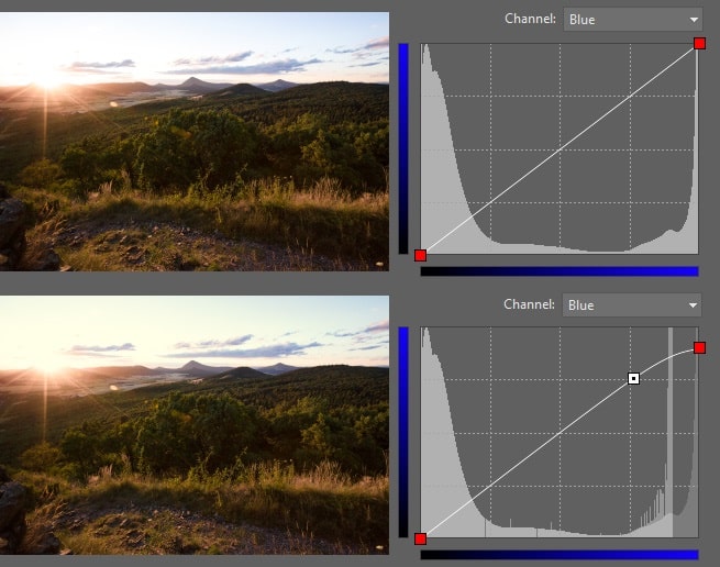
Perfection Through Experimentation
You may have noticed that the changes above required only small changes to the curve. This is generally all that’s needed for major changes to a picture—big changes aren’t useful. But don’t be overpowered by my words—do your own experiments with more radical changes in Curves. The possibilities are practically endless, so you can produce results that nobody else has achieved before.
If our words on work with Curves have caught your interest, but you don’t have Zoner Studio yet, then don’t worry—it’s easy to pick it up. Download the 30-day trial of Zoner Studio and experiment with color toning for yourself.