Colors in Photography: Everything You Need to Know About Red
Red is one of the most prominent colors in the spectrum. It can evoke a range of contradictory emotions. For some, it symbolizes romance, love, and passion. For others, it symbolizes aggression, violence, and war. But one thing is certain, this color makes you feel something.
Red is so intense that it is hard to remain neutral. For artists and photographers, its ambivalence is both a challenge and an opportunity for creativity. You can add red to different contexts and observe what happens as you play with its meaning and interpretation.

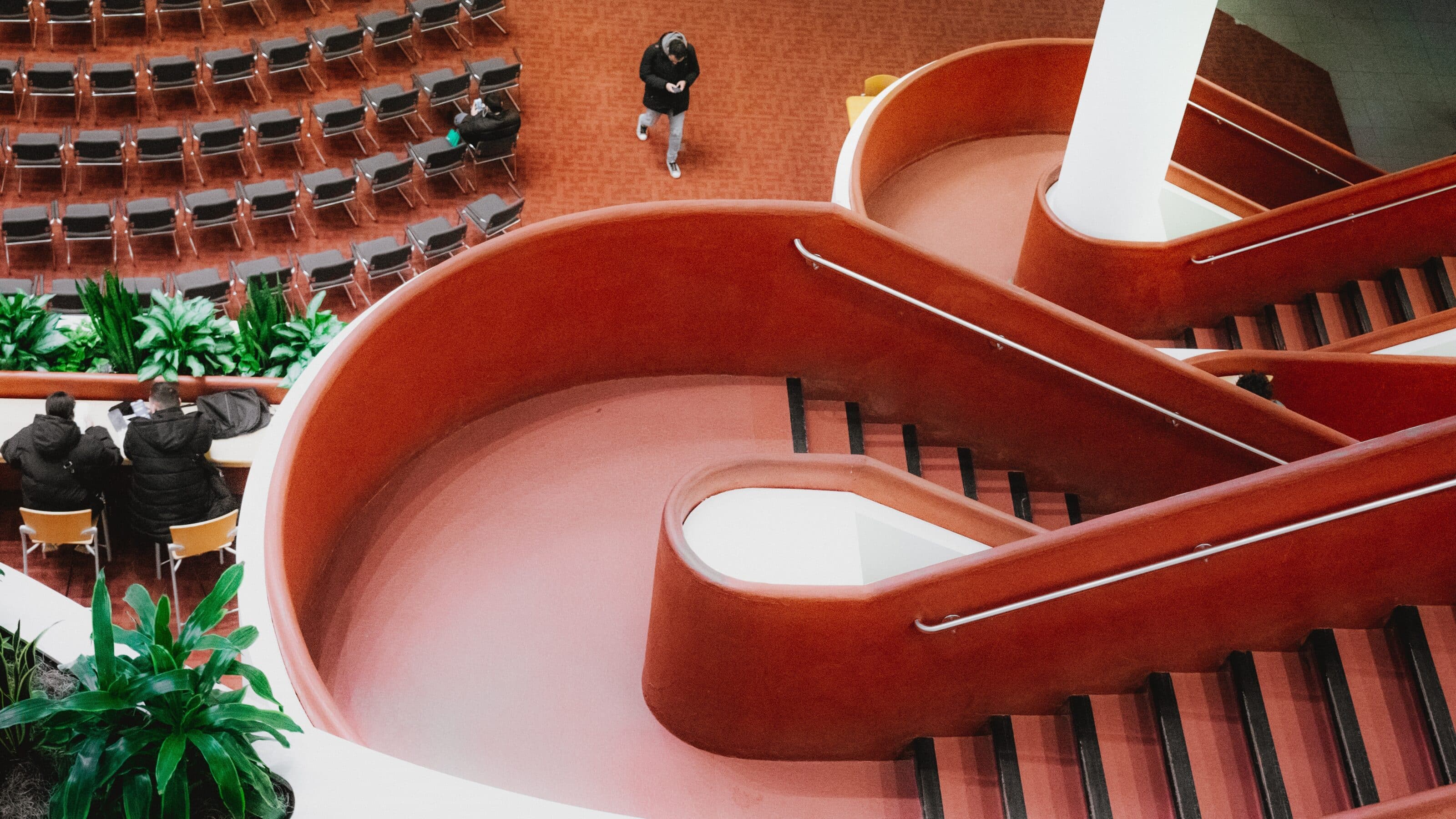
Red not only plays on contradictory emotions, but due to its intensity, it also has a fundamental place in a photo’s composition. A prominent red element in a photograph always draws a lot of attention. If this element is unimportant, this attention may be unwanted.

It’s important to be aware of how you utilize red and direct its fluctuating nature to get the meaning you want.

Psychology of the color red
I have already red’s ambiguity. Red encompasses many forms of love, but also hatred. Like its use with bulls, it can provoke unrest and aggression in others. Red also evokes dominance, competitiveness, and above all, power. Think of red luxury cars, the red carpet, or imperial robes.
The psychology behind red is influenced by the context in which you place it. This is where the opportunity to get creative comes in. For example, you can create a striking red scene that appears romantic at first glance, but conveys something unsettling.

In addition to context, the shade of red you use is also an important psychological element. Lighter red is associated with more positive emotions, while darker hues are linked with sophistication, darker emotions, and mystery.


Red in marketing and design
There’s one rule for using red in marketing and design: Be careful. The prominence of red can help a particular element stand out, but an excess of red can overwhelm the viewer or evoke feelings of insecurity and danger. You can tone down its prominence by adjusting the shades of red.


Red is often used for marketing sports, children’s brands, or food.
It evokes a sense of youth, appetite, energy, and dynamism. However, it’s not always associated with trustworthiness and stability, which is why financial institutions avoid it.
Red also influences people’s subconscious—it can stimulate your appetite. This is why you often find it in fast-food restaurant photos. When shopping, it also creates a sense of urgency and the need to complete a purchase quickly.

Red in art
Red was first used by Neanderthals to decorate their bodies around 250,000 BC. In the Neolithic period, it was used as a protective color during burial rituals.
Since Ancient Rome, red has been used as the color of love and happiness. It played a significant role in weddings, where the bride wore a red scarf to ensure love and loyalty from her husband. In China, many wedding customs associated with red and the happiness it brings have been preserved to this day.
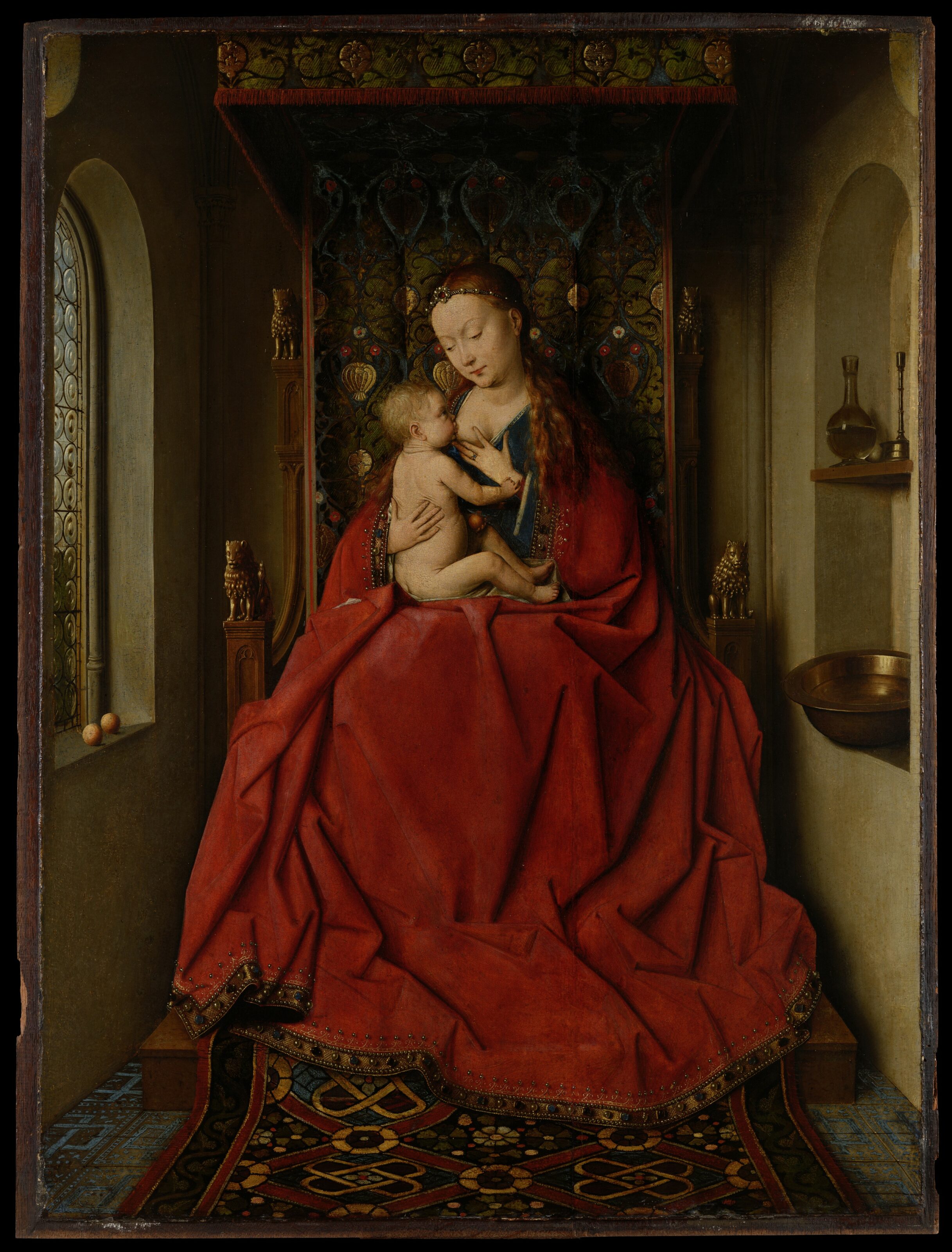
The ambivalence of red was perfectly manifested in the Middle Ages. In Christian iconography, it primarily served as the color of Christ’s blood. Significant church figures, such as cardinals, also wore red. However, it was also used to depict hell.
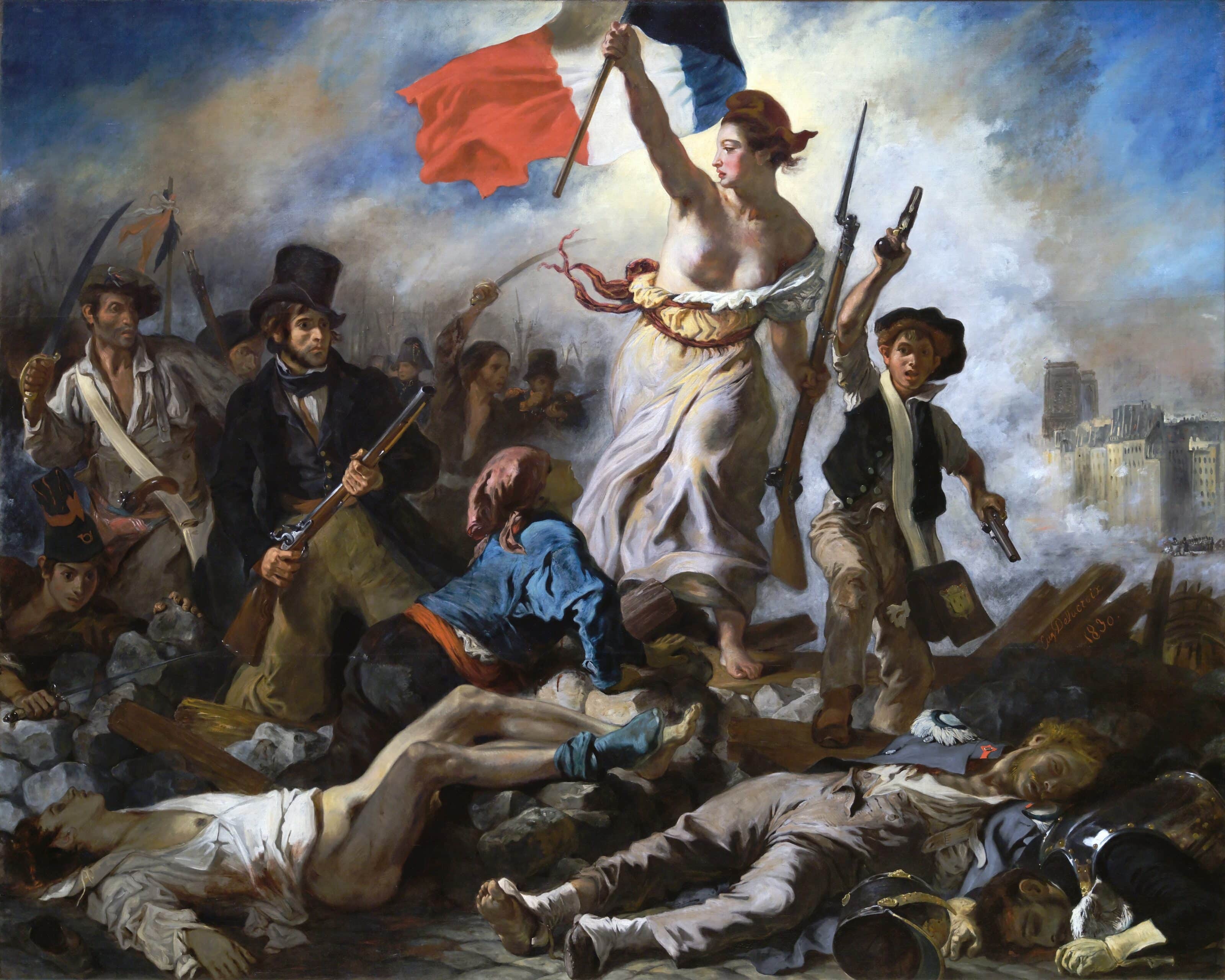
In the 19th century, after the fall of monarchies, new movements took red as their color and gave it an entirely new context. It became the color of liberation for the French Revolution, and later of communism and socialism for the Bolshevik and Cuban Revolutions.
Complementary colors for red
Red is most traditionally matched with its complementary color, green. Be careful not to unintentionally evoke associations with Christmas.

Yellow (or orange) and purple are analogous colors. In photography, the combination appears harmonious, even cheerful. These combinations fit well together and tone down the prominence of red. Another interesting combination is red and blue. The boldness of red is tamed by the coolness and calmness of blue.


In our Colors in Photography series, we gradually introduce all the primary colors and go through f their aspects, from history to psychology.
Learn interesting facts about white, black, green, blue and yellow and how they apply to photography and other mediums.
There are no comments yet.