Design a Halloween Party Invitation or Banner for Your Event
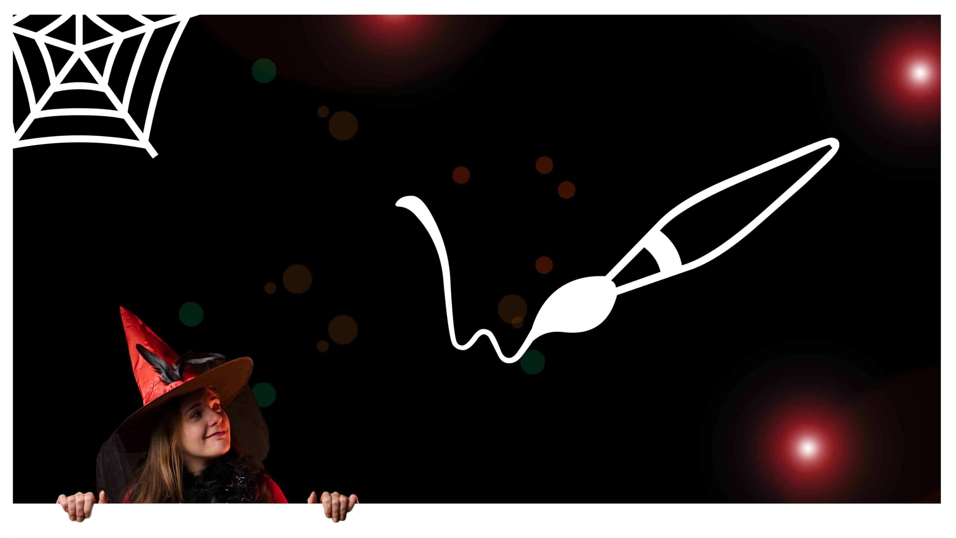
Are you throwing a Halloween party and need a Halloween-themed invitation? Or do you want to announce a Halloween sale on your company’s website with an eye-catching banner? With Zoner Studio, it’s a breeze.
An eye-catching banner or invitation is always more engaging when it includes a personal touch. Include your own photo as a creative element for your banner and create a graphic that says more than a thousand words.
Add people to your invitation
Your invitation will be a success if you include a photo of yourself that is cropped or edited in an interesting way.
Step-by-step instructions
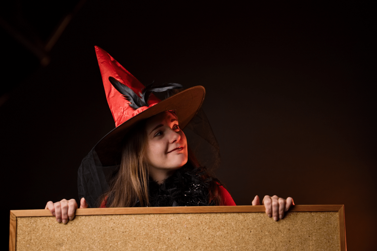
1. Edit the photo in the Develop module. Adjust Exposure, tweak Lights, Shadows, Contrast, and, if needed, retouch any blemishes. Don’t forget about adjustments to Color and Vibrance.
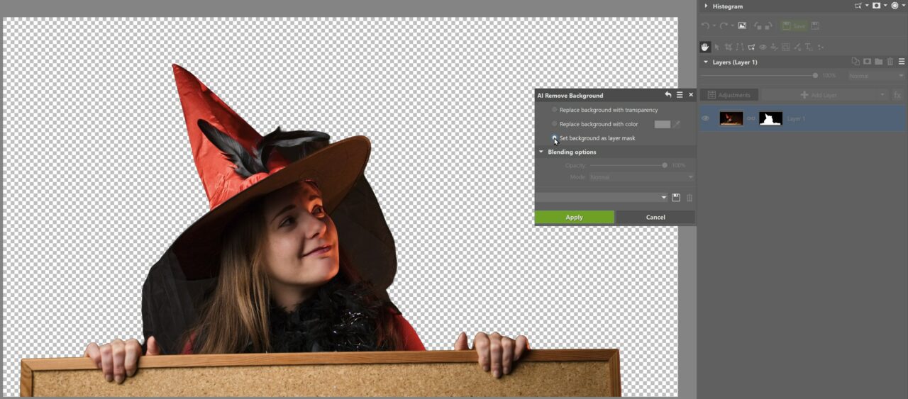
2. Open your edited photo in the Editor module and above the layer list, click Adjustments—>Edit—>AI Remove Background. Select Set background as layer mask so we can continue working with the mask.
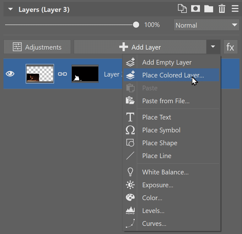
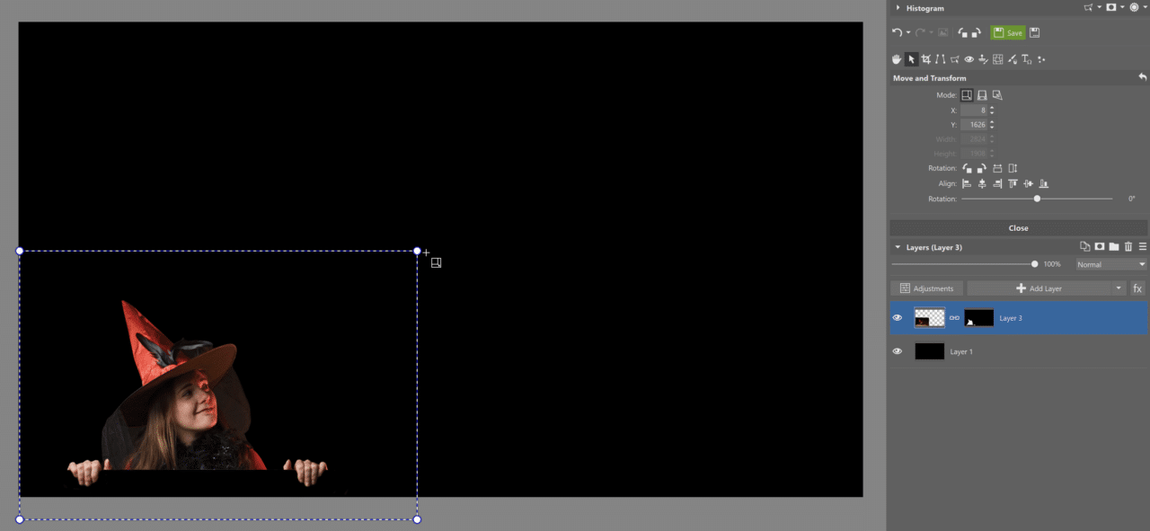
3. Select Place Colored Layer and choose a color background that matches your invitation. We chose black because it’s a Halloween party and it goes with the background of the photo we are using.
4. Adjust the size of the layer with the photo. Next, you can use the Paintbrush in Drawing Tools to fine-tune different details you don’t want in the selection or want to keep from the original photo. Use white to add to the selection and black to remove from the selection.
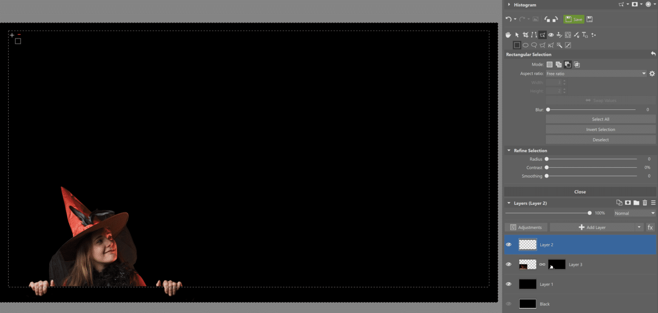
5. We add a frame to the invitation for the model to hold on to.
The frame is added to a new empty layer using Selection Tools. Use the Ctrl key (remove from selection) and drag the mouse to select the area outside the frame. The selected (outer) area is filled with color using the paint can in Drawing Tools. When you’re done, don’t forget to cancel the selection using the Esc key.
6. Adjust the size and rotation of the model. Adjust the details around the hands holding the frame directly in the mask with the model.
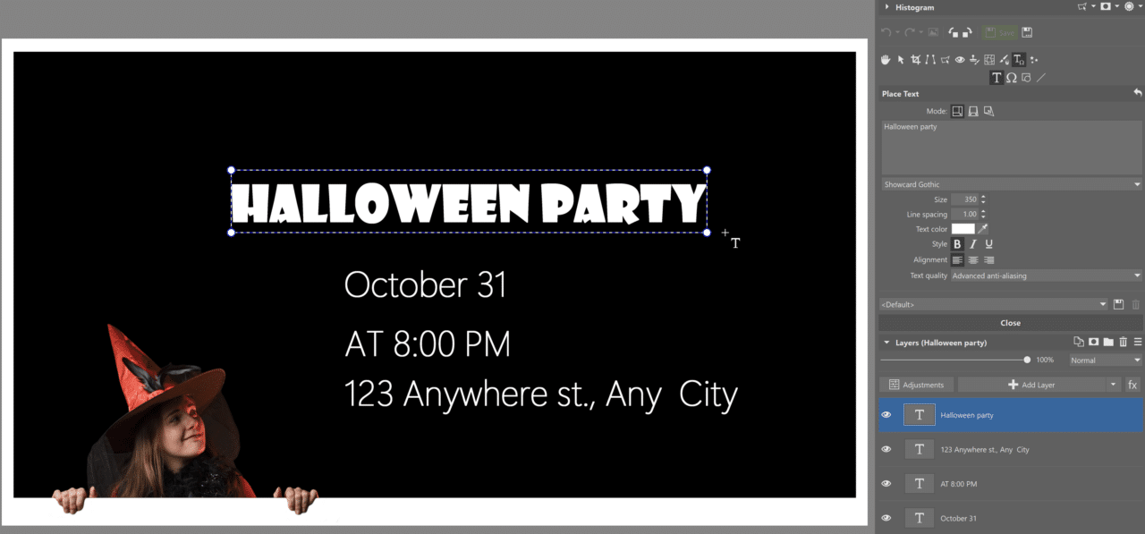
7. Add text using +Add Layer—>Place Text or using Placement Tools. Add each sentence as a new layer. This allows you to edit, move, resize, or rotate the text.

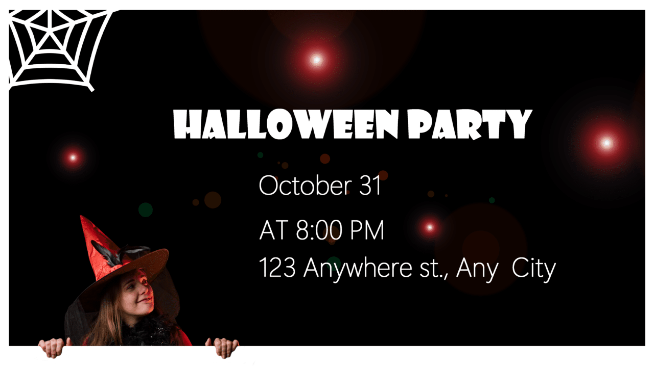
Use layers to add different icons or images without backgrounds to your invitation or banner. We added stars using Effects Tools.
We proofread our invitation and we’re done.
Graphic design guidelines
When designing invitations, banners, or other designs to send to your can ones or customers, it’s a good idea to keep a few basic guidelines in mind that will take your design to the next level.
1. Neutral (blank) space
You want to provide all the necessary information, but sometimes less is more. Blank areas give space and emphasis to the text or images that need it.

Did you know that lines and underlining lower the readability of your text?
2. Contrast
For the purposes of graphic design, this is meant as general contrast. The right contrast between colors, sizes, and shapes can make your message stand out.
3. Balance
Design your creations in such a way that text and other objects are balanced and nothing stands out or is distracting.
4. Proportion
Proportion is closely related to balance. All parts of the invitation, whether they’re photos, headings, extra text, or images should be in proportion to one another.
5. Ranking
Be clear about which message is most important for your design and give it the most emphasis. You may choose higher contrast or place it using the rule of thirds or golden ratio. Put simply, the most important part of the invitation or banner must look the most important.

Did you know that ALL CAPS REDUCE THE READABILITY OF YOUR TEXT? Yes, it’s true.
6. Repetition and consistency
Using the same format for headings and image colors suits your design. A design where the viewer finds consistency, starting with consistent fonts, colors, or image themes, that relate to the main message, helps them understand the message. Repetition works to reinforce this message.
7. Rhythm
One, two, one, two… A regular rhythm puts the viewer at ease. They feel like they understand exactly what you’re trying to say. For example, using the same size for different parts of the invitation and placing them equidistant from each other.
8. Pattern
You can experiment with minimalism and repetitive patterns, which add an element of calm, power, but also a feeling of luxury.
9. Movement
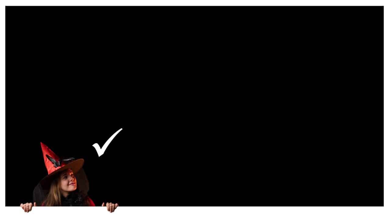
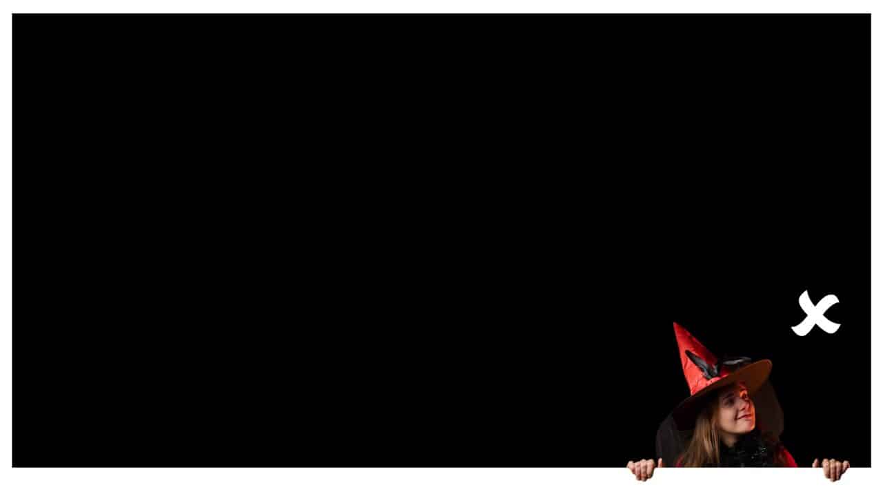
Consider where you want to lead the viewer’s eye. Where do you want them to look? If the model in the photo is looking out of the invitation, viewers will follow their gaze.
10. Variety
In addition to the previous guidelines, don’t forget about variety. Variety creates visual interest for your entire design. Your design doesn’t have to be rigid, but should be creative. Don’t be afraid to use cheerful photos, icons, and text that is funny or a humorous situation.
11. Alignment
When you hear the word alignment, many people’s first thought is to center the image. But left to right alignment is better for graphic design. This is because this type of alignment is the most natural to the human eye.
Download Zoner Studio free for 7 days with full support for all these features. Try designing your own invitation or marketing banner today!

There are no comments yet.