How to Create an Online Photography Portfolio

Whether you’re a professional photographer or just starting with commercial photography, it’s important to have a space to showcase your work. Online photography portfolios are used for this purpose. We’ve got a few tips for creating a portfolio that stands out to potential clients. We’ll also discuss what your photography portfolio should contain, as well as what to keep an eye out for when designing your website.
Photographer websites tend to vary greatly. They usually contain general information about the photographer with most of the site’s content dedicated to a gallery of their photography and products. The gallery should be arranged by the genres the photographer does. Depending on the purpose of the site, a list of services and prices can be included, as well as a blog with related articles. While there is always room for creativity, it’s good to stick to this basic structure because visitors are used to it.
Where to create your portfolio
Two of the most common ways to create your portfolio are using a professional web designer or utilizing a website builder. A professional can design your website based on your requirements and expectations. The visual content of your website can be designed according to UX/UI standards. This ensures that your site not only meets your requirements but is clear and logical for potential clients. You can also choose to collaborate with a copywriter who will come up with engaging text for your site.
It’s important to add that this option is not always the cheapest. Let’s take a look at ways you can save money. The second cheaper option is to create your own website using templates. The most well-known website builders include WordPress, Wix, Webnode, but there are many more.
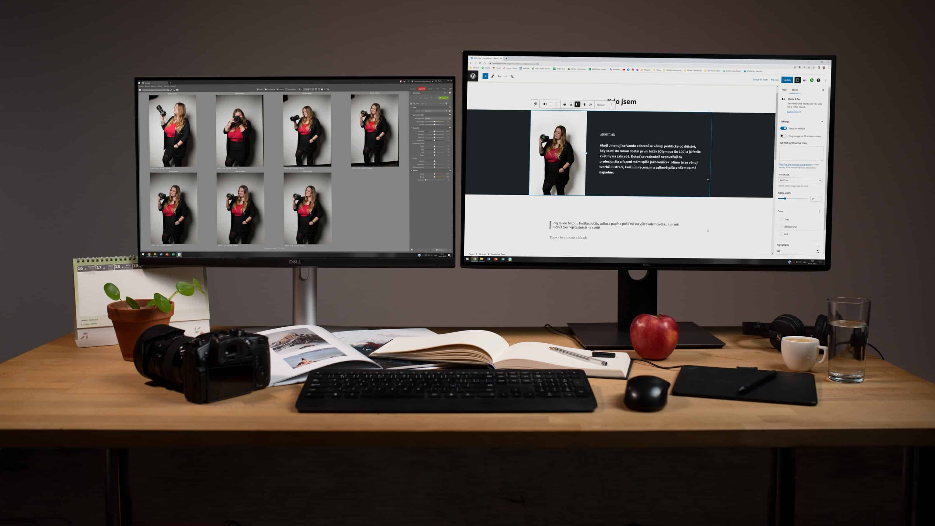
WordPress offers many templates which simplify the job of designing your website
It is simple and intuitive to manage these websites. They have a wide range of templates that you can customize according to your needs. They are also optimized for mobile phones and tablets so you don’t have to worry about complicated coding.
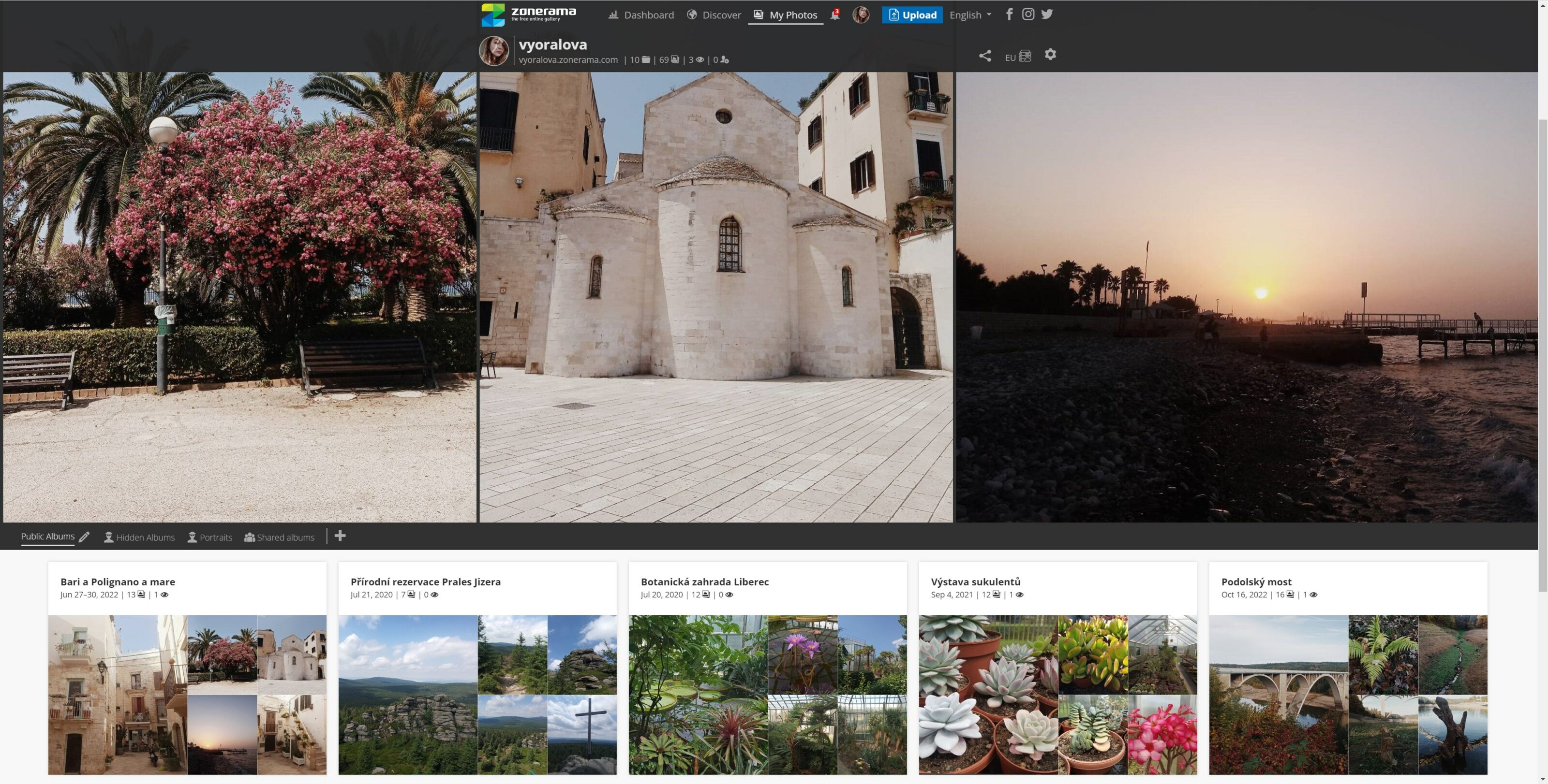
Another option for creating your portfolio is the Zonerama online photo gallery where you can also share your albums with other Zoner Studio users. Plus, you can work directly with the albums you upload in Zoner Studio. However, Zonerama doesn’t work like a traditional website, you can’t include a bio or price list.

Menu
The first thing to decide for your website is the Menu layout. The Menu is the navigation tool for your site. It needs to be clear, concise, and ideally contain 5 pages.
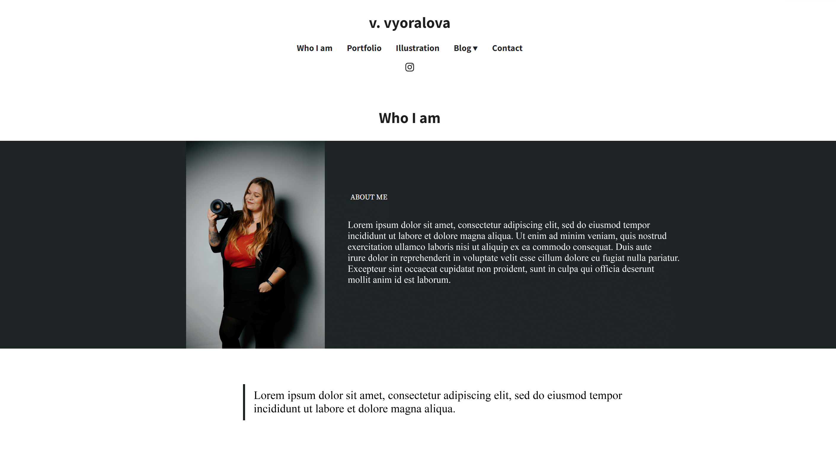
The layout of the main menu is very important. The first thing the client wants to see is not your price list, but your work and information about you. I recommend putting the About Me page first, which tells potential clients who you are, what you do, and what experience you have. Right after that, the client wants to see what you do so make sure you choose Portfolio as the second page. If you have some other projects you are working on, either add it to the Portfolio section or create a separate page for it.
Once the client knows who you are and what kind of photography you do, they may want to read about your photography adventures. If you’ve decided to include a blog on your website, add it right after portfolio. Next, add a price list page if you want it included in the main menu.

In my case, I chose not to include a price list on my website, but I want an extra section for illustrations. I consider these illustrations a part of my work, but don’t want them in my photography portfolio.
Now the client knows not only who you are and what type of photography you do, but also how much a session costs, and your contact information. Regardless of what the order your menu is, put contact information last. At the end of the menu, place the contact page so a potential client has a way to reach you.
1. First page—About Me
In the first page, it’s a good idea to write something about yourself. For example, how long you’ve been doing photography, why you do photography, and what inspires or influences you. This is the place to tell your story. You can also include what techniques you use, but don’t go overboard with a long list. It’s okay to brag a bit, but you don’t want to bore the client.

According to the social publishing platform Medium, the perfect article can be read in about 7 minutes (or 1600 words). At that point, the reader’s attention wanders.

If you want to leave out the About Me, you can include your bio directly on the homepage. For my website, I have the About Me and homepage combined. There are no limits to your creativity, so it’s up to you where you decide to put your bio on your website.
2. Portfolio
The basic concept is to divide your portfolio into sections based on the genres you photograph, such as landscapes, weddings, portraits, reportage, etc. This way, if someone wants to see what you do, they can see the scope of your photography and can better view the photos.

Choose the best photos for each category and don’t add too many. Nobody wants to browse 300+ landscape or portrait photos.
An example of what your portfolio may look like.
3. Blog
Your website can also include a blog where you share stories from photoshoots, articles, or reviews of camera equipment. Keep in mind that you need to regularly contribute to the blog, as it doesn’t look good to have the last article published two years ago. If you already know that you won’t be adding to the blog regularly, then it’s better to not even include one.
4. Price list
You may choose to include a price list on your website, but you don’t have to. If you want one and it’s specific to each type of photography you do, you can add it under each category in the gallery. If you have a general price list, you can add it as a separate page in the menu.
5. Contact
Your website must contain contact information for potential clients to contact you. Contact information includes your phone number, email, and possibly links to your social media like Instagram, Facebook, and other platforms. You can also have a link to your social media in the main menu. If you shoot commercially for different companies, then it’s a good idea to add a section for References where you list what companies or individuals you have worked with.
6. Extras
If you want to include other work apart from photography, you can either include it in the Portfolio section or create a separate page. In addition to photography, I also do illustrations and since I don’t want to mix them with my photography, I created a separate Illustrations page for my website.
I already have my illustrations as separate images, not in folders like I did with Portfolio. There are fewer illustrations and they are all thematically related. If there were more, I would again organize them by genre using folders.
When creating your own website, don’t be afraid to let your imagination run wild. If you’re unsure, get inspired by someone you look up to. Some web designers say it’s better to copy a website well than do it yourself badly. If you decide to design your own website, don’t be afraid to play around with different options the website builders offer. The templates give you plenty of options for how each page can look and can be further customized.


suraj
hello