Marketing for Photographers, Part 2: 3 Things You Need to Think About Before Creating Your Online Portfolio

“I’ve made up my mind. I’ll set up an online portfolio and (finally) put my photos on display for the world. But how? What now?” If you have thoughts like these going through your head, the following article is for you. We’ll show you how to create a successful website that will bring you new fans.
In part one of this series, we discussed a variety of options for self-promotion. Now we’ll zoom in on the very first option we mentioned—publishing an online portfolio. We’d like to show you three things that it’s good to think through when preparing your web presence.
3 Things You Need to Think Through Before Creating Your Online Portfolio
The site’s technical solution. In what content management system will you be creating it? What will your domain name be? What hosting will you use?
Your website’s goal. Will it be a purely sales-oriented page? Or am I more interested in presenting my product?
Building a user-friendly website. Start by performing at least some brief research among your site’s users. Then create a website structure (with both input from your users and a view to the keywords that people tend to look for). Then produce a simplified version of its design (feel free to sketch it on paper), and think over where its links will lead and what its individual pages will contain. In the next step, breathe life into the site, by creating its visual form and its contents. And wrap up by preparing and running testing scenarios (at least among a few friends).
The site’s technical solution.
Believe it or not, you’ll want to kick off the planning of your site’s technical solution by firmly setting its name. Will you be wanting your own domain with your name or your brand name (if any)? Or will you make do with a free domain and accept that the domain provider’s name will be part of it (e.g. wix.com, wordpress.com, etc.)?
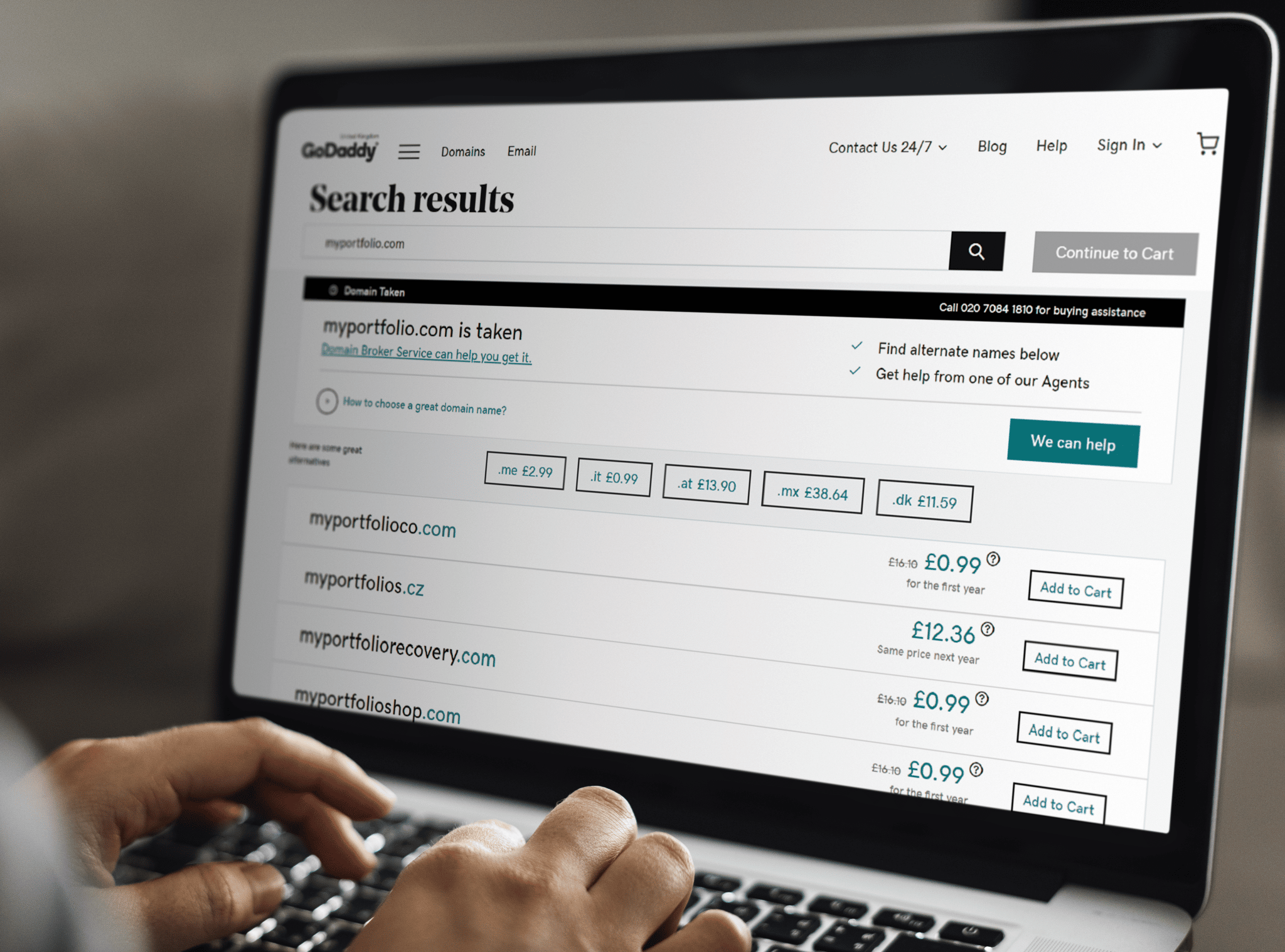
If you decide for the first route, sit down to work in www.godaddy.com (a global domain administrator and seller) and search, search, search. If your name is something like John Smith, you likely won’t find a domain with your name and surname in .com or your country’s top-level domain. Unfortunately. Domains are a pain. However, if your name is uncommon, you might be in luck. In any case—finding a suitable and available domain can take quite a bit of time.
As you can see, choosing the right domain name is key. You should expect it to take some time.
Now for the provider. If you’re choosing one of the traditional solutions we wrote about last time, such as WordPress, Joomla, or Drupal, you’re going to need hosting. Many people have written in many places about how to choose hosting and what to watch out for. So all we can say is—choose a hoster that’s safe and reliable, one with regular backups and good customer service. And also one that can handle high traffic for your website if it really takes off.
If you choose a different solution and dive into creating a website using an online website provider, that somewhat eliminates any troubles with hosting. These providers often offer premium accounts, where they take care of the entire process for you.
Page Goal
No matter whether you’re considering pages on a site of your own or anywhere else, don’t prepare them until you know your goal.
You may be saying to yourself: What? My goal is obvious. I can skip this step! But let’s be honest—are you really so sure? If your page aiming for a hard sell, or do you just want to present your portfolio and create a place where you can put your best work? These two different goals will likely lead to different websites, at least to a certain degree.
Think over what you’re expecting to gain from your future online portfolio. If you’re planning to fill up the calendar and photograph one or two events per week, it will be smart to include some well-considered sales pitches. You’ll want to show what it’s like to work with you, show off your best work, publish prices for your services, and maybe enable visitors to schedule a session online (for example with help from a free reservation system).
When you’re thinking about what you expect from your website, feel free to write down your observations and then strike out the less important ones.
Meanwhile, make sure to include calls to action wherever relevant. These will direct your visitors wherever you need them to go. No matter whether that’s toward the price list, or towards a page where you sell your story, your benefits, and your value—or straight towards your orders page.
If all you want to do is put your work on display, your site can be simple in its structure and content. A few tasteful and impressively prepared galleries, a contacts tab, and a simple price list may actually be enough.
That’s quite a difference! Even just that reason alone makes it a smart idea to think in advance about which direction you want to go.
How to Build a User-friendly Website
Oof… UX. A few of you will nod your heads in agreement, the rest in confusion—what’s UX?! This is short for user experience. But what does that mean? When your website has a good UX, that means it has characteristics ensuring your visitors will leave it satisfied and with the feeling that they saw or gained what they wanted and needed. If it has a bad UX, they’ll leave exasperated and desperate.
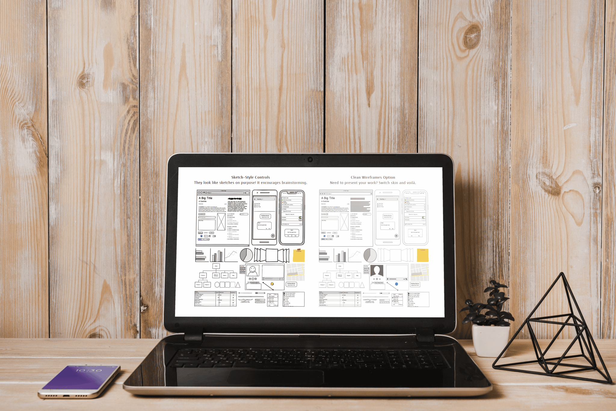
Here’s one example of how a user-friendly website can look. All it took here was trading out an online-based look for a bulletin board, paper, and pencil.
How do you make your website user-friendly? Run through the following steps when you’re creating it. While the path we’ve marked out here won’t guarantee that your website will be the best in the world, it’s definitely better to go this way than to go blind:
User research. Do you know how to learn what people expect from a professional photographer or what they base their decisions on? That’s right—just ask them! Yes, it would be ideal to get more information, for example dozens of filled-in surveys, but in the beginning it will be better to ask a few friends about it. Better some foundation than none.
You can ask in person, but it would be better to prepare an easy-to-read questionnaire in something like Google Forms. Then you can later sit down in peace and go through the answers multiple times.
What are the people around you actually expecting from the photographer they hire? Just ask them!
The website’s structure. Figured out what people are interested in? Let’s say that most of them said they want to see several examples of your work, the prices of your services, and a description of what it will be like to work with you. That sure sounds like a basic outline for your website, doesn’t it?
If you want to be sure that no important and frequently searched-for pages will be missing from your site, you should also determine the most popular relevant keywords. For statistics on these, you can turn to Google Ads. However, you’ll need to register first. But one thing you don’t need to register for is the search box completion on google.com itself. So try writing a basic keyword into the box, and you’ll see what other words it offers you.
The site’s wireframe model (its mock-up). Are you clearer now on what your website’s structure will be? Great. Now it’s time to design its basic model (called a wireframe in marketing slang). You might thinking you don’t need to do this, because you’re just going to be filling your content into a template anyway, and that template’s basic appearance has already been defined. But our advice is—never skip this step.
In a wireframing tool, you can set where your page will have text, where it will have photos, and where it will have, for example, buttons.
This mock-up gives you a better idea of how your individual pages will interact, where each link will originate, and where and in what order your visitors will find important information. If you want, you can prepare your wireframe online (for example in Balsamiq, a simple tool with a 30-day trial), or just draw it on paper. One way or the other, it will be a good thing to have at hand when you’re creating your portfolio.
The prototype. You’ve got a structure, and you’ve got a model, so now it’s time for the prototype. This will look very much like the final website. It will be colorful and interactive. And it will let you see your future website in its entire scope. This is precisely the right step for playing with colors, your logo, and your photos. In short, with the overall design.
Testing. This should be followed by the next (but not the last) part, which is testing. Take your prototype and show it off. To your friends, your siblings, your spouse. Before you do that, though, prepare a testing scenario. That will let you learn much more specific information than you’ll get if you just ask “How do you like it, Joe?”
Almost done? Not at all! Now it’s time for another important phase (maybe the most important one)—testing.
Ask your test subjects how they’d go about ordering your services, and watch how they behave on your site. Are they having any trouble finding your contacts page? Are they clueless about how to fill out your web form? Testing will teach you a number of interesting facts that will make your portfolio pages that much better and help you really fine-tune them.
And round and round. It may seem that you’re done, but you should count on the fact that you’ll basically never stop preparing new wireframes and prototypes and testing them. After all, you don’t want your website to become yesterday’s news!


There are no comments yet.