Stand Out on the Web

Web self-promotion is a must for every modern photographer. What should your site have to present your work in the best possible light? Read on to find out.
Most photographers even at the hobbyist level have their own websites. There’s no one right look for these sites. But on any good site, the photographer’s gallery forms the core.Generally, the better-known the photographer (you might say—the better they are), the simpler the site.
What’s the Best Route to a Great Photo Website?
There are various ways to set up your website, and they can be combined. We will describe the two most common ones.
Creating a Site From Scratch
One route is to have a UX (user experience) expert create a basic design, and have a graphic artist work based on it.They will intuitively position page links, set the logo is, where the portfolio link is, where the slider goes, and how visitors can show/hide photos and go back a page. Their work ensures that your visitors don’t get lost, get disgusted, and then get packing to a better-designed site. The graphic designer uses this work to create an overall site design, which the programmer then turns into a reality.
Starting From a Template
The other option is to buy a template and then fill your content into that. Such templates are powered by various content management systems. WordPress is among the most widely used templates for online portfolios. It’s very easy to manage, and so you can add content on your own. You don’t have to stick to just photographic content; you can also add a variety of text and articles. Also, many templates (“themes”) are responsive—that is, they auto-adapt to look good on any screen, from a phone to a tablet to a monitor… even a Retina monitor. Of course a programmer can offer you all this too—it’s all a matter of what you work out together.
Content
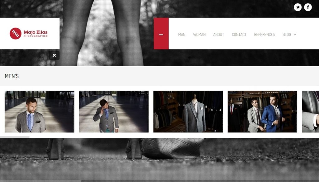
Photographs themselves are definitely the foundation of every portfolio. Take care to ensure that yours are presented at the best possible quality (while still ensuring that they can’t be abused). Beginning photographers generally cover multiple genres (nature, portrait, fashion, nudes, reportage, weddings, etc.) and they will need for their gallery to reflect that. So typically their homepage will link to a list of subgalleries.Visitors use it to choose the category they want to browse. Professional photographers generally stick to just one genre (e.g. fashion or glamour), and so their web’s menu leads to it directly.
Some photographers show a mini-gallery right on their home page. That way, visitors can see some of their work immediately. But this is unsatisfactory if you work in multiple genres. One solution here is to use a large picture slider.
Another “must” for photography websites is a contact page, with a phone number, email, and links to Facebook, etc. “About Me” pages are also very common. People like to know where you’re from and where you work. If you work commercially for well-known names, don’t hesitate to include a References section where you list the companies or other clients with whom you cooperate. Have a passion for blogging? Then be sure to include a Blog section as well. But keep in mind that you will have to make sure to keep it fresh. There’s nothing worse than when a blog’s newest article is two years old. If there’s a risk of that, don’t bother with a blog at all.
Should I Show Pricing Information?
Showing prices on your website is a two-edged sword. If you only work in a single genre, e.g. weddings or studio photos of children, then show a price list. Then your potential customers will immediately know what to expect. But if your work is such that each of your photographs demands a different approach, then a price list is pointless. People will probably be able to intuit your prices based on your work and the quality of your references.
Here are a few links in closing that may inspire you, through either their design or their theme.
Majo Elias (this article’s author)

There are no comments yet.