6 Useful Edits for Fall Landscapes
Fall landscapes can be breathtaking in person, but they often lose some of their color and atmosphere in photos. Fortunately, a few targeted adjustments in Zoner Studio are all it takes to restore warm tones, enhance detail, and bring back that magical fall haze. Here are six techniques that can transform your fall photos in seconds.
In this article, we discuss:
- how to edit fall landscapes to bring out more color and atmosphere
- why it’s important to correctly set and fine-tune white balance
- how Vibrance, Contrast, and Shift Primary Colors work
- when to use Color Shift to refine specific hues
- how to remove or add fog and haze using global and local adjustments
- other tools in Zoner Studio you can try when editing fall photos
There are plenty of adjustments available, and you don’t have to stick to just a few. In this article, we focus mainly on those that bring out color in landscape photos. These are the adjustments that strongly influence the color and overall light of fall photos.
All of the adjustments are done in the Develop module of Zoner Studio and are non-destructive. If you later decide you don’t like some of the adjustments, you can return to it at any time and change or remove it without affecting the rest of your work.
White balance for a warm, golden tint
Fall landscapes often don’t look the way we remember them. Sometimes the camera misjudges the auto white balance and sets the temperature in Kelvin too low, resulting in a bluish cast. Other times, the white balance may be technically correct, but the scene still doesn’t feel warm enough for classic fall colors.
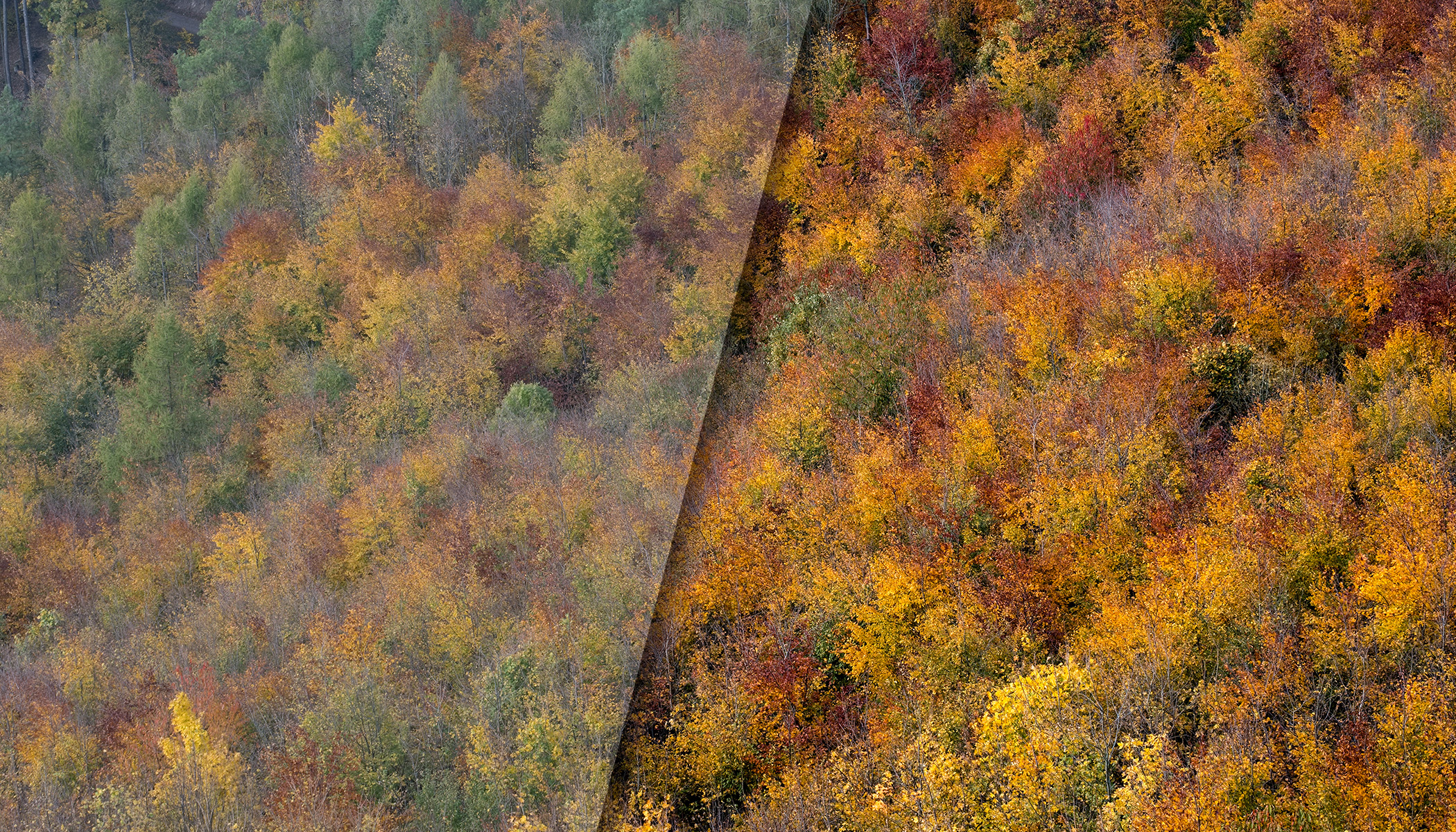
In both cases, increasing the White balance Temperature slider helps. The exact value depends on the specific photo, your creative intent, and other adjustments you’ve applied. Since you can always come back to it later, don’t overthink it. Choose a value that looks right to you. When working with colorful leaves, it’s always worth adjusting the White Balance to yellow and nudging Tint slightly toward purple to see if it adds that warmth.
The Canon R5’s automatic settings selected 3088 K for White Balance and +6 toward purple for Tint. For comparison, the second image uses 5100 K and +20 for tint. The ideal value is likely somewhere in between, depending on your creative vision.
A useful trick that works for many sliders: push it to the extreme and then slowly bring it back to a point where the image still feels natural.
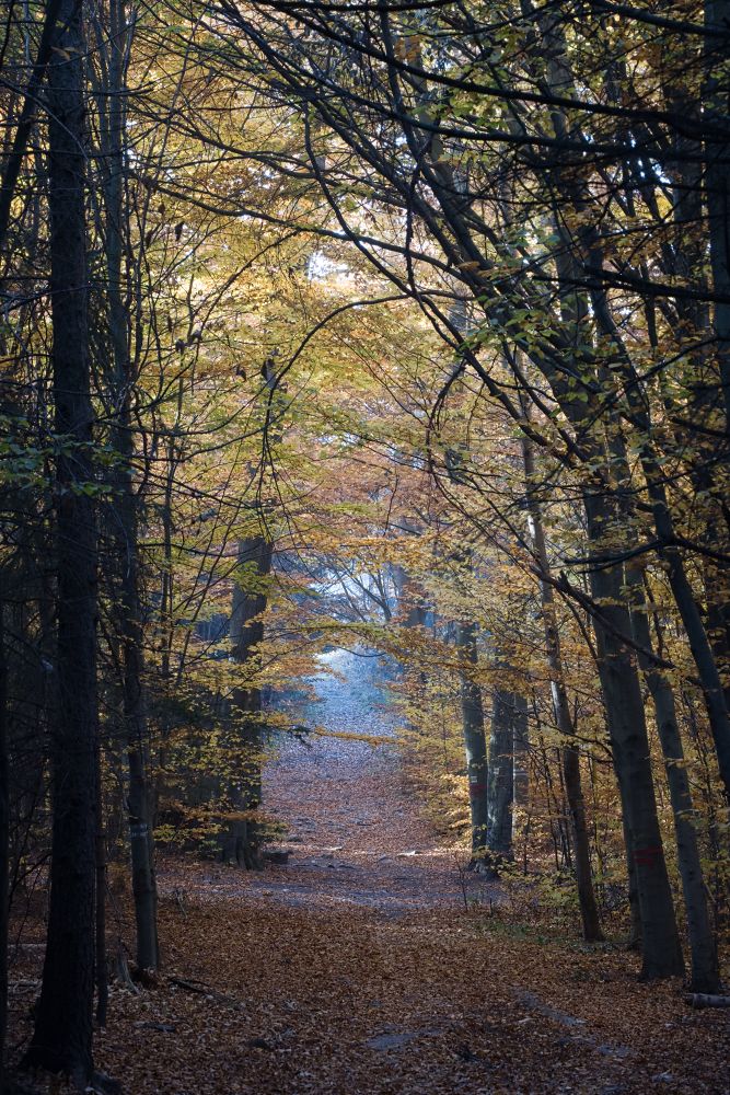
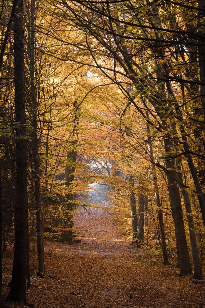
Basic contrast and vibrance
Fall colors deserve to be brought to life. While the Saturation slider works, Vibrance is usually the better option. It boosts muted colors more than already-saturated ones, resulting in a more natural look.
In the same section, the Contrast slider not only adds depth, but also richness to the color. It’s a good idea to adjust Contrast with Vibrance, since they influence each other.
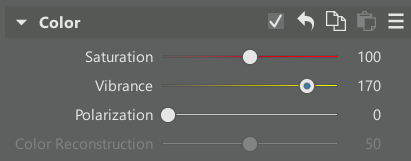
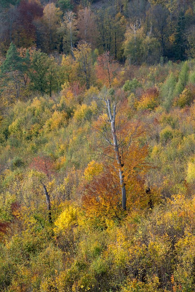
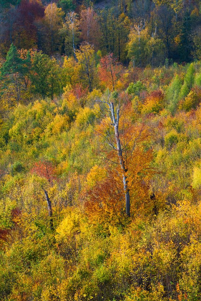
Compared to the original, Vibrance was increased to 170 and Contrast to +50.
Shift Primary Colors
White balance affects overall color, but another powerful tool is Shift Primary Colors. Primary colors—red, green, and blue—form every pixel, and by shifting their hue, you can significantly influence the color palette of the entire image. For example, your “base red” can become a deeper, more orange-red.
The effect depends on how far you push it. Small adjustments can help fine-tune color, while large shifts create a stylized or retro look.
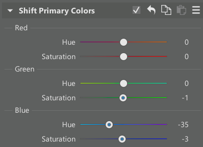
Focus mainly on each Hue slider. The Saturation sliders are secondary. They also help, but often overlap with what Vibrance and global Saturation can do.
Depending on your photo, different hues make sense. Blue often works best when shifted to the left, so try that first. Red and green can go in either direction depending on the scene, so there’s room for experimentation.
The only difference between these two photos is Hue for blue is set to -35 in Shift Primary Colors.
More advanced and precise color correction
If Shift Primary Colors doesn’t help, Color Shift offers very targeted adjustments. Generally speaking, you can select groups of hues and shift them towards each other. The tool is straightforward, but because it has many options, I’ll only illustrate one example here. Learn more in the article about Color Shift.
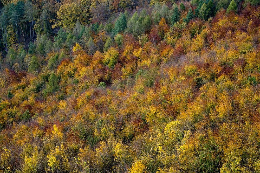
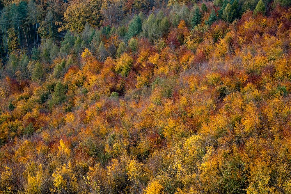
In the example below, the original yellows and greens were shifted toward orange, and their saturation increased. The rest of the image remained untouched.
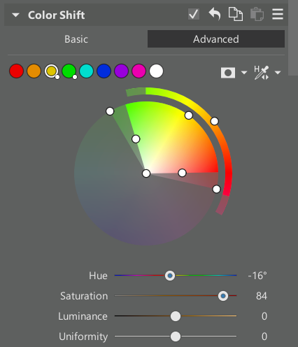
The original yellows and greens were shifted toward orange and made more saturated. The rest of the image was untouched.
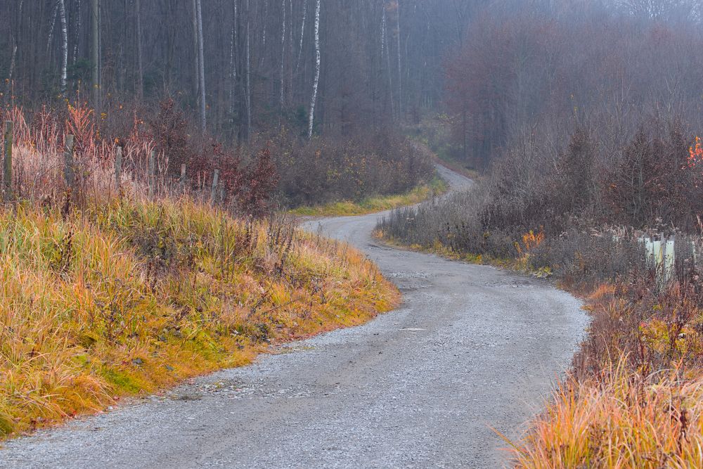
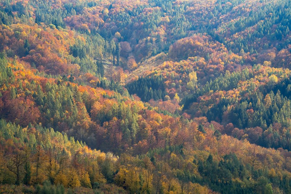
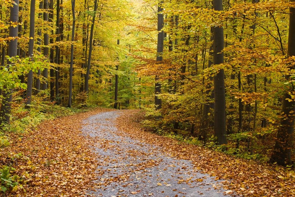
Removing fog
Fog is common in the fall, especially in the morning. Distant hills may appear washed out with very little contrast.
Zoner Studio offers several ways to fix this. The simplest is Dehaze under Exposure. Increasing the slider reduces the fog and slightly darkens the image, so you may need to counteract it with Exposure adjustments.
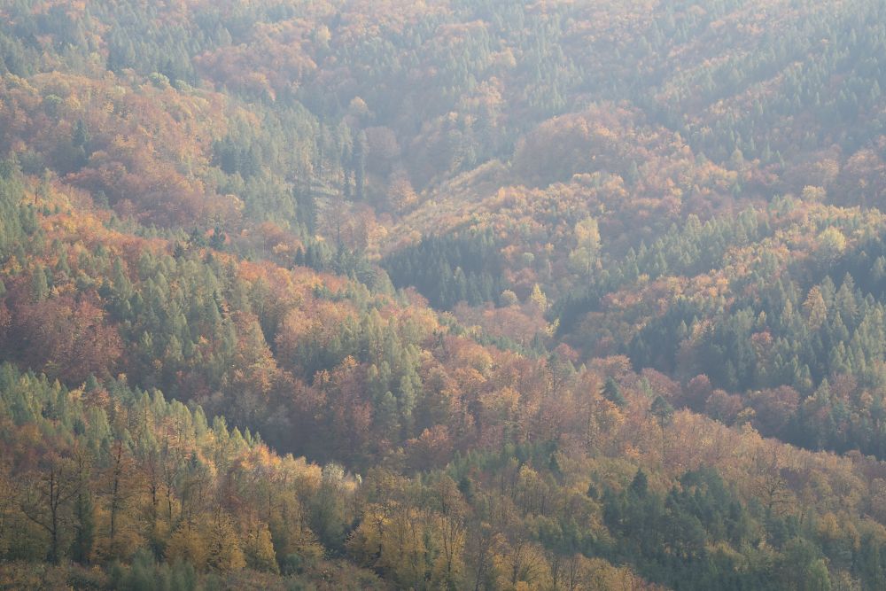

The fog was filtered out using Dehaze at the maximum value of +100.
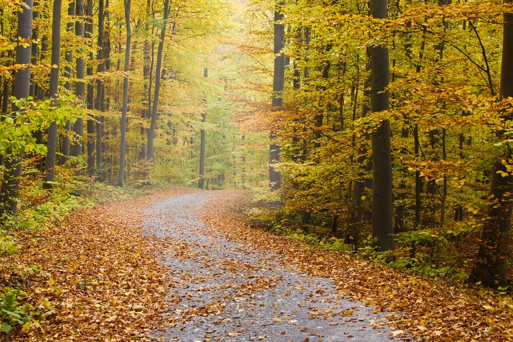
If Dehaze alone isn’t enough, another method is adjusting the Black and White point. The Black determines the darkest values in the photo. If the image is too light, dragging it to the left makes it darker.
The other colors shift accordingly, with dark tones darkening more and bright tones darkening less. White point works the opposite way. Pull the brightest tones to the right. Keep an eye on the Histogram while performing these adjustments. It should expand to reach the left and right ends of the graph.
In addition to Dehaze, Black and White point were adjusted to -40 and +60.
A third option for removing fog is the Tone Curve, but adjusting its endpoints only replicates Black and White point, so it’s better saved for more advanced work.
Adding fog or haze
On the other hand, some photos benefit from a dreamy look, which you can achieve by adding a touch of fog.
To do this globally, simply move the Dehaze slider to the left or shift the Black and White points in the opposite direction from the fog-removal method.
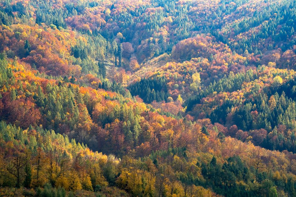
But adding fog locally produces a more natural, striking effect. You can use it to emphasize depth (objects receding into haze) or create a golden glow.
Use Local Adjustments and create a mask with Linear Gradient, Radial Gradient, or Brush. Once the mask is in place, you can apply negative Dehaze or adjust Black and White Point just within that area.
This time, fog was added using the brush. Similarly, its traces could be in a valley or elsewhere, depending on your imagination.
To highlight sunlight, increase White Balance within that local mask. You can find more inspiration in our article Add a Realistic-Looking Sun to Your Photos.
Further adjustments
These basic adjustments for fall photos are only the beginning. It’s worth experimenting with other settings, whether it’s trying out different sliders or removing distractions like parked cars or power lines. Our other articles guide you through these types of adjustments.
FAQs
Should I adjust white balance first? Yes. It’s one of the most important adjustments. It affects the overall atmosphere of the photo and influences all other color adjustments.
Is it better to increase Saturation or Vibrance? Vibrance usually works better for fall photos. It enhances color intensity without oversaturating tones that are already strong.
What is Color Shift for? Use it when you want to adjust specific hues, like turning yellow leaves more orange, but want to leave other colors unchanged.
How do I add fog to a photo? Use Local Adjustments to create a mask, then apply negative Dehaze or lower Contrast in just that area. This is great for emphasizing depth or sunbeams.
There are no comments yet.