Coloring Step by Step I: Color Theory
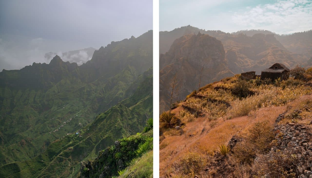
You’ve probably noticed the various popular photo styles, presets, and filters out there that give photos a retro look—as if you’d peeled them out of an old, dusty album. We’re fans of these too, and you’ll find some among our presets. You can encounter this vintage look not only in portraits and reportage, but in landscape photos too. But why do some people give fresh green landscapes an autumnal, parched look, like after a drought?
And what’s the right route? What’s the photographer’s creative goal? What can you learn from this style, even if you prefer a natural look reminiscent of a RAW file that’s been opened in the Develop module?
In this article series, we’ll literally illuminate and focus on just that. But first things first—a little theory never hurts. We’ll explain the color model and show how colors interact with each other.
When your colors are “off” and a photographer friend of yours has mixed feelings about your creation (the skin color or sky color doesn’t seem right to them), you may have color management configured incorrectly. Our recently published article on color spaces will help you there.
Color Models
A color model is a system that mathematically describes colors based on the ratios of their individual elements. Colors in nature are given by the mix of light on different wavelengths, and the various color models try to produce and reproduce colors as faithfully as possible.
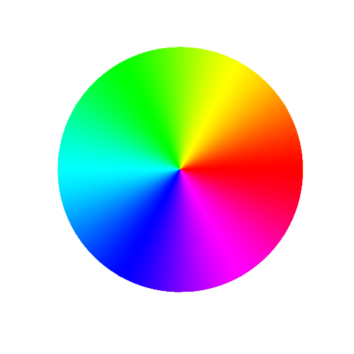
The RGB Color Model
You probably know the RGB model from computers if nothing else. It expresses colors that are produced by assembling red, green, and blue elements. This model works with a light source, and every element is “projected” with a different intensity. We can create any color combination we like by mixing this way.
You’ve likely encountered the RGB model when working with the tone curve in the Develop or Editor module in ZPS. I think you’ll agree that color editing is not completely intuitive at first sight.
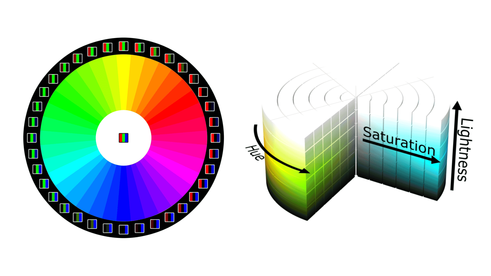
The HSL Color Model
The HSL model may be less familiar than RGB, but it’s all the more intuitive to understand. While the RGB model is easier for computers, photographers will better appreciate HSL, which enables simple color mixing.
Instead of the red, green, and blue elements, it works with three parameters: Hue, Saturation, and Lightness. You can also find this model in Zoner Photo Studio. Its Color Shift tool draws from the HSL model.


So there are good ways to technically define and describe colors. But we’re more interested in subjective perception than in individual colors’ wavelengths.
Color psychology is fantastic, because it hints at how colors influence us, though this applies for individual colors separately. And don’t forget that we each have our favorite color.
Did you know that some languages don’t have names for all the colors as we know them?
Tools for Working With Colors
In photos we generally encounter representations of several colors. Then there’s contrast and the balance or harmony among colors. With all that together, we have something to lean on. And it’s the different kinds of contrasts and color harmony that determine whether a picture is aesthetically attractive in terms of its colors, or “something’s off.”
Types of Contrasts
Two colors with significantly different characteristics stand out even more if we capture them in one photograph. Contrasts are usually tonal, where the above-mentioned Hue plays the main role. But let’s also not forget contrasts outside of this property of colors. For example, light contrast in a black-and-white photograph.
Contrast has a long history—the expressionist painter Johannes Itten classified seven types of contrasts:
- Contrast by value is the most visible, because the human eye is best at distinguishing lightness. This contrast between light and dark is most apparent in a black-and-white photo, but you’ll also notice it between colors.

- Complementary contrast is a striking contrast of colors at opposite sides of the spectrum.

- Contrast by temperature is related to human perception of colors. We perceive the shades of the sun and fire as warm colors. We connect cold colors with ice and water.

- Contrast by saturation helps us to achieve a mild effect that is the opposite of contrasts between complementary colors.

- Contrast by extension works with the sizes of individual areas of color. Saturated and pure colors need less space to stand out.

- Simultaneous contrast could be defined in a nutshell as a contrast of imprecisely complementary pairs. Colors try to approach each other.

- Elementary contrast arises when three or more elementary colors are used.

The Principles of Color Harmony
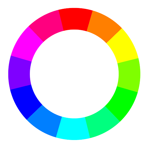
The rules of aesthetics that make up the theory of harmony among colors mainly concern pure colors. If you’re working with fairly unsaturated colors, try to work based on your feelings. Color harmony leaves out neutral colors, i.e. shades of black and white. These are in harmony with every color. We’ll show you five basic harmonies defined on the RGB color wheel.
The first color wheel was assembled by Isaac Newton, who worked from the seven colors of the rainbow. Painters and other artists use red, yellow, and blue as primary colors. So you can also encounter the RYB color wheel.
- Shifted complementarity

- Triad

- Analogical colors

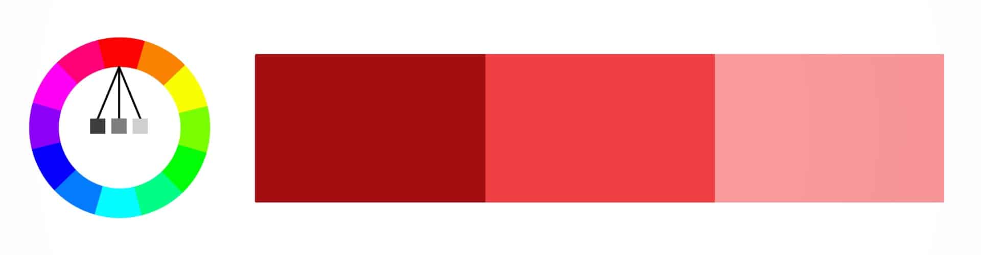
- Monochromatic colors
Note individual colors when you’re taking pictures. How do they affect you? Seek out and identify individual contrasts and harmonies. Are you heading out to take pictures outdoors and looking for a good background? How will that wall harmonize with the model? Does the scene match her clothing? You can’t usually repaint a house’s walls, but you can advise your model in advance as to color of clothing to prepare.
But you don’t have to notice colors during just photography. You can constantly look around you with a photographer’s eye and focus on how professionals work with colors. You can find good work with colors for example on posters, billboards, magazine covers, in internet graphics, or on the wrapping of your favorite candy. And you can definitely find more examples.
As a bit of homework, try finding at least five examples of good (or bad) work with colors!
In our next installment, we’ll go over examples from history and how work with colors and color grading has developed in the film industry, which we can view as an inspiration for photographers—and to this day video is, so to speak, a step ahead. But it’s no problem; as photographers we can build on that and get inspired.

There are no comments yet.