Coloring Step by Step II: Adjust Your Images’ Colors Like the Filmmakers Do!
How can you as a photographer take inspiration from color toning in movies? We’ll use the examples of four famous movies to show you different styles of color grading. As you’ll see, colors have a fundamental impact on how we see movies. We’ll be looking at legends such as Saving Private Ryan, The Godfather, and The Matrix. Have you ever thought about the roles that color palettes play in them?
In part one, focused on color theory, we got to know the individual color elements, color contrasts, and color harmonies. If you left out that part with its dose of necessary theory, we recommend going back to it—start step by step from part one!
Besides the aesthetic aspect and combinations of certain tones, colors evoke emotions and have a psychological effect on the viewer’s perceptions. After the transition from black-and-white movies to color, brightly saturated colors alone were enough to draw visitors to the theaters. The first Technicolor movies such as The Wizard of Oz (1939) were like colored-in coloring books: a showcase of saturated and blazing colors. It’s no wonder that the next evolution was a turn away from this “rainbow” style.
The Godfather and Vintage Toning
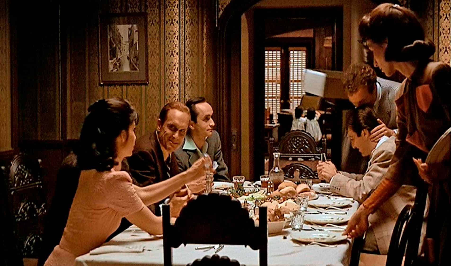
This movie, filmed in the 1970s, used a palette meant to evoke the America of the 1940s. Note the warm undertone, the gentle oranges, and the dark-gray neutral shadows and lights with cream tones, intended to evoke a nostalgic impression of the past. The other colors are essentially desaturated. This pleasant color palette with natural skin tones cleverly draws the viewer into the plot, making them feel like they’re part of a Mafia family.
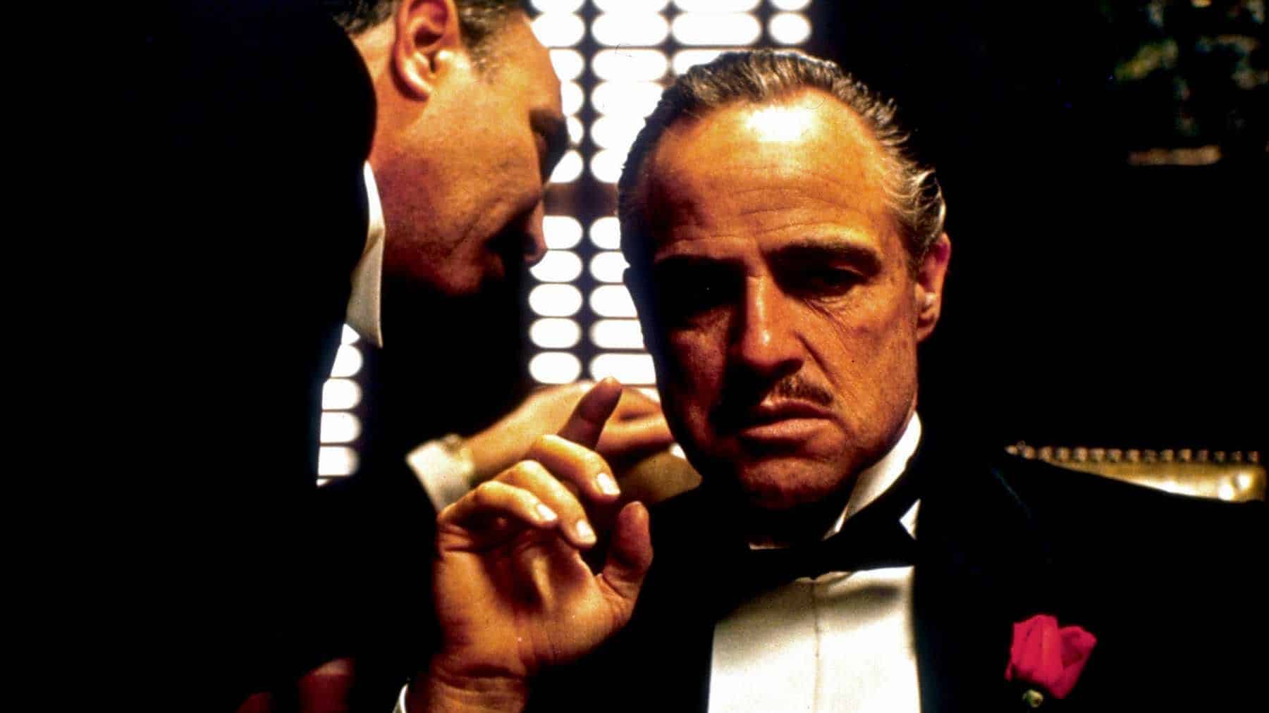
Another color playing an important role in The Godfather is the saturated red of the rose in The Godfather’s suit. The red rose is melded into not just this suit, but the entire movie. It’s a symbol of romanticism and passion, while being prominently displayed in the movie’s posters and other promotional materials as well.
You can find a vintage effect in the basic preset pack that’s built into Zoner Photo Studio X. But you can also desaturate selected colors effectively using Color Shift.
Saving Private Ryan and the “Bleach Bypass”
This effect was first used in the Japanese film Rickshaw Man, but it only became well-known after its use in Saving Private Ryan (1988), starring Tom Hanks.
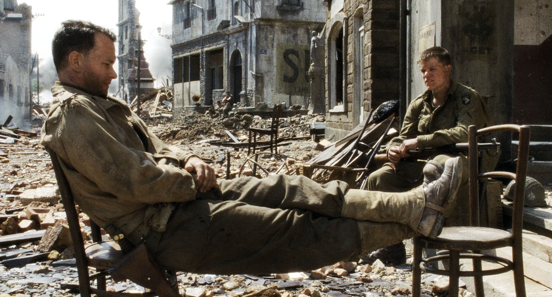
Its colors are strongly desaturated, giving its scenes a cold, cruel undertone and strongly reminding viewers of the black-and-white photos that make us think of history.
You can apply Bleach Bypass from most preset packs focused on cinematic color toning. Or you can use it as a springboard, as filmmakers have. In films such as 300 (2006) and Sin City (2005) you’ll find it in slightly adapted forms.

The Matrix and Its Green Tones
The Matrix is an example of a movie that utilizes monochromatic harmony among its colors. Various greens pervade every scene.
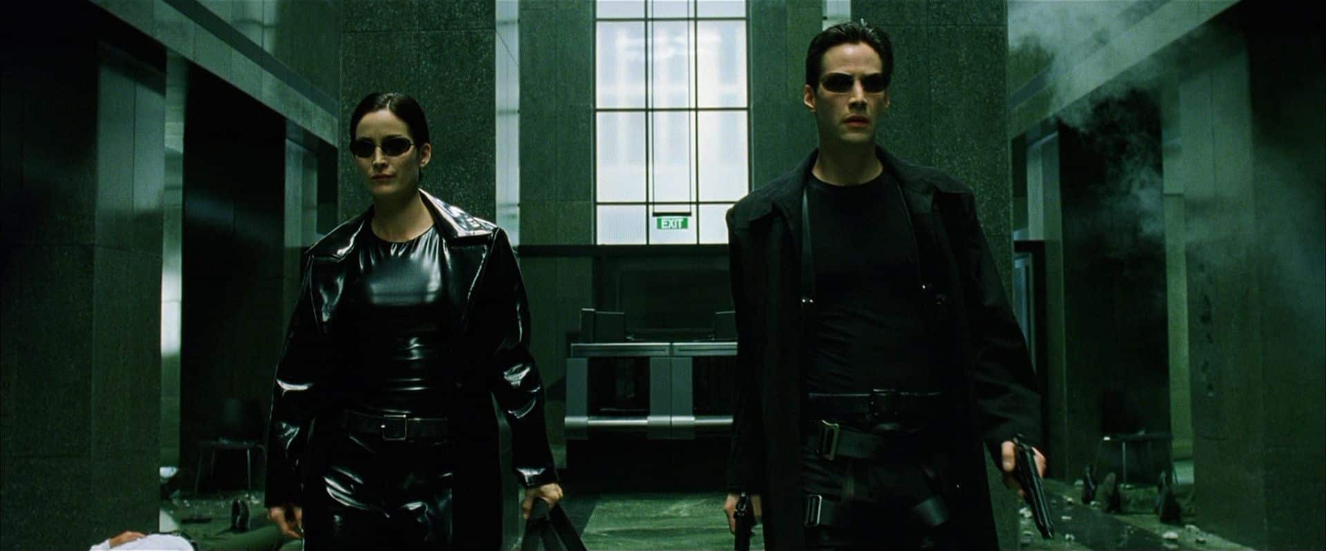
Green emphasizes the plot’s placement within the digital world of The Matrix; we tend to connect green with programming, the command line, and machine language on green lighted monitors.
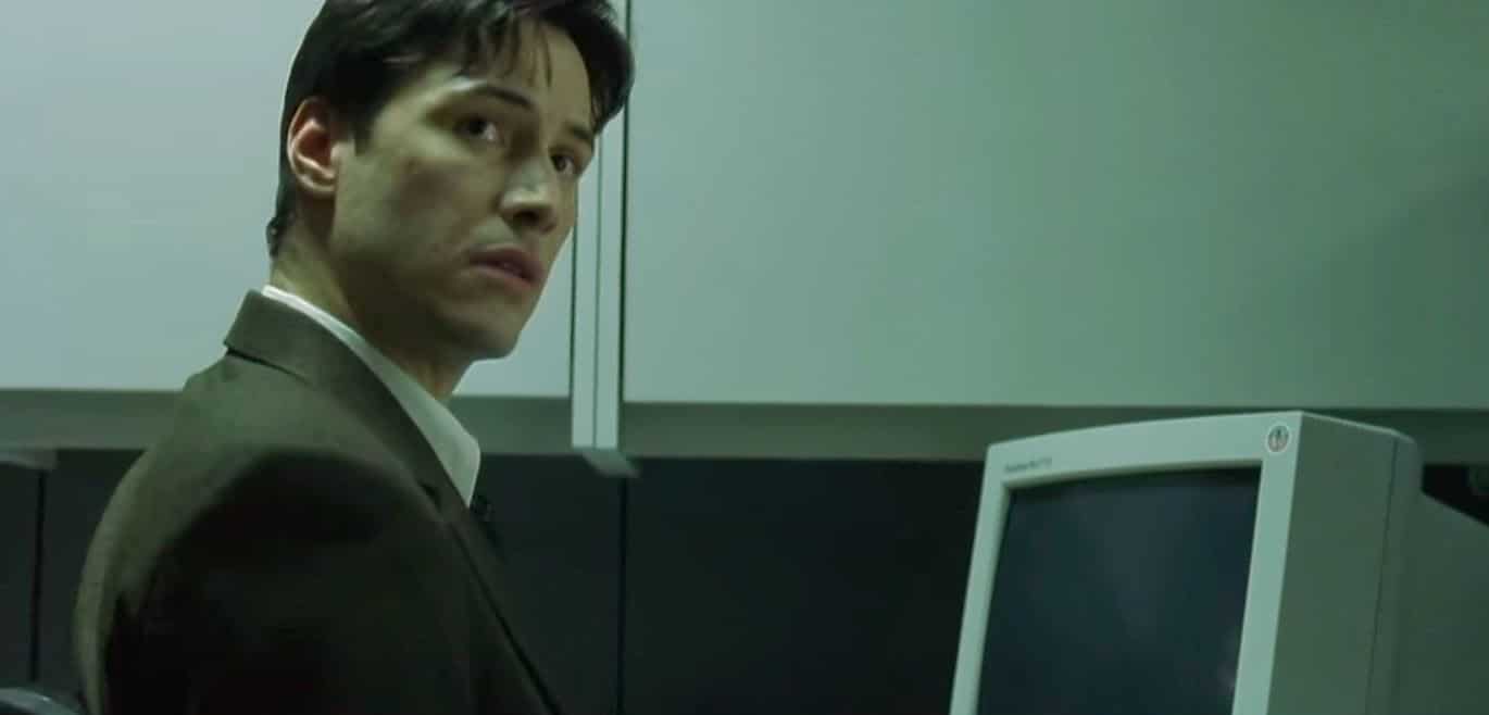
A stronger green effect was added after the fact for the film’s Blu-Ray version, to make its toning more consistent with the second and third movies. Originally the color toning in The Matrix was far milder. You’ll only find it in the original DVDs released in 1999.

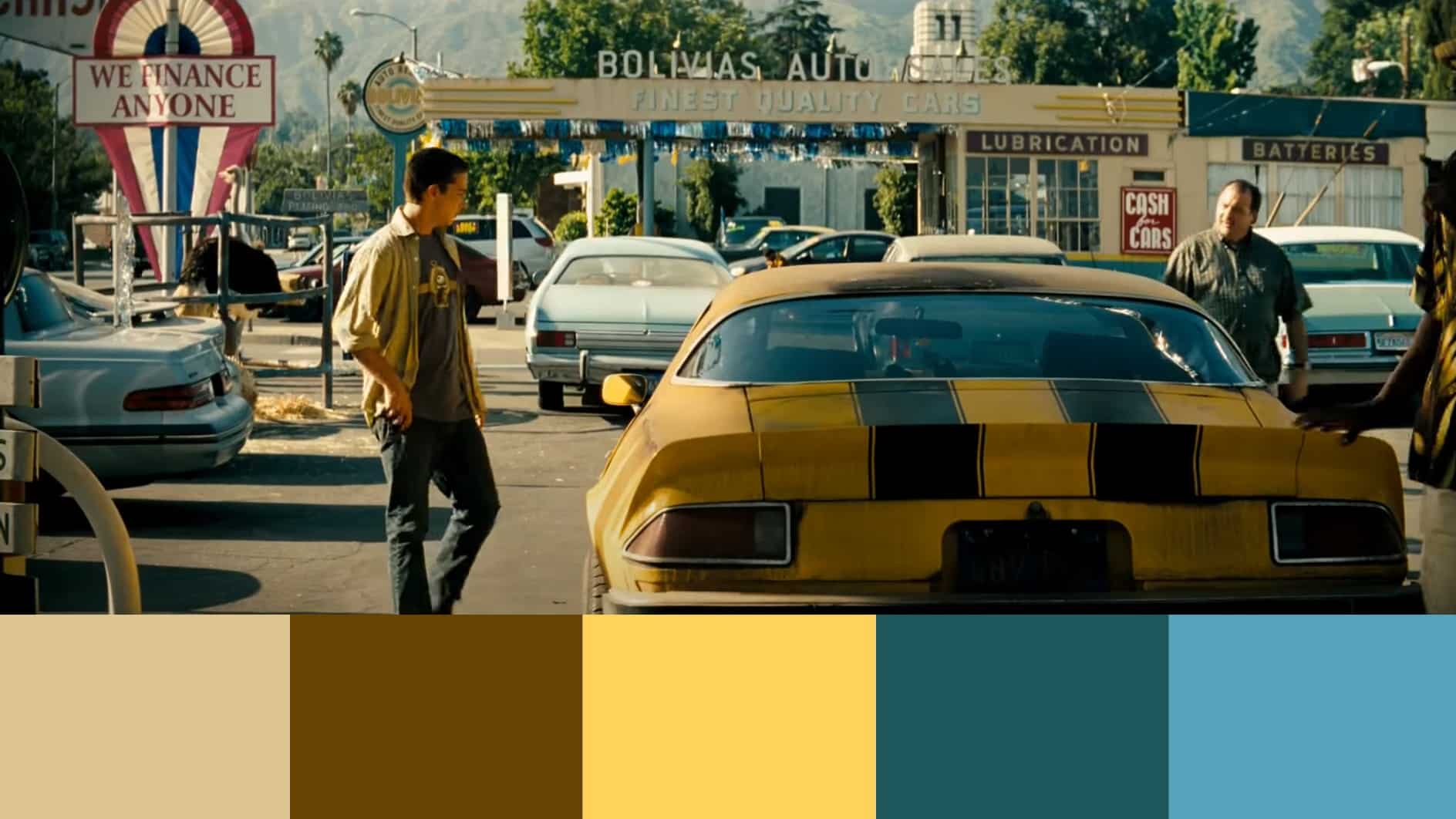
Transformers and Orange & Teal
You’ve surely noticed this trend among the movies of the last few years—and seen it in photos too. Now we’ve finally arrived at the answer to our question in part one of our series: Why do some photographers recolor green vegetation to autumn-orange tones even in summer or spring?
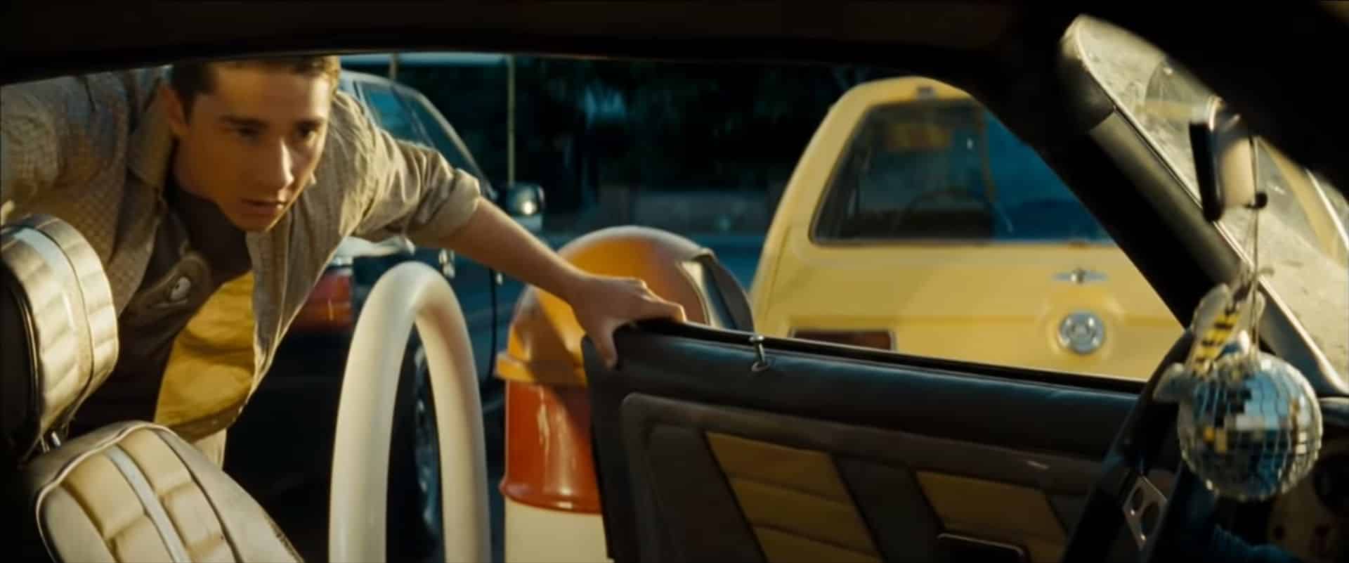
The advantage of Orange & Teal toning is that you are mainly working just with orange tones (primarily in the lights) and azure tones (in the shadows), which are complementary colors that form a contrast together. Similarly as in The Godfather, here as well you’re working with relatively natural skin tones—orange comes closest to them. That lets you optically separate the actor from a dark background, drawing attention to them and improving the separation of foreground and background.
Another reason, and one explanation as to why Orange & Teal is so popular, is the fact that it’s reminiscent of the Golden Hour and sunset—one of the most sought-out times of day for its natural light that flatters most photos.
Apply film coloring to your photos as well
Just like the film studios, by adjusting your photos’ tonality, you can create a consistent look for your portfolio, or use a suitable choice of colors to shape how your photos are seen and strengthen content and emotion. Light colors look light and refreshing. Meanwhile, photos with dark colors will look dramatic.
In the next part of our series, we’ll go over editing photos right within Zoner Photo Studio X, taking inspiration from these movies and more.
There are no comments yet.