Compose Better—Use a Black and White Preview

Does it sound crazy to you to use a black-and-white preview in your camera instead of color? Try it anyway. This preview will keep your eyes more focused on composition, making it easier for you to notice compositional flaws. That enables you to fix composition errors on the spot, instead of crying over your ruined pictures at home on your computer.
Colors, and especially clear and bright colors, naturally attract the human eye, and grab all attention for themselves. Then among all the glittering colors, you can easily lose your awareness of image composition. Black-and-white pictures, meanwhile, are largely about composition. So switching your world into black and white can change your photographic vision—how you see light, shapes, and structures. That can enable to see composition problems in your pictures right in the viewfinder. And you can do it without having to actually shoot to black and white. After that it’s easy to fix the problem on the spot.
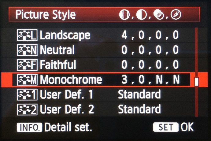
If your camera enables it, turn on its black-and-white preview function. You’ll find it in the camera menu under a name like Picture Style, Picture Control, or similar—the exact name will depend on your camera type.
Choose whichever option corresponds to a B&W preview, and double-check that you are saving photos to RAW.
Now when you turn on the live preview, the image on your camera’s LCD will display in black and white, and the picture’s post-shot preview will be black and white as well. But color information will still be saved to the actual pictures you take—to your RAW files. You can then open any photo in Zoner Studio and work with it as a color photo, or even convert it to actual black and white.
Shooting via the live view is the most efficient for training composition, as you see the picture’s shades of gray in advance. But the post-shot view of the picture you’ve taken will also serve you well.
Spend a certain amount of time on shooting with the black-and-white view, during more than one photo shoot. Try shooting this way for a month or more. You’ll be training your eyes, just like runners train their muscles. You’ll see how you are slowly learning to see the world in a new way, and you may be surprised at how your pictures change. So what are all the areas where a black-and-white preview can help?
Drowning in Colors
Flashy clothing or articles of clothing, scenes made up of many colored objects, light sources with differing color temperatures, differently-colored backgrounds… all this can create a veritable cacophony of colors in which it’s hard to orient your eyes. Highly visible colors grab your attention, leaving you no room to perceive the connections among the individual objects in a picture. The black-and-white preview will help you to suppress these distractions and concentrate solely on the subject itself and on how it fits into the picture overall.


A Different Light
Although you can’t really see the warmth of afternoon sunrays or the variety of a night sky’s tiny colored lights with a black-and-white preview, it gives you completely new possibilities for work with light. Concentrate on light’s direction and on the contrast it makes with shadow. Take notice of how rays of light influence the presentation of space and how they support the overall composition.


Lines and Patterns
When shooting with a black-and-white preview, you should also focus on the structures and patterns formed by various shapes. Notice the lines that lead your eye around the picture. The black-and-white presentation will increase their readability; they’ll practically pop out of the picture. Try to connect the lines and structures of various objects and hook photographed objects and persons into these structures.


Playing with Negative Space
Negative space is the part of the photo where “nothing’s happening.” It’s essentially the picture’s background. But don’t underestimate its role, because it can be very useful for separating a photographed object from its background. It can give a photograph depth and make it dynamic. When using a black-and-white preview, pay the most attention to the picture’s bright and dark parts and to their relationship.


Perceive Composition
While reading this you may have gotten the impression that I’m promoting black-and-white photography as such. But I’m not, and even the preview shouldn’t always be black and white. Composition is not, of course, entirely independent of color, and there are topics where a color representation is critical. For example in photographs of a blooming springtime garden or of a autumn forest trail sprinkled with colored leaves, color is the central element. But often color can reduce our ability to perceive a photographed scene.
In black and white, it can be easier to concentrate on how objects are positioned, on their interrelationship, and on how they relate to their environment. If you get rid of distracting colors, then you can better follow how your picture respects basic compositional rules, including e.g. the golden crop.
So when you head out to try shooting with a black-and-white preview, try the following small experiment on top of that. First photograph the scene as usual, using the viewfinder or the color preview. Take several pictures, and then try photographing the same scene with the aid of the black-and-white preview. It may surprise you what new things you notice!
David Janeba
Nice pictures though I prefer color versions of the last two. Black-and-white images are generally overrated.
Zoner
Well, there’s difference between the black and white picture and preview. You can have a color picture at the end, but tha black-and-white previews can give you a new perspective when taking the pictures. That can be an interesting experiment.