Get the Analog Look in Zoner Studio
Digital photos are technically precise—sharp, high-contrast, and color-accurate. But it’s often this very precision that can make them feel a bit sterile. The analog look, inspired by 35mm film and classic cinema, is based on softness, imperfections, and a strong sense of mood. The good news is you can easily recreate this look in Zoner Studio.
In this article, we discuss:
- how to soften contrast and balance highlights and shadows for a softer, more film-like result
- how to use Color Shift and other color adjustments for faded, pastel tones
- how to add subtle film effects such as vignetting, grain, and glow
- how to save your adjustments as a preset for a consistent style across a whole series
I’ll show you how to “break” digital images just enough to make them feel more natural, cinematic, and visually cohesive across a series—step by step. Keep in mind, though, that there isn’t a single analog look. Different films and development processes produce different color rendering. Think of this article as a guide, not a rulebook. There are countless ways to achieve the analog look, and Zoner Studio gives you the tools to explore them all.
Soften contrast: Working with light and shadow
One of the biggest differences between digital and film photography is contrast. Digital images tend to push the highlights toward pure white and the shadows toward deep black. By comparison, film handles transitions more gently with a narrower tonal range.
Start with basic Exposure adjustments settings in the Develop module of Zoner Studio. Lower Lights so the highlights aren’t blown out, and details remain visible. Then slightly increase Shadows so dark areas don’t collapse into solid black. If the image still has too much contrast, reduce overall Contrast.
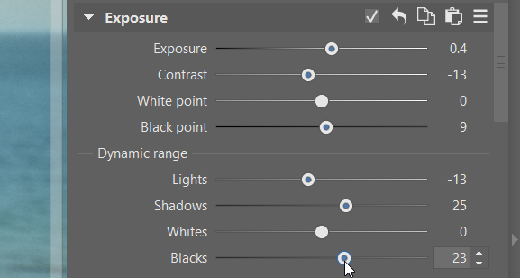
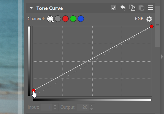
The goal isn’t to make the photo look flat, but to soften transitions between highlights and shadows. At first glance, the photo should appear softer. Curves are also very effective. Slightly raising the Black Point gives the photo a faded look that’s typical of film photography.
Faded and pastel colors
An analog look isn’t just about lower saturation. Color shifts play an equally important role. Film rarely renders colors in a perfectly neutral way. Individual shadows shift slightly, are brighter, and the overall palette tends towards soft pastels.
The key tool here is Color Shift. It lets you work with each color separately and gives them a film-like character. For select colors, gently adjust Hue. Just a few degrees is usually enough. Greens often look good when shifted slightly toward yellow, blues toward turquoise, and reds subtly toward orange.
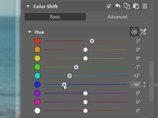
In addition to Hue, it’s important to fine-tune Saturation and Luminance for specific colors. You might slightly desaturate some colors, while keeping others more pronounced. A small increase in Luminance for specific colors can also help, making them lighter, more airy, and less digital.
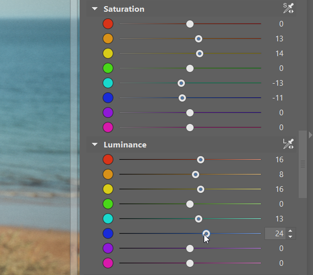
Global Saturation and Vibrance (found in the Color section at the top part of the right panel of Develop) work best as a supplementary tool. Use them sparingly, and only after you already adjusted individual colors. The end result should be muted, pastel, slightly washed-out tones that resemble classic film rather than a modern digital look.
Split Toning is another useful tool for getting that film aesthetic. It lets you lightly tint the highlights and/or shadows separately. In many cases, adding just a touch of cyan to the brighter parts of the image is enough. But don’t hesitate to experiment with all three color wheels.

Effects that complete the look
Final effects give the photo its unmistakable analog character. As always, less is more, so use them sparingly. Focus mainly on the following tools:
- Vignetting
- Grain
- Glow
Subtle vignetting draws attention toward the center of the image and evokes the optical behavior of older lenses. Keep it subtle, with soft edges or no overly dark corners.
Grain is essential for a convincing film look. In Zoner Studio, you can find it under Effects. Choose a finer grain type and adjust its size to match the image resolution. Ideally, the grain becomes visible when you zoom in, but remains unobtrusive at normal viewing size.
A slight glow can beautifully soften the light and give the photo a dreamy feel. Use very low values so that the glow influences mainly bright areas and doesn’t blur the entire image.

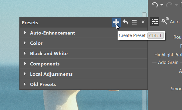
Saving your style and applying to a series
An analog look works best when it’s consistent. If you’re editing a series of photos, applying the same adjustments to all photos helps unify the series.
Edit one image until you’re happy with the result and save the adjustments as a preset. You can apply this preset to the rest of the photos in a series to create a consistent visual style, much like shooting an entire roll of film. The photos will naturally feel like they belong together.
Analog isn’t about filters—it’s about feeling
An analog look is not created with a single click. It’s the result of many small, thoughtful adjustments to tonality, colors, and mood. Zoner Studio offers all the tools you need to do this—the key is to work intuitively and not rush the process.
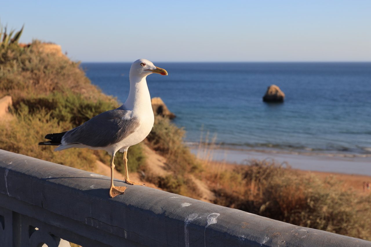
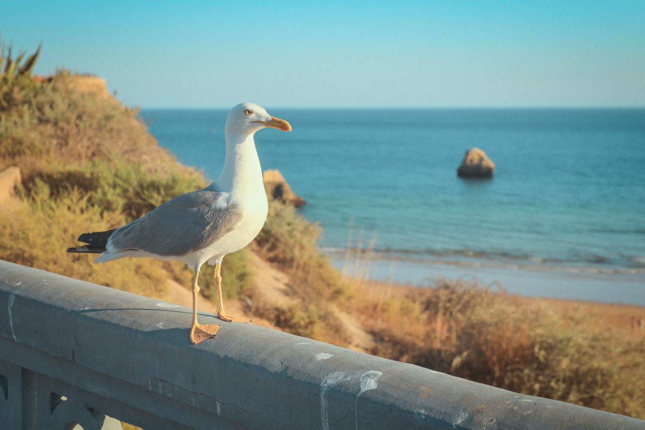
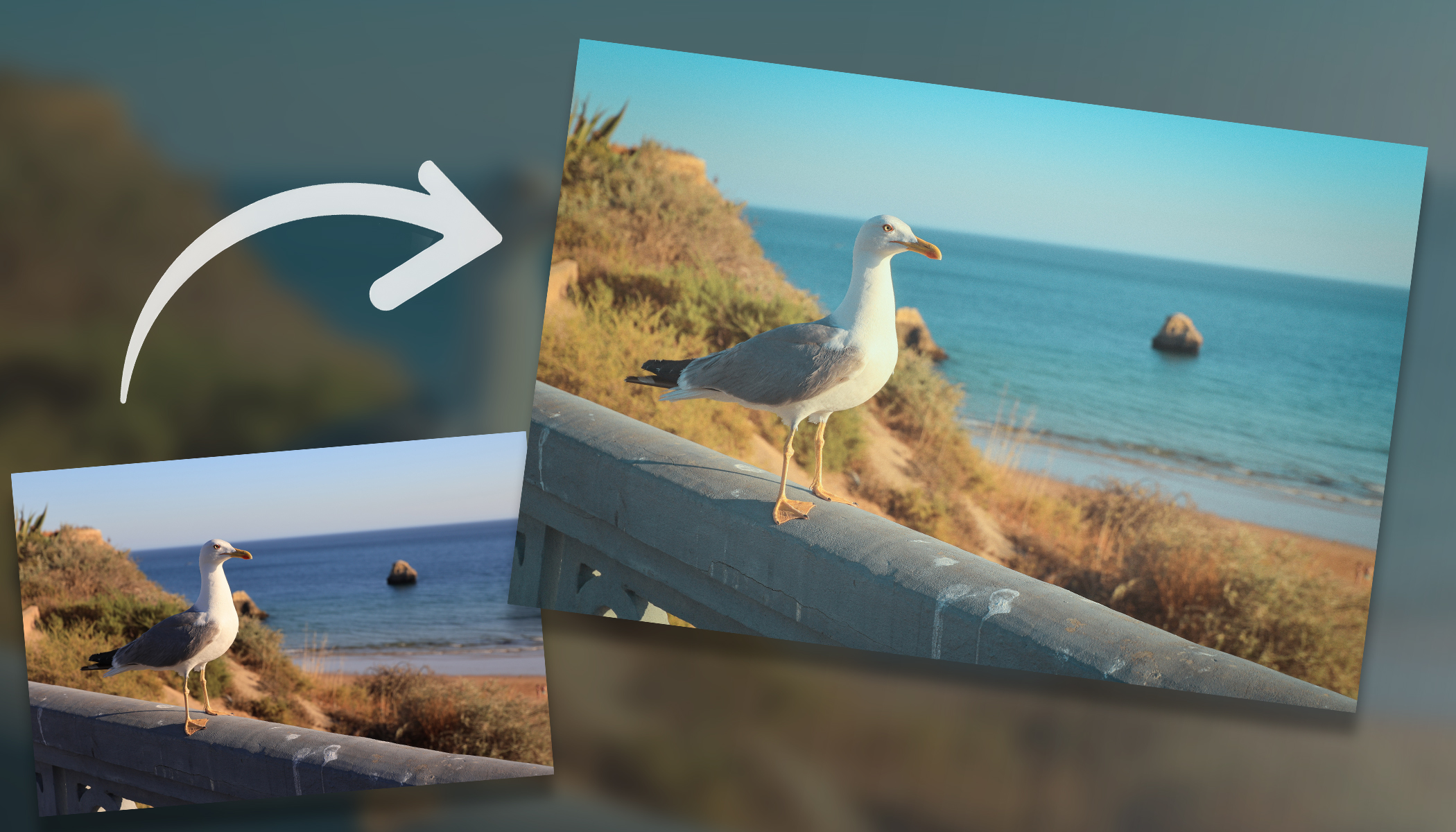
Before and after editing.
Try building your own “analog” preset and refine it over time for different scenes. The more photos you edit this way, the more natural the style can be. And that’s exactly what the analog look is all about.
FAQ
How much should I adjust contrast? Aim to preserve detail in both the highlights and shadows. A slight reduction in contrast and adjustment of the curve can give a softer, film-like result.
How do I choose the right color shifts? There’s no universal rule. Make only small shifts and watch the overall balance. Focus mainly on greens, blues, and reds.
How much grain should I add for the film look? Grain should be fine and noticeable mainly when zoomed in. Excessive grain can be distracting.
Should I use Vignetting and Glow? Yes, but sparingly. They should enhance the mood, but not mask the image.
Can I use a preset for an entire series? Absolutely. Edit one photo, create a preset, and apply it to a whole series. This gives you a consistent visual style. It’s advisable to manually fine-tune individual colors if needed.
There are no comments yet.