Video Editing in Zoner Studio—Part 2
Videos are a great way to showcase your photos and videos. In the first part of our two-part series, we covered how to add multiple video and audio tracks to your video project. In this article, we dive into advanced techniques, including working with audio, keyframes, and adding elements like your company logo.
You control audio clips the same way you control video clips. Once you select an audio clip in your project timeline, you can trim it, move it around the timeline, or adjust the placement on different audio tracks. Unlike video tracks, it doesn’t matter which item is higher in the timeline with audio tracks. This is because the layers don’t overlap.
Editing audio clips
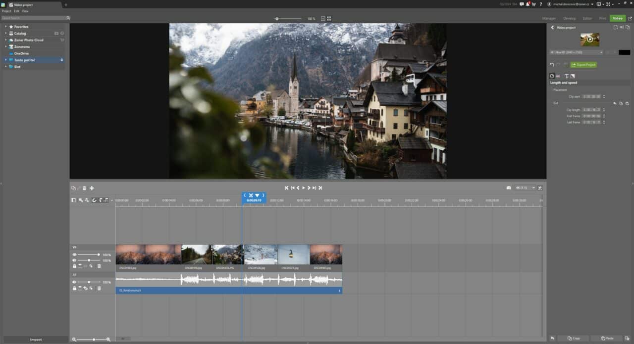
When editing audio, remember that your final project will be exported starting at second 0 and ending with the last clip on the timeline. This includes all audio and video clips in that time range. To ensure your music ends at the same time as your images or videos, you need to trim it. You can do this either by using the mouse (just like with video clips) or by manually setting the Last frame value in the right panel.
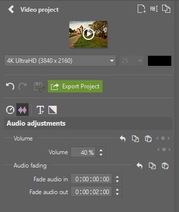
If you’re trimming music, make sure that it ends smoothly rather than stopping abruptly. Use the Fade audio out setting for a gradual fade. Combine Fade audio out with Fade out for video tracks to create a seamless ending for your project.
Alternatively, you can use keyframes. This gives you more options for the fade-out. For example, you can adjust the ease-in-out curve to ease-out.
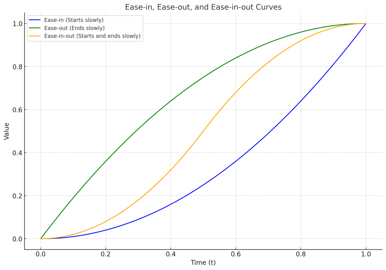
The differences between ease-in, ease-out, and ease-in-out:
Ease-in
- The change in value starts slowly and gradually accelerates.
- Typical use: To create the feeling that an object is beginning to move (e.g. a car accelerating).
Ease-out
- The change in value starts quickly and gradually slows down.
- Typical use: To convey the feeling that an object is slowing down (e.g. a car coming to a stop).
Ease-in-out
- A combination of the two: the value change starts slowly, speeds up, and then slows down again.
- Typical use: Smooth transitions of motion (e.g. for more natural animation or muting of sound).
First, enable Show Keyframes, which can be found next to the buttons that control the track.
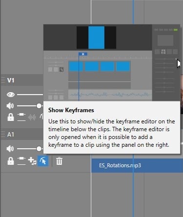
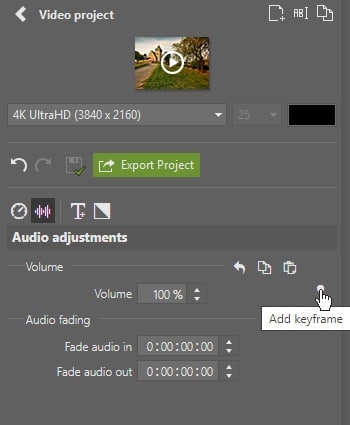
Since you haven’t added any keyframes yet, nothing happens when you click the button. Select the audio clip, scroll to the end, and position the playhead (vertical line) approximately 2 seconds from the end. In the right panel, click the dot that appears when you hover over Volume.
Next, move the playhead to the very end and set the Volume to 0%. Once you insert the first keyframe for a setting, additional keyframes are added as the playhead moves and the value changes.
You can remove keyframes the same way you add them. Place the playhead on the keyframe, then click the dot in the right panel. You can also delete it by double-clicking the dot in the keyframe editor under the timeline.
Adjust the volume of the music to match the narration
While creating a video project, you may find that captions are not always enough. Especially, if you need to describe multiple points. For these cases, it’s better to add a narrator’s recorded commentary.

To ensure the narration is clear, adjust the volume of the music so it doesn’t overpower the narration.
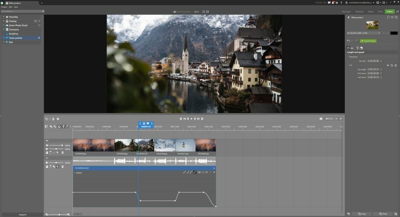
Add your recording and you’re ready to edit. Using keyframes, you can see a line or curve with anchor points representing volume levels over time. For audio tracks, you see a range of values from 0% to 200%, allowing you to increase or decrease the volume as needed.

To add a keyframe, double-click the line. Double-click again to delete it.
For example, you can lower the volume of the music to 40% when the narration begins and bring it back to 100% when it ends. This way, the music remains audible while the narration is crystal clear.
Increase and decrease volume gradually—over approximately .5 seconds—to avoid abrupt transition. After marking different parts of the curve, you can adjust its shape using the buttons in the editor header. The ease-in-out option typically produces the best sounding results in this case.
Add custom watermarks
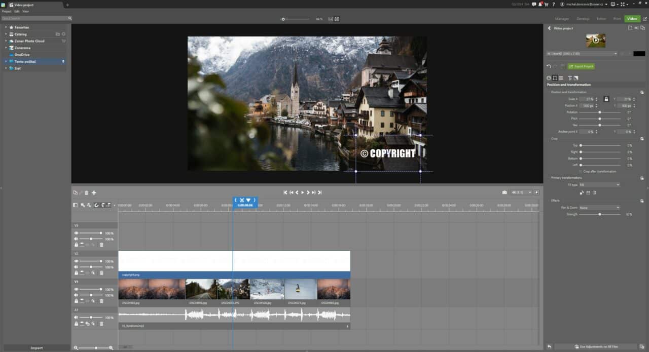
Adding a company logo or watermark to your video is simple. If you have a premade watermark with a transparent background, add a new video track on top of the others and add the logo there. If the watermark isn’t transparent, it will cover everything in the tracks below it, including images and video clips.
After adding the watermark to a new video track, adjust its Clip length in the Length and Speed tab, or stretch it to the desired length on the timeline. Then, in the Position and Transformation tab, use the Scale and Position settings to resize and position it—such as in the bottom-right corner of the video.
Managing text boxes
Zoner Studio offers premade templates for adding text, which you can fully customize. Even if you choose a specific template, you can completely transform it by adjusting the settings.
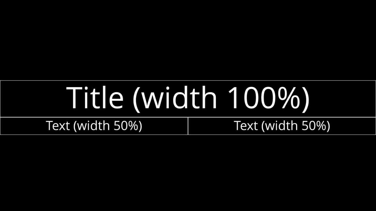
The templates include: Title, Subtitle, and Text. Each functions as a separate text box. The height of each frame is adjusted based on the text it contains, while the width can be set using the Width setting for each text box individually.
Text boxes are aligned in a row side-by-side. For instance, if you set the Title text box to 50% and Subtitle to 50%, they’ll appear on the same line. If their combined width exceeds 100%, they will automatically move to a new line.
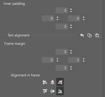
Choose the placement of the text boxes using Alignment in frame. Inner padding adjusts the spacing between the text and screen’s edge.
Another useful setting is Frame Margin. These values determine the spacing between frames for each direction separately.
In this example, we add a simple animation to our text. We use the Title and Subtitle 2 templates, positioned in the bottom-right corner. We drag the template to the timeline and edit the text. Customize the font, color, or style as desired. Then, go to Position and Transformation and set the playhead to the start of the text box.
Create a new keyframe above Position and move the X value to positive values to move the text off-screen to the right (e.g. 2000px will work). Then, move the playhead forward 10 frames and set the X value to 0, bringing the text back into view.
The further you move the playhead to the right, the slower the animation is. And the more to the left, the faster the animation is. Finally, adjust the ease-out curve to create the effect of the text coming in from the right and gradually slowing down.
Start editing your videos today! Download Zoner Studio free for 7 days—no limits. Create a video that will amaze and engage your viewers!

There are no comments yet.