Make Color Your Subject to Get Powerful Photos
Photography is a field that relies heavily on colors. That’s because colors are one significant element affecting every photo. Sometimes more, sometimes less. Let’s take a look at a situation where colors are simply fundamental.
Today, amateur photographs might seem to be hot on the heels of professional photographs. But there are still differences that form clear boundaries between them. The relationships among elements in a picture are one of these differences. The picture’s color composition is another.
A photo, as a picture, has certain attributes. These attributes come mainly from you, the photographer. You’re responsible for its composition; you’re responsible for how it’s edited; you’re responsible for its effect on people.
Catching Eyes at First Sight
I’ve had comments under my articles in the past telling me that I care too much about photographic experts and not enough about ordinary people. I protest! I care about ordinary people too. When a photo has been taken skillfully, everyone appreciates it, even if they don’t know why. An expert will know why, and will tell you.

Color as an Element of Composition
Let’s take a look at one reason why a photo can catch eyes at first sight, and why a specific place in a photo can grab attention right away. What reason is that? “Color landmarks,” as I call them. These significantly affect a picture’s composition.

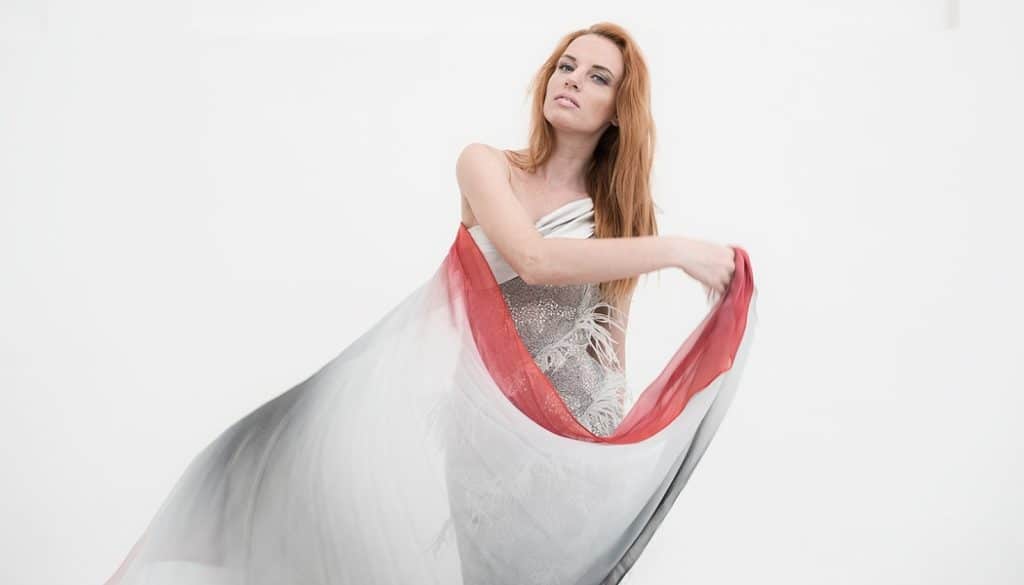
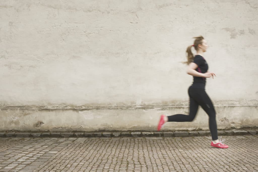
Color landmarks are dominant colors placed in a photo whose other colors are neutral—usually grayish. The photo either has no other colors, or they are heavily suppressed. This type of photo is often shot in an urban environment. Concrete is a great neutral background.
A typical example of these photos is a scene with a person plus some very visible element—most often a person with an umbrella, walking along a concrete wall on a cold, damp day. But there are also other cases where a photographer can use color landmarks to enhance a photo.

The How-to
Try this technique out for yourself. All it takes is a little advance planning of how the photo will look. Start by choosing an artistic, rather than documentary, photograph as your foundation. I say this because in documentary photography, you don’t really get to influence the scene.
So—find yourself a neutral environment, and then nestle your single-color element within it. Try to make your subject stand out by making it the most colorful thing in the scene, and make it a real attention-getter. By the way, this is also a great way to practice your photographic skills. You’ll start thinking more about what appears in your photos.
What to Avoid Like the Plague
The simplest solution for creating a color landmark in a photo is selective desaturation in an editor. One frequent combination is a black-and-white desaturated photo plus a striking red element of some kind. Avoid this approach! Put your work in during the shot itself, and then make as few edits of this sort to your photo as you can. Still, mild desaturation of distracting elements can come in handy.
Harnessing Dominant Colors
Colored elements can be put to work in any branch of photography. Colors and their combinations really make the photo, and if you want to draw more attention to something, there’s nothing simpler than to use colors as one method for that.
Photos done this way are mainly found in advertising and fashion photography. But you can also find uses for them in just about every genre—even documentary photography.
There are no comments yet.