CRI: Color Rendering Index — Color Fidelity in Photography
Photographers well-versed in photography terminology are certainly familiar with the term white balance. However, white balance is not the only factor to consider when discussing light. You can also measure how well a light source displays different colors compared to natural light. This type of measurement is useful for photography as well as other color work, whether it’s painting or putting on makeup.
I was able to get by not knowing about CRI ratings for a long time, but when doing product photography and portraits, I occasionally had color issues that I couldn’t explain. These issues were explained when I learned more about color fidelity.
In this article, we’ll take a look at the basics of light ratings in terms of the ability to reproduce color. We can then use this knowledge to explain and discuss the different types of lighting used in photography.
What is CRI?
CRI stands for Color Rendering Index. It is a value from 0-100 that attempts to identify how close the colors under a given light are to what would be expected in natural light.

The higher the number, the truer the color rendition. This also means better quality light.
Today, CRI ratings are found with most light sources. Common house lights are usually just above 80, indicating acceptable colors.
How light is rated
CRI has its downfalls, so it’s important to know how light is assessed.
CRI uses a set of 15 color samples. We know how these samples look under natural daylight.
These samples are lit with a certain light and given a numerical value indicating how close the resulting color is to what we would see under natural light. The results for each sample are labeled from R1 to R15. But for normal ratings, only the first eight numbers are used. They are then averaged to produce the Ra value(a=average). However, this is commonly referred to as CRI, so don’t be surprised if you see CRI for some light sources, and Ra for others – the meaning is the same.
Red R9
The problem with CRI is that it uses an average, so a large error in one color can be compensated for by good results elsewhere. The most problematic color is deep red, the result of which is hidden behind the R9 label and not used at all for Ra (or CRI). Remember, CRI only uses the first eight colors!

Red (R9) is present in skin color, so it’s desirable for photographers to get the best result.
That’s why some lights give a more accurate picture and list both the CRI rating and the R9 value. Unfortunately, this is no longer very common.
As you’ll soon see, well-rendered reds are a much more important criterion than just a high CRI, so values somewhere over 50 are considered good values.
In addition to CRI, there are newer light rating systems such as TLCI, TLFM, TM-30, etc. Only these ratings are not currently found on ordinary lights, so I won’t focus on them.
Sunlight and candles: Ideal light
The CRI indicator was designed based on sunlight, so it’s no surprise that the CRI for sunlight is around 100.
The number is affected by the way the measurements are taken, but I did some amateur experimenting with my spectrophotometer specifically designed for monitor calibration (X-Rite ColorMunki Photo). Even so, the results it reported were typically 98 to 99. The normal spectrum of outdoor light frequencies looks like this:
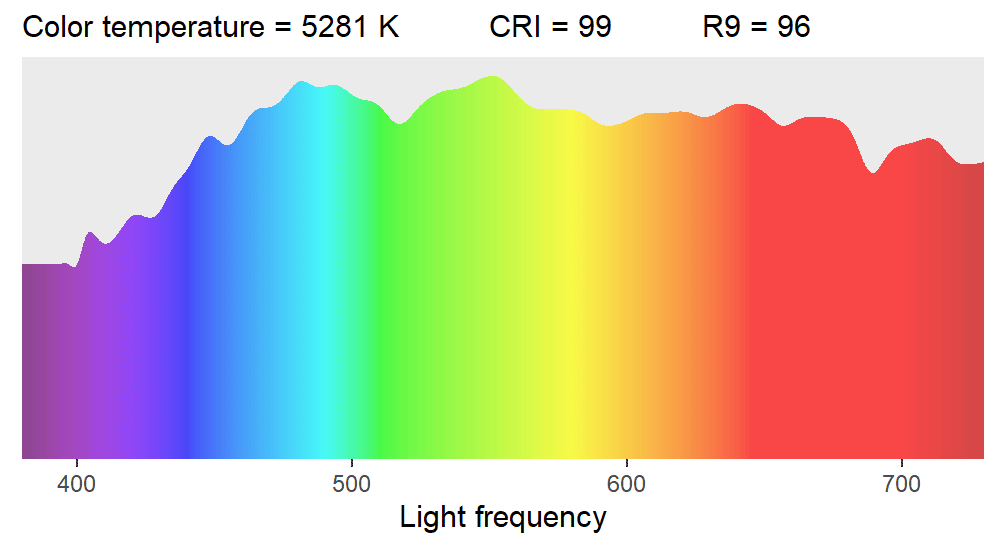
The graph shows the frequencies and their relative representation in light. The light intensity itself does not play a role. Both CRI and R9 are high for daylight in spite of my simple measurement method.
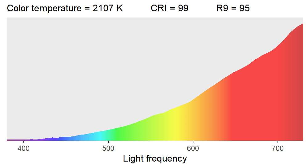
A candle gives off similarly good light, but has a much lower color temperature, meaning it makes everything look orange. The spectrum looks different, but that’s as compared to a theoretically ideal spectrum of the same temperature. Even with the naked eye, you can say the graph looks “good” and the colors shift to warmer tones in an even and predictable way when compared to daylight.
The worst lighting: Streetlamps
I measured absolutely terrible color rendition at night using a sodium lamp, in other words, an ordinary streetlamp. Its CRI was only 6! Interestingly, the R9 value came out at -267, which is possible for individual colors.
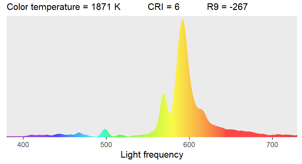
Sodium lamps give off a very limited spectrum of frequencies that we perceive as yellow. We know based on the principle of how light words that to see an object as purple, the right frequencies must be reflected off of it. However, frequencies that are not yellow are hardly available for this light, so purple objects will appear black to us.
Next time you walk the streets at night, notice how few green cars you see. They are there, only they look black or gray to you. The same is true with blue. But the lamp does give off some blue light, so you can sometimes see blue. But keep in mind, this effect only works where there are only sodium streetlamps and no other light source is nearby such as house windows, car headlights, light from the night sky, and so on.
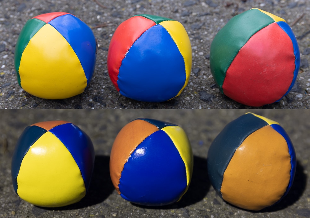
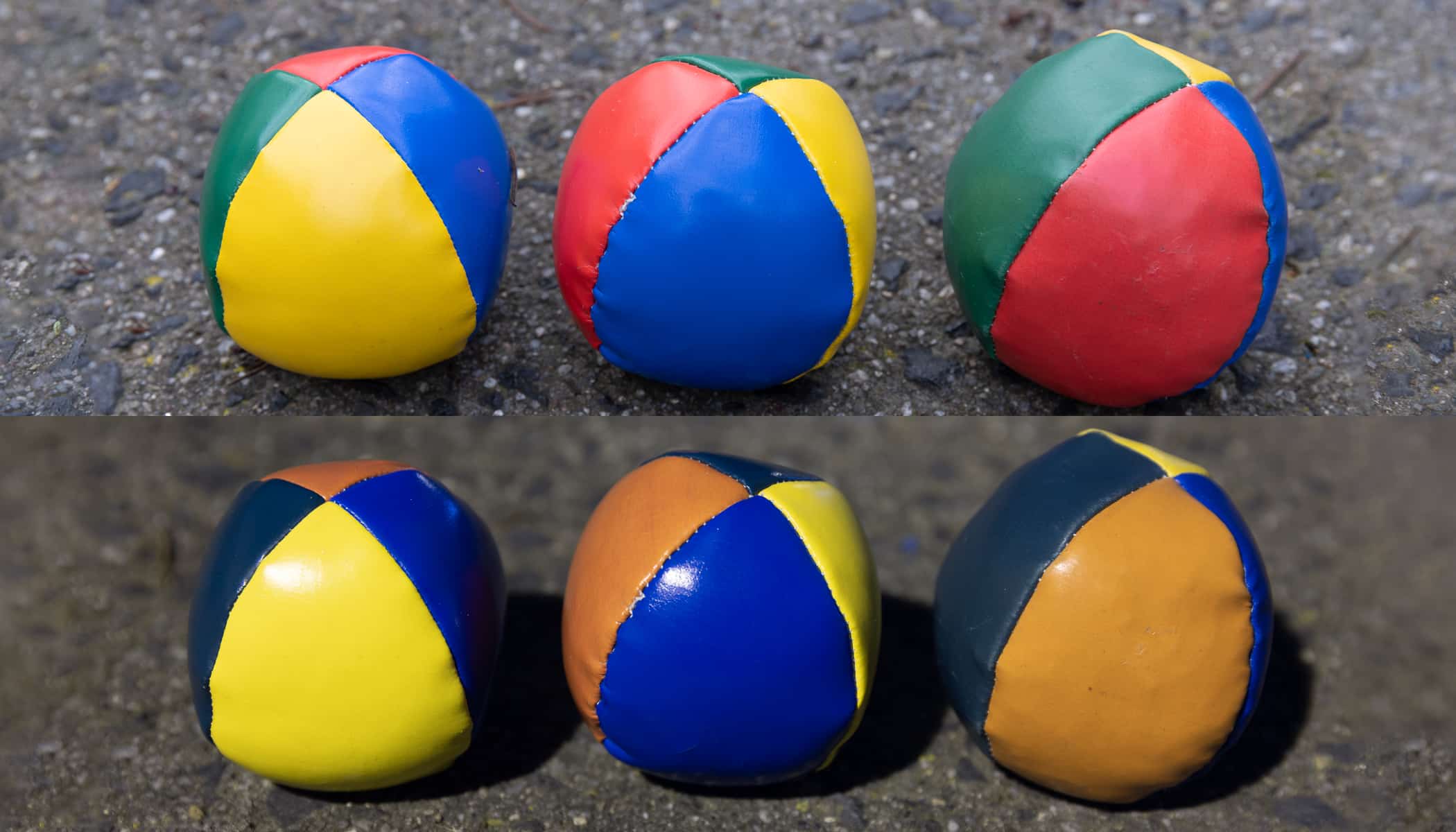
On the balls above, you can see a comparison of a sodium streetlamp with the same scene photographed the next day using daylight. The long 15-second exposure with the lamp revealed some blue, but green is not present and red turned out very bad.
That’s why when you’re taking city pictures at night you can try your best, but no white balance setting will give you absolutely true colors.
Next: Home lighting
So far, we have explored the basics of CRI and shown the extremes you may encounter. Fortunately, home lights are much more consistent, but for us photographers, there are still some major differences between them. We will focus on this in the continuation of this article.
There are no comments yet.