Using Edits to Make Your Subject Shine
The article is over 5 years old. The information in it may be outdated.
![]()
We are working on its update. In the meantime, you can read some more recent articles.
Today we’ll take a look at how to improve a photo where the subject lacks emphasis. We’ll do it using basic tools in Zoner Studio. We hope you’ll download the starting picture and follow along!
Deciding What Can Be Improved
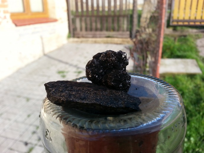
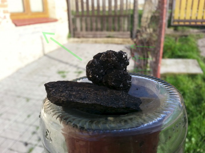
This picture’s subject is the coal, while its background doesn’t play an important role. And yet the coal takes up only about 1/8 of the picture’s surface. The rest of the photo is just background, with no importance for the author’s intent. Meanwhile, its colors distract from the subject. So our goal will be to emphasize this central motif and suppress the unimportant background areas.
You’ll be using the following tools for the edit:
- Collinearity (K),
- Crop (C),
- Quick Edits (Q),
- Selection Brush (Shift+Q),
- Invert Selection (Ctrl+Shift+I),
- Fill with Surroundings (Shift+Del),
- Place Shape (Shift+S)
- and Effect Brush (E).
The letters in parentheses above are shortcut keys.
Editing Workflow in Zoner Studio
Composition
This picture has two key problems here: receding lines and a boring center composition. The window in the background, with its strong colors, draws attention away from the dark central motif. The green lawn in the right quarter also lacks any meaning for the picture. The vertical red line, however, is useful—it helps keep a viewer’s eyes on the main subject.
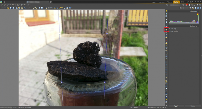
First straighten the receding verticals using the Collinearity tool.
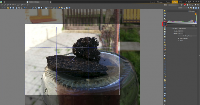
Then use Crop to remove the unimportant parts of the photo with elements that draw attention away from the subject.
Tip: For easier composition work with the Crop tool, turn on one of the two cropping mark displays. One of them is for the Golden Ratio, and the other for the Rule of Thirds. To show them, use the View menu’s Crop Marks item. To cycle through them quickly, use the Tab key.
Use the crop to move the subject out of the center and eliminate the distracting window in the background.
Tonality
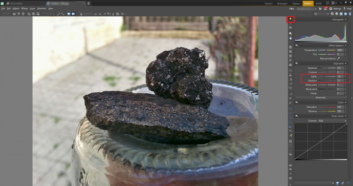
The coal is properly exposed, so there are no overexposure problems to fix here. But going for a good exposure has made it hard to see the coal’s structure, which is critical for the picture. To emphasize it, draw out its details using the Shadows slider in Quick Edits. To show Quick Edits, click the lightning-bolt button or press Q. Meanwhile, the histogram does show some mild blowout in the wall in the background. To suppress that problem, use the Lights slider.
Clarity
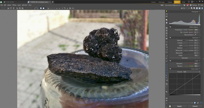
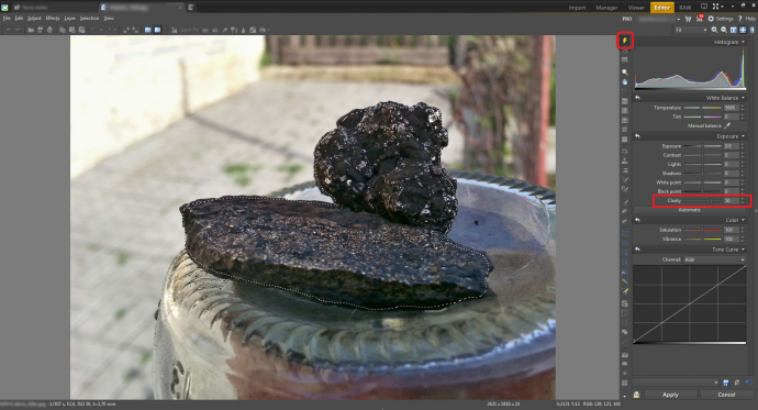
To further emphasize the coal’s structure, increase its clarity. First select the area with the texture you want to emphasize. You can use the Selection Brush for this. We’ll be needing to leave this selection at one point and come back to it later, so use the Selection menu’s Save Selection… item. That saves the selection outline (not its contents) so it can be reloaded afterwards. Then raise the move the Clarity slider to the right. This slider is in Quick Edits.
To suppress background detail, meanwhile, you’ll want to reduce the background’s clarity. Invert the selection by using the Selection menu’s Invert Selection item. Then in Quick Edits, move the Clarity slider to the left—into the negative values.
Cleaning up the Scene
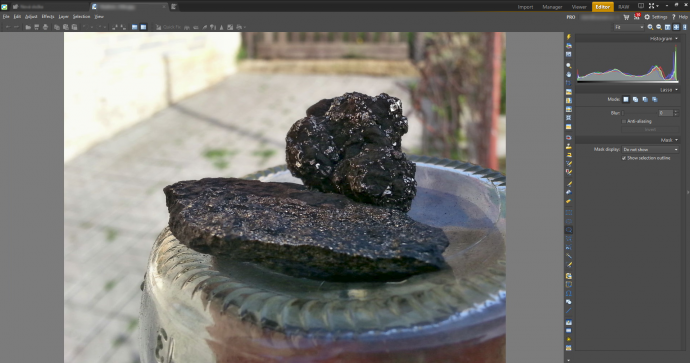
The small broken-off piece of coal on the right side of the picture is still stealing a lot of attention. The solution is simple. Select that area using one or more of the selection tools, and then use the Selection menu’s Fill with Selection item. Or—to do it yourself for finer control—use the Clone Stamp or the Healing Brush.
Emphasizing the Golden Ratio
The person who took this picture wanted to emphasize the golden sheen on the coal. Now, you could use brush-work to add detail to the individual glints, but that would be very time-consuming. What’s quicker is to place a rectangle of a glint-like color across the coal, and then hide most of that rectangle, so that it covers the glints only. To do that, we’ll be using an appropriate choice in the Mode dropdown while adding the rectangle. This works for two reasons. First, because Mode can set what changes (here, what parts of the rectangle) get merged into the picture based on any one of a variety of factors, including brightness. Second, because the glints are significantly brighter than the coals.
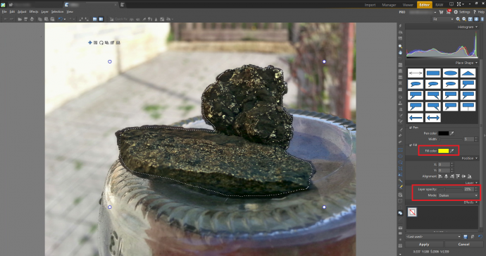
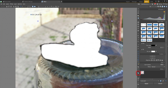
Restore the selection you saved earlier by using the Selection menu’s Load Selection item. Then put the rectangle in the picture: use the Place Shape tool. Place the rectangle over the whole selection, so that it’s all covered with that one surface (the rectangle) of a single color.
Set a yellow fill, set the Opacity to 25 percent, and set the Mode to Darken. Again, the Mode sets how the colored rectangle will affect the picture when it’s blended in. While Normal mode would just draw the rectangle over the picture, Darken mode only copies it over in the spots where the picture is brighter than the yellow we’ve used. In other words, the yellow is only added to the glints.
Final Edits
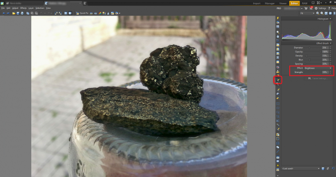
Now our picture has more contrast, and its main topic is clear. But there’s still a small problem—the background is darker in the right part of the picture than in the left part. To manually brighten dark areas, use the Effect Brush, with the Brightness effect and a positive effect strength. Draw on the dark areas to brighten them.
When using this brush for darkening or brightening, use a low effect strength and consider a low brush opacity. Even with a low strength, you can easily overdo the Brush, since you’ll tend to compare each change to what you saw before it, instead of the state before you started.
Composition-wise, the photo’s bottom portion is basically unneeded. This photograph was taken in a 4:3 format, and cropped in that format too. Re-cropping it to analog film’s 3:2 format improves the composition and prepares the picture for printing on standard photo paper.
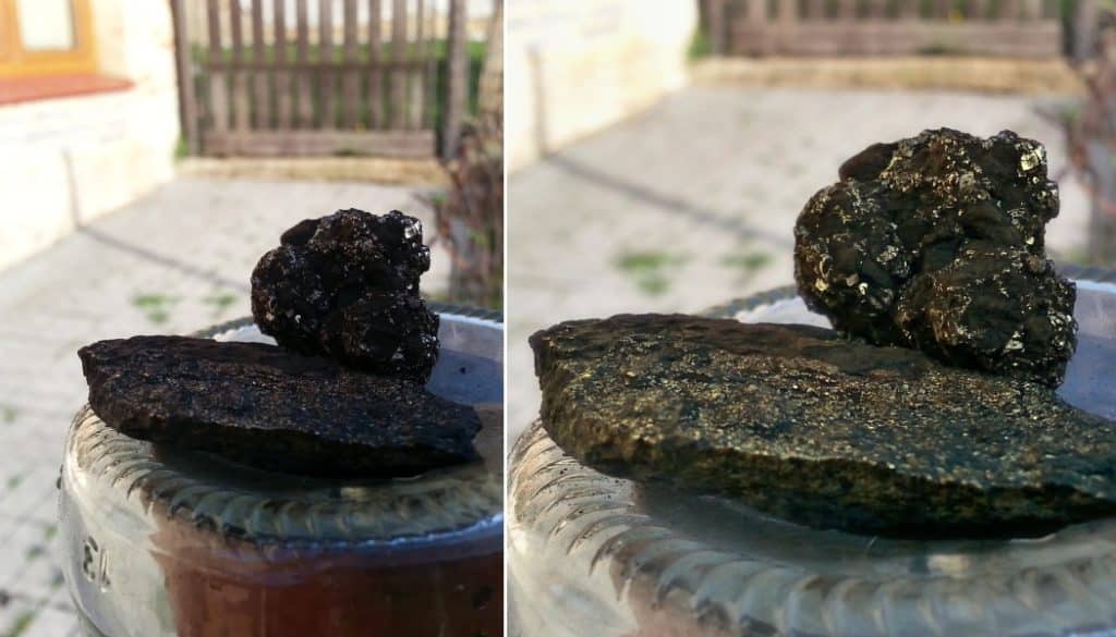
Now let’s compare the photo before and after we took the steps above.
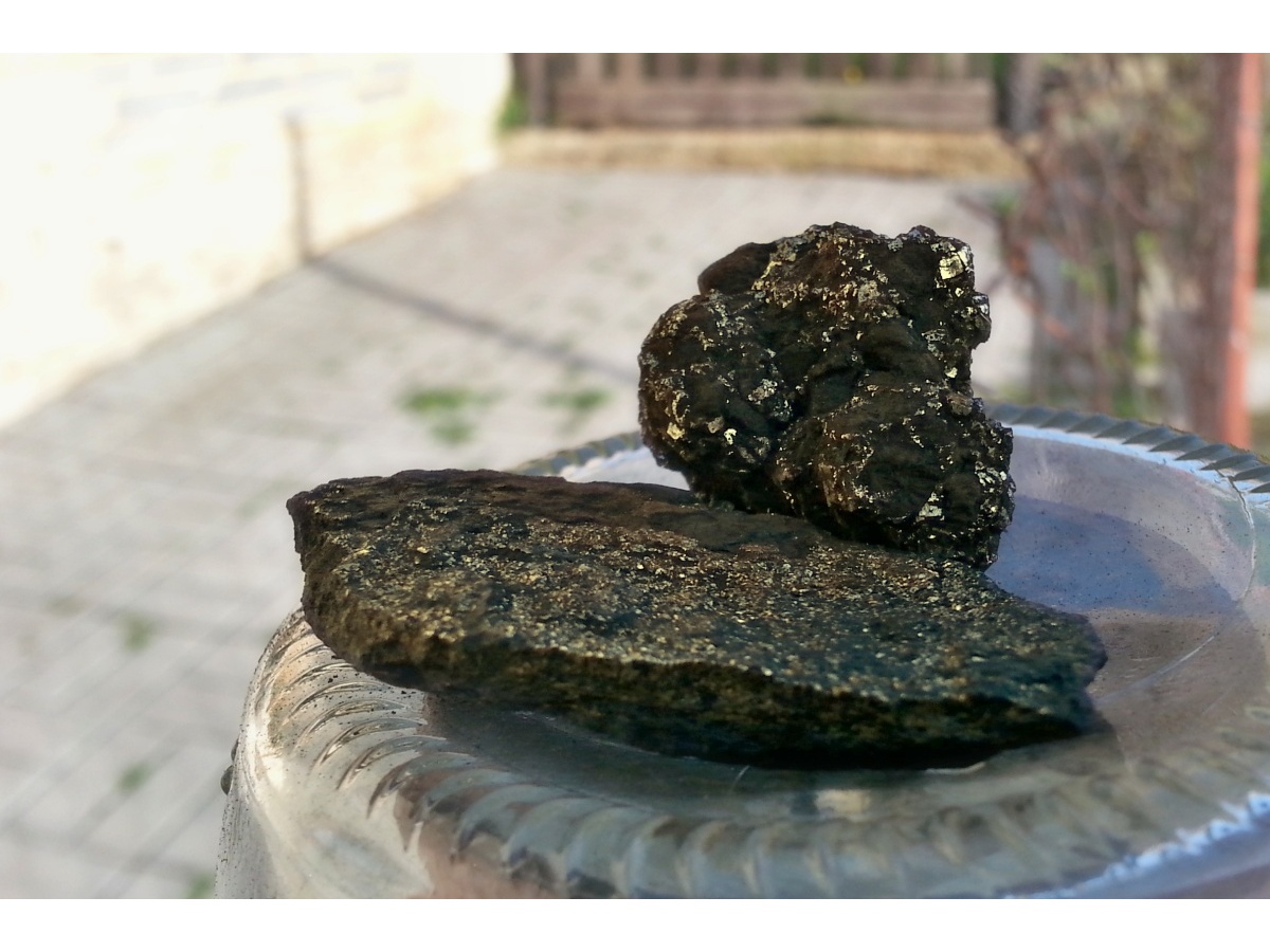
The final picture and the original. To switch between the versions, run the mouse over the picture.
Need to fix similar problems in your own photos? Try Zoner Studio 7 days for free and get perfect photo edits!
Annalize
Wow, this is such a stunning article! Keep up the good work!
Carol Undy
This was great, more of this type of article would be greatly appreciated. I tried to find tutorials on youtube, but very few are in english. I’m sure more people would buy your software if there were more how to info like this out there showing just how versatile and powerful the software is.
stephane v
Great article , l learnt a lot
John C.
Great article!
Grady J
I agree with Carol. I have been reading your articles, and this is the first one that makes me consider buying your software. Tutorials like this demonstrate the value of your product.