VIDEO: What to Watch Out for When Adjusting Contrast in Your Photos
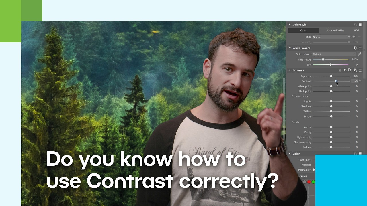
In this video, Vanda breaks down one of the most important tools you’ll find when editing photos in Zoner Studio—contrast. Although contrast is often the first adjustment photographers reach for when they want to make an image pop, it can also be the trickiest one if not used carefully.
In the video, you’ll learn when to add contrast, when to avoid it, and how to use additional tools to achieve a more natural result without losing details in highlights and shadows. Interested in working with contrast during photo editing? We’ve selected additional articles from Learn Photography to guide you through contrast adjustments.
How to Increase Contrast Smartly and Tastefully
5 Ways to Enhance Contrast in Your Photography – A practical guide to various contrast adjustment techniques in Zoner Studio, including exposure tools, Curves, and local adjustments. The article explains when and how to increase contrast so your images look more dynamic without sacrificing detail.
3 Ways You Can Add Life to Dull Photos – Recommendations on how to breathe life into flat, lackluster photos using exposure adjustments, contrast, and haze removal. This is an excellent companion article to the topic of contrast, as it demonstrates how to enhance contrast thoughtfully when editing flat images.
Low-Contrast Editing: When You Want a Softer Look
Low-contrast Photogaphy in Zoner Studio – This article takes the opposite approach and shows you how to achieve softer, less contrast-heavy edits in Zoner Studio. Instead of increasing the difference between highlights and shadows, you’ll learn how to reduce tonal differences to create a gentler, calmer mood—ideal for images shot in diffused light or foggy conditions.
The article explains how to adjust the Highlights, Shadows, Black Point, and White Point sliders to achieve a naturally low-contrast look, and how fine-tuning color saturation can further enhance the result.
This approach is especially popular on social media today. A more matte look can evoke mood, softness, and a cinematic feel. As mentioned in the video, lower contrast isn’t a mistake—it’s simply another way to communicate something through your photograph.
Contrast as a Tool, Not a Goal
Contrast is a powerful ally—but also an easy way to ruin a photo. Whether you’re editing a portrait, landscape, or black-and-white image, always think about the story your photo is meant to tell. Sometimes a dramatic look suits it best; other times, a subtle, almost low-contrast style works better. Watch your histogram, use local adjustments, and don’t be afraid to look for balance. Zoner Studio is there to help you.
There are no comments yet.