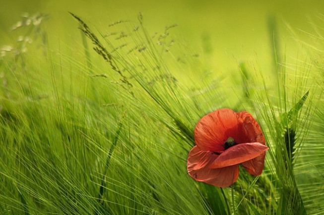
7 Tips for Better Composition

Image composition is a critical element that can elevate—or deflate—the value of your photographs. Thus it’s something that you should never underestimate.
These are 7 basic tips for better composition:
The study of composition has one advantage over the study of other elements of photography: it doesn’t matter what camera you use while you’re studying composition. What’s more, you can even switch your device to fully automatic mode. All the better if you do—that way, you can concentrate on just the content of your photographs and not worry, for now, about camera settings.
1) Fully occupy the space in your photograph with the subject
When you look at the picture, do you see a lot of “expressionless” empty space around the picture’s subject? Maybe not on all sides, but just on, say, the left or the top? Focus on what truly interests you in the scene and let it dominate your photographic canvas!
2) Compose in the viewfinder or the camera display
This will save you work, and it will also ensure you will have enough image data left over for eventual large-format printing.
3) Avoid center composition
Or in much better words only use center composition when the situation calls for it. Beginning photographers have a tendency to always put all the objects that interest them in the center of the picture. But this kind of composition is useful mainly for portrait photography, where it gives the subject a certain extra seriousness, and sometimes for architectural photography. In most other cases, it pays to put the subject in another place, for example…
4) Rule of thirds
One of the imaginary lines dividing the picture into thirds horizontally or vertically. Thirds have a close connection to the concept of the Golden Ratio, a ratio of sides known since Greek times to have a deep aesthetic effect on the viewer. The Golden Ratio itself is not used in photography directly, but it is used in a simplified form—indeed, via the Rule of Thirds. So while you are taking your shot, imagine a Tic-Tac-Toe grid overlaid over the viewfinder. Place the photograph’s subject on one of the intersections of that grid. This will give you a more dynamic picture!

5) Frame your picture
No, not by heading down to the hardware store and picking out a frame there. Rather, by finding natural frames within the scene that ensure that your audience will not find their eyes driven out of the picture. Frames make people look at your pictures longer.
6) Look for repeating motives—for a rhythm
Repeating objects, and sometimes something that disrupts that rhythm, are powerful tools for composition. Rhythm attracts your audience’s attention.
7) Utilize guidelines in each scene
Guidelines—highways, rivers, straight lines, crooked lines—help guide your audience’s eyes. And when you catch sight of such a line, you can take advantage of it to keep viewers focused on the main subject of your picture.

Even though there are whole books that can be, and have written, “just” about composition, the seven areas above are a great starting point for learning to take engaging and powerful pictures. Now get out there and practice!

There are no comments yet.