Add a Bloom Effect to Lights in Your Pictures
The article is over 5 years old. The information in it may be outdated.
![]()
We are working on its update. In the meantime, you can read some more recent articles.
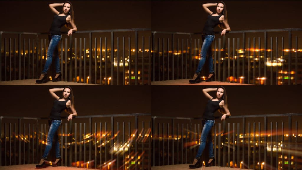
Today’s cameras are so technically advanced that pictures have lost the atmosphere that lenses once provided. One way to give them some charisma is through clever use of a blurring effect.
The Bloom effect is a hot topic (with fans and foes) in computer graphics today—but it comes from real life. Bloom is a slight blurring of light sources to create an aura around them. Bloom doesn’t suit every photo, but when used wisely, it can make many pictures more attractive.
The method described here utilizes image layers, and so if you are just starting out with layers, we recommend first reading our article on the basics of using layers in Zoner Studio.

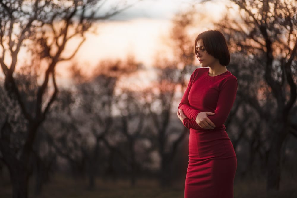
The actual process is simple, and it can also be “recycled” for a number of other effects. For my illustrations I chose a photo that’s already fine. But an extra bit of gentle light can give it a dreamy, romantic touch.
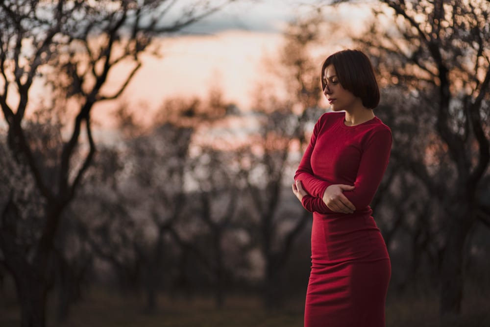
Canon 5D Mark III, Canon 85/1.8, 1/200 s, f/1.8, ISO 800, focal length 85 mm
Step 1: Duplicating the Original Layer
When you first open a picture in the Editor, it has a single layer. So start by copying this layer so that you get two identical, stacked layers. This is easy to do: click the Duplicate Layer button in the right panel’s Layers group. This does not visually change the picture at all; it just adds another layer.
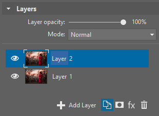
Most other edits should also start this way, because then you’ll be making all your changes on a new layer, and so if something goes wrong, you still have your original. For this effect here, work without layers would be even harder than usual, because they’re critical to the process—you’ll be editing a new layer until it only contains the bloom effect itself, which will be blended with the original layer based on your settings. So here the two layers are a necessity.
All of the upcoming steps are to be taken on this newly created layer, so make sure that this really is the active layer, i.e. the one that’s differently colored in the list.
Step 2: Isolating Light Sources
Now you need to choose which spots you find interesting enough for you to blur them and add their light to the surroundings. This mainly means the brightest spots in the picture. You can do this automatically, by setting a minimum intensity below which lights will be ignored. That’s the route we’ll illustrate.
To do this, use the Curves filter (via, for example, Menu > Adjust > Curves) and set up the curve so that everything but the lights of interest drowns in black. But black won’t literally be used as black in this edit. Instead, it will serve as a neutral color; black areas will stay in their original state, without brightening. Everything else—everything that stays visible—will be used to increase brightness by some amount. In our picture here, I’ll especially want to select the sky, which will then shine onto its surroundings.
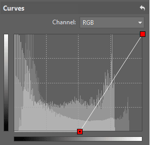
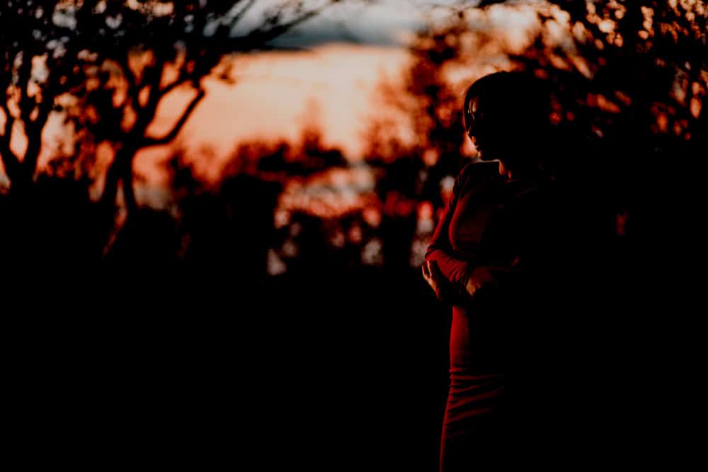
This step isn’t essential, but it does give you some extra control over your results. Also, if you decide that you don’t want the extra shine in certain places (e.g. on a model’s face), it’s easy to paint over it with a black brush. There’s no need for precision here; you’ll be blurring the result later anyway.
Step 3: Changing the Layer Mode
To properly see how the light will be blended with the original pixels, you need to switch the layer blending mode (the Mode in the right panel’s Layers group). There are many options here; you can experiment with them later. Among the most practical is Screen.
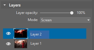

Step 4: Blurring
You now have everything ready for the blurring itself, and thanks to your setup above, you’ll see the results of your edits “live.”
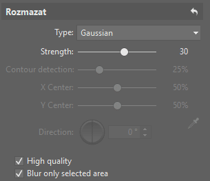
Use e.g. the Adjust menu’s Blur filter. Out of this effect’s settings, the Type setting deserves the most interest. Set the Gaussian type. Then set the Strength, which determines the degree of blurring, as expressed in pixels. The best Strength to use depends on what effect you wish to achieve, and on the picture’s resolution. Generally you’ll want something around 50. For some pictures, ones with a high resolution, you’ll be wanting to use this filter multiple times. Use the Ctrl+6 shortcut and the Enter key to quickly blur the same layer multiple times, to get a stronger effect.
Step 5: Fine-tuning the Brightness and Colors
After the blurring in the last step, the picture lost contrast due to the averaging of colors. To easily restore that contrast, use Curves again. The sky’s the limit for edits here; you can think up any curve shape you like, to get any final result you like. Your edit can be very dramatic, or you can go the opposite route and leave this step out completely to get a very gentle look.
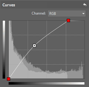


The result after final edits to the histogram curve.
With your edits to the histogram curve, you may have accidentally increased the saturation of the photo’s colors. That’s not necessarily bad, but if you’re bothered by it, then take this extra step: use the Enhance Colors filter—e.g. via the Ctrl+1 shortcut. Use the Saturation slider here to remove or add saturation to a photo’s colors. There’s no hard-and-fast rule here; do what feels right.
A Wide Range of Uses
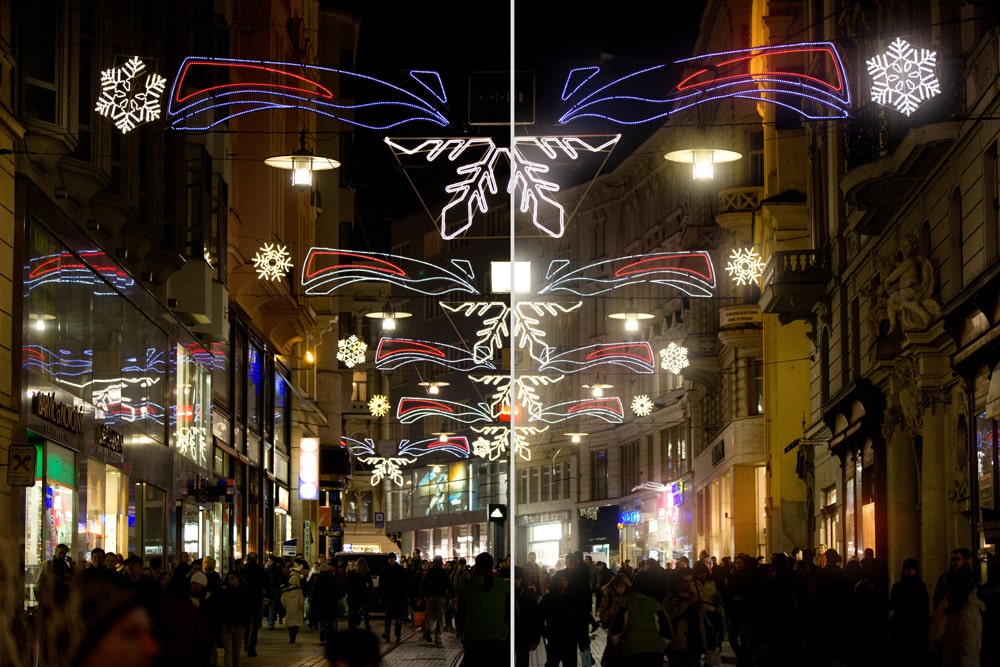
That brings us to the end of the workflow itself. In this picture I blurred a large area, but you can work identically when adding a bloom effect to much smaller light sources.
Alternative Effects
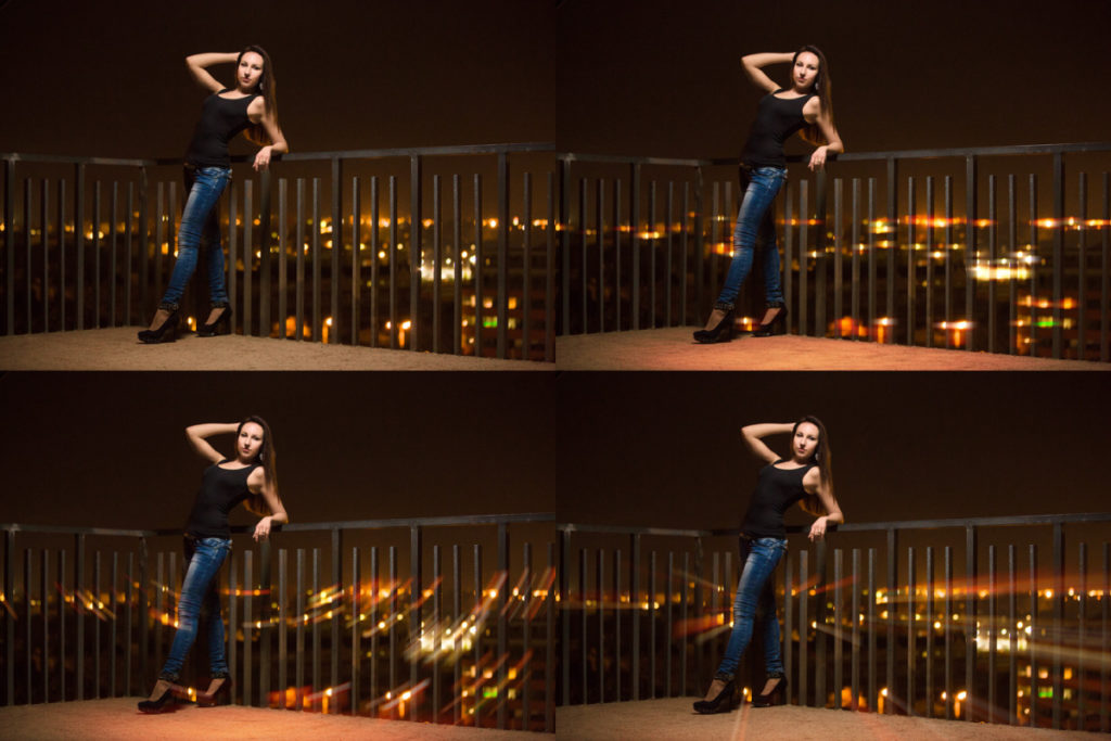
If you don’t mind experiments, try using a different type than Gaussian for the blurring. Directional, Rotational, and Zoom are all interesting options here. Your overall approach does not change, and yet through this tweak you get a different kind of effect, which can be a better fit for certain pictures.
A Simple Foundation for Complex Work
The workflow described here has several steps, but it can be performed in a minute. It illustrates several principles that you can also use when creating complex compositions or effects. If you’re still not sure, download Zoner Studio, try it 7 days for free, and experiment with bloom in your own photographs. This is also a good way to learn work with layers, which will come in handy for you in the future.
There are no comments yet.