Composition: How to Draw Attention to Your Subject
There are several tools you can use to draw your audience’s eyes towards your photos’ subjects. But there are also many ways in which you can accidentally transfix your audience with something different than what you intended. So in today’s article, read up on the right way to get your audience’s attention and keep them focused on your subject. That will give your pictures better, more pleasing composition.
Guide All Eyes to the Subject
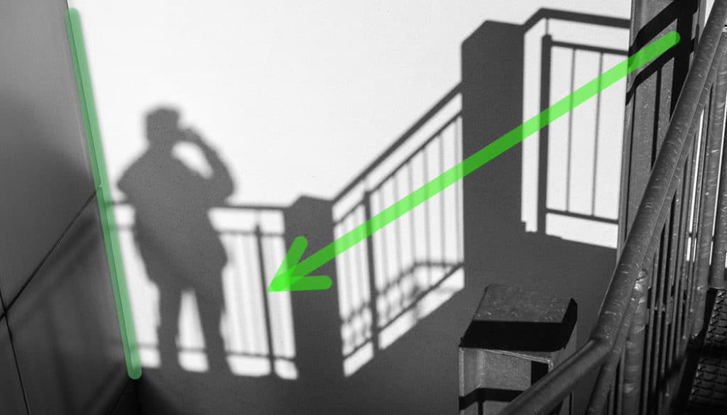
In a previous article, we explained the “Golden Crop” rule, which you can use to find an ideal place to position the subject in a picture. For an image with a complex composition containing a number elements that may compete with the subject for your audience’s attention, it’s good to guide their eyes towards the subject using “guidelines.”
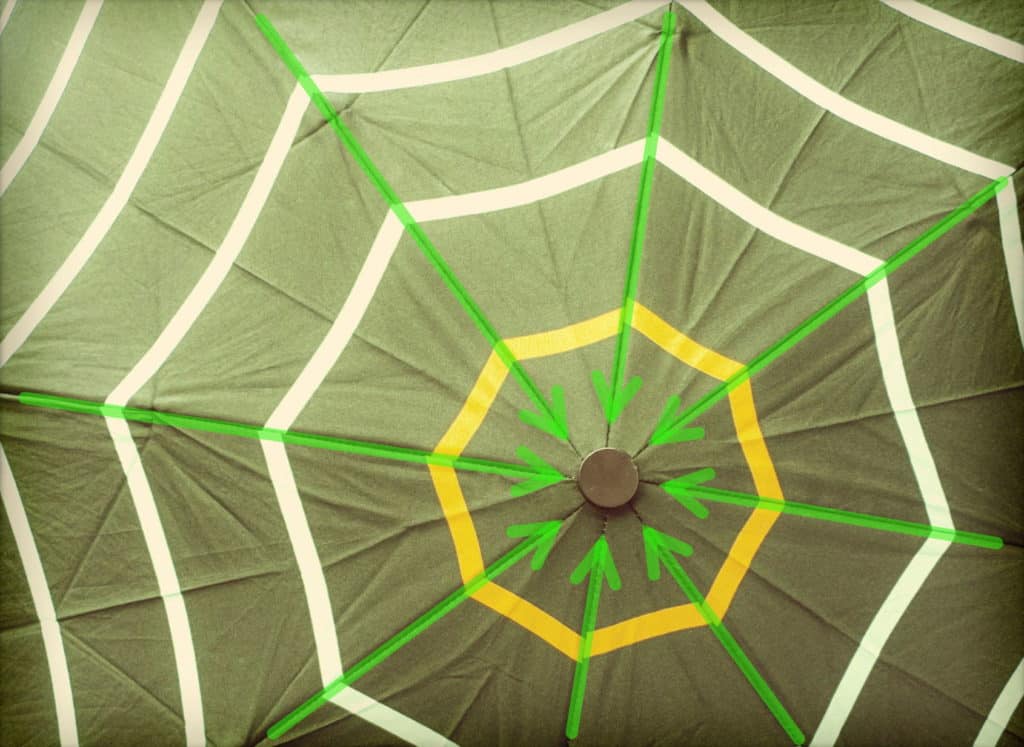
These can be made up of something very concrete in the picture—maybe a path or a railing. But often they can be imaginary instead, made from, for example, a row of repeating elements that together serve as a “path” to guide the eyes.
Panasonic Lumix DMC-LX 3, 1/13 s, f/3.2, ISO 200, focus 6.8 mm (32 mm equiv.)
Panasonic Lumix DMC-LX 3, 1/500 s, f/2.8, ISO 200, focus 10.2 mm (48 mm equiv.)
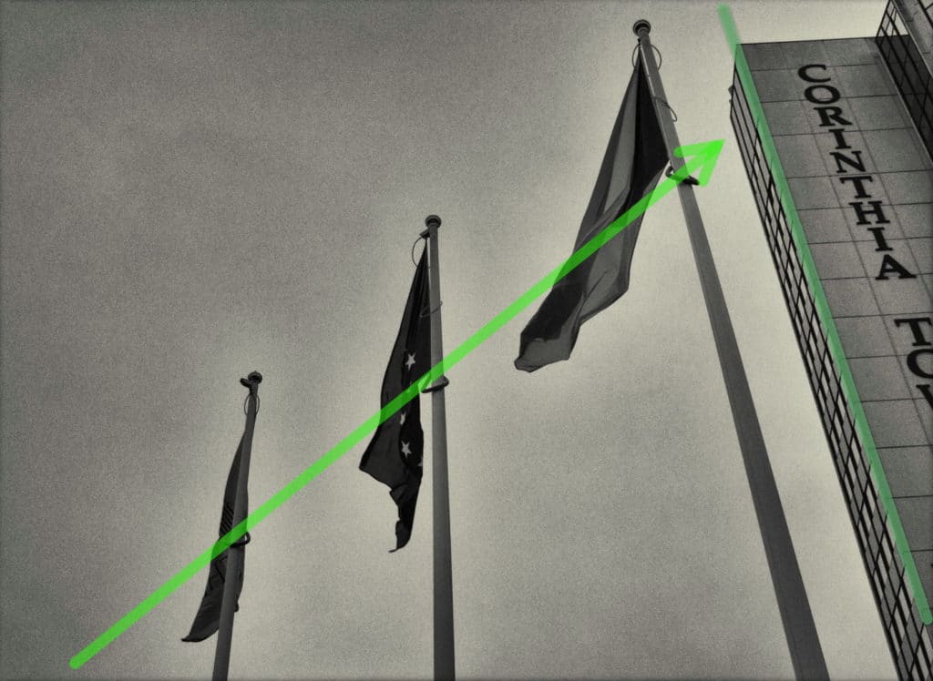
When composing your images, you also need to carefully watch for unwanted guidelines that might lead your audience’s eyes away from the subject.
Vertical guidelines often serve to optically box in the subject and prevent your audience from moving their eyes on out of the image.
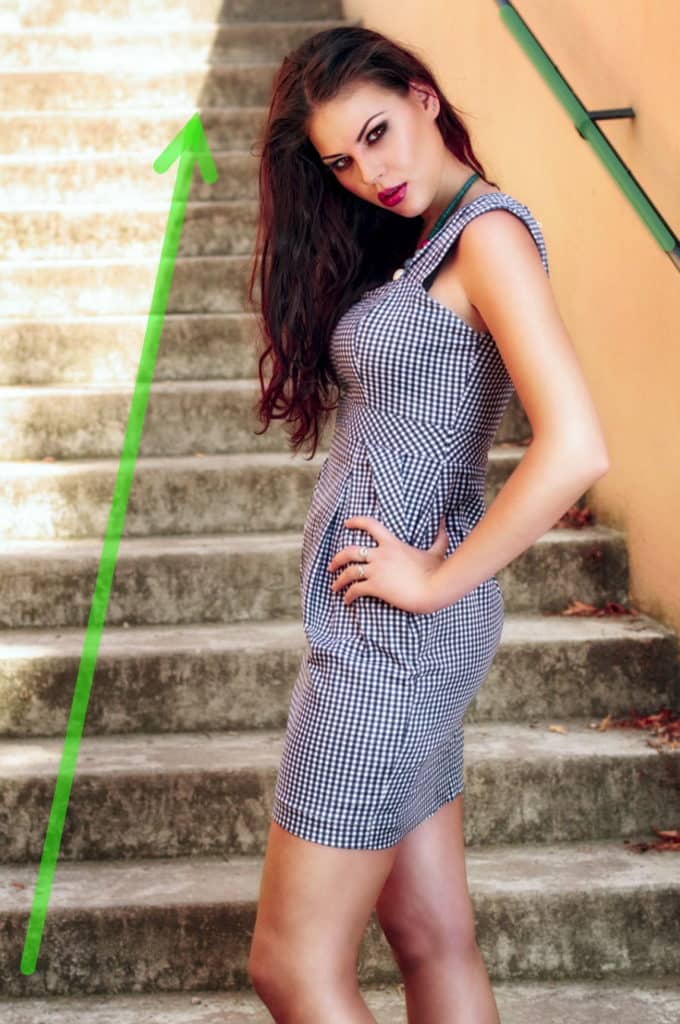
Canon EOS 7D, EF 50/1.4, 1/125 s, f/3.2, ISO 100, focus 50 mm (80 mm equiv.)
Clean up Around the Edges
When composing, you need to also pay attention to the edges of the picture.
A photograph can often be disrupted around its edges by unwanted elements that have no connection to the picture that you set out to take. They’re just distractions, stealing attention away from your subject. It’s usually enough to just step back a bit while composing; this removes the unwanted elements from your picture. In situations where you can’t clean up the picture’s edges while composing, you’ll want to do it later on in a photo editor, for example in Zoner Photo Studio.

Canon EOS 7D, EF-S 15-85/3.5-5.6 IS USM, 1/10 s, f/5.6, ISO 100, focus 35 mm (56 mm equivalent)
Take More Readable Photos
When photographing complicated scenes, always try to make them easy for your audience to interpret, by taking advantage of any guidelines available in the scene. And likewise, you should make sure not to leave lines and elements in the picture that steal attention away from your subject.
Terry Byford
Jan, I beg to disagree with your assessment of the last image. Far from being distracting, using the branches of a tree to “frame” an image is a well established ploy to concentrate on the subject matter, and fill in what would be an otherwise boring blank sky. And by removing the branches, this is what you end up with. Here, though, it is more a question of which is better, with the branches in or removed? For me, the image becomes somewhat unbalanced without the branch, and you only have to look at the revised image to see how much the blank sky impacts on our appreciation of the image. Quickly reverting to the original, it feels and balances better despite the so-called defect.
This image is not perfect in this respect and it would have been better for the photographer to have moved to his left to include more of the branches to provide a more positive frame. This would have been my advice when taking this image.
Zoner
Thank you, Terry, for you point of view, it’s always interesting to hear other photographer’s opinion and advice.