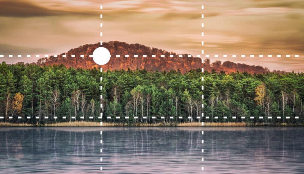
Composition: Everything You Need To Know About the Golden Crop and the Rule of Thirds

As a photographer, you have one fundamental tool for defining pictures’ composition. That tool is the way you place your subject in the frame. You can do this job best if you know about the Golden Crop and the Rule of Thirds. Your placement of the subject within a photo’s space affects not only how easy it is overall to interpret, but also the meaning of what it says.
Place Your Subject on a Golden Crop Point
For ideal subject placement, photographers use a rule called the “Golden Crop.” To observe this rule, you need to place your subject on the “Golden Mean” intersection—that’s the intersection of two of the dividing lines that you can get by dividing the image’s space into two parts, where the ratio of the larger part to the smaller part (it’s about 1.6 times bigger) is the same as the ratio of the whole picture to the larger part.
We can find many things in nature whose organization reflects the Golden Mean—for example, the leaves on a branch, the scales on a pine cone, the shell of a snail, and even the human body. Thus, compositions based on the Golden Mean are more harmonious for the human eye than other compositions.
But in practice, this is too complicated to do. So we usually divide the picture into thirds instead.
To get the knack of placing your subject on Golden Crop points, start by working with the composition tools offered in a photo editor. Just open up a photo that you’ve already taken, and use a cropping tool (like the one in the Editor in Zoner Studio) to adjust its composition appropriately. The majority of photo editors today can show a grid depicting the Golden Crop points, and/or the Rule of Thirds points. Over time, this rule will become second nature for you, and you’ll start to be able to apply it automatically before you take your shot. If your camera can show a reference grid on the display, don’t hesitate to harness this ability while you’re composing.

In the sample photo, I placed the center of the umbrella on the Golden Crop point already while I was taking the picture.
You’ve probably noticed that the Golden Crop lines (and the simpler Rule of Thirds lines) intersect in four places. So you have four different options for where to place your subject while still respecting the Golden Crop rule. Ideally, you can put your main subject on one intersection while occupying another intersection with a secondary subject in the background that optically balances out your main subject.
When deciding which intersection to use for your subject, it’s good to keep in mind how we read (here in the West). Both text and pictures get to read from left to right and top to bottom.
So we start by looking at the top left intersection and finish up at the bottom right. And the bottom right is also generally considered the most appropriate spot for placing the subject.
Ideally your audience “reads” the whole photo and stops at the subject, prompting them to think about the photo and (if you really succeed) to go back to the beginning to read it again. The tool that will help you to inspire them to read this way is guidelines—which we’ll be covering in upcoming articles.


Panasonic Lumix DMC-LX 3, 1/160 s, f/2,8, ISO 200, focus 12.8 mm (64 mm equiv.)
The Rule of Thirds
Dividing a picture’s area into thirds is not just a simpler way to respect the golden crop. It’s also, and above all, a way to divide up pictures that contain multiple planes. One typical example is landscape photographs, which usually include a horizon line.
For these, it’s a good idea to place the horizon line one-third of the way from the top or the bottom. If the sky is uninteresting, then place the horizon on the top dividing line. Meanwhile, if the sky is exceptionally interesting, you can place the horizon on the bottom dividing line to leave more room for the sky.

Canon EOS 5D MkII, 70-200/2.8, 15 s, f/22, ISO 100, focus 200 mm
Put Thought Into Your Subject’s Placement
The rules of dividing the picture into thirds and composing to the Golden Crop points are used in all photographic genres, and for most topics (including abstract topics) they markedly improve your photos. So don’t hesitate to use them.
Jester the Clown
These so-called rules are, in fact, no more than a guide; a suggestion of how your image might look most pleasing when they’re applied.
While that’s true to some extent, they’re by no means set in stone and many, many images will look far better if these guides are disregarded.
This article barely scratches the surface and there are lots more of these guides out there.
In reality, if you draw sufficient lines all over any image, eventually, you’ll end up finding yourself folliwing at least one of these gides, whether you want to or not.
By all means learrn about and understand them but never fall into the trap that you need to be constantly applying them.
The truth is that you don’t.
Zoner
Thanks Jester for your comments. It’s deffinitely true it is good to know the rules, because if you know them, you can intentionally avoid them and that can be good too.
Richard Lindgren
I really liked it.
Zoner
Thank you!