The Right Composition and the Right Light: 7 Things You Can Learn From the Movies
Did you know you can improve your composition while you’re relaxing watching movies on TV? Just think about filmmakers’ reasons for using particular shots. And then use the same approaches in your photography.
We all have our favorite movies—and favorite shots within them. Look at them closer and you’ll find that filmmakers constantly use the same tried-and-true composition methods. It’s worthwhile to try them in photography too.
I’ll demonstrate this through the examples of several typical compositions that I like and that I try to use in my photography.
Thirds and the Golden Crop Are the Foundation
The golden crop and the rule of thirds are absolutely fundamental for composition. That’s nothing new. And the vast majority of filmmakers abide by these guidelines too. You’ll find this confirmed in practically every frame of every film.
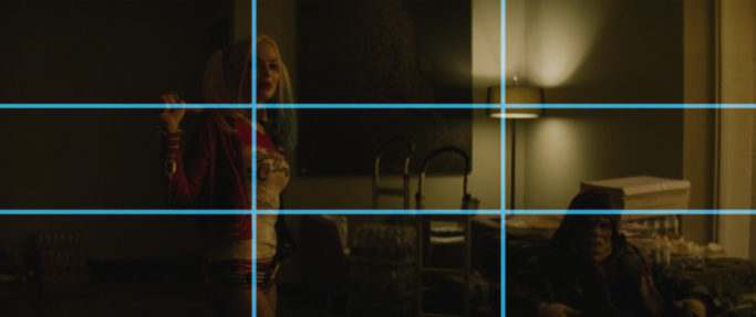
When you’re watching movies, try to notice this and to think about why a filmmaker shot a given scene exactly how they did. It’s an excellent way to practice composition even without a camera. And you can seek new possibilities within even something as basic as the rule of thirds.
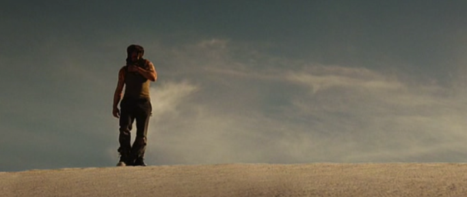
It all looks very simple and ready to use. But thinking up a composition like this when a scene doesn’t have just one plane and one object can sometimes be quite complicated. Movie scenes do generally tend to have simple compositions compared to, for example, the works of classical painters.
Compositions in Dialogue Scenes
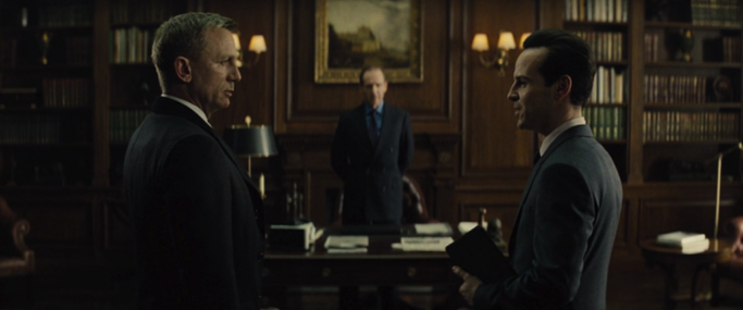
Movies generally include a lot of dialogues. The cameraman will usually film a dialogue scene from over the shoulder of one of the dialogue’s participants. Very often you can use this approach when you’re taking reportage photos. One basic model for this approach can be birthday parties, where you’re photographing people as they’re giving birthday wishes.
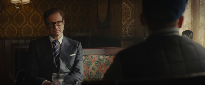
In the previous scene, also note the simple, but very well-functioning single-point overall lighting from the window on the side. You can make use of this in practically every interior.
Less (Light) Is Sometimes More
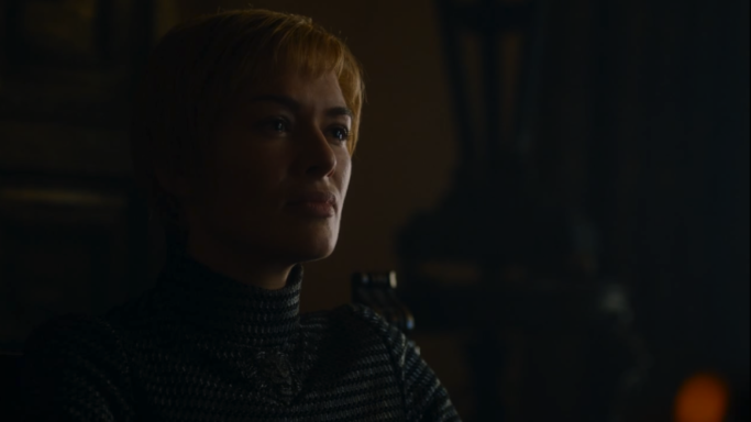
Game of Thrones is one show that has great work with light. It’s full of dark scenes that are deliberately underexposed, with only the main features of people’s faces detailed via lighting from the side. Everything else is in shadow. This minimalism emphasizes what’s important and gives room to the imagination.
Combine Different Lighting Temperatures
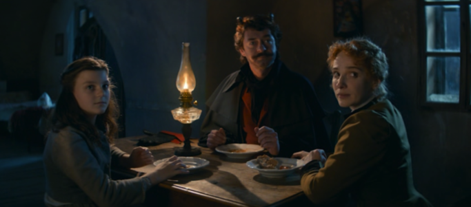
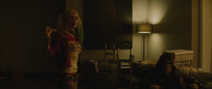
When they’re lighting night scenes, filmmakers often make use of the warm light of a light bulb or a candle to illuminate the subject, combined with cool blue light representing the moonlight. But this kind of lighting doesn’t always suffice. Sometimes you need to help yourself out with supplementary edits, for example via editing presets.
Graduated Compositions Using Fog
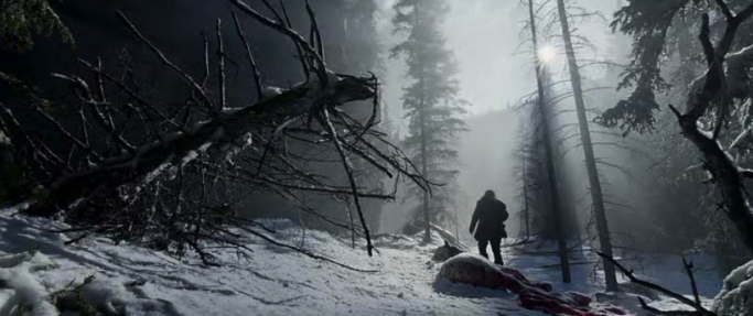
Have you ever wondered why photos and movie scenes in the fog look so good? Part of it is the fact that fog (as well as smoke) creates distance-based layers. Objects gradually grow brighter as they grow more distant, and so the closer (darker) ones look more important.
Depth of field also works like this.
Wide Shots Pull You In
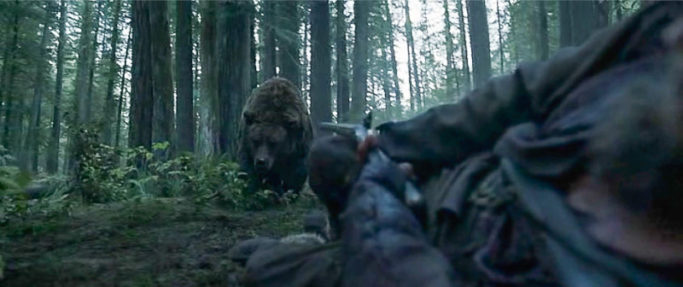
Revenant was very interesting for me in terms of composition. It makes heavy use of closeups shot with a wide-angle lens. This makes the viewer feel like they’re lying on the ground next to the protagonist and fighting for their life.
So definitely try leaving your comfort zone and e.g. photographing kids or animals from the ground. It will give your photos added action.
The filming team also used a wide angle in the following scene (practically a cult classic today) from The Terminator. You can see how the end of the gun was very close to the lens during the shot. I feel like Arnold’s gun is practically sticking out of the TV; maybe you do too.
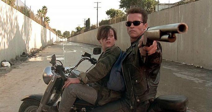
By the way, for safety reasons I can’t recommend creating this kind of composition with a working weapon.
Lines That Show the Direction of the Action
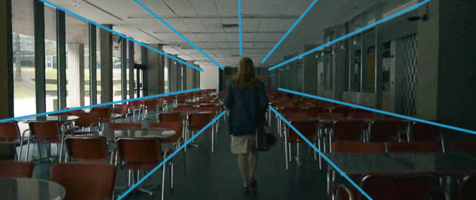
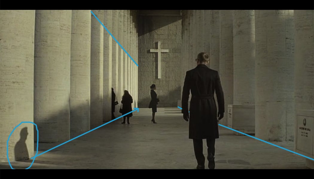
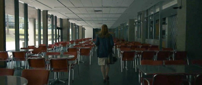
A scene is also made stronger when it has several straight, dominant lines converging towards the subject or theme. In the previous illustration, it’s the direction the protagonist is leaving towards.
You can create lines in a scene using regularly repeating motifs that run off into infinity, for example.
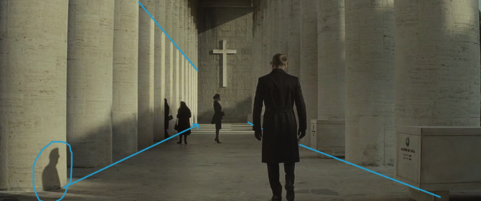
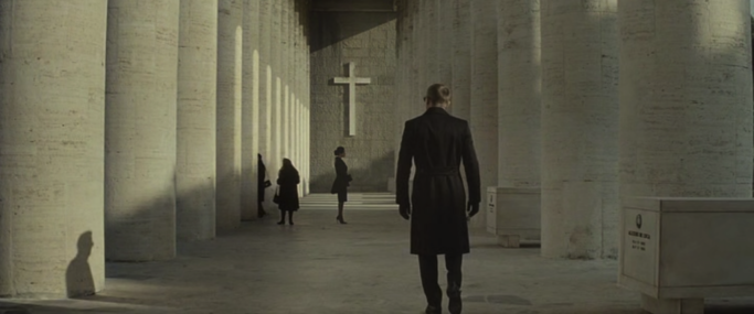
In this example from Spectre, besides the lines leading towards the lady behind whom the protagonist is standing, there’s also an ingenious composition for the shadow on the column. Like in the last example, this shadow is aiming past an imaginary arrow pointing towards the action.
Watch and Get Inspired
There’s nothing simpler than learning by watching. And movies provide a lot of opportunities here. Take advantage of them! And if you also have some favorite movie compositions, I’ll be glad if you share them in this article’s comments.

There are no comments yet.