How Can You Tell When Black and White Is Right?
We see the world in color, and cameras can reliably record the colors we see. Despite this, a black and white conversion will often make a photo better. When does black and white pay off?
The decision on whether or not to convert a photo to black and white is often a subjective one that depends on what a person prefers. You’ll certainly find people who always choose black and white… or who always choose color. Converting a picture to black and white is a way of stylizing it; after all, it’s “normal” for things to be in color. Yet despite all this subjectivity, there are several guidelines that can help you to decide when to go for black and white.
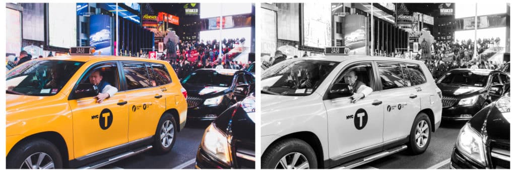
Is Color Important For This Picture?
Try taking a look at some of your photos and thinking about this question: Is color what’s really important here? Would the picture lose anything if it didn’t have any color? If so, then it’s probably not a good idea to convert it to black and white. Imagine you’re trying to photograph a gorgeous, colorful ara macaw. There probably won’t be any point if you’re shooting to black and white.
But that doesn’t mean that strongly colorful scenes should never be converted to black and white. Garish colors can often distract from your subject. And in some cases the colors in your picture can have absolutely no meaning for the mood or topic that you want to express. But when colors are a part of a photo’s topic, that photo should be in color.
Canon EOS 100D, EF-S 24 mm f/2.8 STM, 1/80 s, f/4, ISO 800, focal length 24 mm
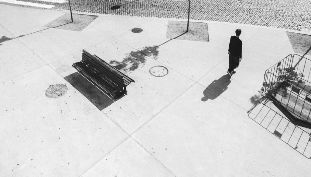
Is The Photo Dominated by Geometry?
If your photo uses graphical elements and above all highly visible lines, then it’s ideal for black and white. Use the scene’s lines to get a dynamic composition that forcefully leads a viewer’s eyes. In black and white these lines stand out even more, and they’ll be all the more impressive.
Sony A7, FE 50 mm f/1.8, 1/160 s, f/8, ISO 125, focal length 28 mm
Is the Photo High-contrast?
High-contrast pictures with rich, full shadows and large, clear, bright areas tend to work superbly in black and white. You see, as soon as you remove the colors from a picture, all that’s really left is the interplay of light and shadow.
High-contrast pictures have lots of black and lots of white, and not so many medium gray tones. And contrast is one of the things that can make black and white photos so interesting. Often colors steal our attention and rob us of the taste of contrast. So if you’re sitting in front of a picture where the difference between light and dark tones is dramatic, then don’t hesitate to convert it to black and white.
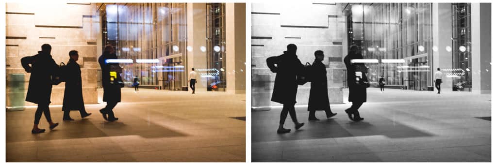
Canon EOS 100D, EF-S 24 mm f/2.8 STM, 1/60 s, f/2.8, ISO 1600, focal length 24 mm
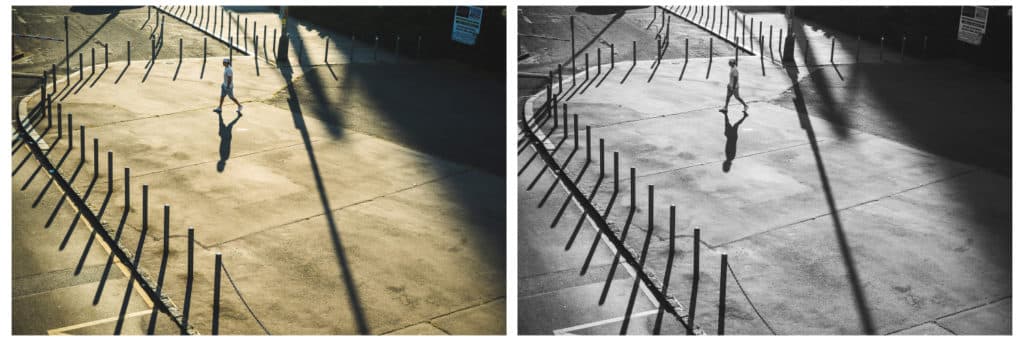
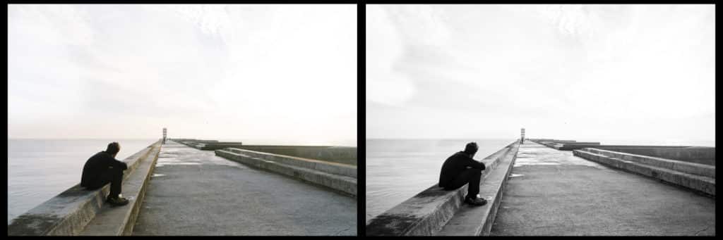
Does It Glimmer with Shadows?
When the sun is just above the horizon, it can cast long shadows, which a black and white conversion will then emphasize and highlight. Here as well you’re playing a game of contrast between light areas and the dark shadows that stick to them. Colors bewilder and divert all eyes from these shadows. So if you want to strengthen shadows, convert a picture to black and white.
Sony A7, FE 28 mm f/2, 1/160 s, f/8, ISO 100, focal length 28 mm
Is Anything Brimming with Structure or Texture?
Objects with a palpable structure or texture, or any object with a characteristic surface… these are all promising candidates for black and white. This can mean anything from tree bark to peeling paint or wrinkled skin. Normally you feel texture with your fingers. But as a photographer, you want to make people feel it with their eyes. Your take on a picture should give your audience the feeling they’re viewing something smooth, rough, sharp, or soft. And that’s easier to do in black and white.
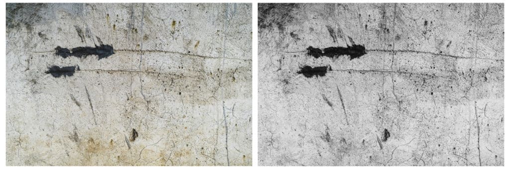
Sony A7, FE 50 mm f/1.8, 1/4000 s, f/3.5, ISO 100, focal length 50 mm
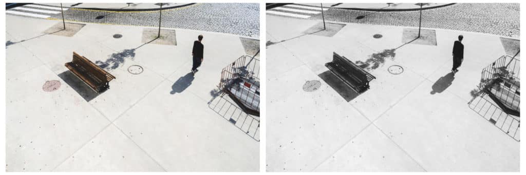
Is the Photo Dominated by Just One Thing?
Simple compositions look good in black and white. The ideal is to have a picture with one main subject that is set against uncomplicated surroundings. It’s important for it to be a bit isolated from its background, since in black and white, the two could otherwise blend together.
Sony A7, FE 28 mm f/2, 1/100 s, f/7.1, ISO 100, focal length 28 mm
What Mood Do You Want to Create?
Often both the black-and-white and color variants of a photo have their strong points, and so it comes down to what you want your picture to say. Black and white boosts work with a picture’s drama. You can also use it to give a picture a darker or moodier atmosphere. Of course this doesn’t mean that black and white photos are always sad or dramatic. But it’s easier to steer in those directions than it would be with full color.
One nice example of this is any landscape with a sky full of clouds, where black and white underscores the sky’s structure, draws out its contrast, and makes the picture feel more dramatic overall. You can also get some atmosphere from objects peeking out of side streets, or landscapes drowned in fog.
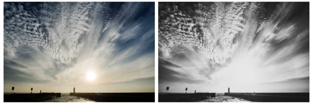
Sony A7, FE 28 mm f/2, 1/100 s, f/22, ISO 100, focal length 28 mm
When you’re converting photos to black and white, take care to keep your blacks black and your whites white, so that your pictures aren’t just drowning in bland shades of gray. After all, the magic of black and white photos lies in contrasts and in the interplay of light and dark. Even though the decision to convert a picture to black and white is a matter of taste and of the atmosphere you want to create, it’s always true that when you do go black and white, you want a bolder composition.
In any case, don’t worry—seek out clear lines, dominant figures, objects on simple backgrounds, and high-contrast scenes, and you’ll be fine.
Jaqueline Pocahontas
Excelente, alguns anos passados meu foco eram pra cores primárias. Conheci um alemão ( hoje meu marido), que apreciava preto e branco. Então ele postava fotos de mim em preto e branco nas redes sociais. Isso me levou a ter o gosto de ter olhos pelo preto e branco.
ldldjr
I found the article informative – and it highlighted a thought I had yesterday when taking a photo. The little bit of color was the dominant (but minuscule theme), whereas a couple of months ago I did a similar photo where B&W was the obvious choice.
Does it matter if the B&W is achieved by using a specific digital camera setting vs. altering the original color photo to B&W via software? Is there a difference?
Zoner
Hello, I can recommend conversion to B&W via software. Not only you can set the channels according to your own (and you see the result on a big screen immedietaly), but you still have a colorful original that you can edit in another way. So you have more options and your work is more precise.