7 Things To Watch for When Editing Photos
Photo editing is an integral part of digital photography. If you’re just getting started, be extra careful with your editing. Even though some adjustments may seem like a great idea, the opposite may be true. Let’s focus on what you should watch for when editing your photos.
There are several editing tools that almost everyone uses when editing their photos in Zoner Studio. However, it’s very easy to underestimate their power. So, what adjustments should you be extra cautious with?
1. Don’t overdo Exposure
Adjusting exposure is a basic edit, but don’t overdo it. It’s easy to move all the sliders to their highest values, but it might not look good. The key is not to overexpose, underexpose, or oversaturate the photo.

Be cautious with the Contrast slider. The contrast slider increases the difference in tone between the light and dark areas of an image.
Luckily, Zoner Studio has Dynamic Range to help you perfectly balance your photo’s contrast. For saturation, be careful with the Saturation and Vibrance sliders under Color.
It’s better to adjust the saturation of a specific color in Color Shift rather than altering all the colors with Saturation.
2. White Balance
Adjusting White Balance can result in colors that are too warm or too cold. While this may work for certain scenes, like winter landscapes with bluish tones, it might not look good on a portrait. This is because it alters the skin tones, which should always remain as natural as possible.
3. Natural Skin Tone
This brings us straight to our next point: natural skin tone. Nobody wants to look like they have jaundice or a bad sunburn in a portrait.
4. Retouching
A common mistake is retouching that is overdone to the point where the model’s face loses its structure and looks blurry. Be extra cautious when using the Clone Stamp, Healing Brush, and especially the Smoothing Brush. Use these tools sparingly for natural-looking photos.
Use the Smoothing Brush only to remove unflattering blemishes and keep the retouching as natural as possible.
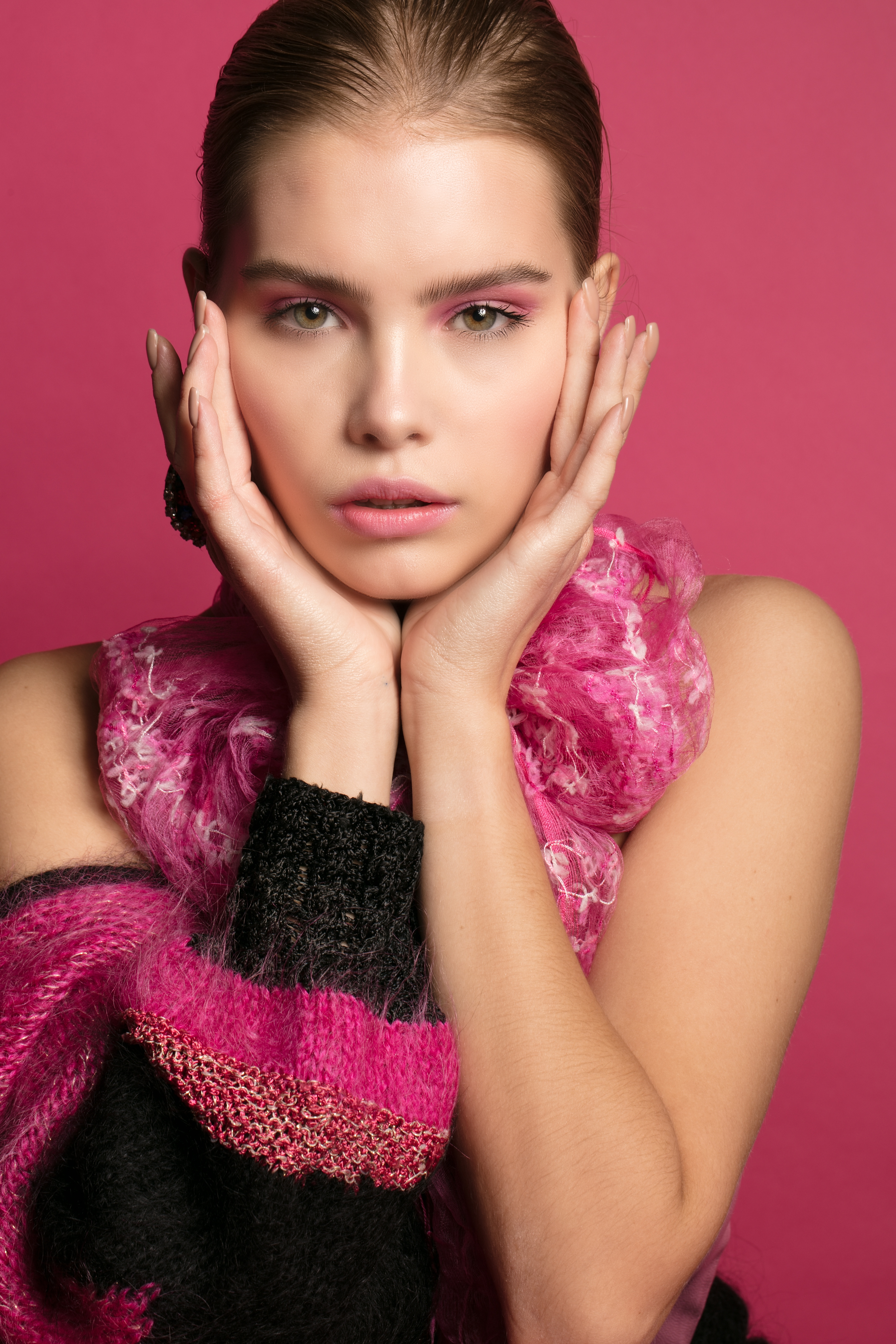
The example above shows the difference between retouching that is subtle and retouching that is overdone.
5. Reducing noise
The fifth adjustment where you need to be careful is Noise Reduction. Excessive noise reduction can remove too much texture, especially in portraits. Don’t turn your subject into a wax figure.

Example of noise reduction that is overdone and noise reduction that is done correctly. Notice the difference in facial features.
6. Sharpness and Texture
Overly increasing Sharpness and Texture can make skin less smooth and facial features too sharp. Approach these adjustments with care.

Excessive sharpness and texture. In the first example, the facial features are so sharp that it doesn’t look right.
7. Presets
Use presets with care and keep the theme of the presets in mind. Presets designed for wedding photography may not be suitable for winter or autumn landscapes. They can change the mood and mute colors that should be otherwise emphasized.
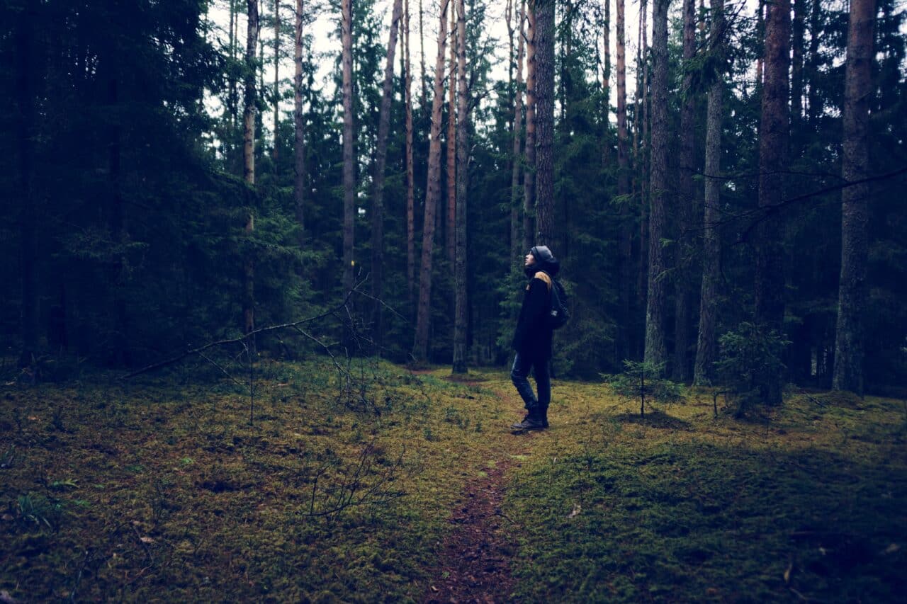
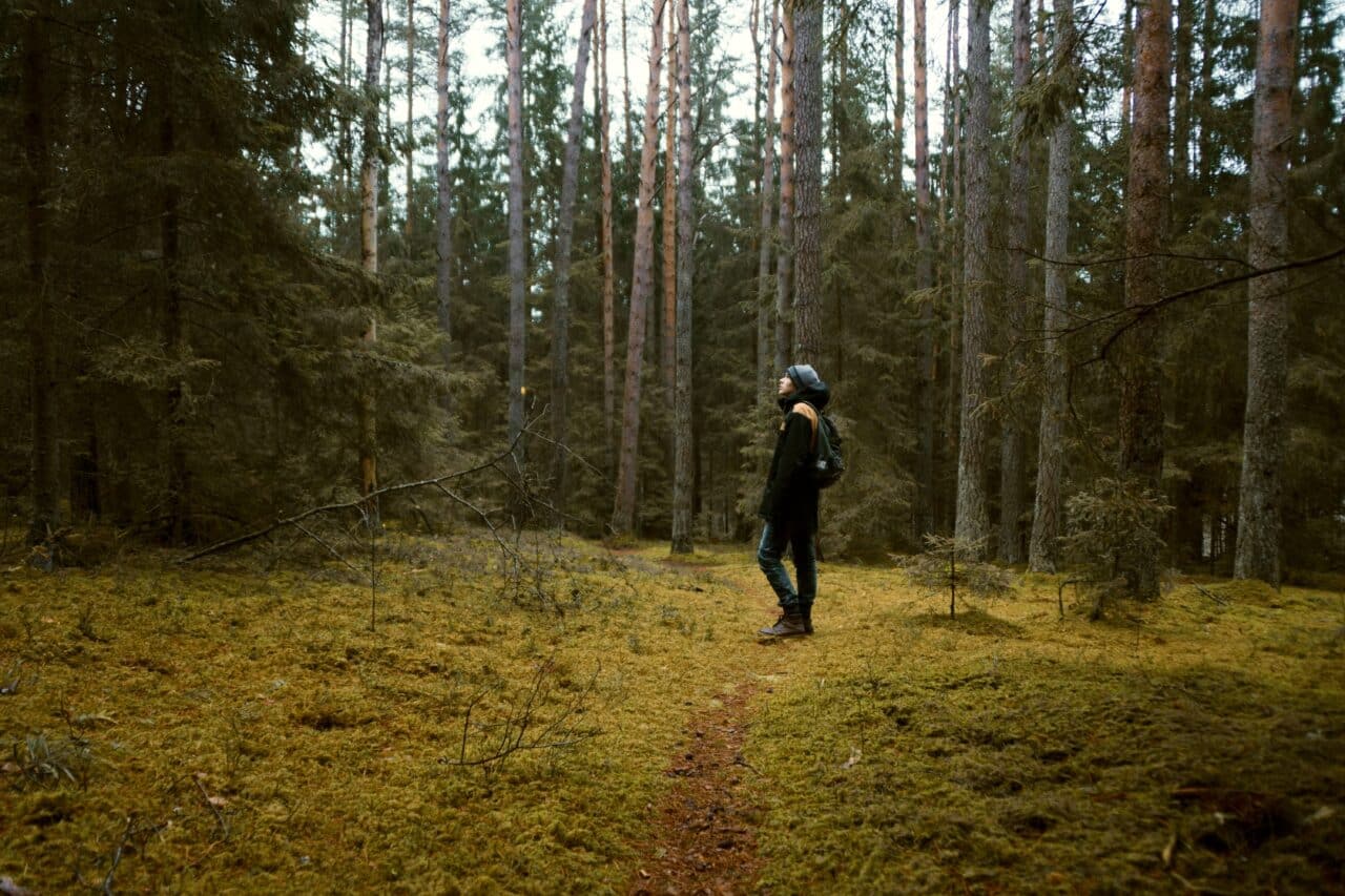
In the example above, you can see how a forest photo looks with a winter preset and a preset specifically designed for nature photography. As you can see, the winter preset doesn’t enhance the photo as intended.
Download presets for free and modify them in Zoner Studio, or create your own presets.
Download Zoner Studio for a 7-day free trial with access to all features. Check our video tutorial for a visual guide on how to avoid these editing mistakes.
DonP
Excellent article, great tips. Thanks!
Zoner
Thank you, we’re happy you like it! :)
Bruce Baker-Johnson
I see the ‘desaturation’ (local colouring?) effect in wedding photography from all over the World – it’s still as prevalent and popular with couples as ever. I think you miss the point with a lot you say – you are correct if people want to ‘share’ or sell their pictures but with photography throughout the years it’s predominantly the work of the ‘individual’ that has endured. I do little post processing only the odd ‘correction’ (tilt, crop etc) myself but I rarely share or sell anything – I take the pictures I WANT TO – I’m not in the least interested in the opinion of anybody else. The number of my pictures published (in books – long ago now) and the reception at my rare slide shows is gratifying but not the object of the exercise at all. At 70 I don’t expect to change that view.
Bruce Baker-Johnson
Brubaker Imaging
Zoner
Thank you Bruce for sharing your experience and view. There is never only one “correct” one and it is the beautiful about photography.