Like the Style of Someone Else’s Photo? Try Imitating It!

The article is over 5 years old. The information in it may be outdated.
![]()
We are working on its update. In the meantime, you can read some more recent articles.
We’re sure you’ve seen photos somewhere before with a look that you loved, that you wanted to imitate—but you couldn’t for the life of you. Trial and error doesn’t work very well here. Today we’ll teach you how to examine your favorite photo and how to use what you learn here to compose an editing approach that will give you the results you’re looking for. We’ll demonstrate all this with an example from practice.
One of our readers, Kamila Matějovská, asked us how she could make her photo of a girl and an apple look like another photo that she had found on the internet. So we’ll be using this example to show what approach to use when you yearn to imitate someone else’s photo style.
First Examine the Photo
The worst thing you can do here is to dive straight into editing and hope things turn out somehow. They’ll turn out somehow, but not how you want. And then you’ll have to start over from the beginning.
Take a good look at the photo you want to imitate and try to understand what it’s made up of and what tools it uses. Right at the start, of course, try to understand the composition (who’s positioned where, what’s in the foreground, and what’s in the background) and how the objects in the photo relate to one another. You see, a photo’s real magic will often be all about making the right choice of clothing and accessory colors, avoiding striking clothing patterns, etc. But these are things that have to be worked out before taking the picture; we’ll skip them in this article.
We’ve got a few questions you can ask yourself when studying the photo you want to emulate:
- Does this photo feel bright, or gloomy?
- Are its colors cold, or warm, or does it try to keep the colors realistic?
- Is it high-contrast, or faded?
- Are the dark areas truly black? (Check the histogram.)
- Are the brightest areas truly white, or has some color shifting or darkening occurred?
- Are the faces brighter-than-life? And what about the eyes and teeth—maybe they’re brighter-than-life too? Peek at your other photos and compare them “with reality.”
- Are their colors realistic? Have you really ever seen grass with that color? The sun with that color? And what about the typical color of blue jeans? And is the white t-shirt really white, or is it tinted?
- Are there any added color gradients visible in the picture? Or more sunshine than usual?
- How do the colors of the objects in the photo blend with each other? Are any of them significantly more saturated than the rest?
These questions will help you pin down what in fact was done with the photo of “normal objects in a normal environment.” You’ll see how the photographer shifted reality. Which colors were shifted, whether or not the photo was darkened, whether or not the shadows were softened, or artificial sun was added.
If your answer to any of these questions is “I don’t know,” that’s OK. I myself often don’t know and have to guess. But every edit and change you identify will help you come closer to the style you want.
So How Should You Edit the Photo?
Now you should have a rough idea of where you’re going with the edit. In our example here, we want to imitate a dark, high-contrast photo where the whites are actually grayish-yellow. The entire photo has a warm tint and heavily shifted colors. You’ll be working in the Develop module in Zoner Studio.

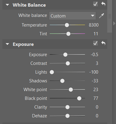
Set the Exposure to -0.5 and shift the Lights to -100…
…and unfortunately, this guide is not going to continue this way. If you’re aiming for a particular style, you can’t robotically edit a photo by dragging sliders to silver-bullet values. You’ll often be going back and changing settings you’ve already adjusted. The path to your final values will be a thorny and gradual one. But I won’t scare you any further; instead I’d like to try describing how you might work in Develop’s various settings groups.
Seeking the Right White Balance
Take even just one look at the sample photo, and you’ll see that the white is more of a yellow. That’s why our imitation of it will be tuned towards warmer tones, and so the White Balance value will be shifted rightward. To shift a photo’s overall feel, use the second slider, Tint. Unfortunately, we can’t give exact values here; everything depends on the specific photo.
What about the exposure?
The photo will be dark overall, so let’s move the Exposure slider to the right. The photo’s overall contrast can be handled using Contrast, but right here and now, let’s not do that. Instead we’ll work with other settings that can affect the overall contrast.
What settings are those? First of all, Lights, which we’ll decrease (i.e. we’ll pull the slider to the left). After all, you’ll notice that the white in the photo we’re imitating isn’t a bright white. Likewise we’ll pull the Shadows and Black Point sliders leftwards. By doing this, we’re drowning the girl’s surroundings in dark colors—just like in the model photo.
After changes like these, you need to correct the photo’s overall feel by shifting the White Point to the right, so that the brightest points in the picture aren’t drowned in gray. This will also increase the photo’s contrast.
Colors and How to Do Them
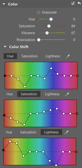
Now we’ve reached the “wildest” part of our edits: color shifting. Here the Vibrance and Saturation sliders, which control how colors behave throughout the photo, sadly won’t be enough on their own. You’ll be needing more detailed work with individual shades of colors; fortunately the Color Shift controls offer exactly that.
In most cases—including this one—it’s good to start with the first of the three tabs: Hue. You work with these controls by dragging a node on the color spectrum up or down to change the specific output color value for a given input hue.
The first three nodes from the left (in the red, orange, and yellows part of the spectrum) will influence skin color and a picture’s yellow elements (here it’s the sun, sunny spots, and warmer parts of the grass). The next two (yellow-green and greens) most often influence grasses and leaves. These are followed by the sky’s blue tones, and then purple tones (uncommon in nature, more common in clothing), and then back around to red.
Tip: When you drag a node in the Hue tab to the top, that changes a color to the next color to the left . Drag it to the bottom, and it becomes the color to the right of what it originally was.
We reached the tinting shown here mainly by shifting the tint of the leaves and the ground towards yellow. Our change in the blue part of the spectrum is mainly for the jeans and their colors.
When you work in the Saturation tab, you can get rid of colors that are too visible. In this example that was the green tones; we meanwhile added a little saturation to the blue tones.
The last tab of Color Shift is where you change individual tones’ lightness—here we’ve emphasized the skin tones and suppressed the blue of the jeans.
Using the Tone Curve Controls
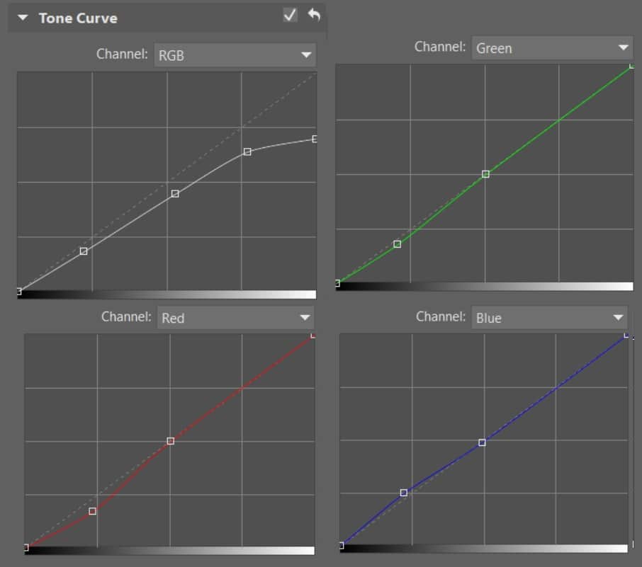
Some people completely ignore the exposure sliders such as Exposure, White Point, and Lights, and just work directly with Tone Curve. Some other, meanwhile, make very little use of Tone Curve. I personally combine them both, because you can achieve certain effects better in the first way, and others better in the second way. in this specific case I also used Tone Curve to drag down the bright tones and soften the shadows. The straight line has been turned into a curve.
You can continue here with adjustments by eye to the curve’s individual color elements (red, green, and blue). But this here is more about your own feeling you get from a particular photo. In my case, I’ve emphasized the blue element in the shadows, while suppressing the other elements.
Besides a node in the shadows, it can be good to click and add a “stopper” node to the Tone Curve in the midtones to keep shadows edit from affecting the whole curve.
Info: Don’t forget that in the Develop module, you’re working with non-destructive edits (unless you’ve turned those off). This fact lets us lower the values in Exposure and then raise them in the Curve with no shame—the program puts together the final effect on its own and applies it to the source data, without degrading the photo through applying the first edit and then applying a second, third, fourth, etc.
Filters Help With Local Edits
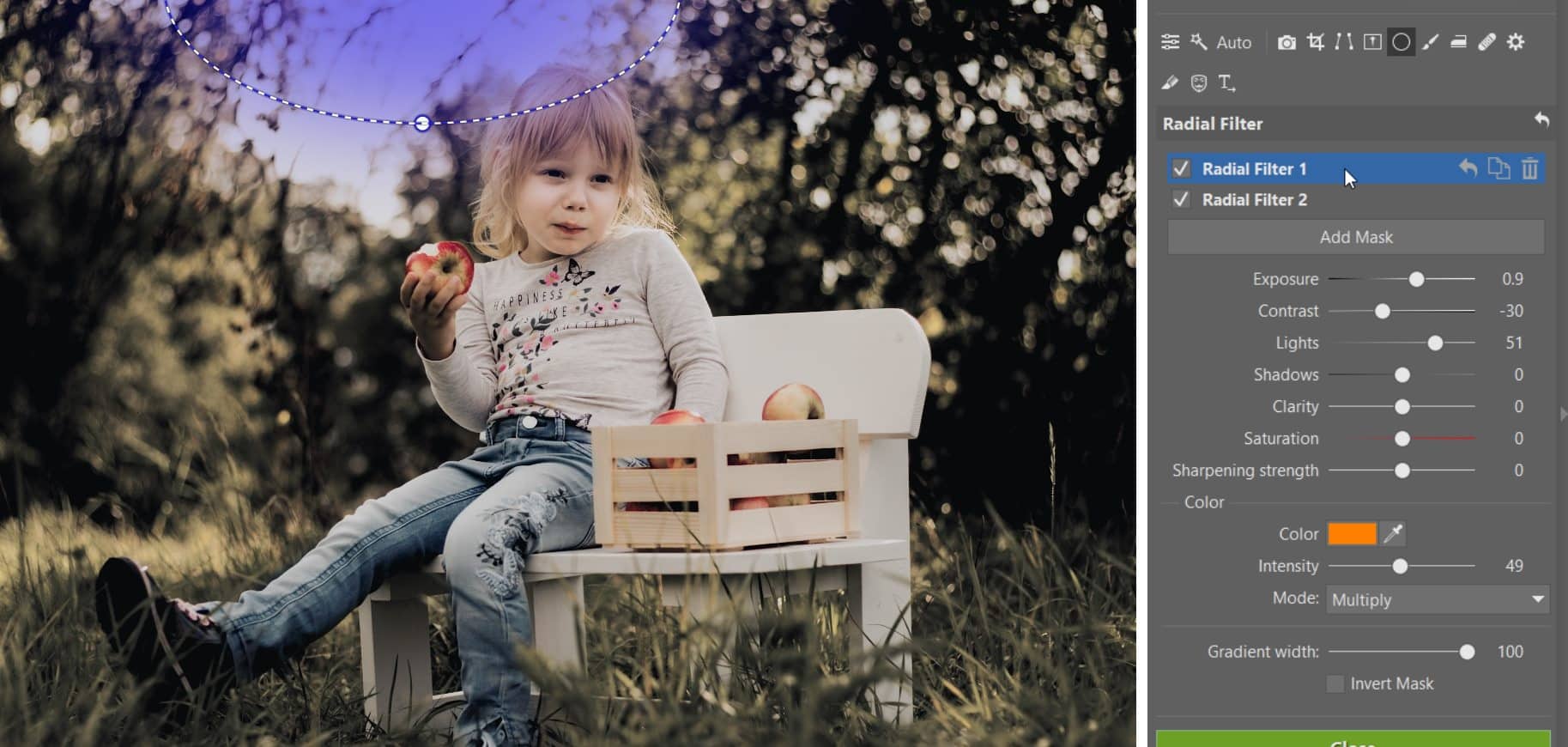
If you want to focus on edits that only affect one part of the photo, both of the two filter types (the Radial Filter and the Filter Brush) are good choices. First let’s take a look at the Radial Filter.
One of the radial filters used here is inverted—so it changes the area around the photo’s edges—and by lowering the exposure, we’re focusing attention on the photograph’s central motif.

Our second radial filter, meanwhile, simulates sunshine over the subjects’ heads. This is a combination of raising the Exposure and Lights values and partially also our use of a color gradient in the Soft Light mode, which gives the photo a feeling of brightening. We can go back and change the filter gradient’s color value at any time to better support the picture’s overall colors.
The Filter Brush will be the last tool we use for this job; out of the tools in the Develop module, it offers the most detailed control over a picture’s individual parts.
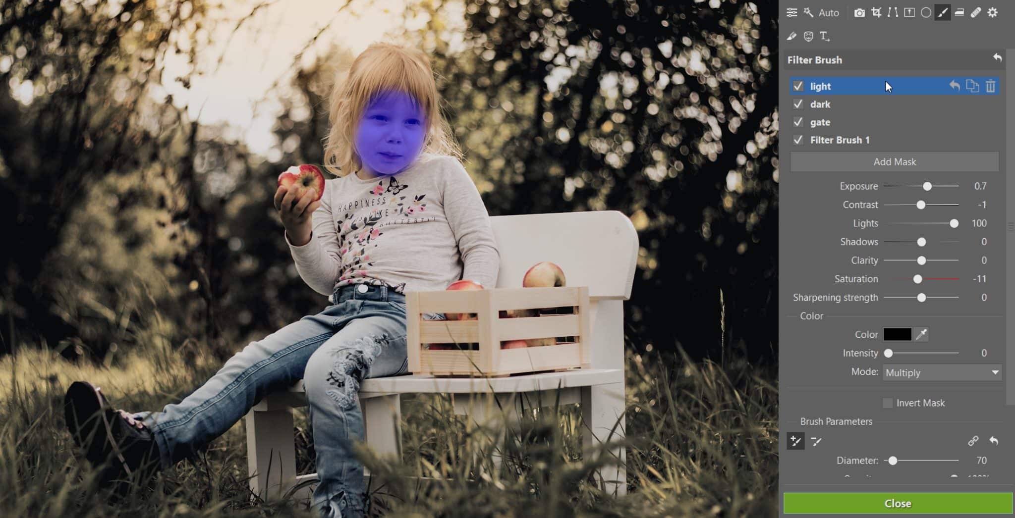
Our preceding changes have significantly darkened the girl’s face, which we’ll correct using a Filter Brush mask, with increased Exposure. Here the magic of non-destructive edits shows up once again—you can add e.g. 1.0 to the exposure value without fear, even if you’ve take 1.2 away somewhere else earlier. Before applying the final values, the program calculates your edits for every pixel, and so the result of e.g. +1.0 and -1.2 exposure would be a mild adjustment. The image isn’t degraded, and values aren’t cropped away in the lights and shadows like they can be when you’re working in the Editor.
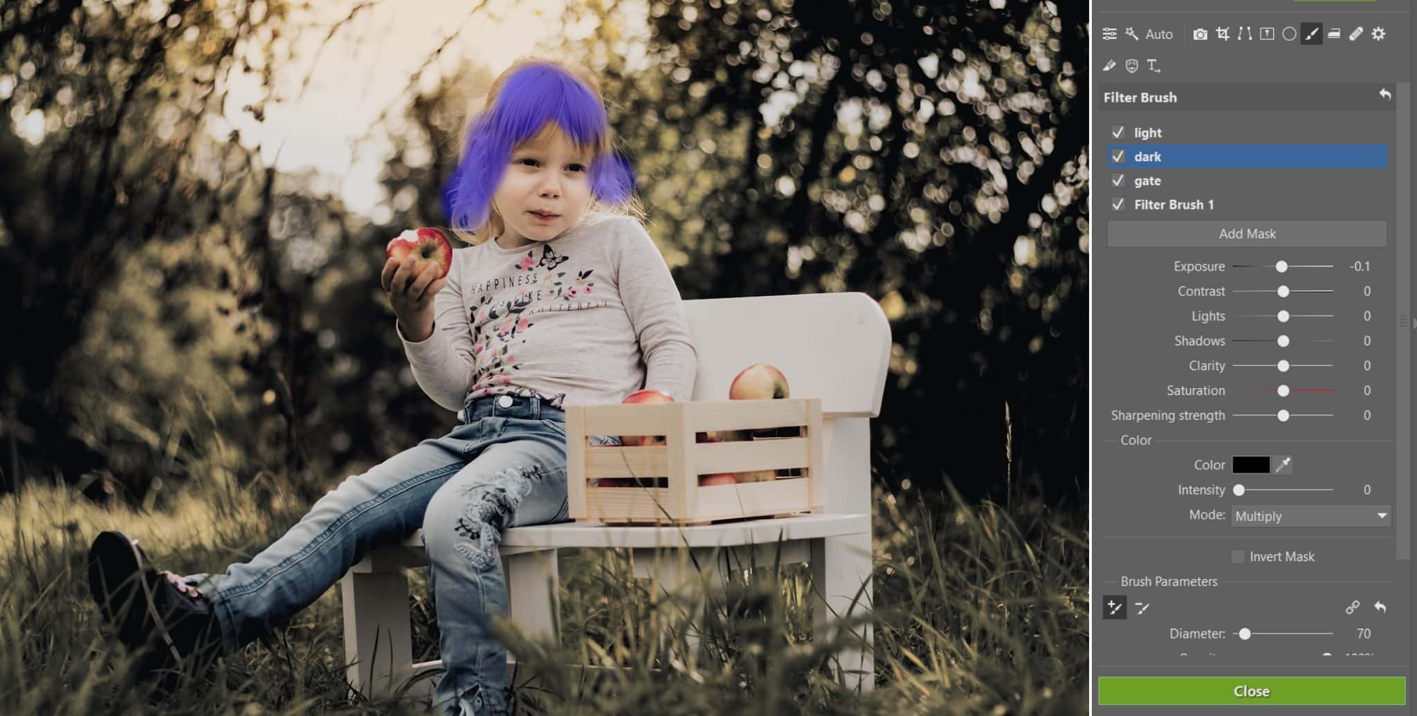
We’ll use a second Filter Brush mask to darken the hair around the girl’s face.
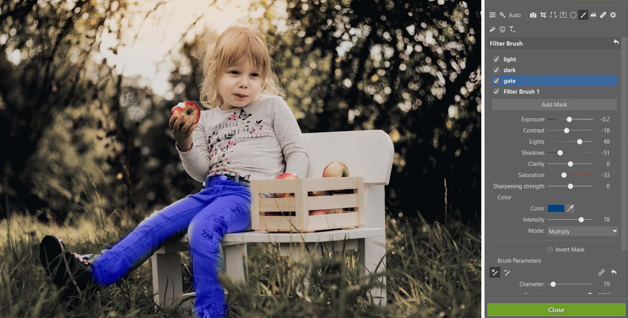
And finally, our third mask takes care of the pink patches on her pants and desaturates them towards blue.
You’ll need to experiment a bit with the color settings and blending mode, but the settings in our picture can be a good guideline.
Why Doesn’t It Always Work Out?
If you were expecting a short and simple guide, then this article has surely disappointed you. The problem with questions like these is that a different starting photo is involved each time. When someone is aiming to shoot dreamlike portraits in a meadow, they take care during the shoot itself to ensure that their subjects are wearing clothing with neutral colors. When someone is photographing a runner in his outfit, they don’t lead him to a field full of blooming lavender. Problems like these are just plain tough to fix “in post.”


We’d like to thank Kamila Matějovská for providing the picture of the girl and consenting to its publishing.
The photo being imitated here is the work of The Moody Mama (Pinterest).


There are no comments yet.