Nature Photography in Color and Black and White Beauty in the Details
I’m one of those people who likes the Instagram aesthetic. That’s why I use a consistent editing style for most of my photography. On the other hand, with my degree in graphic design, I learned to do a lot of black and white photography. I try to use my photography to show texture and shape details in nature that may be missed in the color versions.
It happens to all of us. You go for a walk somewhere or are in your backyard and suddenly, you notice something you want to take a picture of. But, as luck would have it, you don’t have your camera with you, just your smartphone. That’s okay, because today you can get great photos even on a smartphone. When you combine the pictures you took on your phone with editing in Zoner Photo Studio X, the results are even better and definitely worth sharing.
Color or black and white? Both!
The cohesive look of social media sites, like Instagram, led me to start posting photos in pairs. The first photo is in color and matches the overall look of my feed, while the other is black and white. Each version showcases something different and posting one without the other loses meaning and depth.
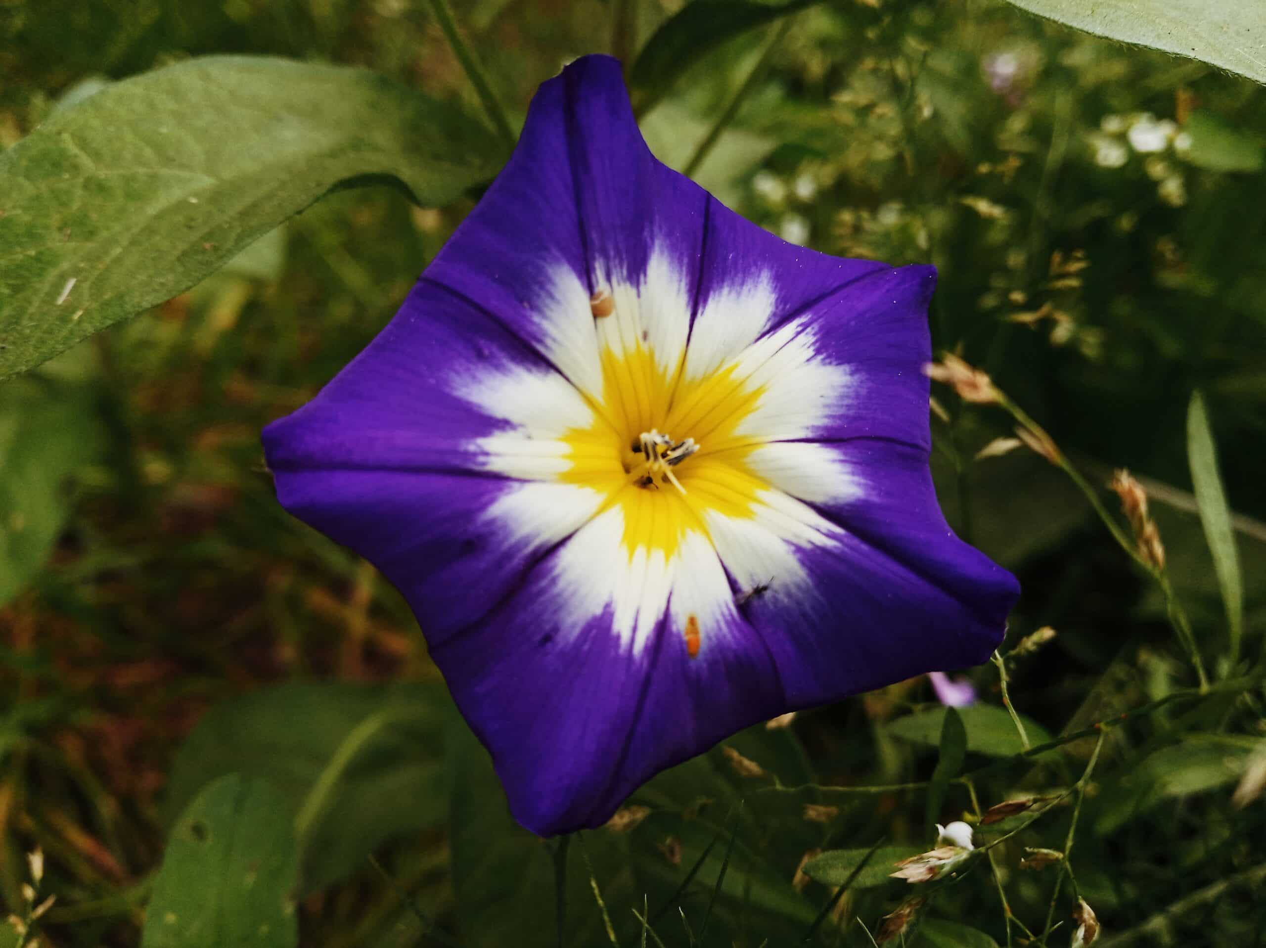
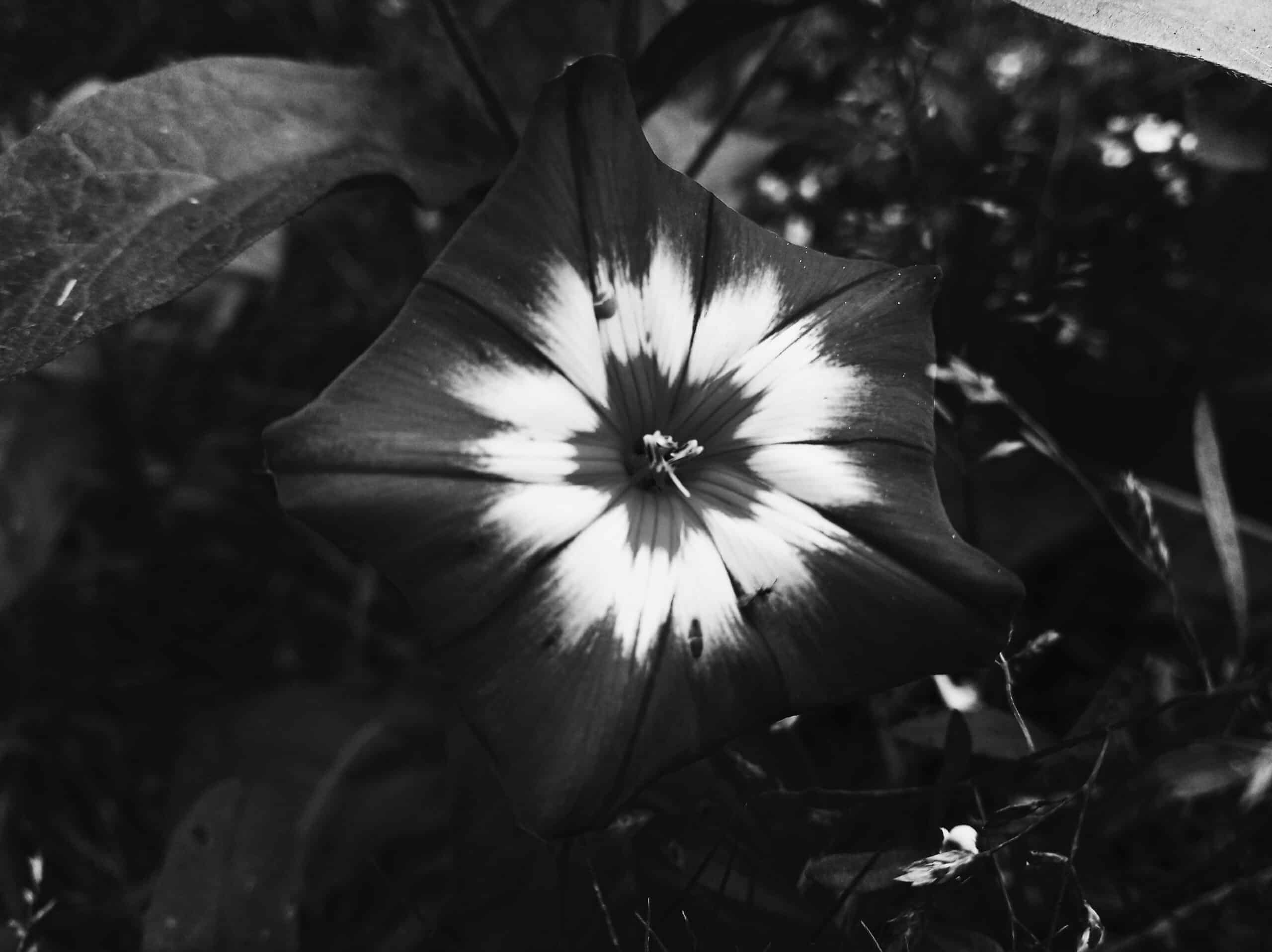
In this example, you can perfectly see the flower’s star shape only after it’s converted to black and white
Black and white to emphasize contours
In the previous photos, you can see how the central star shape of the flower stands out only after it’s converted to black and white. Even though the edges of the petals blend in with the grassy background, the white part of the flower is all the more noticeable and emphasizes the shape in higher contrast. In comparison, the color version lacks contrast. I personally prefer fewer contrasting colors because I don’t like overly bold colors that stick out like a sore thumb.
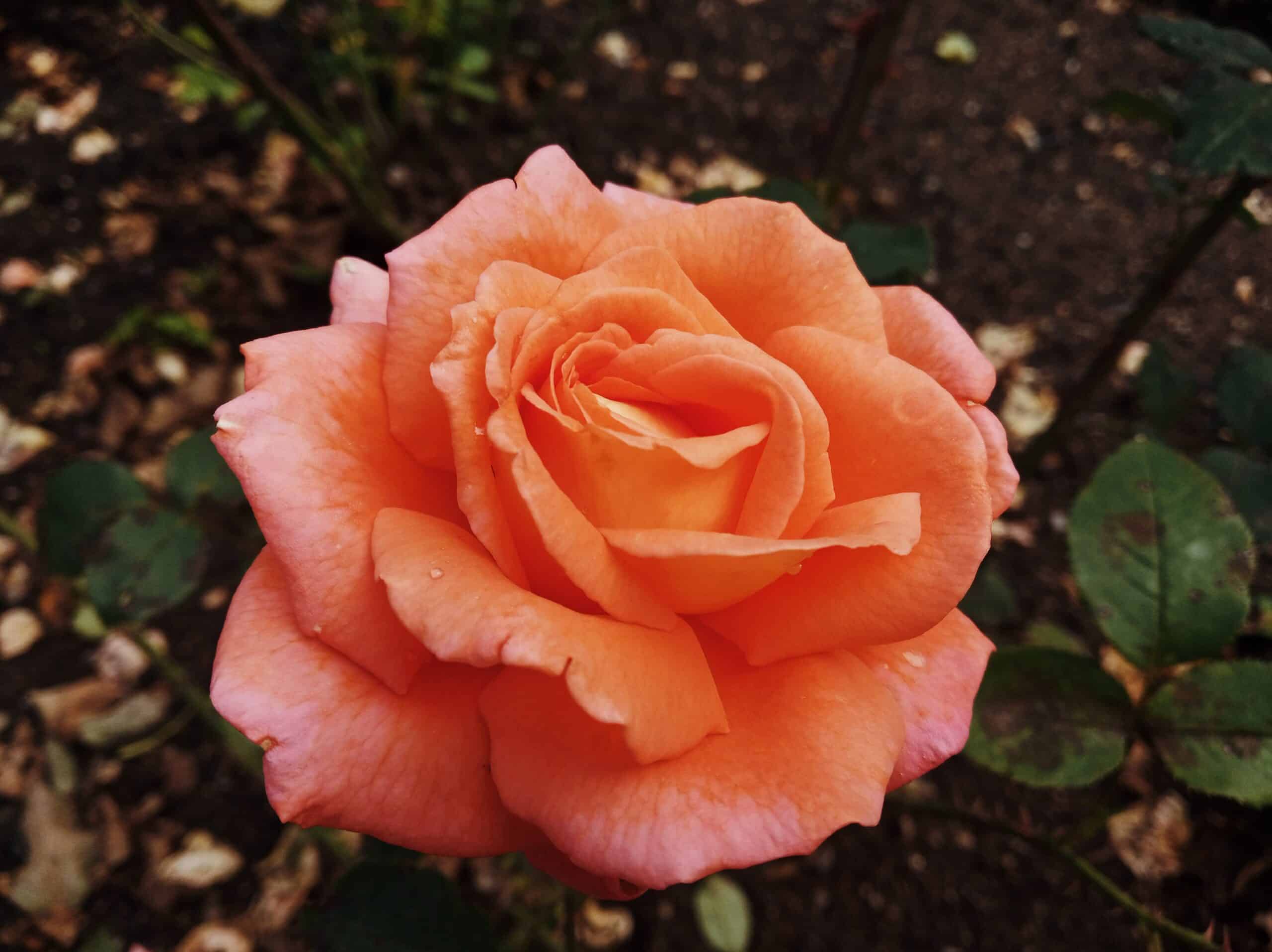
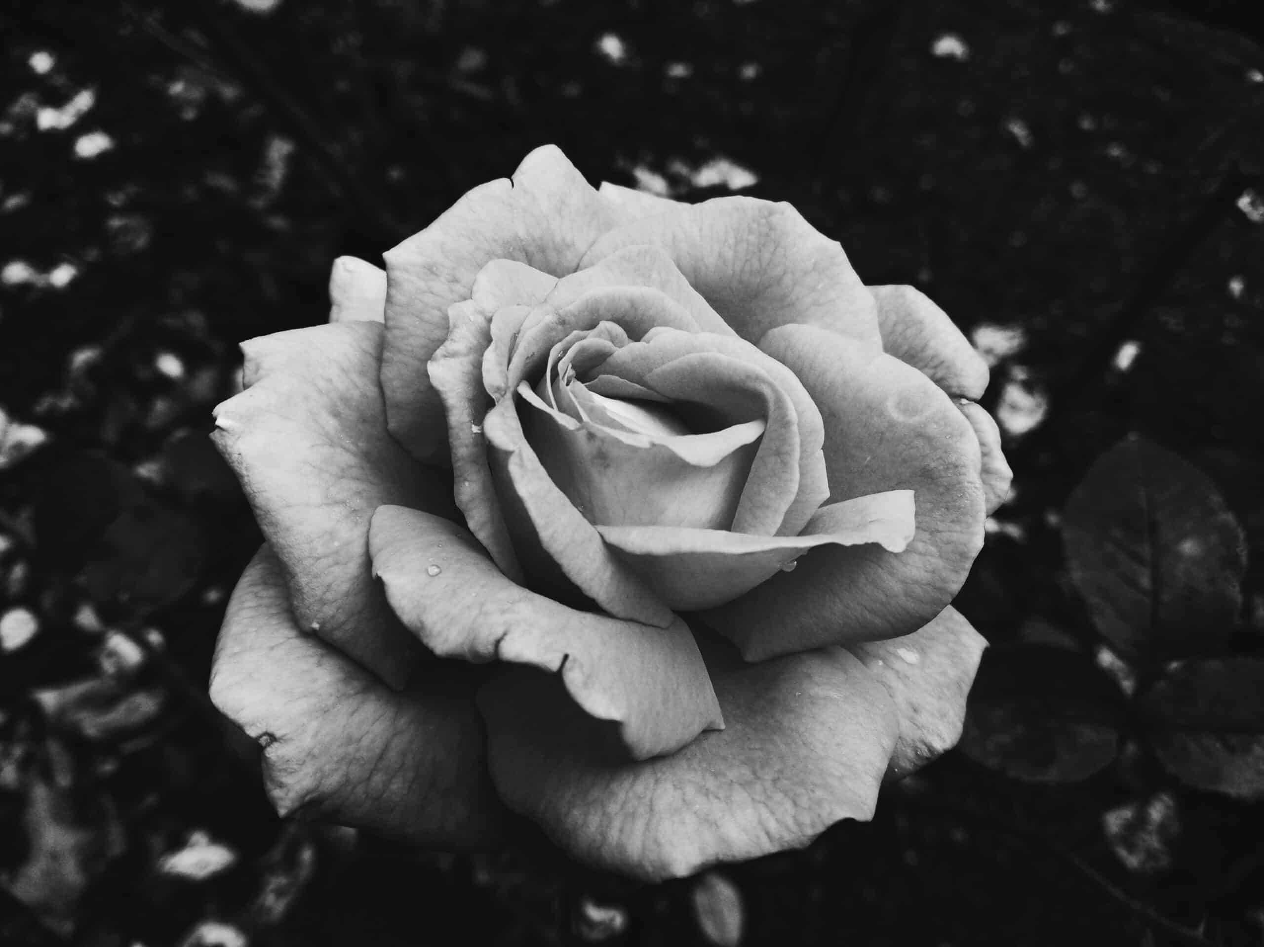
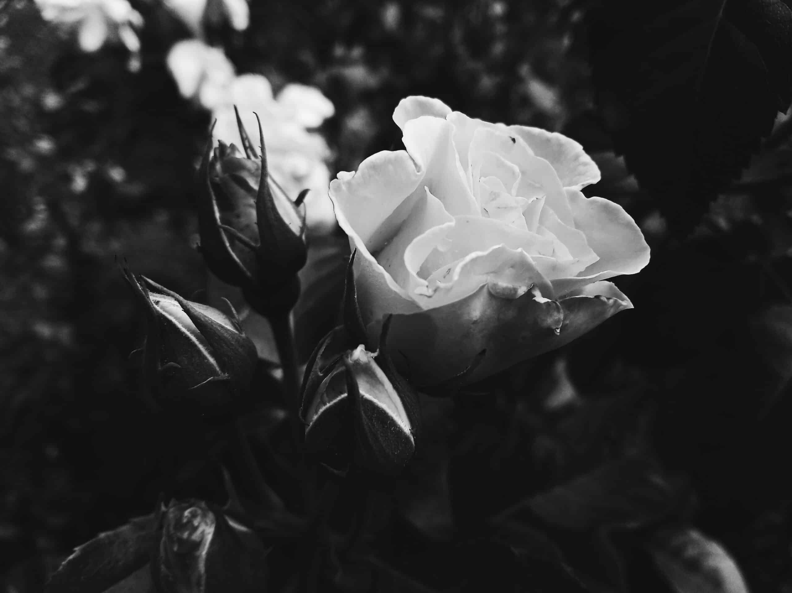
The contrast between a delicate, colorful rose with a black and white rose with sharper petals
The color photo of the rose looks very tasteful, delicate, and emphasizes the fragility of the flower. In comparison, the black and white version shows the sharp edges of the petals that are not as noticeable in the color photograph.
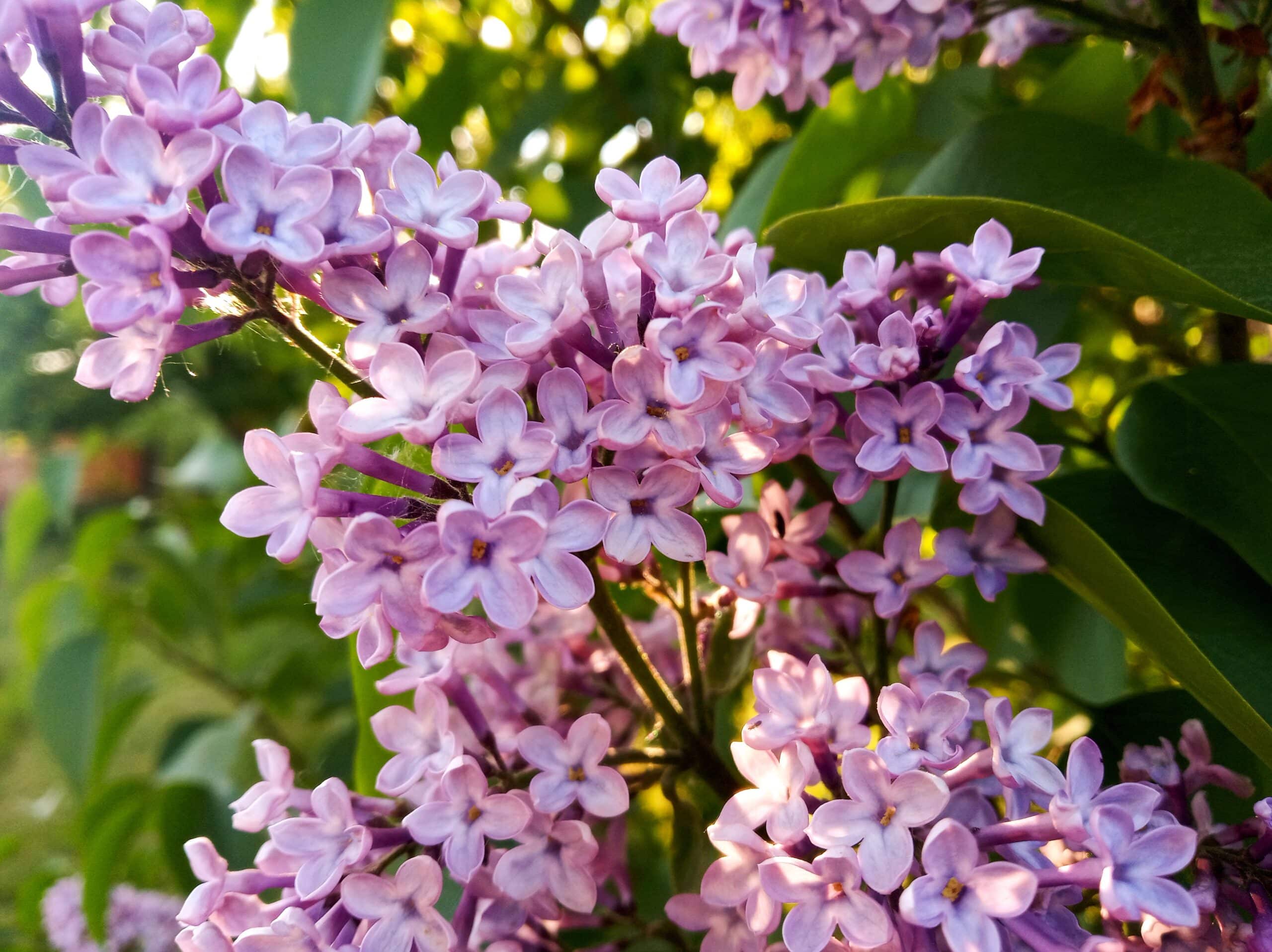
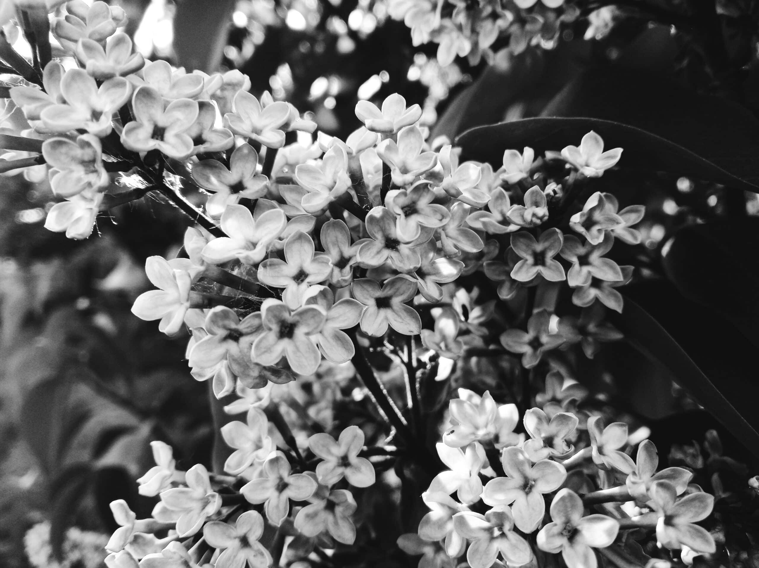
Lilac tree illuminated by the sun
Lilacs have very beautifully shaped flowers which stand out all the more in the black and white photos. Again, the shapes are more defined due to increased contrast. In the color version, this increase in contrast would also affect the colors, making them even brighter, which was exactly what I didn’t want. For this reason, I kept the original color version almost unmodified, as the lilac itself has a very nice soft color. In this example, it is enhanced by the sunlight which slightly tints the leaves and branches to shades of yellow.
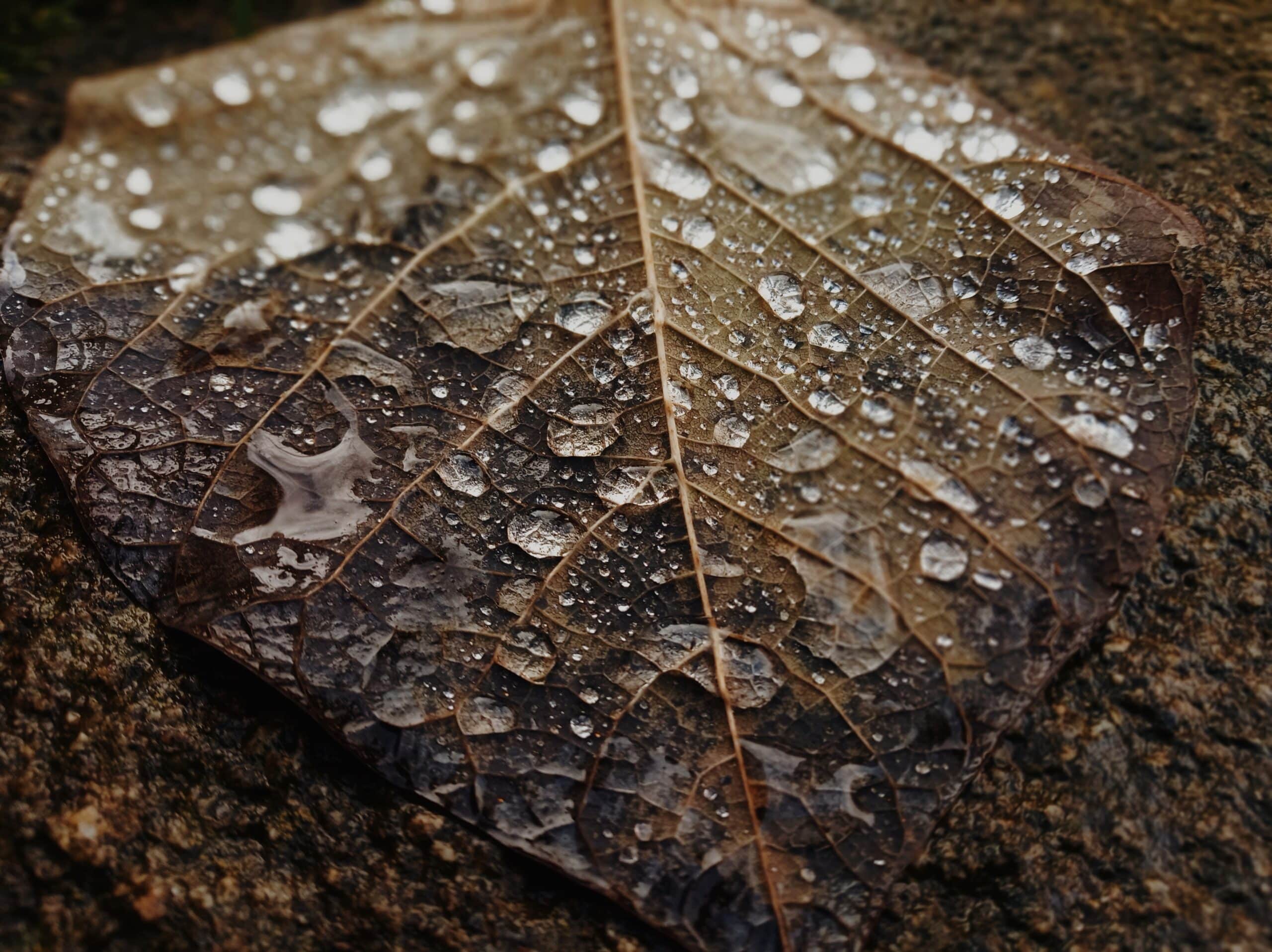
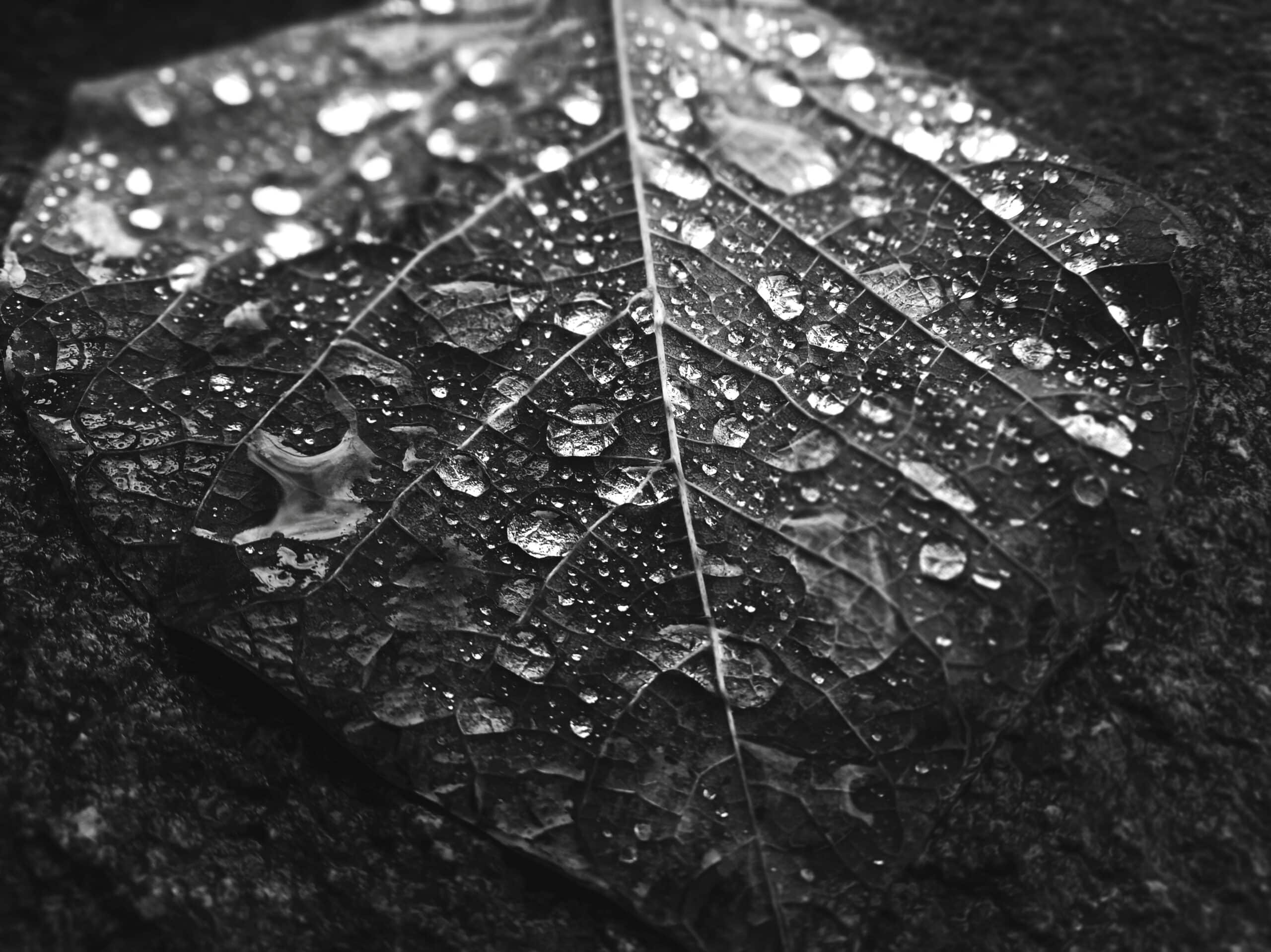
Leaf with droplets of morning dew
In this example, the actual edges of the leaf are more pronounced in the color version. The leaf has copper tones which do not blend in with the rock it’s resting on. On the other hand, in the black and white version, the edges of the leaf blend in with the rock on the right side of the photograph. The veins of the leaf and the contrast of the dew droplets are all the more pronounced in the black and white version.
Light
Light is the most important part of any photograph whether it is color or black and white. We’ll now demonstrate in a few examples how light can change by changing the color and adding a bit of contrast.
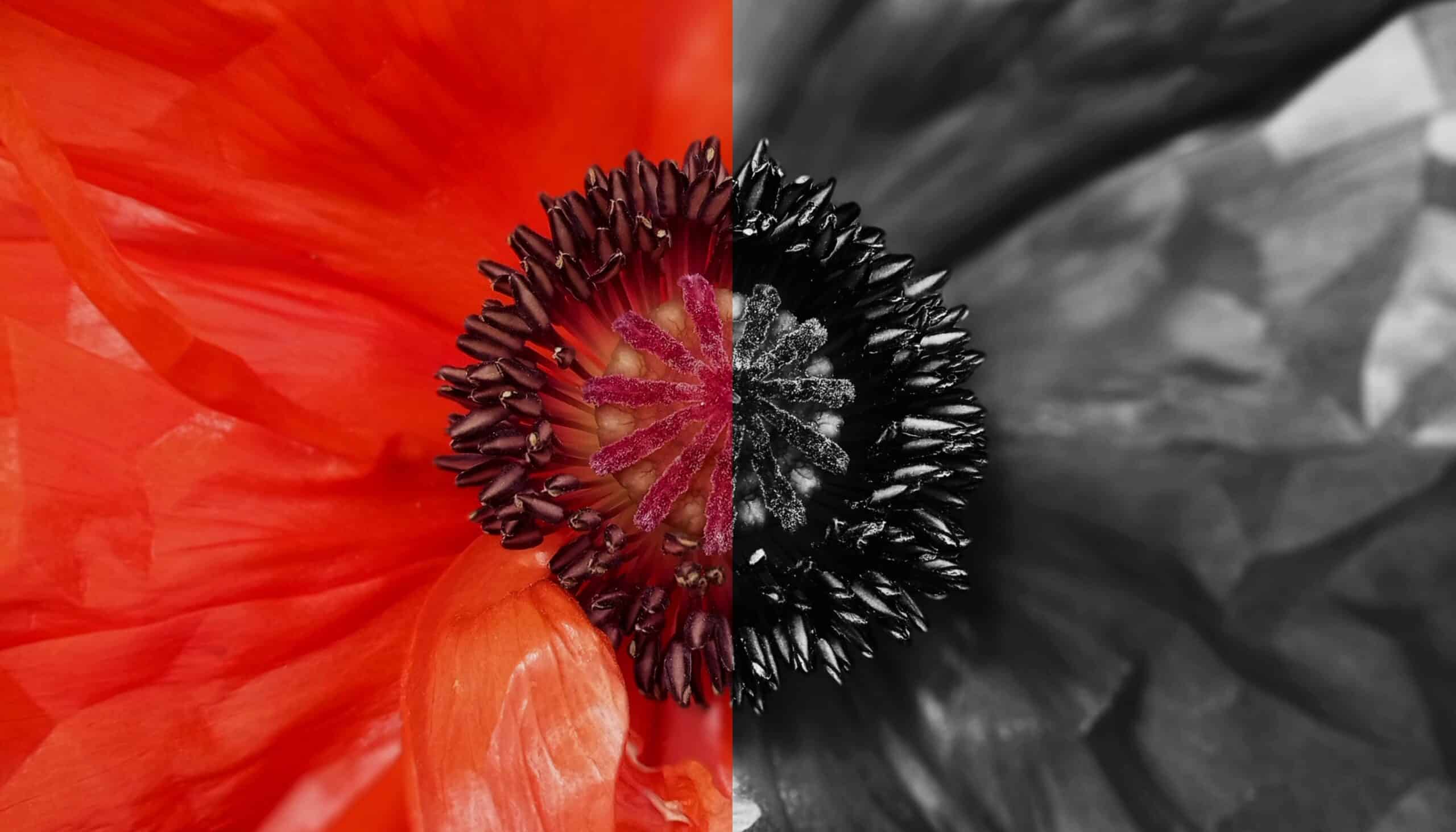
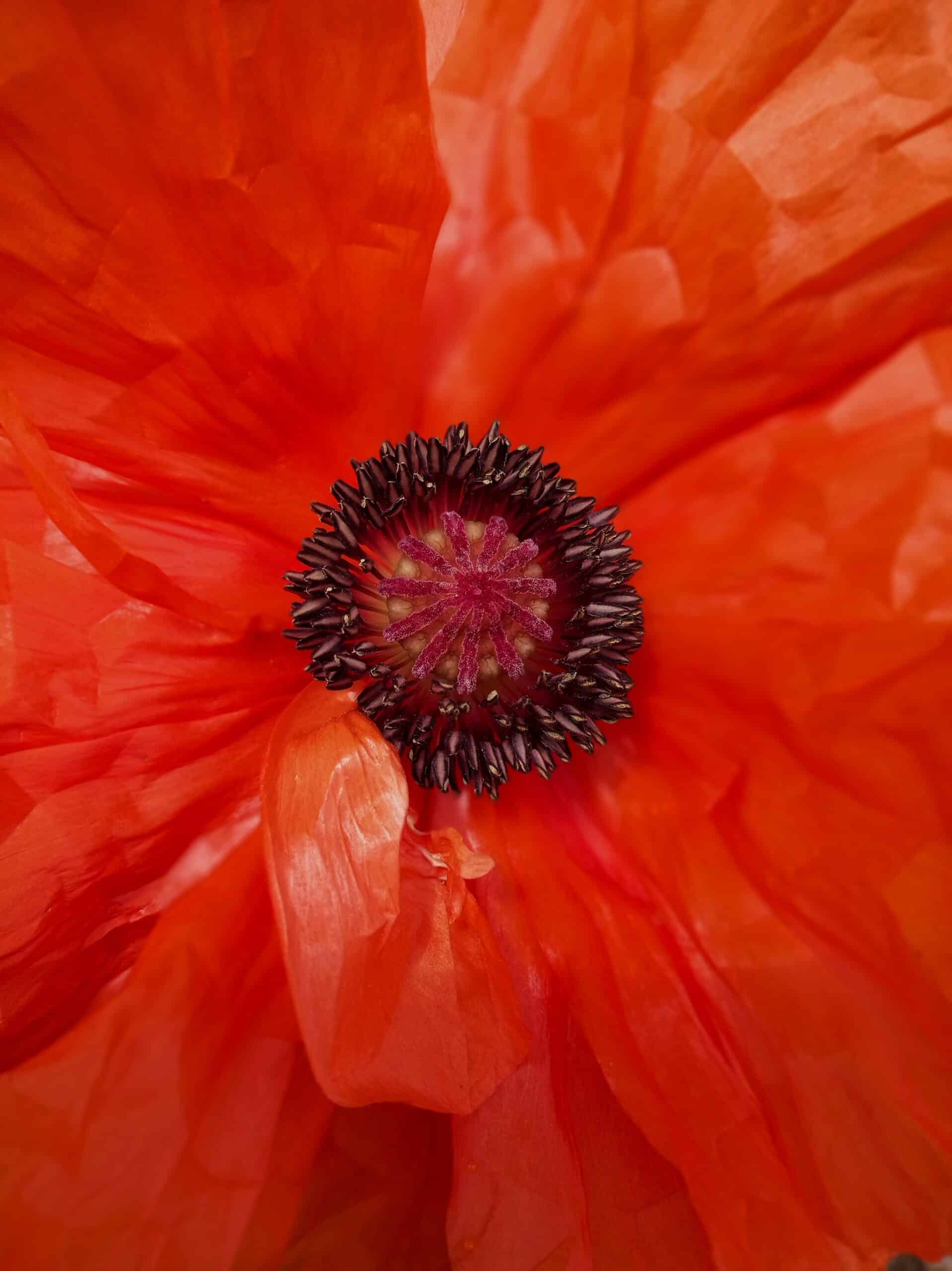
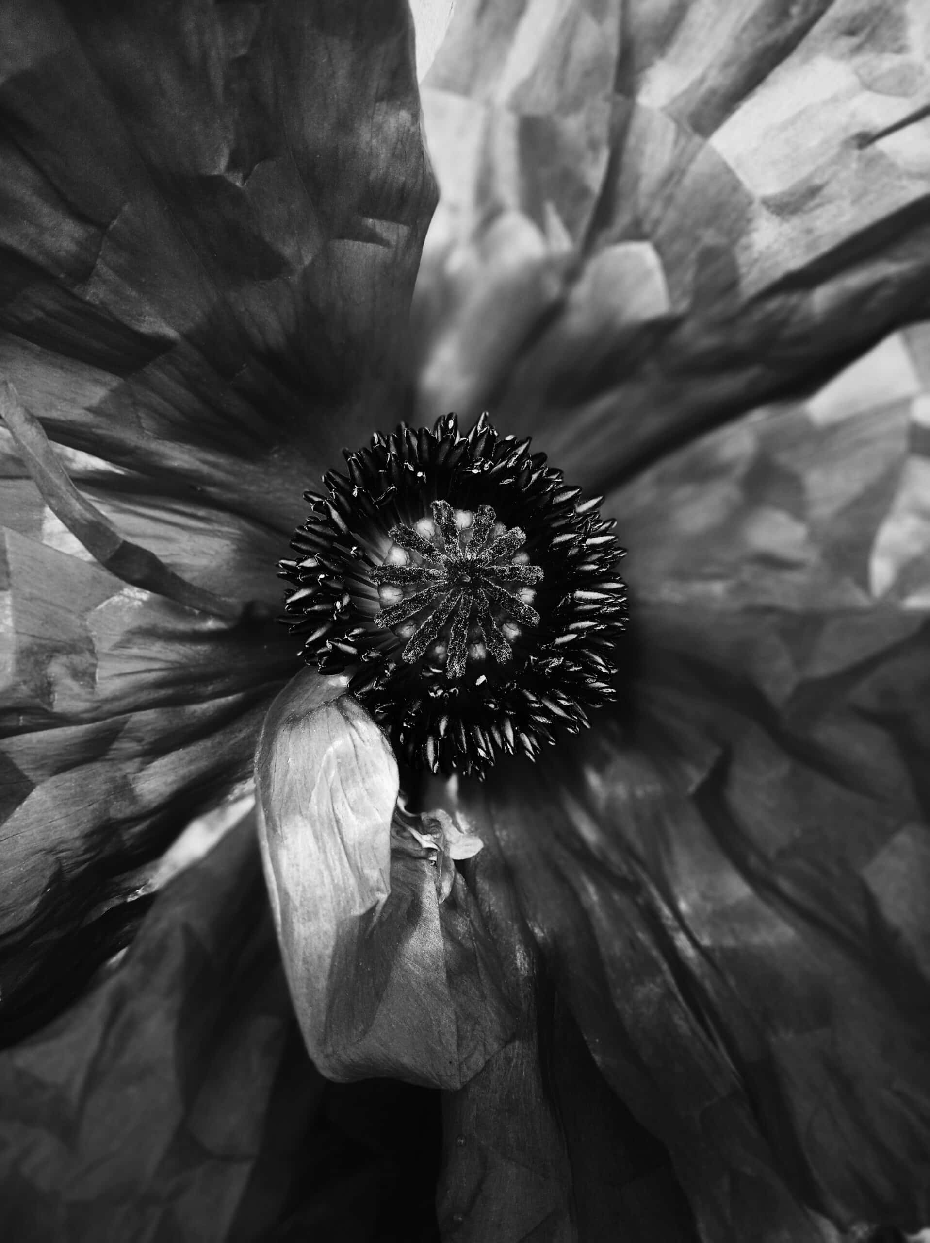
Close-up of a poppy emphasizes the delicateness of the flower with the use of color and contrasting contours with the use of black and white
Oftentimes it’s not only the contours but also the light passing through the flower petals that stand out much more in the black and white versions. I deliberately keep more subtle tones in the color version and don’t increase contrast to bring out the delicateness of the poppy. On the other hand, I increase contrast in the black and white version to make the contours stand out more.
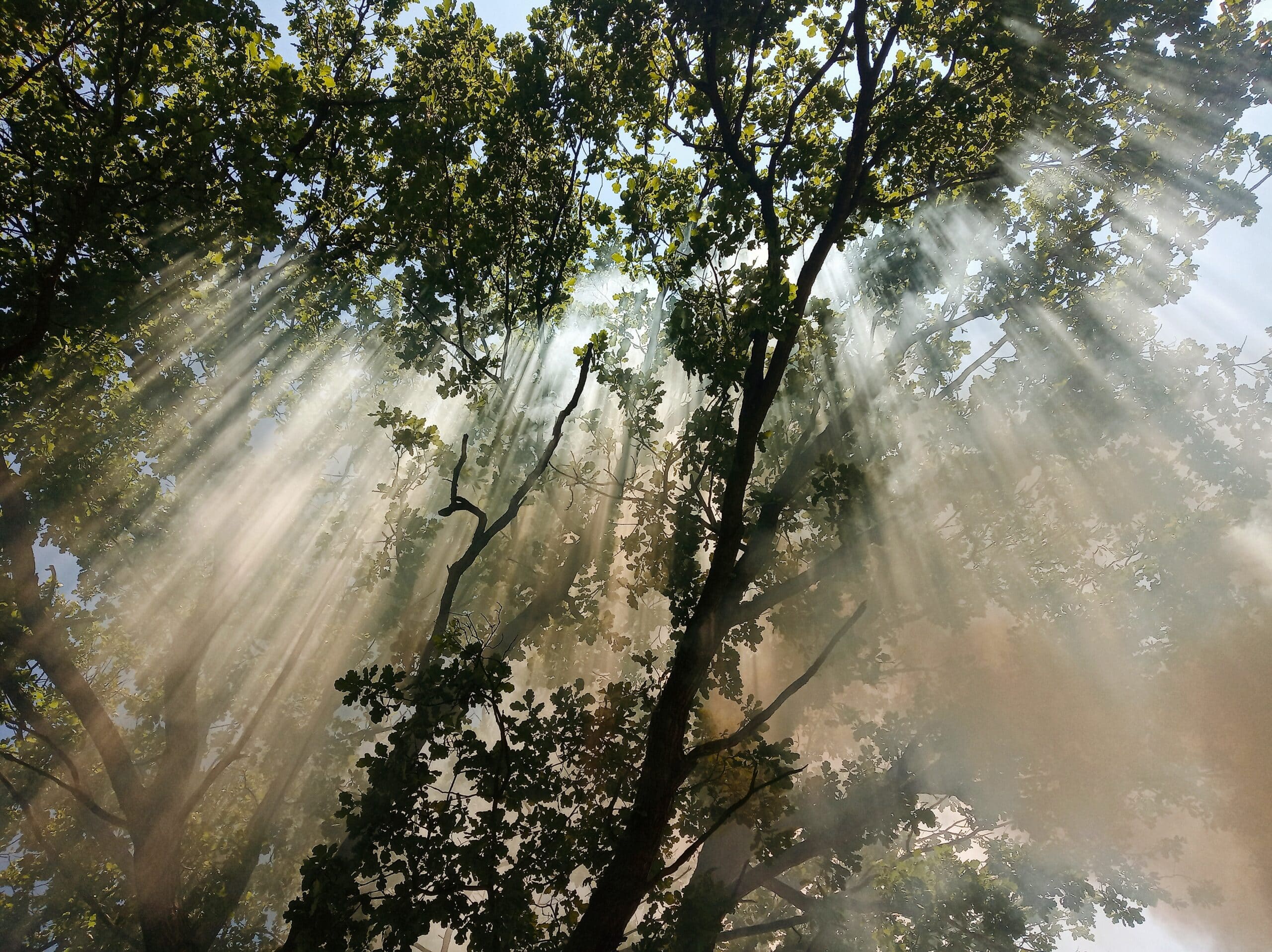
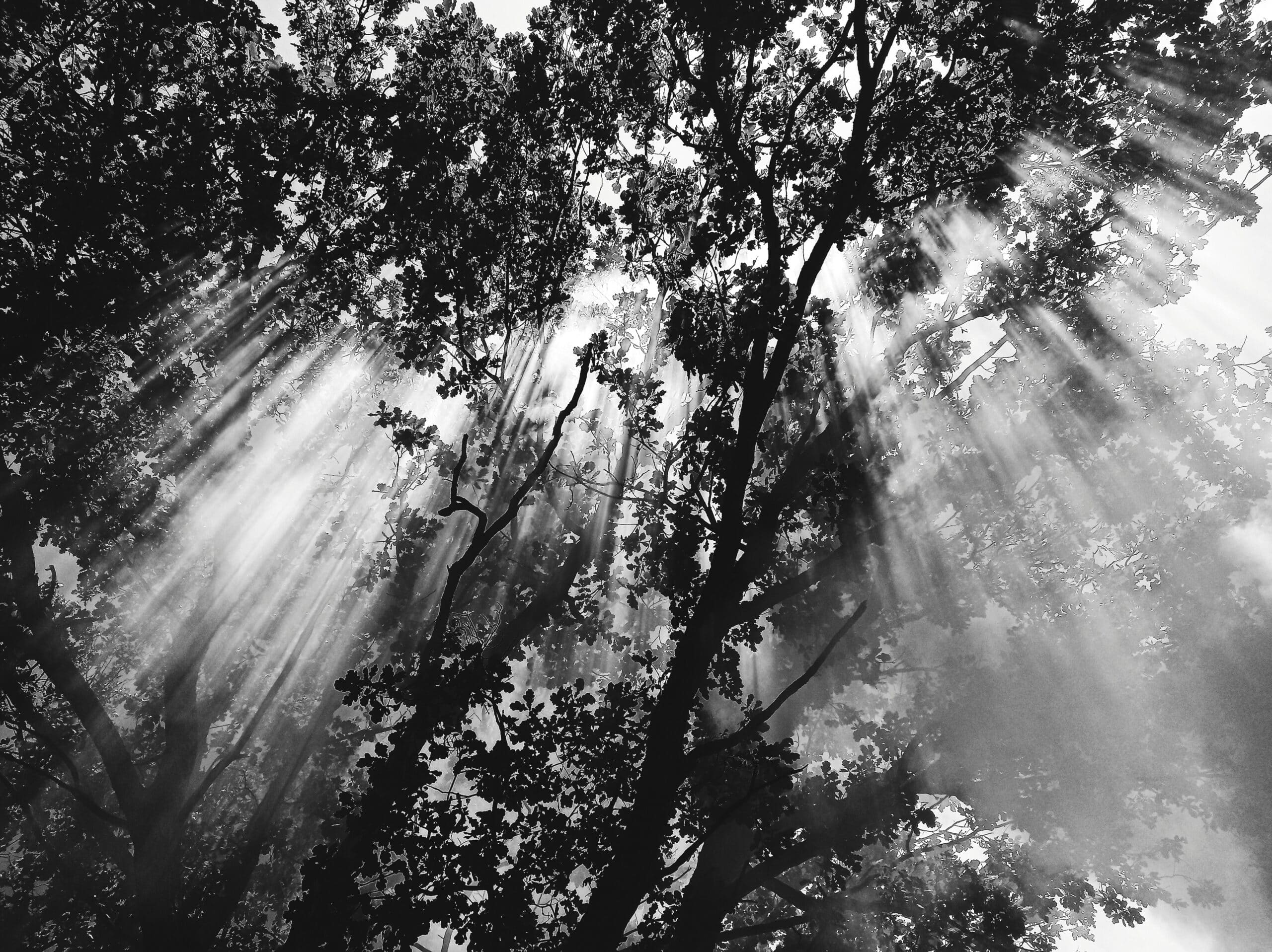
Light filtering through the tree branches accentuated by smoke from the fire
In this picture, there is a tree with a campfire below it. The smoke from the fire in combination with the sunlight creates beautiful sun rays filtering through the branches. In the color version, the grayish-brown color of the smoke is visible, adding to the picture’s effect. In the black and white version on the other hand, it’s much less obvious that the sun rays are blending in with the smoke.
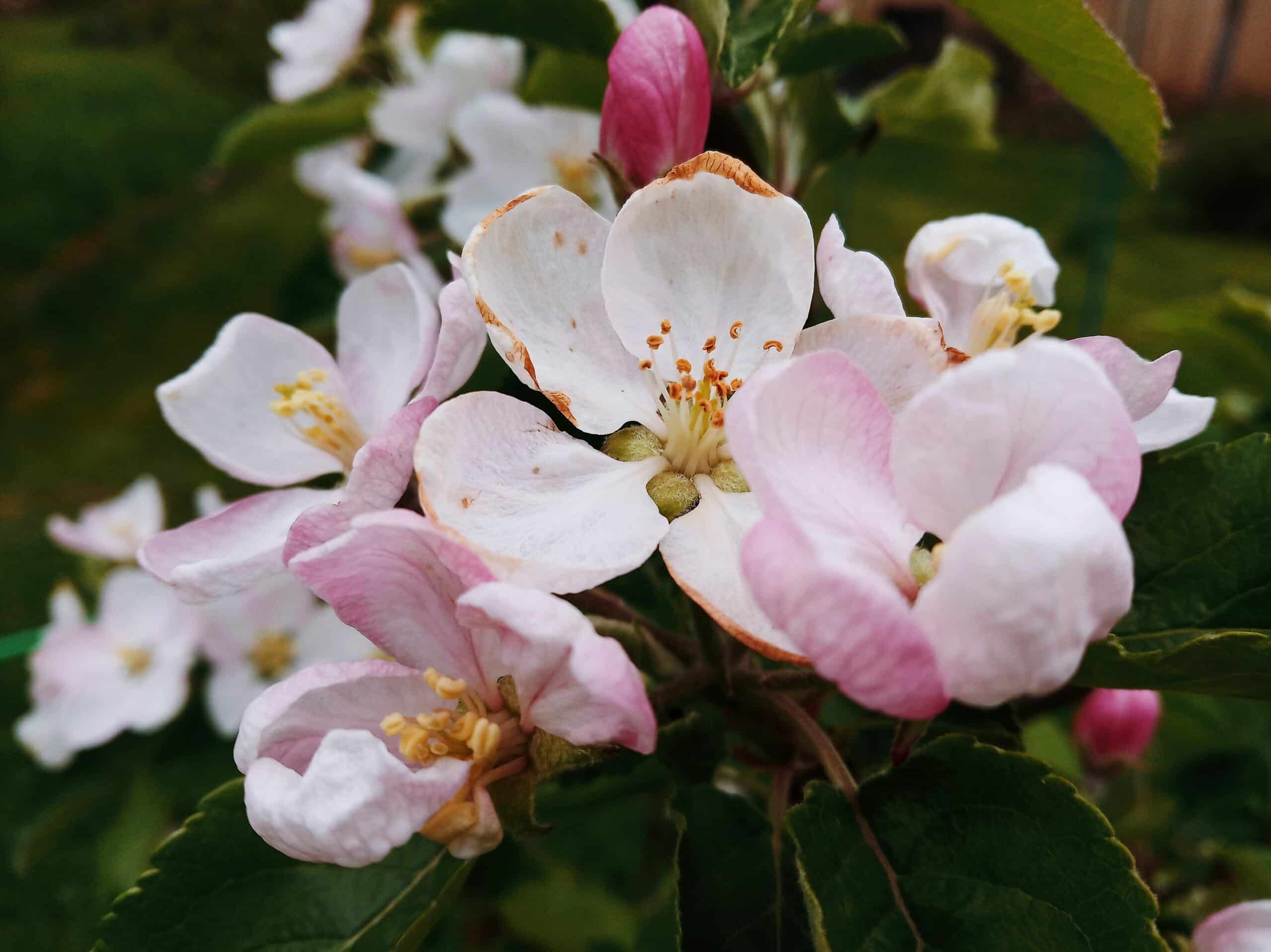
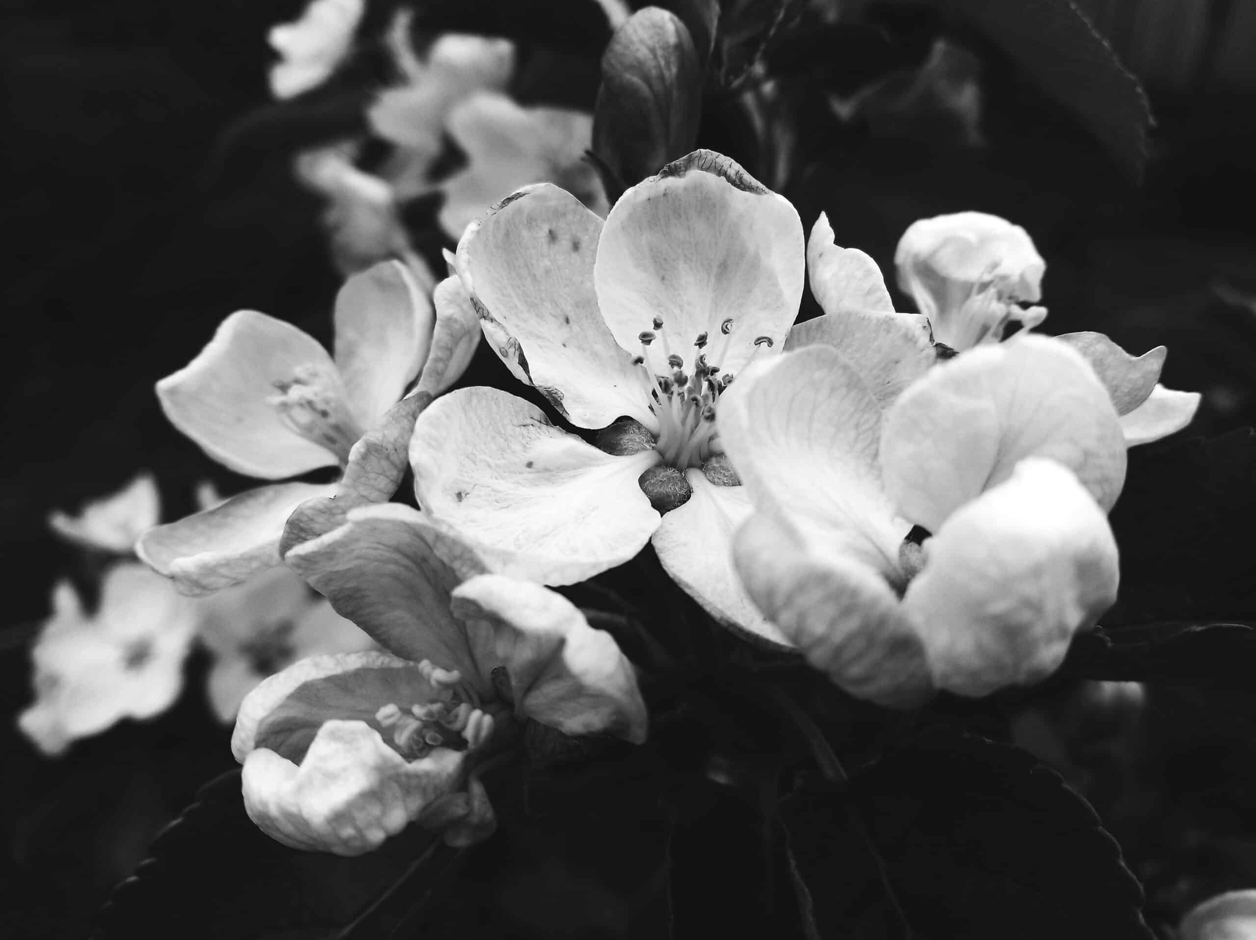
The pink blossoms of a young apple tree
The apple blossoms are very delicate in the color photo. Nevertheless, the brown edges are already visible at the ends, which are lost in the black and white version of the same photo. In the black and white photo, I added some light to the petals to bring out the contrast against the black background.

Further reading: How to Adjust Exposure and Dynamic Range
Color
It may seem that some plant photography could lose a lot and gain little when converted to black and white. Especially those blossoms that were photographed because of their color. This is a misconception. While they may lose their color, they gain a unique, yet mysterious look by being converted to black and white.
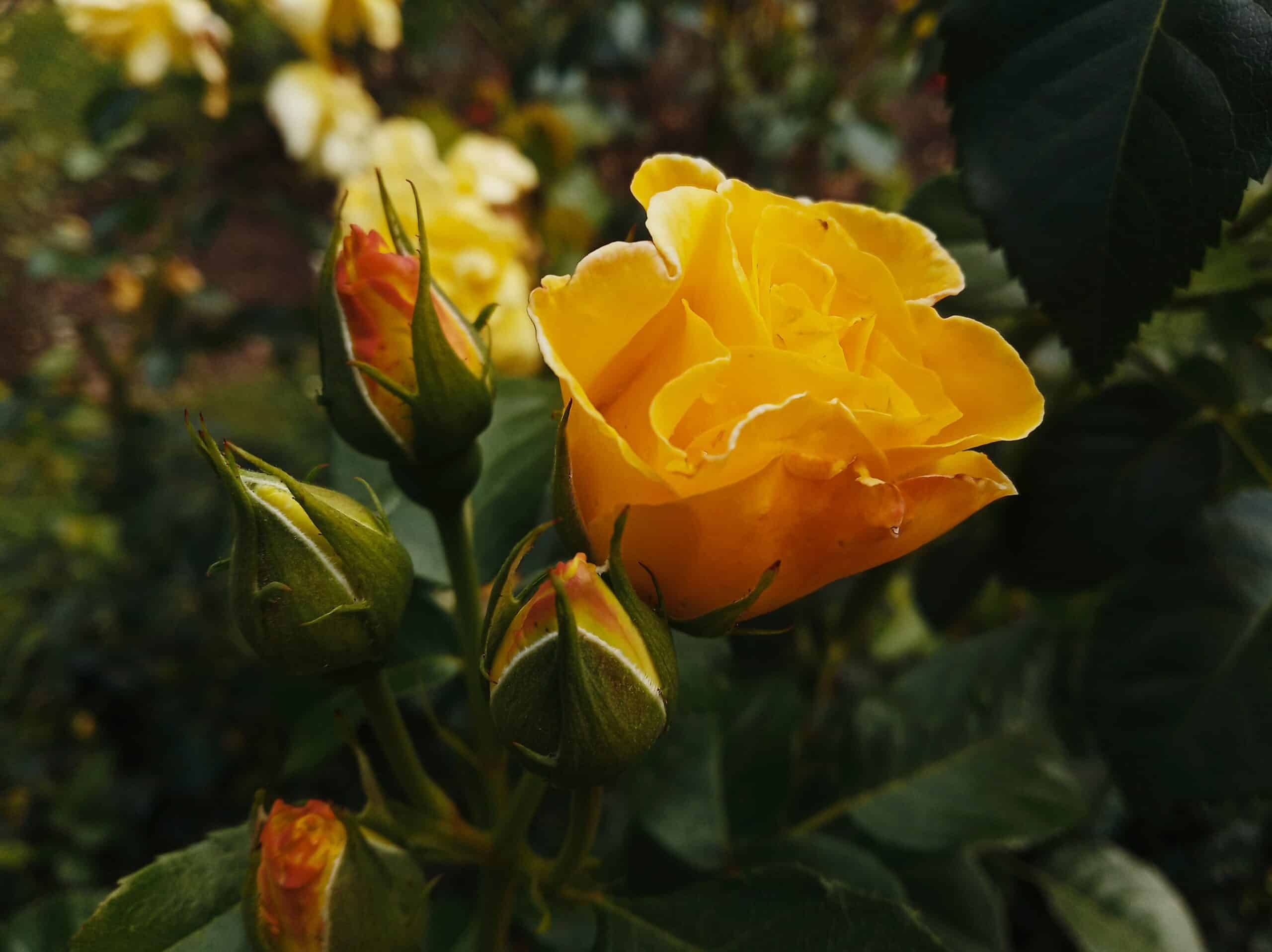
Yellow roses with rosebuds
The yellow color of the rose is undeniably a significant part of the color version. It emphasizes not only the yellow color but also shades of orange and red that the rose exudes, especially visible on the rosebuds. The flower is the central part of the image in contrast with the green background. In contrast, in the black and white version, we don’t know if the rose is yellow, pink, or white. The outlines of the leaves are much more lost in the background, the buds lose their outlines, making the flower itself all the more striking.
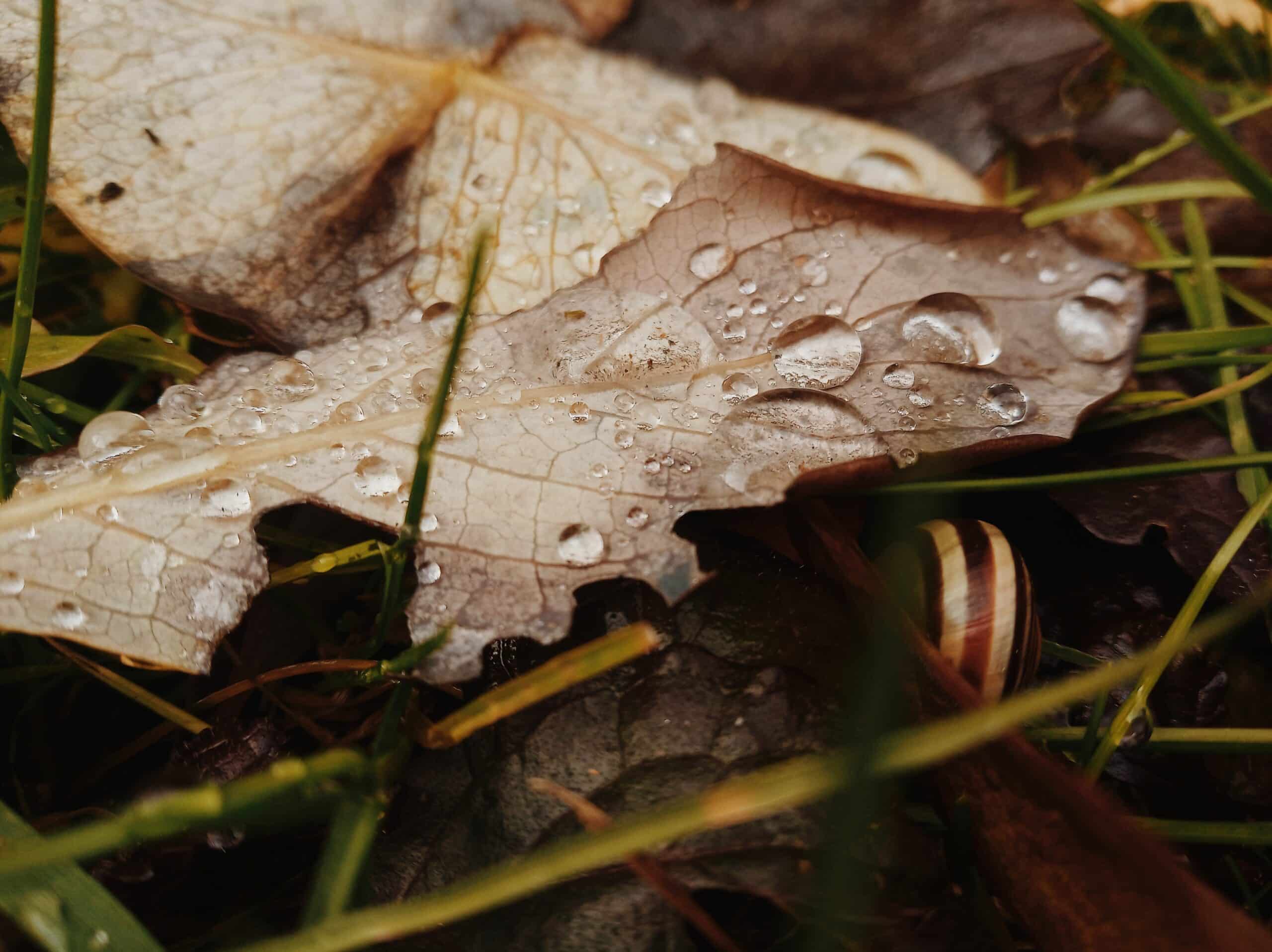
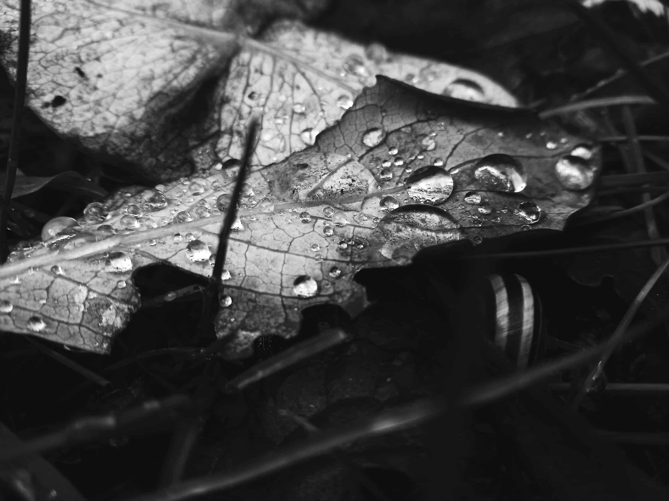
A snail hiding under a leaf from the drops of morning dew
The snail’s shell has more contrast in the color version even though it matches the colors of its surroundings. However, by converting it to black and white, the shell’s contrast and prominence are lost, but the photograph takes on a darker character and brings more attention to the leaf under which the snail is hiding.
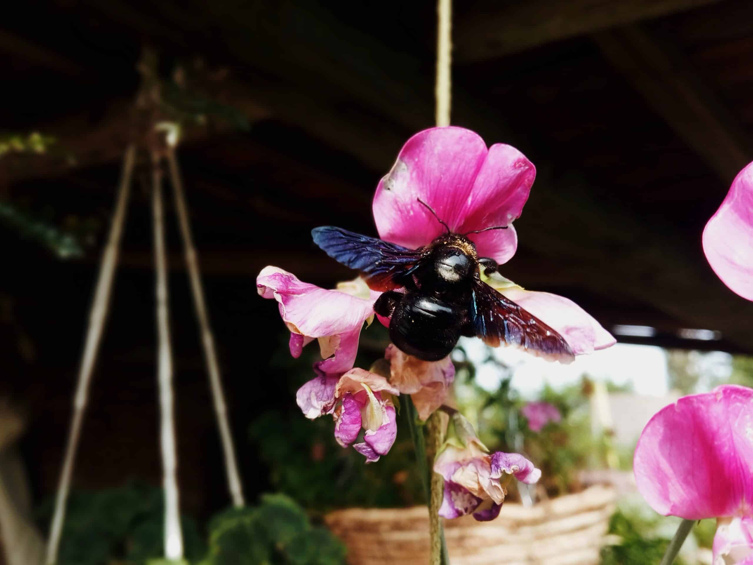
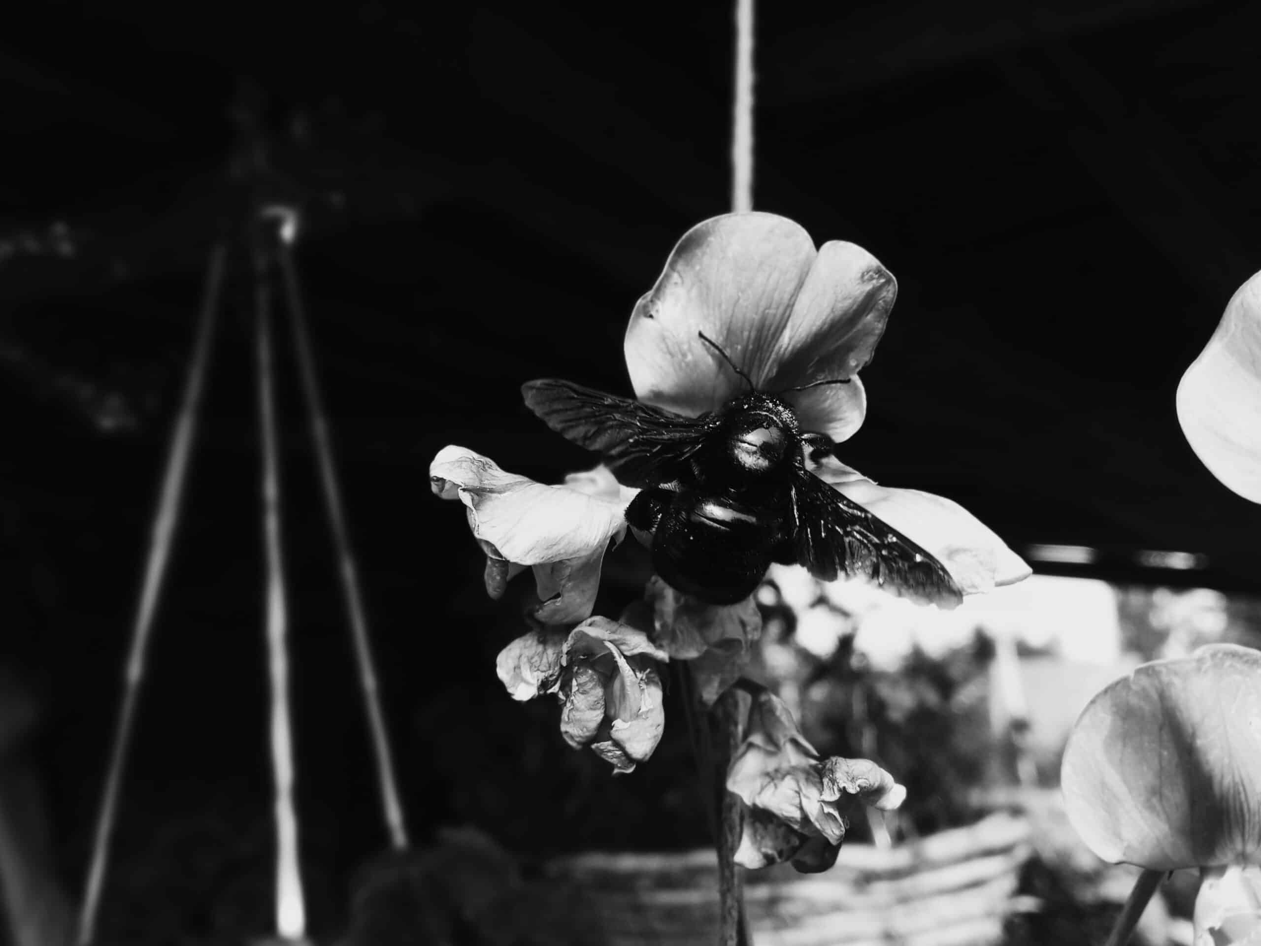
Carpenter bee pollinating a flower in the garden
The photograph of the carpenter bee in its color version is certainly interesting. In particular, thanks to the contrast of the bee’s black body with its purple-blue wings and the pink flower it’s pollinating. In the black and white version, this color contrast goes away and it’s much more difficult to see if it’s a carpenter bee without its distinct coloring.
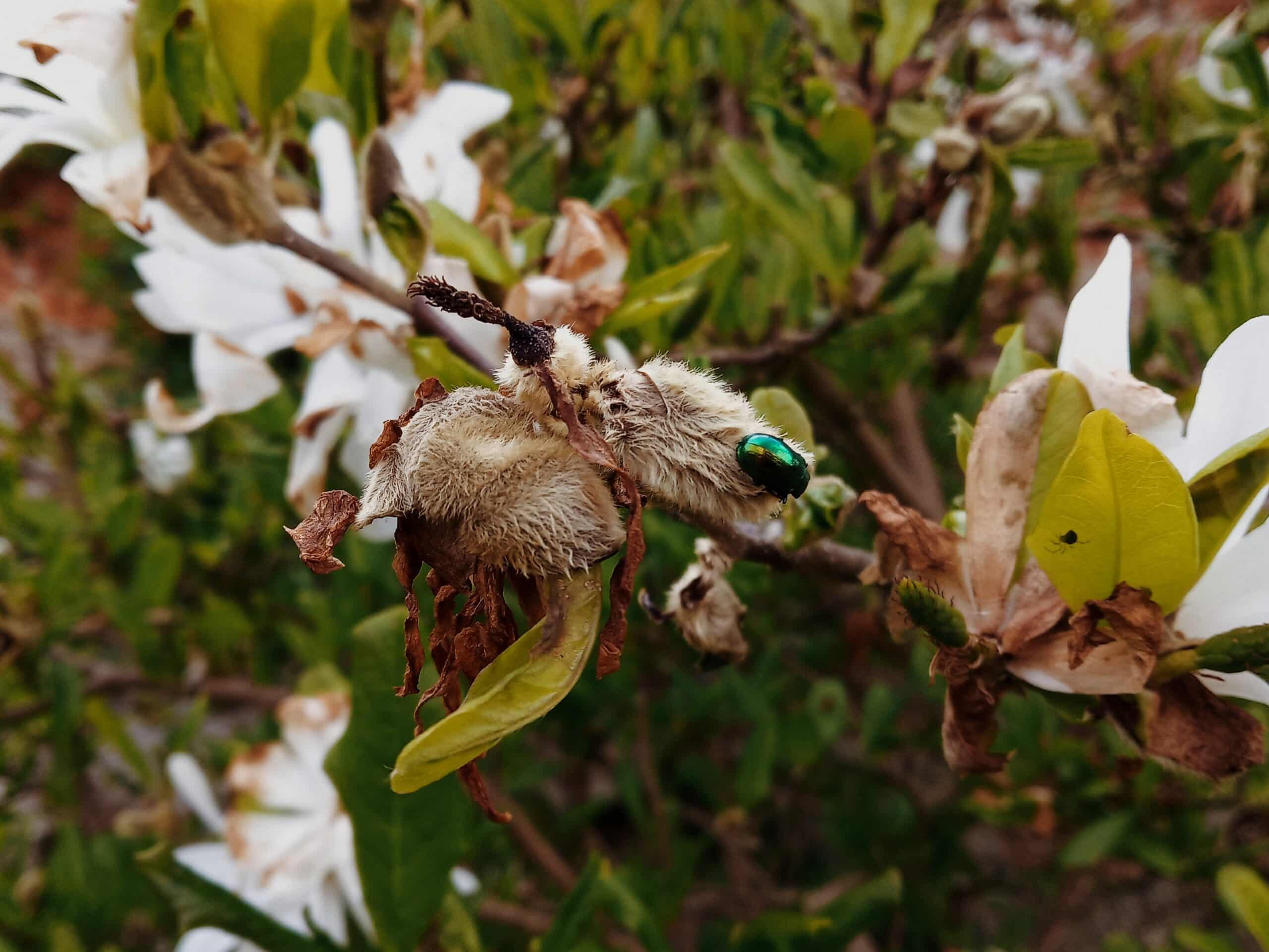
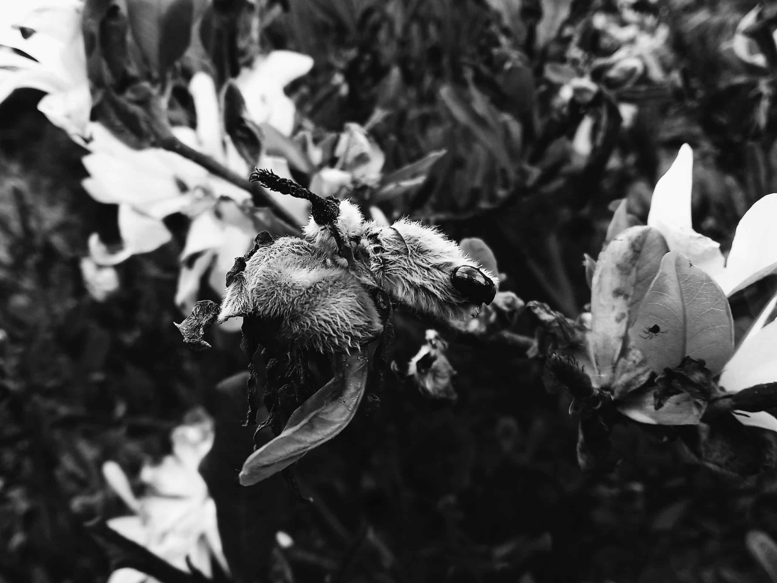
This example is similar to the one with the carpenter bee. In the color version, the beetle is very striking due to its coloring, while in the black and white version, there is a touch of mystery.
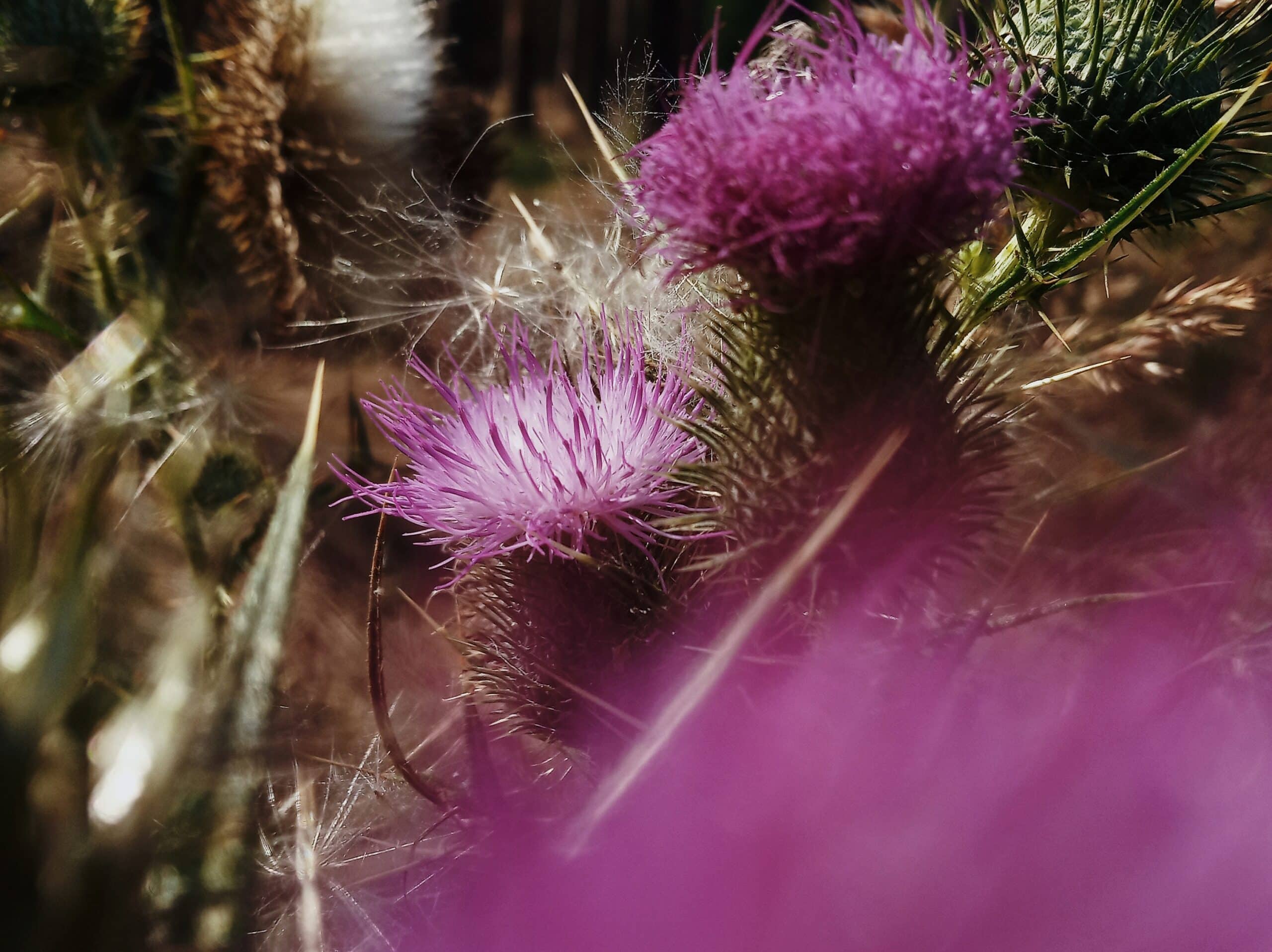
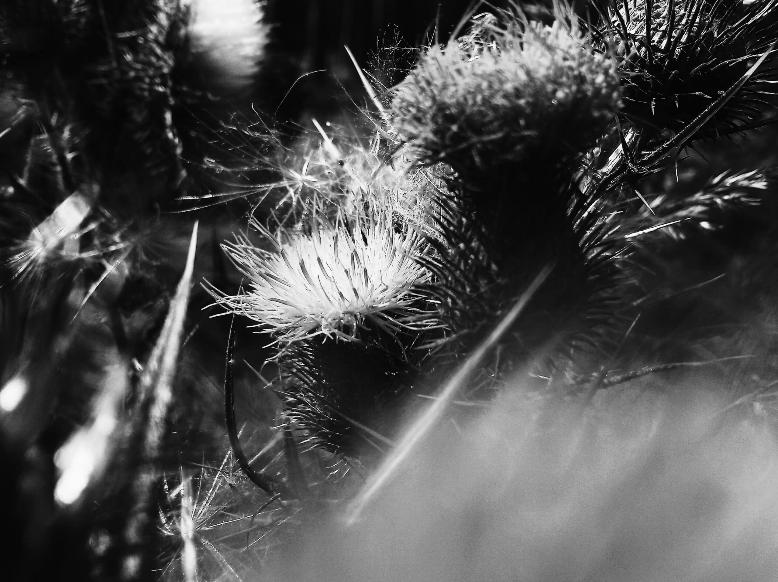
Combination of interesting contours, color, and light on the thistles in the forest
In this example, the black and white version looks more mysterious and may even look like something from a scary movie. The thistles are much sharper looking than in the color version. Again, there are earthier shades contrasted by the soft purple color of the thistle. The color version as compared to its black and white counterpart looks significantly “dreamier,” and I’d even say fragile.
Editing
All of these photographs were shot on a smartphone. It’s not wrong to share photos taken on your smartphone. You don’t always have to have a top-of-the-line camera on hand. As far as post-production goes, I used to edit the majority of my photos using mobile applications for presets, contrast, and color balance.
Lately, even though it’s a slightly longer process, I’ve been uploading the photos to my computer via Google Drive and then editing them in Zoner Photo Studio X. Even though it’s more time consuming, the quality of editing is much better. Zoner has many additional features for tweaking color, contrast, and light than photo editing applications. The results make the extra time well worth it. I then upload the edited photos to my Google Drive and they are ready to be shared on Instagram.

There are no comments yet.