Photographing Silhouettes
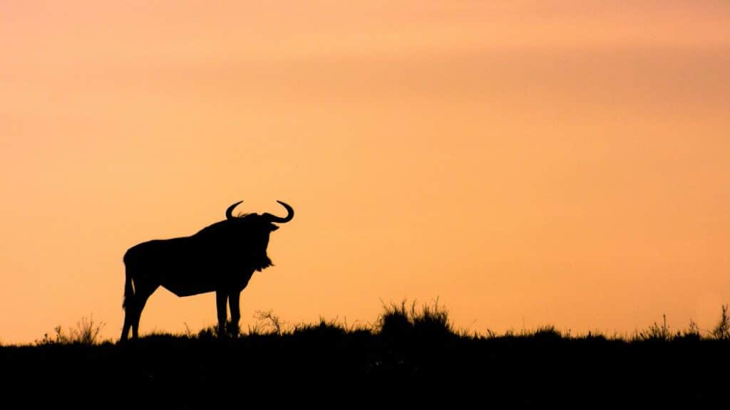
Silhouettes. Striking photos where the subject is only hinted, not shown. Despite this—or because of it—they are well-loved, and they are real attention-getters. Come join us for some inspiring silhouette photos and for tips on how to make your silhouettes even better.
Silhouette photos need to strike a compromise between making the subject mysterious and making it distinguishable.
And they don’t always succeed at that. Sometimes you get nothing more than a gray jumble of shapes that’s only fit for the trash can. But with practice you can get a feel for this special genre and avoid taking chaotic pictures in the first place. Photographing silhouettes is an interesting exercise that will also help you to improve your other, non-silhouette pictures.
That’s because an “eye for silhouettes” has a very broad usefulness. But first, a digression: just like in silhouettes, the characters in animated movies and TV shows tend to be standing with their side to the camera. For example when you see a cartoon magician pull a rabbit out of a hat, he’s always holding the rabbit and the hat off to the side, and not straight towards the camera. And this is because the audience can see the action from the silhouette, making it easier to tell what’s going on overall.
What Should I Photograph?
Anything that looks good in a side view. People, yes, but don’t stop there. Also try photographing characteristic buildings, landscapes, pets, and close-ups from the man-made or natural world.
Meanwhile, avoid things that are not distinguishable from their silhouettes or are boringly flat—this applies for example to landscapes with a setting sun. Consider the following picture:
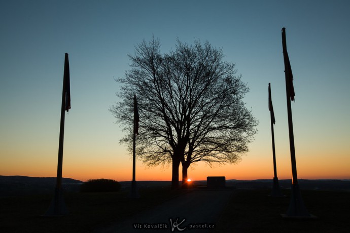
Canon 5D Mark II, Canon EF 16–35/2.8 II, 1/100 s, f/7.1, ISO 100, 35 mm focus
Here the rising sun gives the sky a beautiful color, and the tree silhouette along with the flagpoles makes it more interesting. If I had stood just a few meters to the side and photographed only the sky, I would have created a silhouette of nothing but the utterly uninteresting level landscape in the background. If you don’t have a landmark or something similar available, then you can spice up the picture in a pinch by, for example, crouching down:
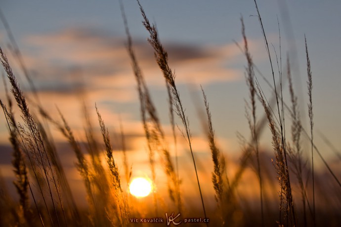
Canon 5D Mark II, Canon EF 70–200/2.8 II IS, 1/1000 s, f/5.6, ISO 100, focus 70 mm
There is no shortage of landscape material in the city as well. This picture was taken in much deeper darkness, and the lights in the library on the right also play a role. Without them, there would be nothing but a big black area in that part of the picture (and most likely I’d just compose the picture without that area).
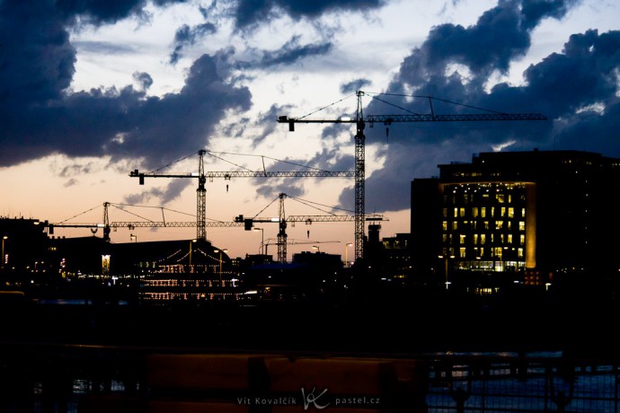
Canon 40D, Canon EF-S 55–250/4–5.6 IS, 1/125 s, f/4.5, ISO 1600, focus 84 mm
What Time of Day?
As you can see in the photos above, it’s very common to have some sky in silhouette pictures. That’s because it’s easy to acquire an enormous contrast between the light in the distance and the dark foreground. Thanks to a digital camera’s relatively small dynamic range, this can be leveraged to make the foreground completely dark.
Thus it’s simplest to just point the camera at the sun (but watch out for your eyes), because it’s very rare for there to be anything else brighter in the scene. That lets you turn practically anything into a silhouette.

Canon 40D, Canon EF-S 55–250/4–5.6 IS, 1/100 s, f/25, ISO 100, focus 84 mm
But it’s no problem to utilize any other time of day instead. I took this picture, for example, just before daybreak. It shows a mountain silhouette in the foreground and the moon in the sky:

Canon 40D, Canon EF-S 55–250/4–5.6 IS, 1/50 s, f/4.5, ISO 400, focus 79 mm
But you don’t have to shoot against the sky. At night especially, artificial lights become the stars of the show, and your options are much more varied. Sometimes a tripod becomes necessary. For example in this photo, I had to use a long shot time (1/4 s) to enable the enormous focal length (300 mm, full-frame equivalent 480 mm) and because I wanted to blur the water.

Canon 350D, Sigma 70–300/4–5.6, 1/4 s, f/8, ISO 200, focus 300 mm
Night photography places greater demands on imagination and nimbleness. The following photo shows a couple walking up a castle staircase. If the lovers had been just a few steps closer or farther away, then one of the lights would have illuminated them, giving a very different photo:

Canon 40D, Canon EF-S 10–22/3,5–4.5, 1/30 s, f/4, ISO 400, focus 16 mm
The rules for composing silhouette photos are… the same rules as always. But not quite; there’s a bit more to keep in mind—mainly the fact that when photographing with a non-TTL viewfinder, the shot often looks brighter to your eyes than it does for the camera. A much larger portion of the picture will turn out black than it may seem in the viewfinder. Because of this, when you have a landscape or city in a picture, it’s usually somewhere on the edge of the photo, and the picture itself only depicts some object. So for silhouettes it’s more common than usual to aim the lens at the sky.
Notice how in this picture the beach and the sea lay right at the bottom edge.
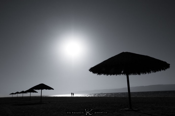
Canon 40D, Canon EF-S 10–22/3.5–4,5, 1/1600 s, f/8, ISO 100, focus 17 mm
Here’s a similar situation as an example, with some very pure rule-of-thirds composition on top:
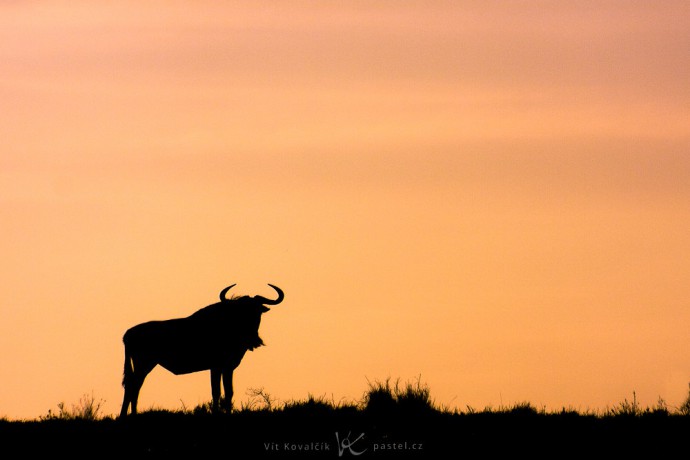
Canon 400D, Sigma 70–300/4–5.6, 1/4000 s, f/8, ISO 400, focus 263 mm
Camera Settings and Computer Edits
All of the photos above were taken with an exposure designed to make the sky or other light areas come out right and make everything else dark. In “correct exposure” this would be a mistake and we would be forced to reach for HDR or the trash can, but here due to our artistic goals, it is what we want.
The main, and often the only, computer edits used are increasing the contrast and the saturation. In light of the fact that usually only the sky is visible, we can risk some very dramatic color and contrast changes that would cause major problems in normal photos (e.g. people photos).
HDR is not typical for silhouettes, but it can be useful sometimes. The following illustration shows an out-of-camera silhouette and its edited version. The upper portion remains in silhouette, while the lower portion has been significantly brightened in order to show off the landscape. My camera has enough dynamic range for the scene, and I took advantage of that, but if I had needed to reduce noise, then I definitely would have tried joining a few shots together.
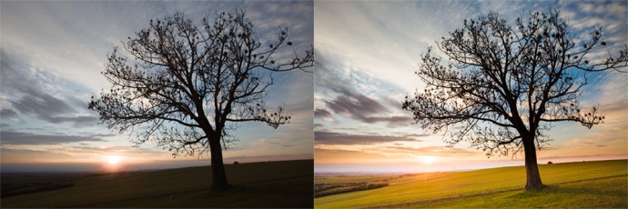
Canon 5D Mark II, Canon EF 16–35/2.8 II, 1/100 s, f/9, ISO 100, focus 16 mm
Some Inspiration for Your Experiments
I’d like to conclude with my favorite out of the silhouette photos I’ve taken. It took about ten tries to get right. The birds were always flying in roughly the same direction. So I set up for my idea and then waited for one to fly by.
I hope that this article has brought you inspiration for future photos and that you’ll get a chance to express that inspiration soon.

Canon 5D Mark II, Canon EF 16–35/2.8 II, 1/640 s, f/7.1, ISO 400, focus 35 mm
TerryB
Vit,
The shot of the couple walking up the old castle steps is wonderful, and it is easy to envisage how it would have been ruined had any light fallen on them.
As for silhouettes in general, personally I feel the subject matter has to be simple, but strong in outline. For me, then, the shots that don’t work are the cranes in Amsterdam, the memorial at Austerlitz and the grass scene. Amsterdam is a very “fussy” image, with far too much for the eye to latch on to, and the other two I find the subjects just weak. But as for the others, these are very appealing with their simple, but bold, outlines, and they leave us in no doubt as to what the subject is. Being virtually duotone as well, certainly adds to their beauty.
Vit Kovalcik
Terry, thank you for the feedback. I agree, that outline is the biggest decider and you are right about the grass and the Austerlitz picture – they are not ideal, but I wanted to include something different as an inspiration. However, I still kind of like the cranes photos from Amsterdam. Yes, a lot of things is happening there, but that just forces the viewer to look at it for more than a mere second. Although, with just a black ground and the cranes sticking out of it, it would have been a nice picture too :)