Three Color Management Tips from the Pros

The article is over 5 years old. The information in it may be outdated.
![]()
We are working on its update. In the meantime, you can read some more recent articles.
Last week, we touched a bit on color management — what it is and why you might find it useful. Now, we’ll dive a bit more specifically into some tips that will help you squeeze the best quality color from your photos and prints. (If you’re a casual photographer simply interested in sharing photos online, this advice is definitely overkill, but feel free to keep reading!)
First, some background. I’m not a color expert, but I have had the good fortune to interview a fair number of them during the course of my career. These experts ranged from professional photographers to graphic artists who are responsible for matching colors under very demanding conditions (for museums or large brands) in addition to consultants who specialize in color management training. I’ve tried to distill what I’ve learned from them into the following bite-sized nuggets to help guide you deeper into the art and science of color management.
Lesson #1: Think Mathematically
Photographers are artists, but color management is a science. For some temperaments, that can be scary. Color management in digital photography is, ultimately, about numbers. After all, digital files are simply a collection of ones and zeros and color spaces are communicated digitally between devices. This means that to be a good color manager, you need to view the various pieces of your digital workflow — your image files, computer monitor, printer, even your room lighting — as a big pile of numbers that represent the kind of color they produce. Your job is to find out what numbers they spit out, record that and make sure those devices keep spitting out the right numbers day in and day out.
That, in a nutshell, is color management.

Lesson 2: Custom Profile EVERYTHING
As we discussed in the previous post, a profile is the digital file that describes how devices reproduce color. Serious color managers therefore make a profile of everything — their monitors, their printers and even the various photo papers they print on.
Of course, monitors, printers and photo paper come with their own pre-packaged profiles and, for the casual user, they convey enough color information to get the job done. But when color is critical, you need to skip the pre-packaged profiles and build your own. The signature weakness of a pre-packaged profile is that it can’t account for the idiosyncrasies of your environment — things like the humidity or lack thereof in the air, etc., which subtly impact the paper. A custom profile for a specific printer paper will help you squeeze out that much more accuracy.
I’ve spoken to professional print shops that will build a custom profile not just for every variety of photo paper they print on, but every roll even if it’s a paper stock they’ve used repeatedly on the theory that even subtle changes from package to package could impact the end result. You probably don’t have to go that far, but it’s a taste of how serious this can go.
Lesson #3: Calibrate Regularly
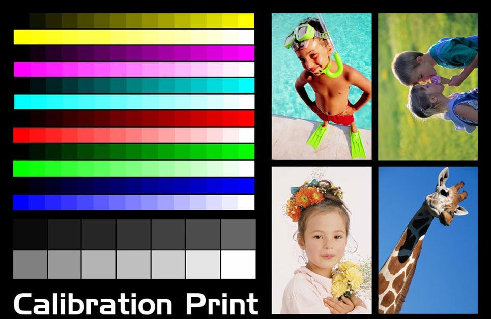
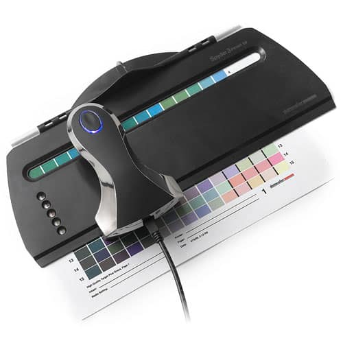
When you create a profile of a device — say, a monitor — you create a description of that device in a moment in time. But from the moment you’ve taken that profile, your device starts to drift away from that profiled state. This drift may be slow or, if you have an older piece of equipment, may be fast. That’s why the pros regularly calibrate their equipment to ensure it’s working in its optimal, profiled state.
There’s really no hard-and-fast rule for how frequently you should calibrate your monitor and printer. If you don’t print much, monthly print calibration should suffice (professional print shops calibrate daily). Monitors are used much more frequently and so should be calibrated more frequently — once a week could work, especially for older monitors, or monthly if you’re not yet at the pro photo threshold.
Lesson #4: Control Your Lighting
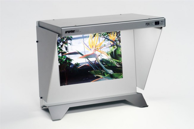
Light plays an enormous role in how color is perceived. Any monitor calibration tool worth its salt can account for ambient/room lighting, but it’s harder for prints — you need light to view them, but different light will impact how the colors look. For pros that rely on prints for their income, proofing the final output under controlled lighting is therefore critical. Proofing stations that offer an industry standard illumination (such as these) give you a controlled lighting source to view your finished product.
(Top image: Mothercare-Photo)


Jay Jay
Really enjoyed both articles on color management, in fact rushed out and bought a calibrator for my monitor. Then I further deviled into the whole process of color management from software to lab processing.