Colors in Photography: Everything You Need To Know About the Color Green
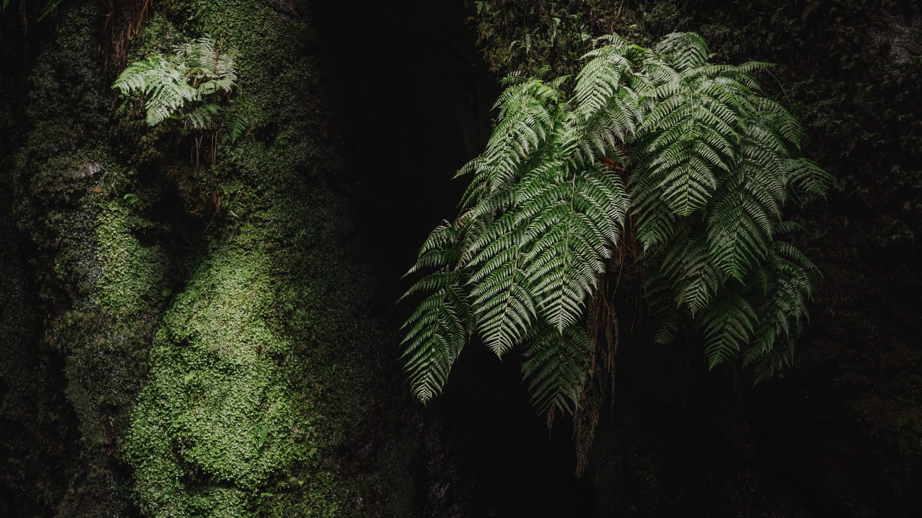
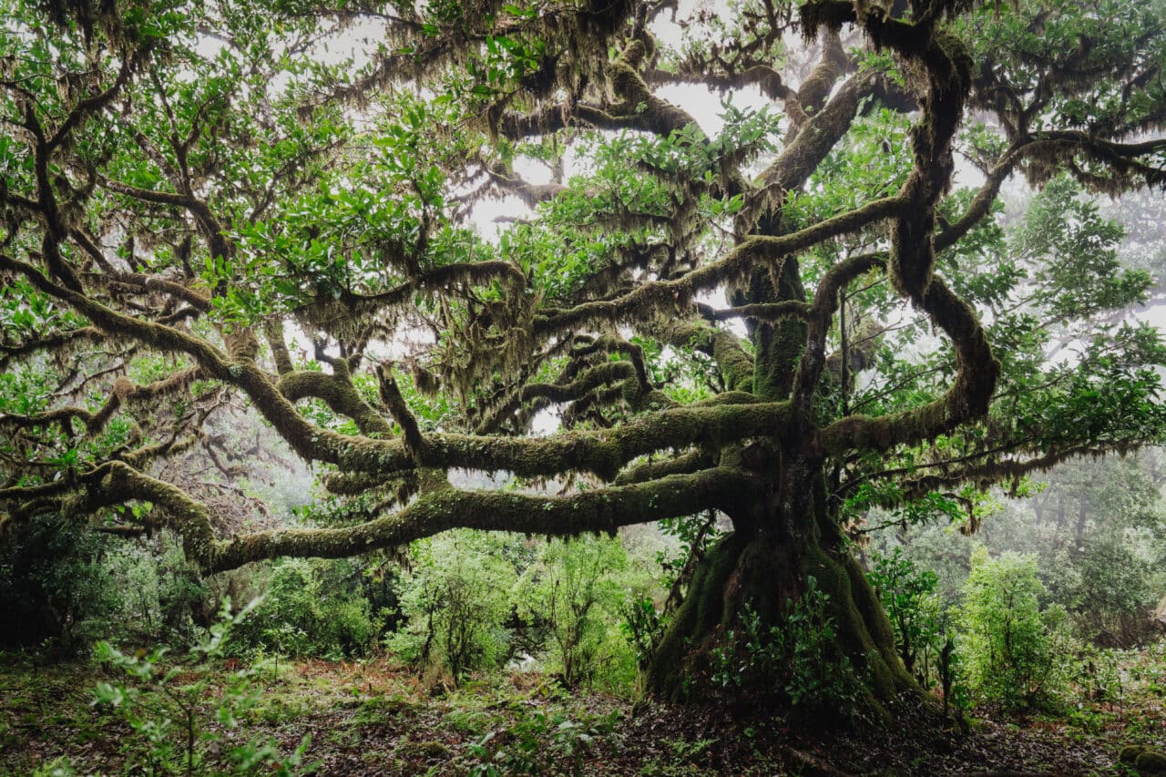
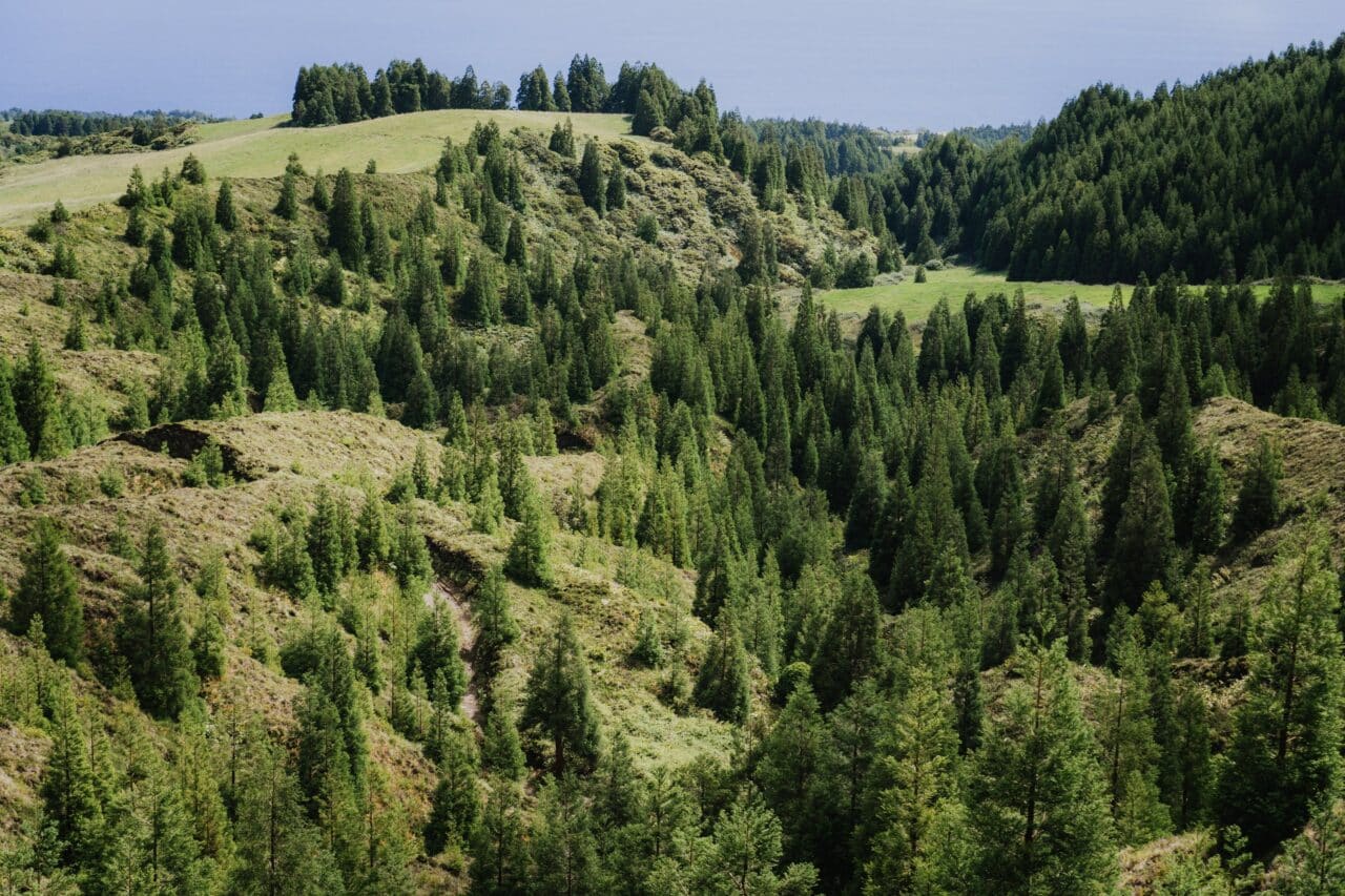
It’s hard to find a color with a more positive connotation than green. We use green to decorate our homes and it plays a major role in city planning. And it doesn’t end there. We are willing to leave the comfort of our cities and hike through wind and rain to high hills for views of endless greenery. Whether it is consciously or subconsciously, people like to surround themselves with green.
The word green is derived from the Old English “grene” and shares a common root with words like “grow” and “grass.” The color green is strongly associated with nature, especially for its calm, regenerative, and life-giving function in our subconscious. Let’s look at how we can use these positive attributes in our photography.
Psychology of the color green
Green has been associated with growth, fertility, and nature since ancient times. In Egypt, crops were depicted with green hieroglyphs and attributed to Osiris, who was associated not only with death but also rebirth. In Roman culture, this color was associated with Venus, the goddess of fertility. In Muslim cultures, green is the color of the Prophet Muhammad.

Green is perceived very positively across cultures, which may explain its popularity.
However, the positive forces of nature are just the beginning of our subconscious associations with green. Especially in the last two centuries, its significance has begun to change slightly. Since 1861, when the U.S. government began printing the first dollars, green has been associated with the color of money. Green is also the color of the digital world.

The first computers displayed text in green, which later appeared in sci-fi pop culture. In this sense, green is probably most associated with the film The Matrix.
The perception of green is also strongly influenced by its shade. While darker and pastel shades of green evoke the aforementioned feelings of calm and comfort, bright green can evoke an excess of energy or even toxicity.
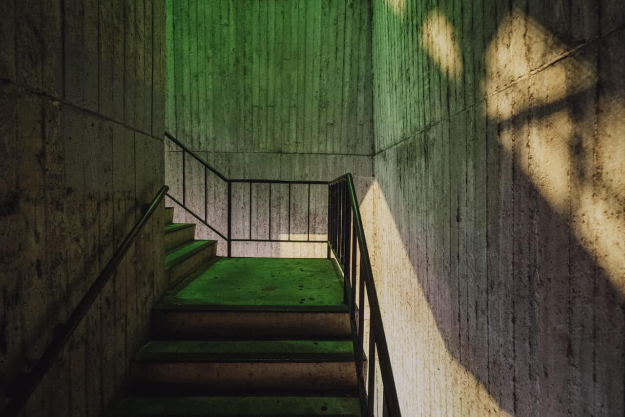
Use of green in marketing and design
It is no coincidence that many photographers that shoot interior design include green apples or limes as decorations. Green elements do not distract from the main theme of the photo but give the image a sense of freshness and vitality at the same time.
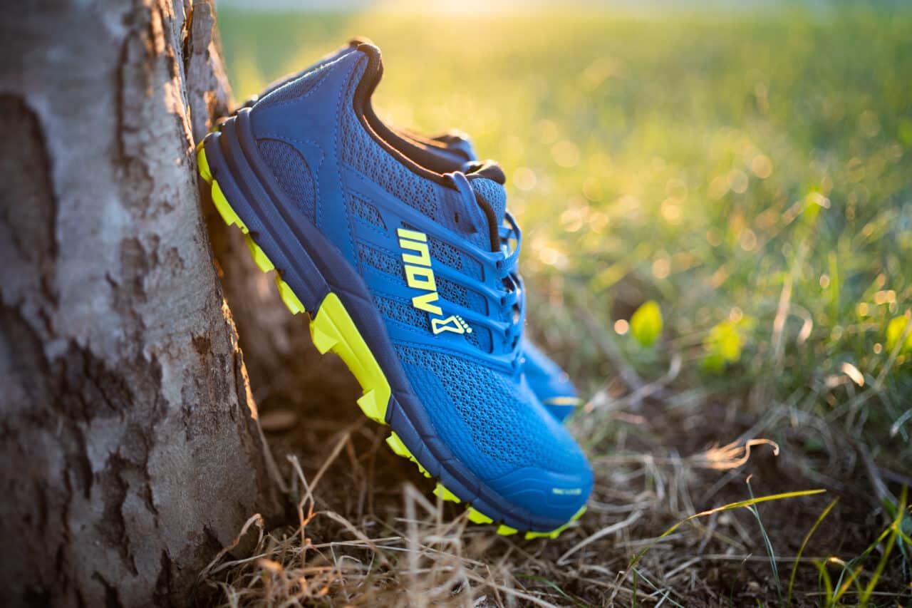
If you photograph products associated with fitness, a healthy lifestyle, and sustainability, green will help you emphasize these aspects. By incorporating the color green, you can also express a desire for constant progress, for something dynamic, lively, and ever-changing. Similarly, technological companies, such as Acer and Android, use this color.
Green works great for product photography associated with fitness. In this case, the shade of green has been edited to be more yellow.
Green in art
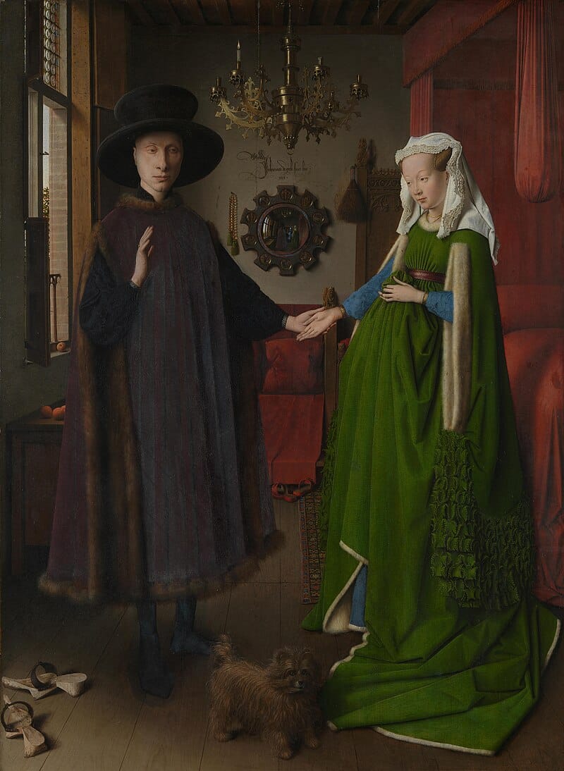
The Middle Ages and the Renaissance built on the ancient use of the color green and added objects associated with wealth and higher social status. Merchants, bankers, and nobles wore green, as we can see in the famous painting of the Arnolfini Marriage by Jan Van Eyck.
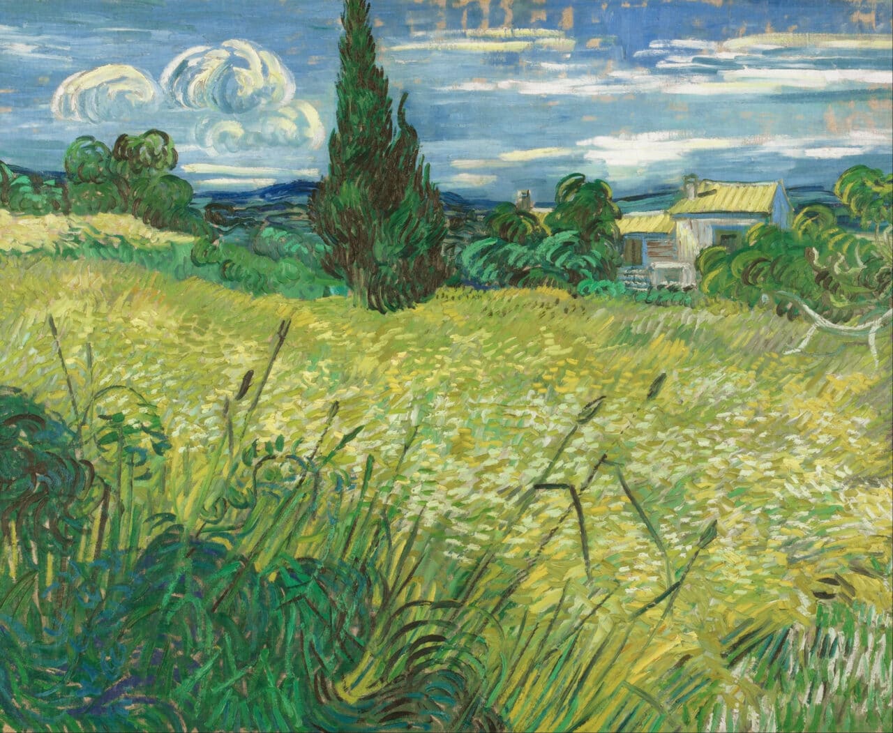
Perhaps the biggest boom for green came with the rise of the Impressionist movement. Impressionists and later movements found a completely new field for experimenting with color. They prioritized feelings and emotions over the realism of representation, and for many, it became a favorite practice to paint landscapes quickly and immediately, trying to capture the fleeting moment in a flurry of colors and brushstrokes.
What colors go well with green?
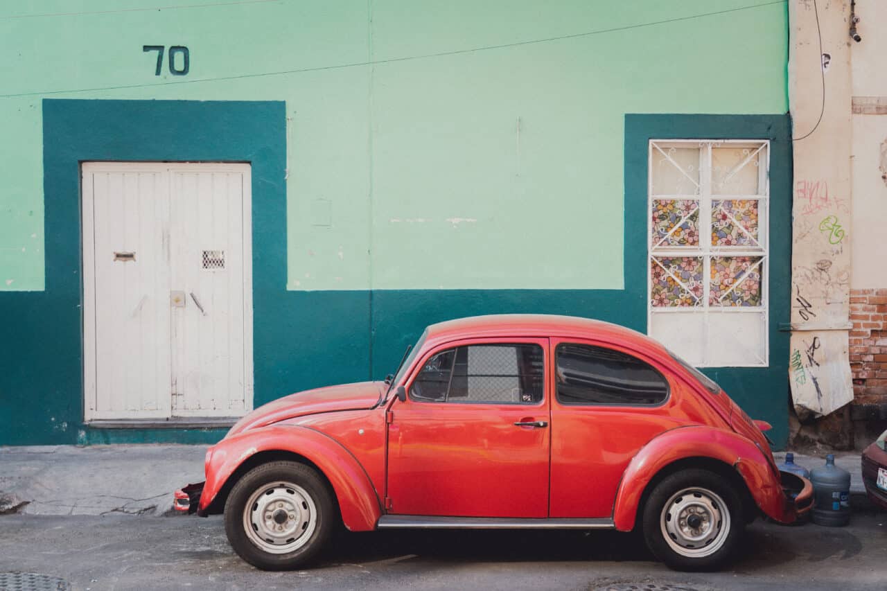
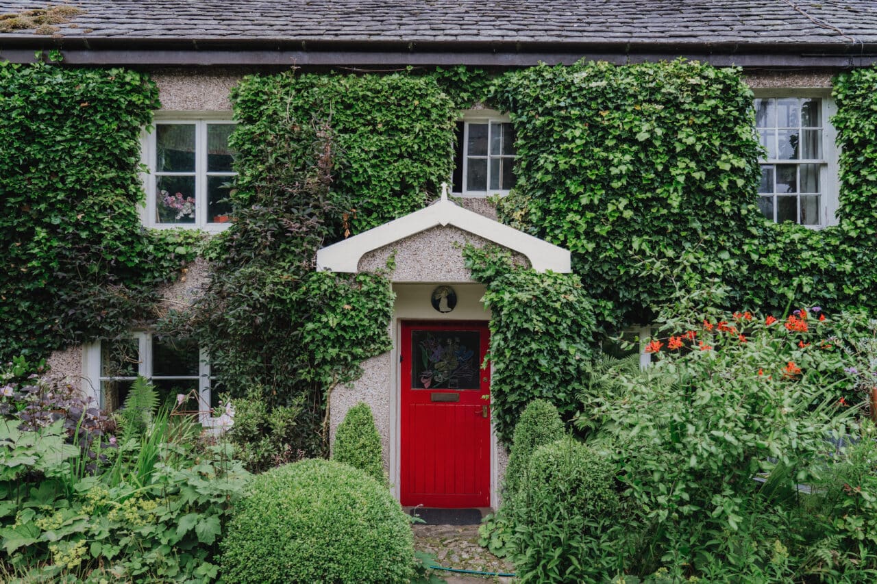
The complementary color for green is red. Together, they create an interesting dynamic in photography and are a popular combination in colorful street photography or architecture.
The combination of green, orange, and purple also works great. These colors are opposite each other on the color wheel and form a triangle. They evoke darker associations and for some countries, they are associated with Halloween celebrations.

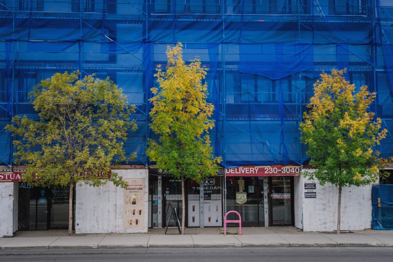
Green is a secondary color and a combination of yellow and blue, warm, and cool colors.
This color combination provides ample space for creativity. In post-processing, increasing selective saturation to yellow brightens the greens, while increasing saturation for blue dulls greens. Work with this dynamic based on what you want to express in your photography.
Join us as we gradually introduce all the basic colors in our series and go through each of their aspects from history to psychology.
Read interesting facts about black, white, red, blue and yellow in photography, among other fields.



John C.
Very interesting. Thank you.