Colors in Photography: Everything You Need to Know About Yellow

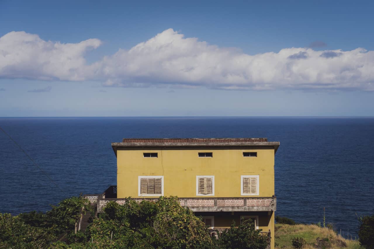
The color yellow is primarily seen as the warm color of the sun in art and photography. But yellow also has negative psychological and physiological connotations.
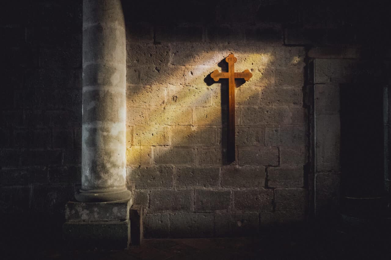
For photographers, yellow is mainly associated with beautiful evening light that magically illuminates the landscape. However, in ancient history, yellow was associated with stories of poisoning. Several types of yellow pigments were highly toxic and poisoned artists over time. For example, yellowcake uranium powder was found on utensils dating back to the birth of Christ, and was used well into the twentieth century.
Yellow is a very distinctive color. If you decide to use it in your photography, keep in mind that it attracts attention. However, yellow is an important creative element not only for shooting, but also in post-production.
When adjusting the white balance to shades of yellow, we can greatly influence the image’s mood. We’ll cover how to do this and what you can communicate with yellow in this article.
The psychology of the color yellow
Yellow is the brightest color in the color spectrum, if you don’t count white. It inspires us with its freshness, energy, and liveliness, but exposure to yellow for longer periods of time, can also make viewers grow weary.

Just like red, yellow is associated with a range of conflicting emotions and feelings.
Still, yellow has mostly positive connotations. Think of the sweet taste of honey or a ripe mango, shiny gold jewelry, or the warmth of a sunny beach. In this sense, yellow is very optimistic, and evokes feelings of happiness, joy, hope, and enthusiasm.

Yellow is a stimulating color and encourages interaction and activity.
However, yellow also has a surprisingly large number of negative associations. In Czech culture, it is closely associated with jealousy, lies, betrayal, madness, and disease.
Use of yellow in marketing and design
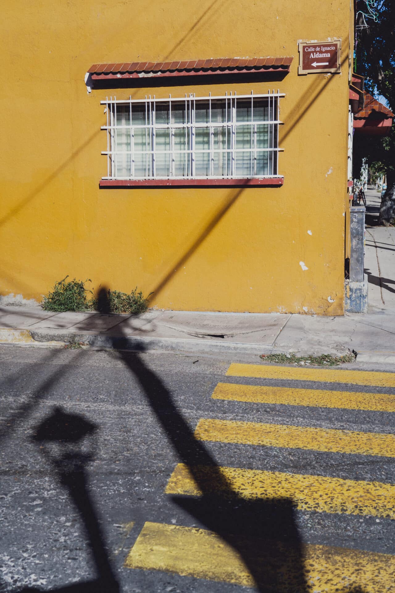
Yellow is rarely used on its own when designing corporate identities. On its own, yellow is distinctive, but hard to read and can fade in different contexts. This is why it is usually used in combination with other colors, like red (McDonald’s, Shell, DHL, Chupa Chups), blue (Nesquik), or white (National Geographic).
Forget the negative associations in art. In marketing, yellow is seen primarily as a positive color, associated with the morning, joy, and the warmth of the sun.
Yellow in art
The use of the color yellow is firmly linked to divine beings, power, and immortality. Many ancient civilizations placed the sun god at the center of their religion. They were usually dressed in yellow. The ancient Egyptians even depicted their gods with yellow skin, because they believed their skin and bones were made of gold.
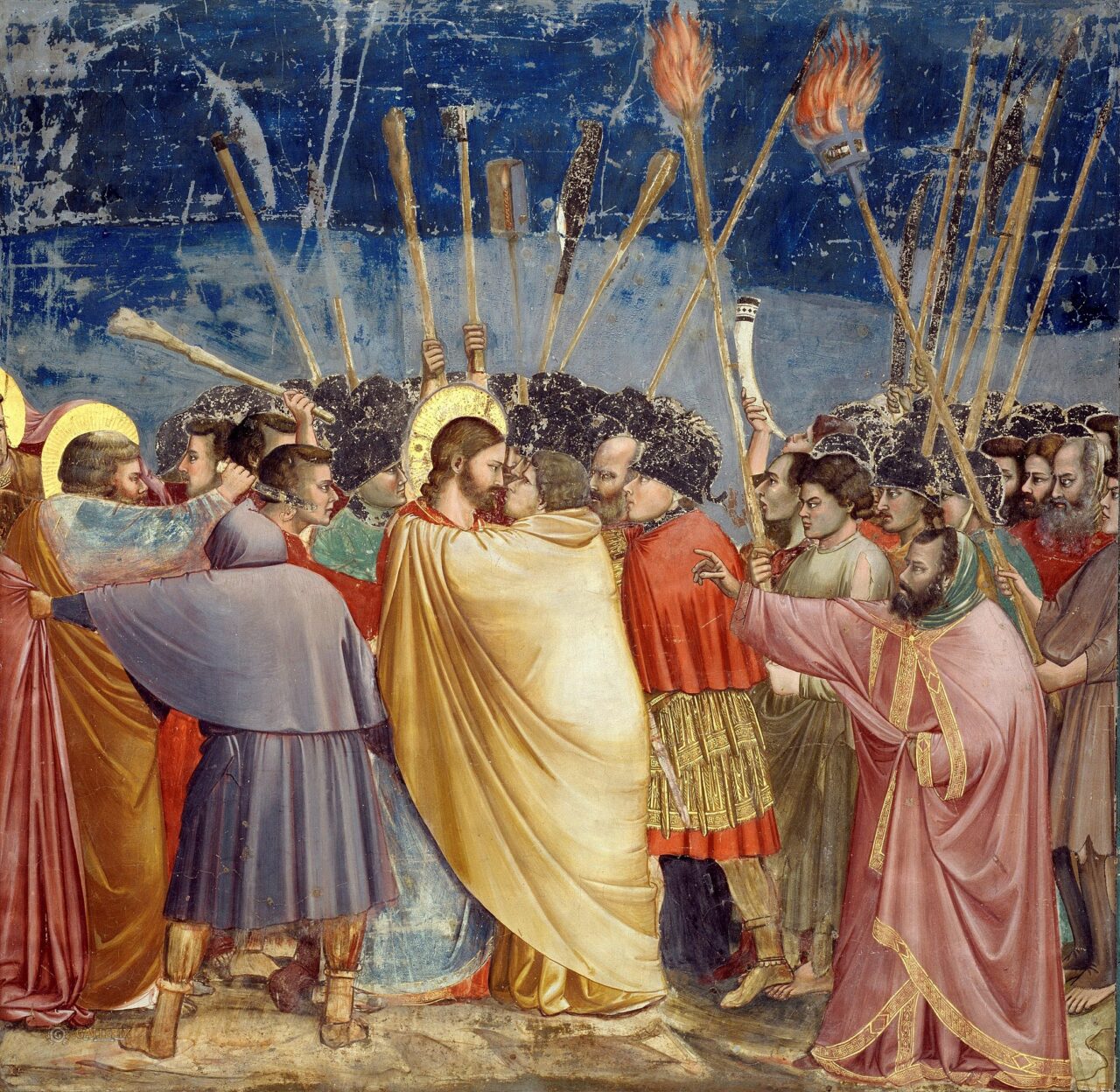
If you’re wondering why yellow is often used in art to depict deception and betrayal, the answer may lie in medieval art. In fact, yellow was used to depict Judas, who you may recall in paintings with his distinctive yellow cloak. The reason for this is unknown, but this way of depicting him quickly caught on and connected yellow with deceit, betrayal, and jealousy. Still, artists continued the tradition of using yellow as a symbol of abundance, wealth, and vitality.
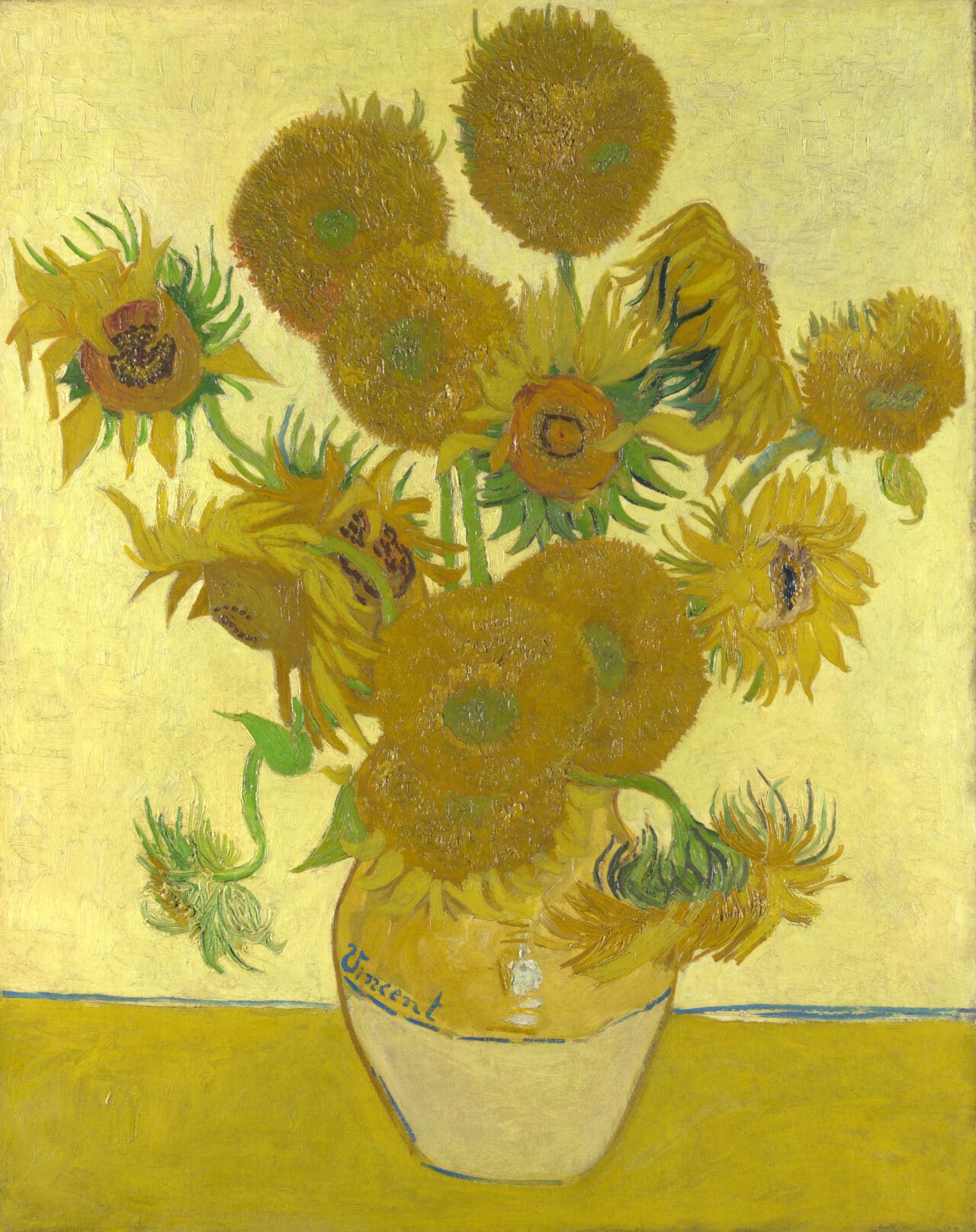
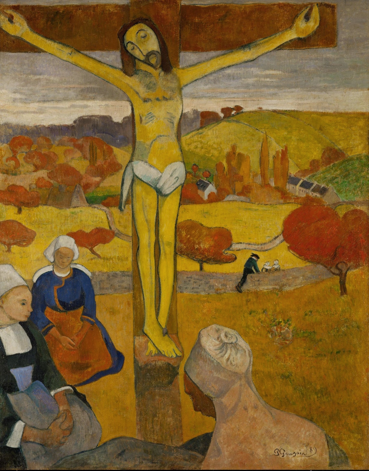
Few artists have been able to grasp the ambivalence of the color yellow as comprehensively as the pair of artists Paul Gauguin and Vincent van Gogh. In 1888, Gauguin spent nine weeks in van Gogh’s home in the south of France. Gauguin used yellow to depict death, like in his painting The Yellow Christ, illness, or poverty. On the other hand, for van Gogh, yellow was the color of joy. He often used a deep yellow to paint stars, sunflowers, dwellings, hay, and crops.
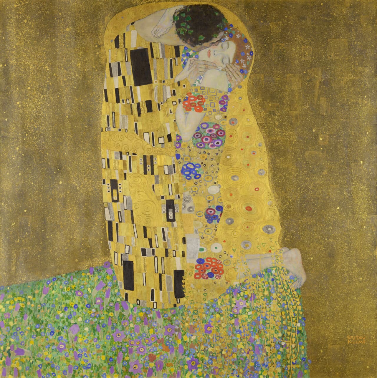
Inspired by Byzantine art, Gustav Klimt created his most famous piece of art, The Kiss, during the Golden Age. The Kiss was warmly received by critics, but condemned as pornographic by the prudish society due to its erotic undertones.
What colors go with yellow
Purple is complementary to yellow. This combination was also made famous by Vincent van Gogh who liked painting purple flowers in landscapes bathed in yellow sunlight. The combination of blue and yellow is also widely used and very impressive, as found at sunset. Analogous colors for yellow are orange and green.
Yellow also goes well with gray, white, or black. However, if you combine yellow and black, be careful with its symbolism. This beelike combination goes well together but gives off an undertone of caution. That’s why it’s often found on road signs or used for the logos of construction companies (CAT, Caterpillar).
This completes our introduction to all the primary colors for our series on colors in photography. We have guided you through all their aspects, from history to psychology.
Read interesting facts about white, black, green, blue, and red and how they apply to photography and other mediums.





There are no comments yet.