Composition: Seek Contrasts in Colors—Then Keep Going!
One very simple and effective way to emphasize your subject is to find a high-contrast background. You can contrast your subject against the background not only visually, but also in terms of its meaning. These contrasts are especially strong when a picture contains two elements that seem dissimilar, but join together to form a surprising composition with a powerful message.
Color Contrast
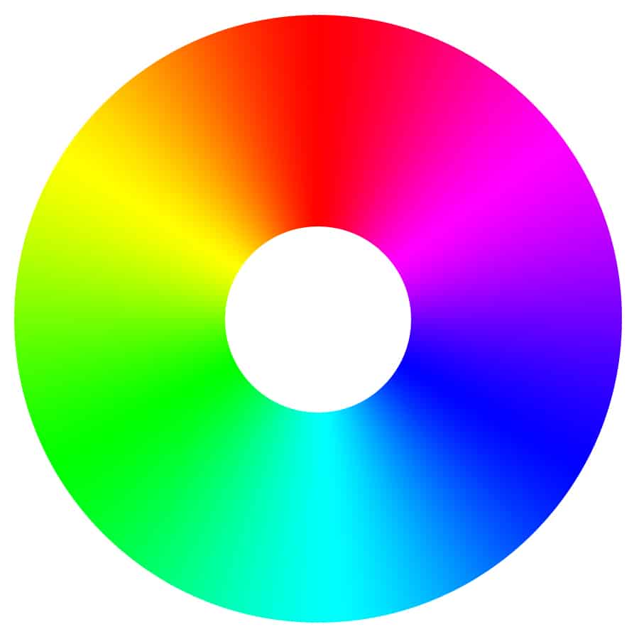
In our age full of digital color photos, the simplest way to give a picture a strong contrast is through colors. When seeking high-contrast colors, you can take advantage of the primary color diagram, where complementary colors are located opposite each other. So for example the color that contrasts with red is sky blue.
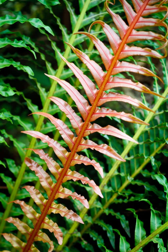
For example in this picture, the green leaves form a contrast against the red leaf:
Canon EOS 7D, EF 50/1.8 II, 1/50 s, f/3.2, ISO 400, focus 50 mm (80 mm equiv.)
Panasonic Lumix DMC-LX 3, 1/125 s, f/4.5, ISO 80, focus 12.8 mm (60 mm equiv.)
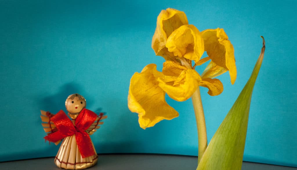
One very striking kind of contrast to use is when a colorful subject stands against a monochrome background. This kind of contrast is relatively difficult to find, and so sometimes selective desaturation in a photo editor is used to achieve it. And in fact, you can even find this kind of function in most of the digital cameras sold today.
But even though selective desaturation is fairly popular among amateurs, advanced photographers avoid it. This technique was popular in the 1990s, but today it’s practically taboo among professional photographers. But a colorful subject located naturally, in real life, against a monochrome background really is eye-pleasing. And actually, that’s also why gray backgrounds in studios are so universal.
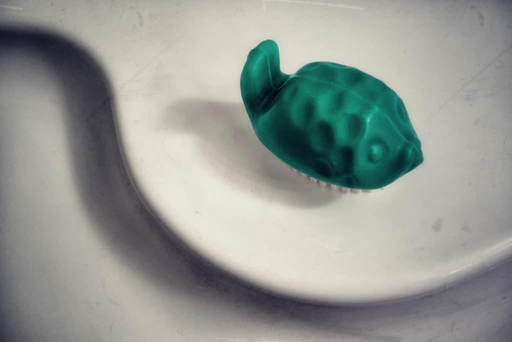
Panasonic Lumix DMC-LX 3, 1/40 s, f/2.4, ISO 80, focus 7.9 mm (37 mm equiv.)
Panasonic Lumix DMC-LX 3, 1/8 s, f/2.8, ISO 400, focus 12.8 mm (60 mm equiv.)
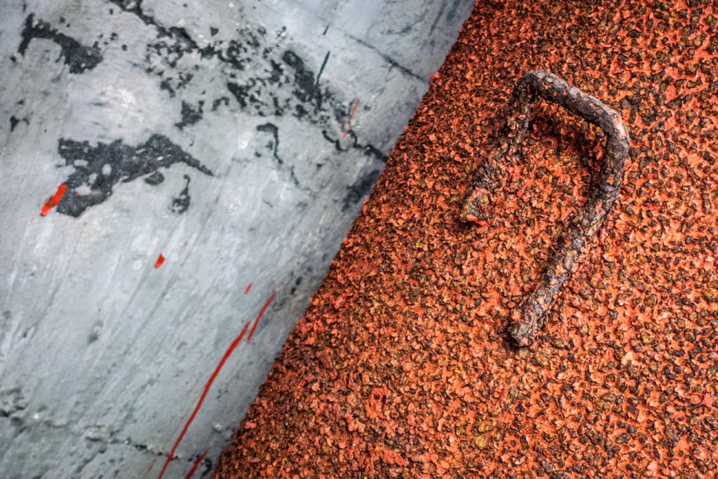
Tonal Contrast
But wait, what if you’re doing monochromatic (black-and-white) photography? There’s still a great kind of contrast to go after here, and that’s tonal contrast. After you’ve desaturated a color photo, its different colors no longer contrast—but their shades still do. Photographers who worked with actual black-and-white film had a keen ability to see the world tonally and were able to guess which objects would be dark in a final picture, and which ones light. They altered the tonalities of the things they photographed using color filters placed in front of the lens.
In the digital era monochrome pictures are, paradoxically, easier than ever to make. The ideal route here is to shoot to RAW and use a monochrome preview. That gives you a full-color image, while still showing the desaturated version of it on the camera display. You can later go on and apply a variety of digital color filters to the color RAW file to very precisely alter the tonality of individual elements in the picture.
Panasonic Lumix DMC-LX 3, 1/40 s, f/8, ISO 80, focus 12.8 mm (60 mm equiv.)

Panasonic Lumix DMC-LX 3, 1/200 s, f/2.8, ISO 200, focus 12.1 mm (57 mm equiv.)
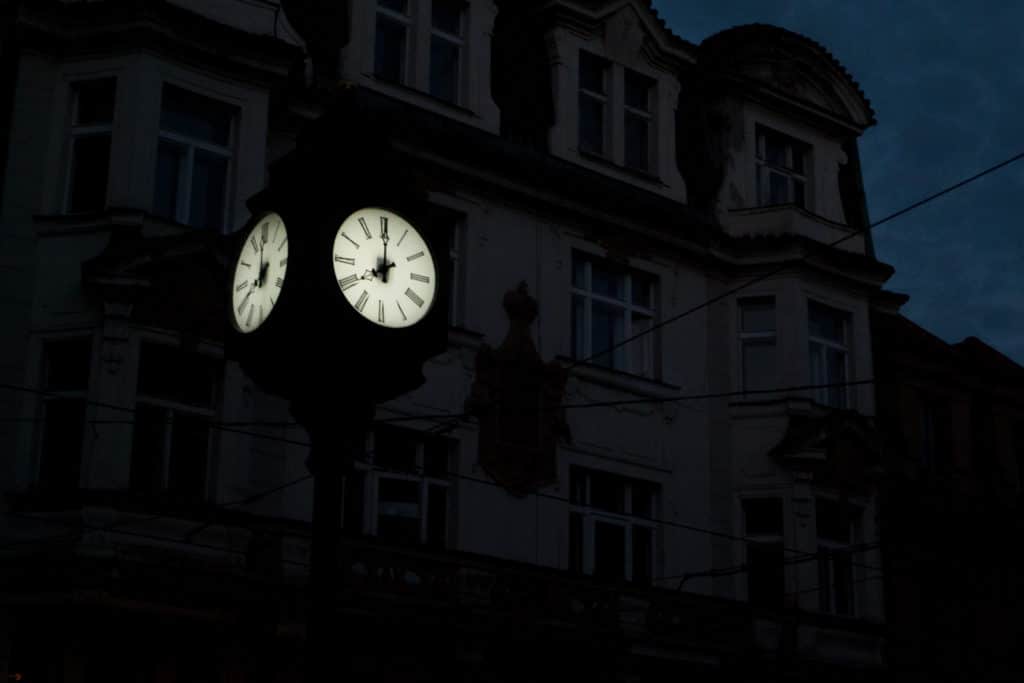
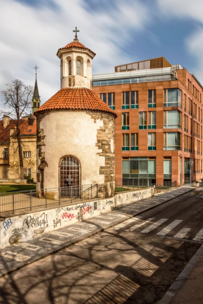
Contrasts of Meaning
Photographs containing contrasts of meaning are very popular and can often be amusing—or can force you to think about unexpected connections. One frequent contrast of meaning are old vs. new. You’ll find it often in any city rich in history). You’ll also find it disguised as smooth (clean) vs. beaten-up. Fashion photographs of beautiful models and clothing in an industrial milieu are a good example of this. Some other good examples of contrasts of meaning are civilization in the wild and elements of nature in urban areas.

Canon EOS 400D, EF 24-80/3.5-5.6 USM, 1/250 s, f/10, ISO 400, focus 53 mm (85 mm equiv.)
Canon EOS 7D, EF-S 15-85/3.5-5.6 IS USM, 1/20 s, f/11, ISO 100, focus 15 mm (24 mm equiv.)
Contrast Grabs Interest
Photos containing contrasts of meaning are more interesting for your audience, because these contrasts force them to think about the photo. These photos can contain an unexpected message or a joke. Tonal and color contrasts, meanwhile, make for pictures that are pleasing to the eye. These three types of contrast are not the only ones that exist, so think up and use your own types of contrast. Photographs containing contrasting shapes, for example, are also interesting!
There are no comments yet.